Learning and color
How Do Colors Influence Learning?
“Colors aren’t important.”
Oh yeah - then how do you explain traffic lights, warning signs, and rainbows? Color is important, and it’s time we pay attention to color in eLearning too.
Learning is a difficult field to understand, and there’s so much research out there discussing these issues that it’s hard to know where to begin. What’s pretty obvious though is that color plays a key role in creating an environment that fosters learning.
So let’s talk about color – What colors help learning? What colors might be annoying or distracting to online learners? And how can we mitigate that risk? That’s what we’ll be delving into here.
Not convinced? What If we told you that color, as part of the electromagnetic spectrum
, is in its purest form energy, a wavelength, which has its own magnetic frequency? What if we told you that colors can affect neurological pathways in the brain? And that they can create a biochemical response? Now, facing that evidence, it’s clear that color has been overlooked for far too long. Dr. Robert Gerard recognizes this and has pioneered research, which suggests that every color has a specific wavelength, and each of these affect our body and brain in a different way.
Using the right color, and the correct selection and placement can seriously affect feelings, attention, and behavior when learning. It’s time that we leveraged that to our advantage. Even research with Alzheimer’s patients has shown that color cues improve memory and that learners recall images in color more easily than images in black and white – amazing, right?
Now listen, we’re not expecting you to be the next Picasso– but a fundamental understanding of which colors work will benefit your eLearning to no end. So that’s what we’re going to do now. We’ll be going through the colors and having a look at what they mean to you and your learners – and the biological response they can elicit. Bear in mind of course, that this isn’t a definitive science. It might be that you’re scared of blue because you’re scared of water – there are unique elements to color choice. But what we’re going for here is a broad-strokes approach that helps us appeal to the most learners with the right colors for our projects. Okay, boilerplate done, let’s begin.
Read more: The Complete Guide to Color Combinations in eLearning
You probably know this already, just by taking a look at a forest or a field. Low wavelength colors promote restfulness and calm, and they improve efficiency and focus.
So that’s why green is an excellent color for improving concentration. Apart from being one of the easiest colors on the eyes, it reminds us of nature. That’s why TV stars stay in the ‘green room’. It’s a relaxing space.
Green is a good color for keeping long-term concentration and clarity, making it a good choice for an office – as opposed to red, which is seen as stimulating and exciting. Maybe it helps in the short term, but stimulation has to tail off sometimes.
Interestingly enough, there’s some real scientific evidence for this. Some studies have shown that people who work in green offices have higher rates of job satisfaction, and consumers have been shown to spend more time shopping in stores that are painted green [1].
Another study, led by Dr. Kate Lee, examined 150 university students. She gave the group a boring, monotonous task that dragged their attention span to a breaking point, pressing a series of numbers over and over as they read off a computer screen. The students were told not to press keys when the number three appeared on the screen. Then break time came, and in a 40-second window half of the group viewed a green roof, while the others looked out onto a bare concrete roof. Amazingly, the research showed that students who looked at the green view made fewer errors and had overall better concentration. [2]
Dr. Lee hypothesizes that the green roof provided a ‘restorative experience’ which helped boost the mental resources of the students involved in the study. If true, that’s a major consideration.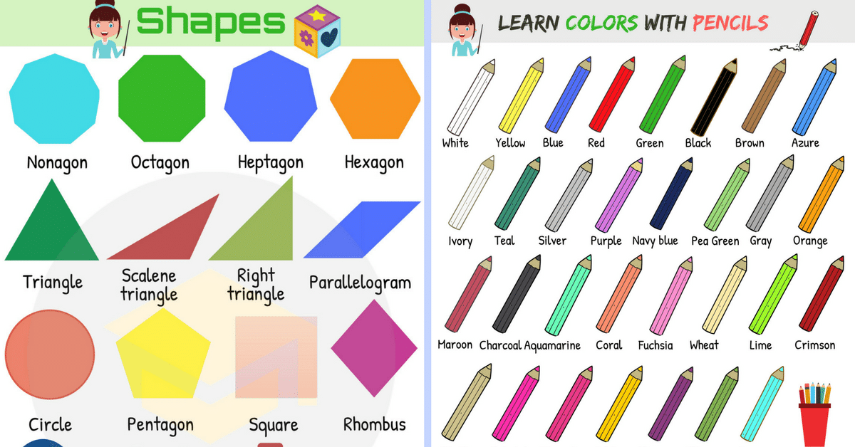 If your learners are tired and bored of their compliance material, add in a restorative green screen, a forest scene, or something else for a bit of a break. Lee believes that just a moment of looking at a green space could provide a moment of revitalization for workers who were struggling to concentrate.
Think about the orange sun setting over the horizon. Nice, right? It’s true, orange can be a welcoming and mood-lifting color for learners, which in turn promotes comfort and improves neural functioning.
Some theorists argue that an environment rich in the color orange increases the oxygen supply to the brain, stimulating mental activity while simultaneously loosening peoples’ inhibitions. An increased oxygen supply also leads to feeling invigorated and getting ready to ‘get things done.' Some have even suggested that test centers be painted orange to stimulate exam-takers.
But this comes at a cost – avoid bolder orange colors if your learners are young and naturally energetic. This isn’t a good color for those prone to overstimulation as well, for instance if your group of learners have attention deficit hyperactive disorder or another health concern which leads to easy overstimulation.
That’s not it on the science for orange, though – many studies have found that when colors are used to emphasize a feature or piece of content on the screen, learners’ attention levels increase. Of course, the best colors for this are warm colors, like orange. So we can say that when you’re looking to highlight certain facts or important information, orange can be a better choice than the traditional red. But, because of its energy and brightness, orange can be an overwhelming choice. Orange is, in other words, best in small doses.
The secrets of orange were known in ancient China too – in Feng Shui, orange is seen as a “yang” color which stimulates focus and promotes organization [3]. Of course, we need to remember that brightness and saturation also come into it, and too bright a color will probably give you a headache! Looking to the experts, color psychologist Angela Wright states that bright orange hues stimulate while low saturation is more soothing. So for boosting energy, go bold, and for relaxing, go mellow. Makes sense, huh?
So to close out orange as a color, in eLearning courses it can be used to highlight key facts and figures, communicate energy, life, and activity. Orange is a vibrant color that demands attention, giving it an edge as a choice for highlighting. But again, use with caution!
Read more: Color Psychology: Use Warm Hues to Energize Your eLearning
Some research suggests that people with highly intellectual work, which requires a high cognitive load, for instance, programmers or academics, are more productive in a blue environment. That said, though; we can’t keep life too monochromatic – it should be balanced with warmer colors. These can be found by using the opposite side of the color wheel.
Blue is best used for learning situations which are challenging. Blue paper, blue ink, or blue highlighting can be used to help improve reading comprehension too. Blue in general it seems is a relaxing and calming color, but lighter shades will seem more ‘friendly’ while darker ones seem a little more somber.
Back to the experts, many color psychologists recommend using blue colors, but adding a bit of extra kick with orange, especially for highlighting information (like we mentioned earlier!).
So in summary, blue is great for promoting high levels of thought, but too much can create a sense of detachment and coldness.
Read more: Color Psychology: Use Cool Colors to Set Just the Right Mood for Learning
Hopefully, by now you’re having a dramatic rethink of the color of your courses, your house, and maybe even your car. That’s great – that’s what we want. Take note of the lessons above and let us know how you’ve implemented them in your eLearning courses. Remember, color is fundamental to the human experience. It’s a huge part of our lives and our perceptions, and we should leverage that in our eLearning courses.
REFERENCES:
1.Effect of Different Colors on Human Mind and Body http://humannhealth.com/effect-of-different-colors-on-human-mind-and-body/243/8/
2. Seeing green boosts your concentration, research shows. May 25, 2015. http://www.smh.com.au/technology/sci-tech/seeing-green-boosts-your-concentration-research-shows-20150525-gh8udh.html
3. Best Color For Concentration And Productivity Is Orange http://www.huffingtonpost.com/2013/09/18/best-color-concentration_n_3949427.html
4. Brain-Based Learning by Eric Jensen, 2000 (p.54-70)
The Effect of Color on Learning
The Effect of Color on Learning: How 4 Different Colors Affect Student Moods and Behaviors
Author: Dr. Christina Counts
Choosing the color palette for a space is important––being exposed to certain colors influences different behaviors, mood, and perceptions (“Color Psychology: How Do Colors Affect Mood & Emotions?”, 2020). That being the case, choosing the color palette for learning environments is particularly important, as color is 1 of 6 design parameters that have a 25% impact on learning (Barrett, Davies, Zhang & Barrett, 2015).
While creating aesthetically pleasing learning spaces is one reason to utilize color in schools, the effect of color on learning is a much more compelling motivation to implement particular colors in school environments. Each color in a learning space can have a different effect on students’ behavior and moods, making it an important part of the learning environment.
The effect of color on learning is an important consideration to make when designing a learning space. Here are some ways that four common learning environment colors affect student moods and behaviors:Red in Learning EnvironmentsRed is a very stimulating color and is often associated with strength and courage. Red in a learning space can increase alertness, creativity, and excitement. A learning environment with red in the color palette can be energizing, motivating students and teachers to act and increasing attention to detail.
Orange is an energetic color that can increase alertness, excitement, and engagement. This hue signifies optimism and self-confidence, promoting happiness and energy. Orange may also promote collaboration in learning spaces.
Green in Learning EnvironmentsGreen is a natural color and brings a sense of balance and harmony into a space. The calmness of green can symbolize relaxation, healing, and stability. A learning environment with green in the color palette may help relieve stress and provide a sense of security.
Blue in Learning EnvironmentsBlue is typically associated with trust, integrity, and peace. This color creates a positive, calming emotional response, generally reducing stress and making people happier. Blue in learning spaces may also inspire student creativity and exploration of new ideas.![]()
The effect of color on learning is an important consideration to make when choosing colors for a learning space design. Every color in a learning space can influence students’ behavior and moods, whether it’s on the walls, floors, furniture, or learning materials. By considering the impacts each of these colors makes, it’s easy to choose a color palette that can help accomplish the goals of any learning environment.
MiEN Company’s design team can help you create the perfect color palette for your learning space’s aesthetic and learning goals. Once you have a design and color scheme for your space, MiEN Company’s wide range of fabrics and surface materials are easy to explore by color using our furniture partners’ online materials libraries. With all of the material and color options available at MiEN Company, you can create an environment that supports your learning goals.
References:
Barrett, P., Davies, F., Zhang, Y., & Barrett, L. (2015). The impact of classroom design on pupils’ learning: Final results of a holistic, multi-level analysis. Retrieved 1 February 2021, from http://dx.doi .org/10.1016/j.buildenv.2015.02.013
Color Psychology: How Do Colors Affect Mood & Emotions?. (2020). Retrieved 1 February 2021, from https://londonimageinstitute. com/how-to-empower-yourself-with-color-psychology/
Dr. Christina Counts, VP of Strategy and Development for MiEN Environments, is a proven leader with a successful background in transforming learning spaces to modern engaging learning environments. Dr. Counts has worked in education for over 17 years with experience as a classroom teacher, district instructional leader, school administrator, and digital and innovative learning designer. In her most recent position, Christina leads a team of professionals that support schools making the transition to a flexible, collaborative, & student-centered learning space. She holds a doctorate in K-12 Educational Leadership, National Board-certified, and Google & Apple certified. Dr. Counts envisions a learning space in which educators are empowered to transform education through design, technology and innovative instructional pedagogy to create learners ready for any future!
Tags :Higher EducationK12 EducationSchool DesignSchool Furniture
6 Ways to Use Color Psychology to Design Effective E-Learning
Blog » Online Education » 6 Ways to Use Color Psychology to Design Effective E-Learning
Contents
- colors
- 3.
 Improve readability with color
 - 4. Improve learning and understanding
- 5. Use colors according to their meaning
- 6. Choose the right color combinations
Research has shown that 80 percent of the information processed by the brain of an Internet user comes through the eyes, and people are extremely sensitive to visual cues when learning. Therefore, visual content is a key factor in e-learning and the correct application of graphic methods can improve knowledge acquisition.
One way to harness the power of visual tools is through the use of color. nine0003
Colors are powerful psychological triggers that help users learn better by changing their perceptions and evoking emotions. However, it is also important to remember that overuse of color leads to cognitive overload and becomes counterproductive. Therefore, it is necessary to find the right balance.
E-learning designers need to know the psychology of color before designing. That's why in this article, we'll look at some of the ways in which color can be used to create eLearning courses, taking into account the physiological and psychological effects. nine0003
1. Use color to attract attention
Color can help reduce boredom and inactivity, thereby improving concentration. When students pay more attention to the study of educational materials during training, the speed of memorization and reaction time increase.
Numerous studies have shown that when developers use colors to highlight a particular feature or piece of content, such as on a screen, students' attention levels increase. nine0003
Warm colors achieve this goal best. Especially red, when used carefully, stands out and immediately attracts attention, stimulating visual perception and helping students remember facts and figures.
2. Use bright colors strategically
Developers should use strong and bright colors sparingly or over neutral background tones when developing eLearning materials. This avoids that the colors become too intense and draw the eye in many directions, in which case the technique loses its effectiveness. nine0003
Therefore colors should be bold, not bright (which is hard to read) and solid, not neon (which seem unprofessional).
3. Improve readability with color
Color can increase clarity and readability of text by as much as 40 percent for two reasons: more logical and help to reason and remember
A few tips for using color for better content readability:
- The most legible of all color combinations are black on yellow and green on white, followed by red on white
- Black on white is easiest to read on paper and on a computer screen.
- Hard colors (red, orange and yellow) are more visible and make objects look bigger and closer.
 They are easier to focus on.
 - Soft colors (purple, blue and green) are less visible and make objects look smaller and further away. They are not so easy to focus on
4. Improve learning and understanding
Because color connects neural connections, people remember colors better than just verbal or textual cues. For example, the Color Matters Institute of Color Research has confirmed that color can improve learning from 55 percent to 78 percent, as well as improve its quality by 73 percent. nine0003
Other studies have also shown that color images are more memorable than black and white ones. According to this data, most of the people surveyed could remember more images if they were in color than if they were in black and white.
To take advantage of this, eLearning developers must match colors with lesson content; for example, using color coding to improve learning.
By using colored backgrounds on fact and concept screens, students can associate color with concepts and this will help them recall information.
nine0003
5. Use colors according to their meaning
When designing e-learning, you need to take into account the fact that each color has a specific meaning. Students may consciously or unconsciously consider the meaning of color.
Color meanings vary across cultures, and developers should select tones appropriate to the culture and specific characteristics of their primary audience. In Western society, for example, red means danger or importance, black means negative, white means purity, blue means water features, and green means flora. nine0003
In the educational environment, the meanings of colors are somewhat different. For example, red often means a mistake, but blue, on the other hand, can signal openness.
A study by Ravi Mehta and Rui Zhu of the Sauder School of Business found that using red can improve performance in detail-oriented tasks. But this is of no use if students need to stay on task and concentrate for a long period of time. However, when doing tasks like brainstorming, blue is more creative than red. nine0003
Developers can also use color values to set the mood of learning, which will therefore affect quality. Red, orange and yellow create an energetic, stimulating course, while green, blue and purple create a relaxed learning environment.
6. Choose the Right Color Combinations
Developers who are new to developing eLearning courses often choose colors based on their personal tastes and preferences. Sometimes this works well, especially when the designer is well versed in what makes for eye-catching combinations and what color scheme would be appropriate for the course. For those who are not so talented by nature, it is best to turn to the basics of color theory. nine0003
One of the most useful and simple aspects of color theory is the color wheel. It shows which colors are in harmony and helps designers create a color combination that doesn't tire students' eyes.
The color wheel (color wheel) consists of the six primary colors—red, yellow, green, blue, orange, and purple—along with their hues. Any two colors opposite each other, any three equally spaced colors forming a triangle, and any four colors forming a rectangle will be harmonious. nine0003
In eLearning design, it is generally best to stick with a color scheme that uses three tones as a starting point, as this is enough to create variety and visual interest without being overwhelming.
Therefore, a triadic color scheme based on the color wheel guarantees good results. Developers should also adhere to the 60-30-10 rule - instead of using an equal amount of each color, they should split the color usage into 60 percent, 30 percent and 10 percent. nine0003
distance learning course for designers IADP Pentaskul
How will this course be useful for you?
Knowing the theory and psychology of color is important in order to develop in each of the areas of design. When working with the corporate identity of brands, printing, interiors, websites and even clothes, color is the main means of expression.
During the course, you will learn from scratch how to choose color solutions for any task or you will be able to supplement your knowledge and eliminate gaps. You will complete practical tasks on each topic and immediately apply new skills. At the end of the course, you will have examples of color compositions and schemes that can be attached to your portfolio. nine0003
Suitable for
Why a designer with knowledge of color theory and psychology?
- The ability to work with color is a must for any designer, from graphic to landscape.
- The principles of color psychology are applied in advertising, website development, interior design, etc.
- By mastering the techniques of color matching, you will be able to create expressive and harmonious works in the chosen direction of design.
 nine0008
income
from 50,000 P
Income to a novice designer in any of the
,areas of 100,000 p
can earn an experienced designer
Vacancies
more than 14,000 9,000
in the design. on the portal HH.ru
over 1,000 orders
on the freelance site FL.ru (*according to data for 2023)
Practical work on the course
Tone extensions in different techniques.
A color chart for an illustration, character, or brand.
Color composition in mosaic technique.
You will know
- The physical basis of color. nine0007 Basic concepts of color theory: color wheel, contrasts, chromatic and achromatic tones.
- Fundamentals of color perception, the influence of shades on emotions.
- The role of color in advertising, branding, interior design and other areas of design.
You will be able to
- Select and use different types of color contrasts.
- Place accents in color compositions.
- Select harmonious combinations of shades and create color schemes.
- Analyze color characteristics and the effect of color on the viewer. nine0008
Certificate of the Moscow Academy of Design Professions Pentaschool
Course teacher
Training program
The program consists of 3 modules and is focused on practice from the first lessons. You will gradually study color theory and draw up color streamers, compositions, schemes.
-
1. Color and nature of color
Course content:
- The physical basis of color: what are color ranges, spectrum, waves, etc.
- Color theory: chromatic and achromatic tones, color wheel, types of contrasts
- Color reproduction. RGB, CMYK, Pantone 9 systems0008
Assignments on the course:
- Perform a series of chromatic and achromatic tone stretches
- Compose with watercolor fills and compose with achromatic tones
- Compose color harmony nine0008
- Find examples for each type of contrast
Result:
11 hours theory
12 hours of practice
-
2.
 Color psychology
 Course content:
- Color perception and shade discrimination. The phenomenon of synesthesia
- Color influence and color harmony, psychological attitude to color nine0008
- Color coordinates: hue, saturation, brightness
- The effect of color on the perception of space
- The concept of heavy and light, active and passive colors nine0055
- Identify and compose the nuance scale of the landscape
- Create a color chart for an illustration, character or brand (choice of manual or computer input)
- Understand how color affects human emotions and visual perception of objects nine0008
Assignments on the course:
Result:
11 hours of theory
12 hours of practice
-
3.
 Working with color in design
 Course content:
- The role of color in different design directions nine0007 Digital color solutions
- Color and composition. Placement of accents
- Paints and their mixing
- Compilation of color schemes nine0007 Color in visual communication: color persuasion in advertising, color meaning in logos
Course assignments:
- Create a harmonious color composition for a cityscape, corporate identity, website or interior in four different versions using different color schemes nine0007 Choose harmonious combinations in accordance with the color scheme and create expressive compositions based on them
- Create a mosaic composition
Result:
- Learn how to match colors, create different color solutions and analyze their effect on the viewer nine0008
14 hours of theory
10 hours of practice
For a comfortable and efficient course you will need a personal computer or laptop with installed programs from the Microsoft Office package: Power Point, Word or similar text and presentation editors.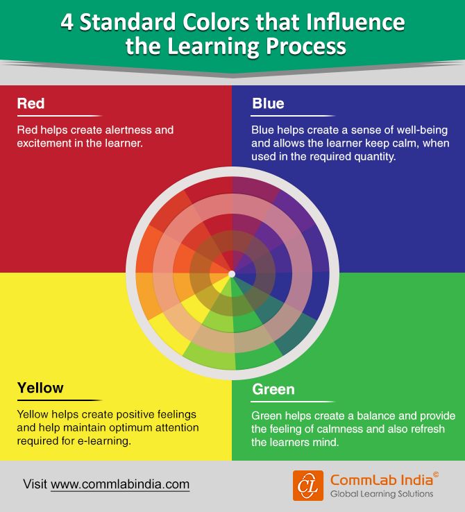 You will also need Adobe Acrobat Reader or a similar PDF product. In order for video lectures to load and play quickly, a stable Internet connection and a fresh version of any browser are important. nine0003
Curriculum of the Color. Theory and Psychology” is available at the link
Hurry up to join the nearest recruitment and get useful skills with a 40% discount
Why Pentaschool
5 years we specialize in training designers
5500 satisfied students
4000 webinars in our knowledge base
91% students are recommended to study at Pentaschool according to otzovik.com
- Lifetime access to course materials after successful completion of training
- Feedback from practitioners
- Join the community of designers from all over the world
Reviews
I received a lot of new and valuable information, I knew something, but with the help of the course I learned more profound points. Something was not familiar to me, but now I understand it. Thank you! nine0003
Show
Alyona Kazakova
Kovrov
Having worked for 9 years as a graphic designer without specialized education. And so I chose a course for myself: “Color. Theory and psychology. And I did not regret it, I learned a lot of new information, which I would not look for in everyday life. A good presentation, here you have both a video lecture and a separate document, which allows you to significantly consolidate the material covered.
Show nine0003
Eduard Tsurkan
Graphic designer, Moscow
Everything is logical and consistent, nothing superfluous.
Show
Anna Buturlina
Moscow
Thank you very much. Everything suits, only a request - to give the opportunity to download video tutorials.
Show
Natalia Kharitonova
Moscow
Tuition fee
Discount
-40% Until January 27
9 200 P 5 500 P
Training period - 2 months Training with a certificate
The price includes:
- 3 modules on color theory and psychology
- practical tasks with verification and personal feedback from an expert
- color compositions and other works that can be added to the portfolio
- unlimited access to course materials after successful completion
- regular online design webinars
- access to the webinar library for the duration of the course and 90 days after graduation
show more
You can also call us yourself at 8 800 550-76-72 nine0425 The call is absolutely free for you
Questions and Answers
Yes, you can study the program even if you have not done design before. You will learn the basics of working with color from scratch and begin to get acquainted with the profession of a designer, and in the future you will be able to continue your studies in our other courses.
This course is universal. On it, you will learn the basic principles of working with color, which you can apply in graphic, landscape, web design and other areas. The program will include lessons on the role of color in different design areas. nine0003
Yes, for each module you will take tests and complete 2-3 practical tasks that are checked by the teacher. After the course, you will have examples of color streamers, compositions and other works that you can attach to your portfolio.
The teacher will check each practical work, mark it and give a detailed text commentary. You will understand what went well and how to correct possible errors.
With approximately 8 hours per week of flexible hours, you will complete the program on time. You can study at the same time as work and independently distribute the load so that the course is comfortable.