The science of colors
The Science of Color
Home » The Science of Color
Newton’s Rainbow
| Sir Isaac Newton experimenting with a prism. Engraving after a picture by J.A. Houston, ca. 1870. Courtesy of The Granger Collection, New York |
In the 1660s, English physicist and mathematician Isaac Newton began a series of experiments with sunlight and prisms. He demonstrated that clear white light was composed of seven visible colors.
By scientifically establishing our visible spectrum (the colors we see in a rainbow), Newton laid the path for others to experiment with color in a scientific manner. His work led to breakthroughs in optics, physics, chemistry, perception, and the study of color in nature.
Aristotle developed the first known theory of color believing it was sent by God from heaven through celestial rays of light. He suggested that all colors came from white and black (lightness and darkness) and related them to the four elements – water, air, earth, and fire. Aristotle’s beliefs on color were widely held for over 2000 years until being replaced by those of Newton.
| Sir Isaac Newton |
Opticks, one of the great works in the history of science, documents Newton’s discoveries from his experiments passing light through a prism. He identified the ROYGBIV colors (red, orange, yellow, green, blue, indigo, and violet) that make up the visible spectrum. The visible spectrum is the narrow portion within the electromagnetic spectrum that can be seen by the human eye. Other forms of electromagnetic radiation, waves of energy, that we cannot see include radio, gamma and microwaves. The cells in our eyes called cones are sensitive to the wavelengths found in the visible spectrum. They allow us to see the all the colors of the rainbow.
…if the Sun’s Light consisted of but one sort of Rays, there would be but one Colour in the whole World…
–Sir Isaac Newton, Opticks
Goethe challenged Newton’s views on color, arguing that color was not simply a scientific measurement, but a subjective experience perceived differently by each viewer. His contribution was the first systematic study on the physiological effects of color. Goethe’s views were widely adopted by artists. Although Goethe is best known for his poetry and prose, he considered Theory of Colors his most important work.
Colour are light’s suffering and joy.
–Johann Wolfgang von Goethe
This very rare book formed the foundation for modern color printing. Le Blon was the first to outline a three-color printing method using primary colors (red, yellow, blue) to create secondary colors (green, purple, orange).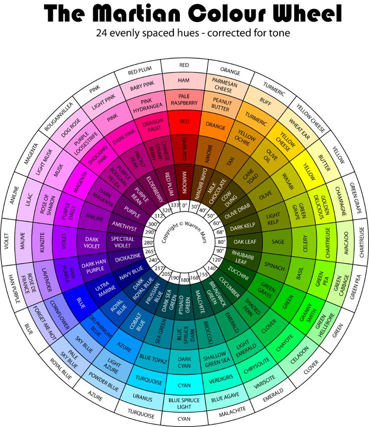 He makes an important distinction between “material colors,” as used by painters, and colored light, which was the focus of Newton’s color theories. Le Blon’s distinction marks the first documentation of what is now referred to as additive and subtractive color systems. Rainbows, TVs, computer screens and mobile devices all emit light and are examples of an additive color system (the subject of Newton’s Opticks). Red, green and blue are the primary additive colors and when combined they produce transparent white light. Books, paintings, grass and cars are examples of a subtractive color system which is based on the chemical makeup of an object and its reflection of light as a color. Subtractive primary colors - blue, red, and yellow – are often taught to us as children, and when mixed together they create black.
…I arriv’d at the skill of reducing the Harmony of Colouring in painting to Mechanical Practice…
–J.C. Le Blon, Coloritto
These colorful line diagrams reveal the chemical compositions of metals. When a pure metal is burned and viewed through a spectroscope, each element gives off unique spectra, a sort of color fingerprint. This method, called spectral analysis, led to the discovery of new elements, and marked the first steps towards quantum theory.
| Shinobu Ishihara | ||
Can you see the numbers in the circles? 4.5 percent of the population cannot see the entire visible spectrum, a condition called color vision deficiency, or color blindness. Ishihara plates are used to test patients for the various types of color blindness.
Gerald Handerson Thayer
Illustrstions by Abbott Handerson Thayer (his father)
Concealing-Coloration in the Animal Kingdom
New York: The Macmillan Co. , 1909
Can you find the animal hiding in this image? Camouflage uses color to conceal forms by creating optical illusions. American artist Abbott Thayer introduced the concept of disruptive patterning, in which an animal’s uneven markings can disguise its outline. In this illustration Thayer shows how a peacock can disappear into its surroundings.
Thayer, an American artist, devoted much of his life to understanding how animals conceal themselves in nature for survival. In his book, Concealing Coloration in the Animal Kingdom, Thayer presented his beliefs of protective coloration as an essential factor in evolution helping animals disguise themselves from predators. He received much praise and criticism. He was extreme in his views arguing that all animal coloration was for protective purposes and failing to recognize other possible reasons such as sexual selection – characteristics for attracting a mate. Teddy Roosevelt most notably attacked his theories by pointing out that this concealment doesn’t last all season, or even all day, but was dependent on a single frozen moment in times.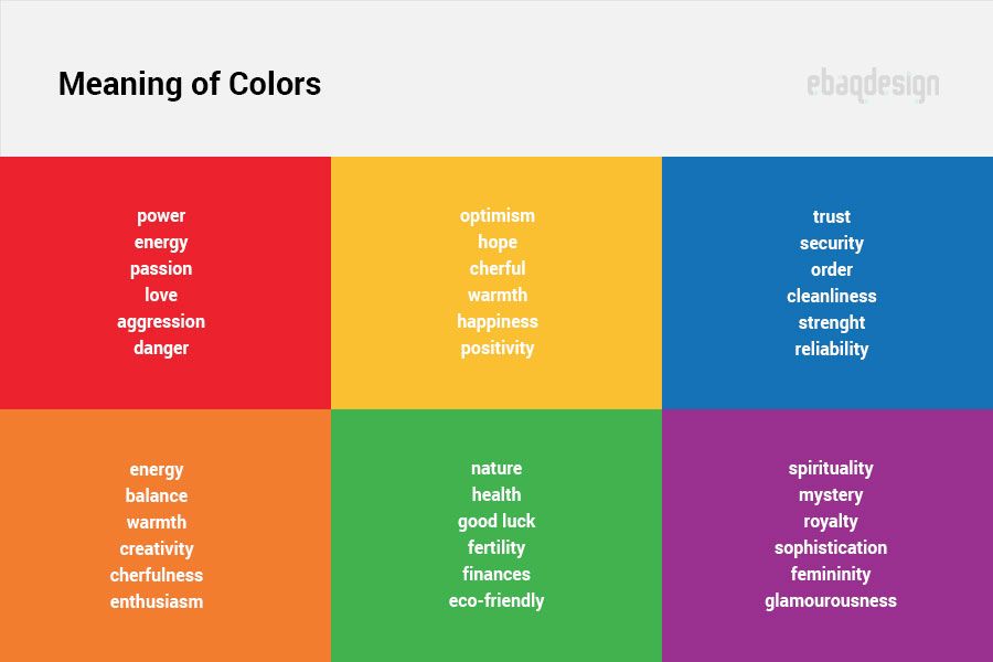 Despite these shortcomings, Thayer went on to be the first to propose camouflage for military purposes. Although his suggestions were initially rejected, his former students were among the founders of the American Camouflage Society in 1916 and his theories were eventually adopted and are still used today.
| Albatross D.Va, 1917-1918 Courtesy of the National Air and Space Museum |
The colorful pattern on this German aircraft from World War I is called lozenge camouflage. Its disruptive pattern applied Abbott Thayer’s theories in an effort to inhibit enemy observation from the air and on the ground.
Color Theory - Understanding the 7 fundamentals of color
Logos, websites & more…
Logos, websites, book covers & more…
Get a design
Color theory is both the science and art of using color. It explains how humans perceive color; and the visual effects of how colors mix, match or contrast with each other. Color theory also involves the messages colors communicate; and the methods used to replicate color.
In color theory, colors are organized on a color wheel and grouped into 3 categories: primary colors, secondary colors and tertiary colors. More on that later.
Via unsplashSo why should you care about color theory as an entrepreneur? Why can’t you just slap some red on your packaging and be done with it? It worked for Coke, right?
Color theory will help you build your brand. And that will help you get more sales.
Let’s see how it all works:
- RGB: the additive color mixing model
- CMYK: the subtractive color mixing model
- Color wheel basics
- Hue, shade, tint, tone
- Complementary colors
- Analogous colors
- Triadic colors
- Why color theory is important
Understanding color
–
People decide whether or not they like a product in 90 seconds or less.90% of that decision is based solely on color.
Color is perception. Our eyes see something (the sky, for example), and data sent from our eyes to our brains tells us it’s a certain color (blue). Objects reflect light in different combinations of wavelengths. Our brains pick up on those wavelength combinations and translate them into the phenomenon we call color.
When you’re strolling down the soft drink aisle scanning the shelves filled with 82 million cans and bottles and trying to find your six-pack of Coke, what do you look for? The scripted logo or that familiar red can?
People decide whether or not they like a product in 90 seconds or less. 90% of that decision is based solely on color. So, a very important part of your branding must focus on color.
RGB: the additive color mixing model
Additive color mixing. If you (like me) have a hard time wrapping your head around how red and green mix together to make yellow, watch this YouTube video.
Humans see colors in light waves. Mixing light—or the additive color mixing model—allows you to create colors by mixing red, green and blue light sources of various intensities. The more light you add, the brighter the color mix becomes. If you mix all three colors of light, you get pure, white light.
TVs, screens and projectors use red, green and blue (RGB) as their primary colors, and then mix them together to create other colors.
Why should you care?
Let’s say you have a very distinct brand with a bright yellow logo. If you post the logo on Facebook, Twitter or your website and don’t use the correct color process, your logo will appear muddy instead of that bright yellow. That’s why, when working with files for any screen, use RGB, not CMYK.
CMYK: the subtractive color mixing model
Any color you see on a physical surface (paper, signage, packaging, etc.) uses the subtractive color mixing model. Most people are more familiar with this color model because it’s what we learned in kindergarten when mixing finger paints. In this case, “subtractive” simply refers to the fact that you subtract the light from the paper by adding more color.
Traditionally, the primary colors used in subtractive process were red, yellow and blue, as these were the colors painters mixed to get all other hues. As color printing emerged, they were subsequently replaced with cyan, magenta, yellow and key/black (CMYK), as this color combo enables printers to produce a wider variety of colors on paper.
Why should you care?
You’ve decided to print a full-color brochure. If you’re investing all that money into your marketing (printing ain’t cheap!), you expect your printer is going to get the colors right.
Since printing uses the subtractive color mixing method, getting accurate color reproduction can only be achieved by using CMYK. Using RGB will not only result in inaccurate color, but a big bill from your printer when you’re forced to ask them to reprint your entire run.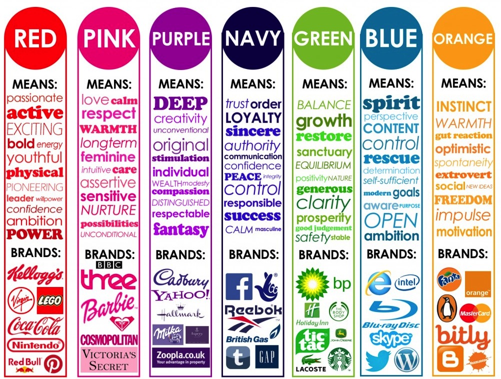
The color wheel
–
I don’t know about you, but when I was a kid, the best part about going back to school in the fall was getting that new, pristine 64-count box of Crayola crayons. The possibilities seemed endless. Until I’d inevitably lose the black crayon.
Understanding the color wheel and color harmonies (what works, what doesn’t and how color communicates) is just as exciting as that new box of crayons. No really.
Being able to understand the terms and processes that go along with color will help you knowledgeably communicate your vision with your designer, printer, or even (maybe) an Apple Store Genius.
Color wheel basics
The first color wheel was designed by Sir Isaac Newton in 1666 so it absolutely predates your introduction to it in kindergarten. Artists and designers still use it to develop color harmonies, mixing and palettes.
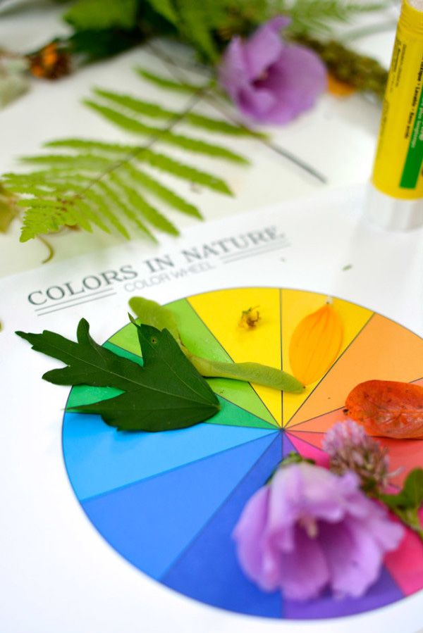
The color wheel consists of three primary colors (red, yellow, blue), three secondary colors (colors created when primary colors are mixed: green, orange, purple) and six tertiary colors (colors made from primary and secondary colors, such as blue-green or red-violet).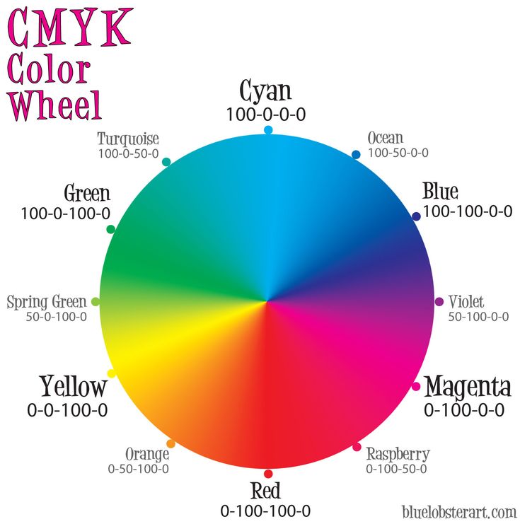
Draw a line through the center of the wheel, and you’ll separate the warm colors (reds, oranges, yellows) from cool colors (blues, greens, purples).
Warm colors are generally associated with energy, brightness, and action, whereas cool colors are often identified with calm, peace, and serenity.
When you recognize that color has a temperature, you can understand how choosing all warm or all cool colors in a logo or on your website can impact your message.
Hue, shade, tint and tone
Let’s go back to that 64-pack of crayons from our first day of school. (Remember “raw umber”? What is an umber anyway, and is it actually better raw than cooked?) Anyway, you might be wondering, how we got from the twelve colors on our original color wheel to all those crayons? That’s where tints, shades, and tones come in.
Simply put, tints, tones and shades are variations of hues, or colors, on the color wheel. A tint is a hue to which white has been added. For example, red + white = pink. A shade is a hue to which black has been added. For example, red + black = burgundy. Finally, a tone is a color to which black and white (or grey) have been added. This darkens the original hue while making the color appear more subtle and less intense.
Color schemes
Let’s talk schemes… (And not the kind that cartoon villains concoct. Bwahaha!) We’re talking color schemes. Using the color wheel, designers develop a color scheme for marketing materials.
Complementary colors
Complementary colors are opposites on the color wheel—red and green, for example.
Logo design by Wiell for Pepper PoweredBecause there’s a sharp contrast between the two colors, they can really make imagery pop, but overusing them can get tiresome. Think any shopping mall in December. That being said, using a complementary color scheme in your business marketing offers sharp contrast and clear differentiation between images.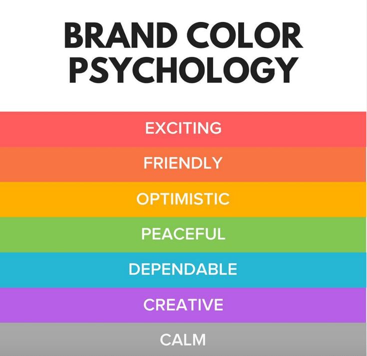
Analogous colors
Analogous colors sit next to one another on the color wheel—red, orange and yellow, for example. When creating an analogous color scheme, one color will dominate, one will support and another will accent. In business, analogous color schemes are not only pleasing to the eye, but can effectively instruct the consumer where and how to take action.
The Tostitos website uses an analogous color scheme. Notice the bright orange navigation bar draws the eye to explore the site, and accent-colored links at the bottom direct hungry consumers with the munchies to “Buy Online.”
Triadic colors
Triadic colors are evenly spaced around the color wheel and tend to be very bright and dynamic.
Using a triadic color scheme in your marketing creates visual contrast and harmony simultaneously, making each item stand out while making the overall image pop.
Burger King uses this color scheme quite successfully. Hey, is it lunchtime yet?
But really, why should you care about color theory?
Two words: branding and marketing.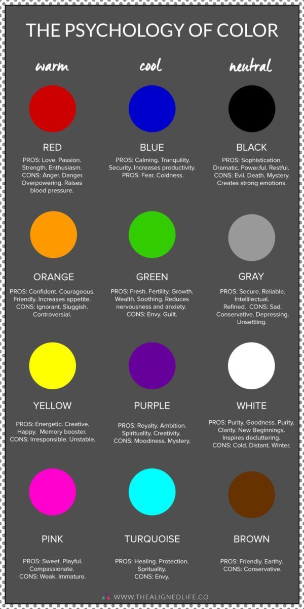
No wait, three words: branding, marketing and sales.
With this basic knowledge about colors and color schemes, you’re prepared to make effective branding decisions. Like what color your logo should be. Or the emotions that colors evoke in a consumer and the psychology behind color choices on your website.
Think it doesn’t matter? Take a look at this article on color combinations from hell. It just hurts.
Not only can knowledge of color theory guide you in your own marketing, it can also help you better understand what your competition is doing.
Web design by mute_workWeb design by Mila Jones CannWeb design by MercClassIn a side-by-side comparison of three law firm web pages, you’ll notice a variety of analogous color schemes. Blue is generally associated with dependability, brown with masculinity, and yellow with competence and happiness. All of these are positive associations in a field that stereotypically has negative connotations, such as dishonesty or aggression.
Making your brand stand out and appeal to your target, plus understanding that poor colors can mean poor sales—that’s why you should care about color theory.
Want to know more about the emotions that colors evoke, and how color psychology can help you in selecting the best colors for your logo?
Get expert help branding your business
Our designers can create the perfect look for your brand.
Get branding
This article was originally written by Peter Vukovic and published in 2012. The current version has been updated with new information and examples.
The Science of Color: Iridescent Perspectives
We endow colors with special epithets and properties, such as beautiful red or noble blue.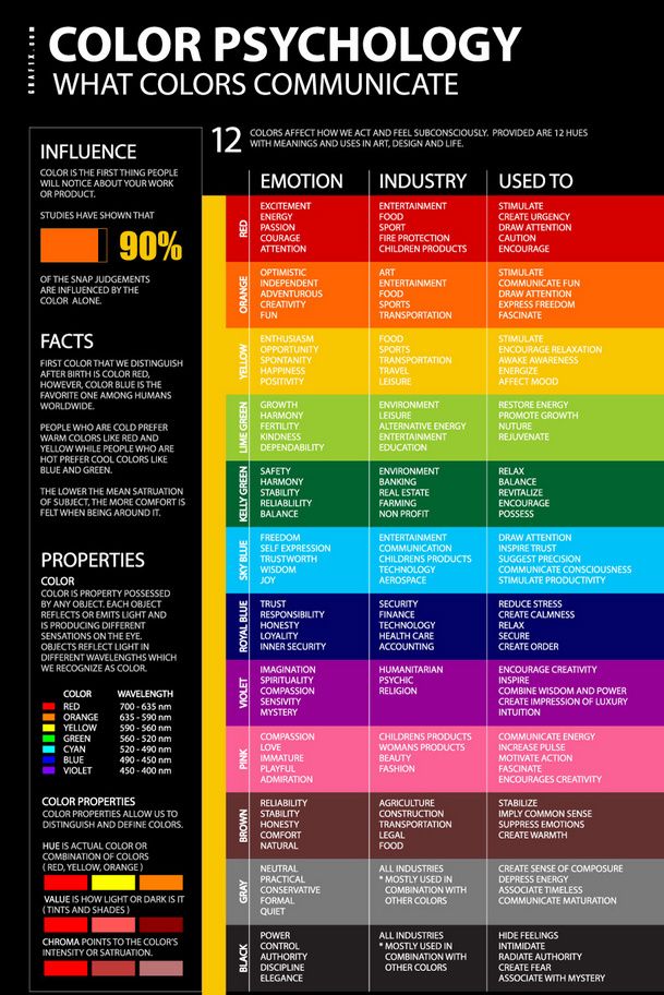 Colors are inextricably linked with our emotions, and we often say: “purple with anger”, “blackened with envy”, “green with anger”. This perception of colors is inherent in our culture and at the same time reflects their natural properties. The characteristics of primary colors are universal. For example, white symbolizes purity and light; red is the color of flesh and blood, activity and fertility; black is the color of earth and death. But nature gives an incredible abundance of shades, and man adds to this the newly invented color nuances of aniline, fluorescent paints. As well as highly sensitive devices capable of distinguishing and registering colors invisible to the eye - from infrared radiation to the mysterious colored halo of the human aura. By making connections between colors and our emotions, can we use their physical (or even magical, as some claim) properties to improve our well-being and mood? nine0003
At the level of instinct
Analyzing the rainbow
The Luscher color test is one of the most popular express methods for assessing the psycho-emotional state of a person*.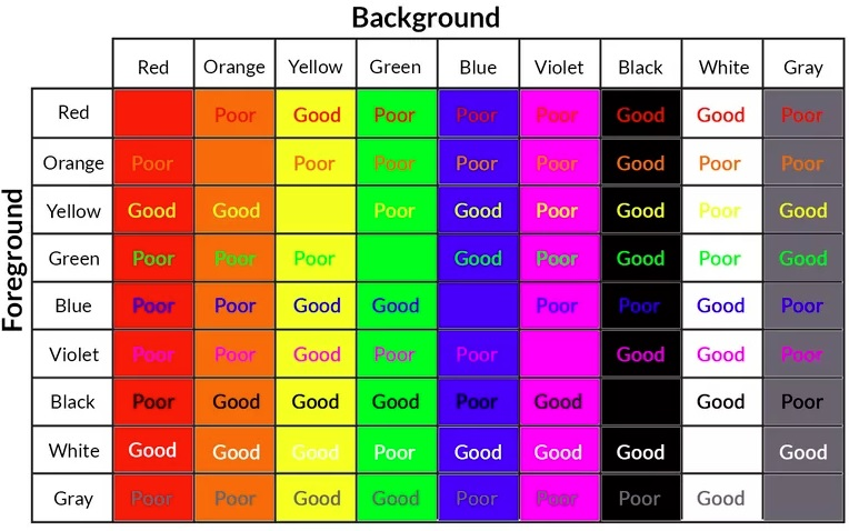 It is used by psychiatrists, marriage counselors, criminologists, doctors, psychologists and recruiters. To compile this test, Max Luscher spent several years experimenting with more than four thousand shades, as a result of which he chose eight primary and several dozen additional colors that have a universal semantic meaning. For example, blue symbolizes peace, red - an impulse to action. The full version of the test consists of seven tables with 73 colored fields; There are also simplified options. During the test, the patient sequentially chooses colors - from the most preferred to the least pleasant. Based on his choice and prioritization, the specialist draws conclusions about the mental and sometimes physical state of a person, behavioral characteristics and inherent fears, inclinations and relationships with the outside world. nine0003
Anton Popov
* Max Luscher. Luscher color test. AST, Sova, 2005.
Why are some colors considered stimulating and others relaxing? It turns out that this effect of color is associated with the functioning of the hypothalamus and the sympathetic and parasympathetic nervous systems.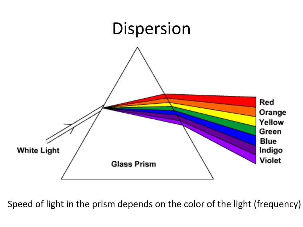 This is confirmed by numerous experiments with color*. The red-yellow part of the spectrum activates the sympathetic nervous system, which is responsible for the fight or flight reactions: the pulse quickens, the blood sugar level rises, the blood supply to the muscles increases, all the senses become aggravated. Blue and green colors, on the contrary, suppress the activity of the sympathetic nervous system, but at the same time the parasympathetic one is activated. The body receives a signal to rest and relax: the pulse and breathing slow down, blood rushes to the digestive organs. nine0003
Presumably, such a mechanism of response to the change of colors was formed over many millennia of human evolution, when all human activity was subject to the rhythmic changes of day and night. The body reacts to the colors of the red-yellow spectrum as the onset of dawn, preparing it for activity, and blue-green is perceived as twilight, a signal for rest. This primitive model is the simplest explanation of why a certain color is preferable for each of us at different moments of life: when we need rest, relaxation, we choose blue, and when we want to get a charge of vivacity, activity, we prefer orange or red.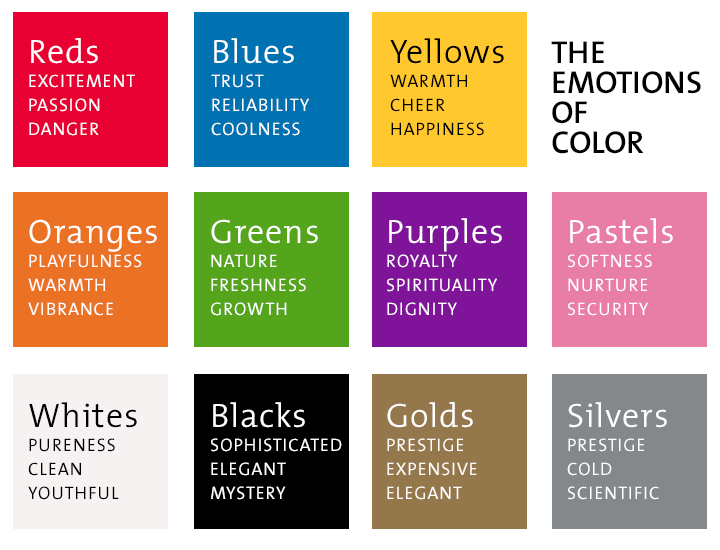 The most famous works in the field of color and psycho-emotional state belong to the famous Swiss psychiatrist Max Luscher, who developed a special system of personality color psychodiagnostics based on his numerous studies. nine0003
Color medicine
However, diagnostics and treatment with the help of color have always existed in ancient medicine. In Ayurveda, the seven colors of the rainbow are associated with the colors of the seven chakras, each of which is responsible for certain properties and psycho-emotional characteristics of a person. In ancient Chinese medicine - with the colors of the five elements: fire (red and orange), earth (yellow), wood (green), water (blue, blue, purple and black) and metal (white). Each of the elements affects a certain organ system. For example, in case of kidney problems, the doctor could recommend giving up black in clothes. Similar techniques were used in folk medicine of the Celts and Slavs. The most famous example is a red cloth bandage against toothache.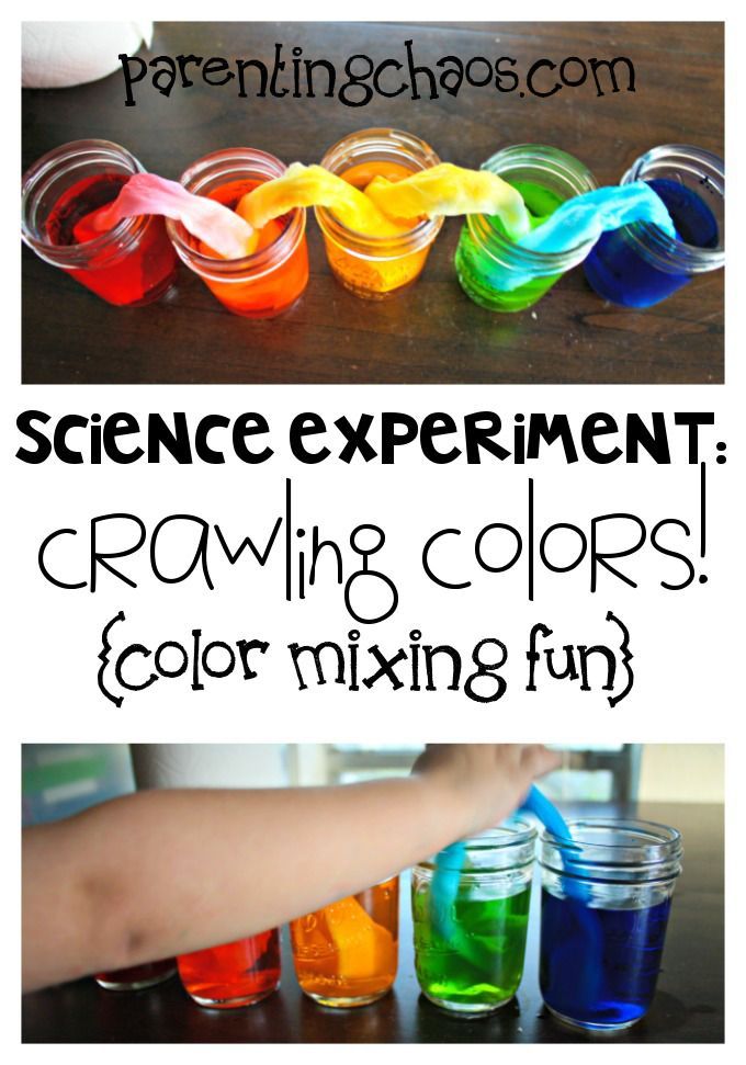 What looks like pure superstition turns out to be quite possible from the point of view of science: each color has a certain wavelength, which is perceived by any living cell. And vision is just one of the body's ability to perceive color. A kind of proof of this is the fact that the blind are able to distinguish bright colors by touching scraps of fabric with their fingers. nine0003
Colors of the aura
See the aura
Modern science already has a tool to see the colored halo surrounding the human body. Bioelectrography makes it possible to register this effect on film or on a computer screen. This method is based on the Kirlian effect*, named after a Russian inventor who discovered for the first time about 70 years ago that when a person's arm or leg is placed in a strong electric field, a glow appears around it. Semyon Kirlian also invented the first devices capable of registering the aura. Since then, technology has come a long way, and numerous experiments with aura chambers have shown that not only humans, but also plants and even physiological fluids, such as blood, have an aura. It was also found that the auras of a healthy and sick person differ in volume, color saturation, more even or, conversely, ragged contours. All the colors of the rainbow are represented in the human aura, they change depending on the emotional state, and a huge database of images of different people allows us to speculate about what this or that color can mean. Perhaps, in the near future, the image of the aura will be used both for diagnosis and for monitoring the treatment of various diseases. nine0003
Anton Popov
*www.kirlian.ru — site dedicated to research in the field of bioelectrography.
English pharmacist Vicki Wall was a contemporary of Luscher - his famous "color test" had not yet been published when, through a series of happy accidents and inspiration, she invented her own diagnostic system using color. This discovery made her world famous, but not in scientific circles, but in the field of alternative medicine. Vicki, a hereditary naturopath who inherited her father's knowledge of the beneficial properties of plants and minerals, worked under the guidance of Dr. Edward Horsley, who specialized in creating medicines based on natural ingredients. She lost her sight but did not leave her job in naturopathy. Moreover, it was found that her perception of colors was surprisingly sharpened. Already blind, she created a system for diagnosing health and psycho-emotional state using different colors, only the role of “Luscher color cards” in her is played by bottles with solutions and tinctures of colored minerals, flowers, leaves and bark of various plants. In the same way as in the Luscher test, the person is asked to choose several color samples that he prefers. According to the theory of Vicki Wall, a person chooses exactly the color that is currently lacking in his aura, intuitively trying to achieve balance, harmony in his energy system. In order to correct this energy imbalance, Vicki Wall's Aura-Soma technique suggests using color-matched solutions: an aromatherapy concentrate for inhalation, an agent for applying to certain areas of the body, and something like homeopathic drops under the tongue.
 The effectiveness of this method in the treatment of various nervous disorders and psychosomatic diseases turned out to be very high, due to which it is used in many alternative medicine clinics around the world. nine0003
Color therapy and color puncture
Treatment with radiation of different wavelengths - ultrasound, infrared or laser - is quite widespread in academic medicine. As for the actual healing power of color, there are many theories about how it works, but most of them are still seeking confirmation, so for now we can only rely on the positive results of numerous experiments. Color treats depression, nervous disorders, diseases of the musculoskeletal system and the vascular system. One of the recent discoveries is that a narrow directional beam of light of a certain wavelength (that is, a certain color) is able to act on biologically active points. This technique is called color puncture, and the most outstanding achievements in this area belong to the famous German naturopath Peter Mandel. Using his knowledge of acupuncture, the study of which he devoted several decades to, Mandel invented a non-contact light device that can act no less effectively than classic needles. And even better, because it does not have many of the contraindications that exist for classical acupuncture and, as a rule, are associated precisely with the fact that the needles penetrate the skin. There are also Russian developments in this area, for example, color-pulse therapy of the iris, which also represents a kind of “energy-information map” of the whole organism. nine0003
Have a question?
- Aeroflex Center for Physical Excellence. Moscow, 1st Vrazhsky per., 4, tel.: (495) 248 6220.
Full color harmony
Ayurvedic interpretation of chakra colors, the meaning of shades within the framework of the ancient Chinese philosophical system of Feng Shui or their symbolism according to Luscher really reflect the universal properties colors. Perhaps different colors can indeed support, weaken or stimulate the life energy that fills and surrounds us. Penetrating into their symbolic essence, discovering our likes or dislikes, we gain another way to know ourselves and build our own full-color harmony. nine0003
About this
- Psychophysiology of color vision. Moscow State University, 1989. 2003.
- Gershon Breslav. "Color Psychology and Color Therapy for All". St. Petersburg, 2003.
- Simon and Sue Lilly. "The Power of Color and Color Therapy". Dilya, 2006.
* S. Kravkov. "Color vision". Publishing house of the USSR Academy of Medical Sciences, 1951; Ch. Izmailov, E. Sokolov, A. Chernorizov. "Psychophysiology of color vision". Moscow State University, 1989.
Hit the color
- Red: the color with the longest wavelength. It is closest to infrared and retains a close connection with the sensations of heat. It gives confidence, energy and enthusiasm. How to use: if you are overcome by apathy and lethargy, surround yourself with red, for example, place some red object near the workplace.
 For those who have a low level of hemoglobin in the blood, it is useful to have elements of red in their clothes. nine0044
 - Orange: close to red, but conveys more of a feeling of gracious warmth than heat. It gives purposefulness and supports creative energy. How to use: this color will help to survive the constraint and fear for those who have difficulty in expressing sexuality, enjoying sensuality. For those who have experienced stress, a difficult situation, orange in clothes will help to recover, to come into balance.
- Yellow: this is the energy of sunlight. It brings us into a state of wakefulness and clarity, helps to concentrate. How to use: when in doubt, have difficulty making a decision, look at or hold a yellow object in your hands. Those who have a weakened immune system or are prone to allergies are advised to add elements of yellow to their clothes. nine0044
- Green: This is the color of balance - it is exactly in the middle of the spectrum. It gives us the energy of green nature, it is the color of progressive development and growth.
 How to use: surround yourself with green if you are afraid of future changes. Green clothing is recommended for those who suffer from jealousy.
 - Blue: This is the color of free space. It expands perception and allows you to look beyond your ideas or your capabilities. How to use: If you are having trouble communicating, try holding a blue object near you or in your hands. Those who want to get rid of excessive excitement, nervousness, restore calm, you can add blue to your wardrobe. nine0044
- Blue: also known as indigo, this hue is as different from blue as a cloudless sky during the day and at night. Carries the energy of peace, self-absorption. How to use: to calmly focus, try looking at an indigo-colored object. Blue in clothes will help those who are in pain - physical or mental.
- Violet: carries the dynamism of red and the stabilizing power of blue, giving inspiration and strength to bring ideas to life. How to use: If you feel like you are mired in the bustle and routine, if you feel a lack of imagination and inspiration, surround yourself with purple.
 Purple in clothes is recommended for those who need to stimulate the body's natural healing energy, recuperate after complex operations. nine0044
Text: Eleonora Kachanova
New on the site
Why continue living in times of crisis: for those who have lost the meaning of life unable to maintain interest. I drop everything halfway through”
“It’s inconvenient to ask my husband for money every time, but he doesn’t understand hints”
Scientists have found out which partners men and women choose in difficult times
“I see prophetic dreams”: how the unconscious gives hints — personal experience
Man with nails: what is the new masculinity
“Fandorin. Azazel”: how did the new series based on the novel by Boris Akunin turn out
The science of flowers
Review of the article: Razogreeva A.M. Legal positions of the Supreme Court of the Russian Federation on the issue of qualification of crimes with "unsuitable" means: experience of discourse analysis // Law. Journal of the Higher School of Economics. 2020. №1. pp.211-229
The reviewed article is a scientific work and is recommended for reading. Therefore, I will immediately “translate it into Russian” and express my point of view on some of the author’s thoughts.
For the review, I needed to clarify some numbers, so, for once, there will be references to the literature))
What is the article about?
The article returns us to a very important, in my opinion, problem of the quality of non-legal (“extra-legal”) premises in law enforcement syllogisms. In order to understand how such premises are formed, the author proposes to use the method of "archeology of knowledge", proposed by the French philosopher Michel Foucault in the middle of the last century, which is based on the concept of episteme. The author of the article explains this concept in a simplified way as follows: “in relation to the statements of the Supreme Court and the system of knowledge produced by criminal law science, which are the visible part of the episteme for us, those representations and common places, those approaches and ideas that circulate in the process of training lawyers and in the course of their professional activities, general ideas about justice and legality (expressed, including in popular culture), the very structure of public order. I will simplify even more and say that the episteme is, in fact, a social context (Foucault would probably swear at such a simplification, but it is more convenient for the reader and me. Je suis désolé, Michele). nine0003
As an example, the author explains the difference in approaches to the qualification of crimes with a "unfit subject" by the concept of "disciplinary society", proposed by the same Michel Foucault.
About the pros and cons of the concept proposed by the author.
One of the minuses is that the concept itself does not give practical suggestions for solving problems, and does not even give a direction in which to look for these problems. That is, this is such a conditional screwdriver that they gave you in your hands, and then you are free to do whatever you want with it - twist / unscrew / throw it away / put it in a box, and so on. However, this minus is very conditional - in any case, a screwdriver is a useful thing. nine0003
The second minus is the use of postmodernist theory, which, like all postmodernist philosophy, tries to explain simple things with complex words, completely confusing what, as it seemed, had just begun to unravel. However, this is my subjective attitude, so it turns out that this minus is again very conditional.
Well, now about the plus.
Extralegal parcels are the kind of thing that gets on the nerves of lawyers all over the world. As is known, in general, about 65-75% of judicial decisions can be predicted [Ruger et al., 2004; Medvedeva M. et al., 2020]. At the same time, about 35-40% of all court decisions are decisions made on the basis of those very extralegal premises (which, in turn, are reduced to the concept of “justice”) [Golushkov D.I., 2018]. Moreover, they do not just underlie, but have primacy over legal norms and state regulation [ibid.]. nine0003
In my subjective opinion, decisions with extralegal premises are the very “unpredictable” decisions that make lawyers nervous in courts.
But, of course, we are not talking about legal nerves, but about the quality of these premises. If non-legal premises are not reflected in the nomes of law and their application is difficult to predict, then a fair question arises - how to protect us from judicial arbitrariness and unjust (in the broad sense) decisions in these same 30 percent of cases? nine0003
Some things, it is believed, can be corrected in a formal, administrative way - for example, if the professionalization of the court has led to an actual absence of acquittals, then the introduction of a jury trial can increase this figure [Pozdnyakov M.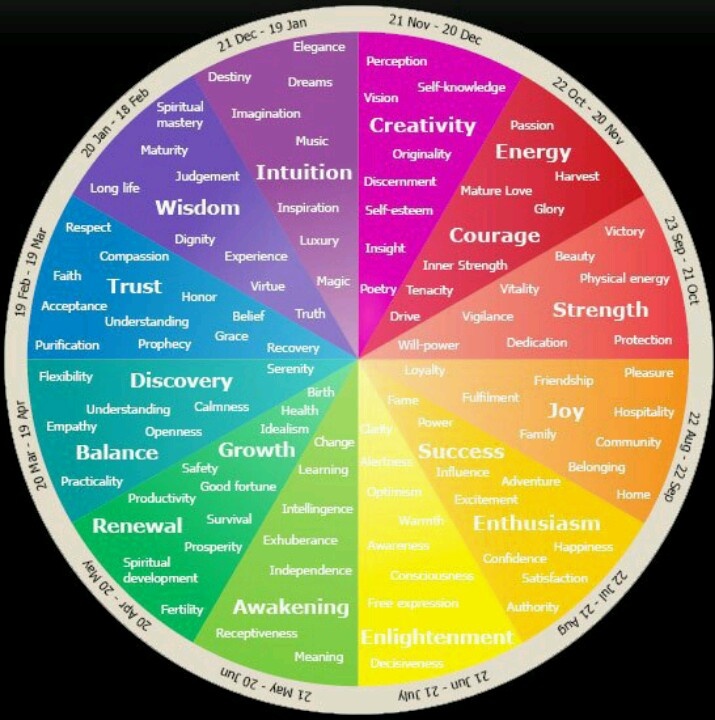 L., 2012], increase the number of acquittals as well maybe the restructuring of the system of statistical indicators [Shklyaruk M.S., 2015]. Or, in general, it is possible to transfer a number of lawsuits to artificial intelligence, thereby excluding any non-legal reflections [Sokolova A.A., 2019].
But, in my opinion, the main problem is those non-legal judgments that cannot be influenced by direct means: these are general arguments based on accepted morality and social context about what equality, justice, balance of interests, etc. are. Napoleon Bonaparte once described morality as a divinatory art, comparing it with the "science of flowers" - this statement is quite applicable to all extralegal premises.
And what has been said implies that there is no mechanism that allows formalized, and most importantly, quickly solve the problem of improving the quality of unlawful judgments in court decisions. And this, in turn, means that the problem of the quality of judgments can be solved only by improving the quality of the "social context" or changing the "episteme" - use the term you want.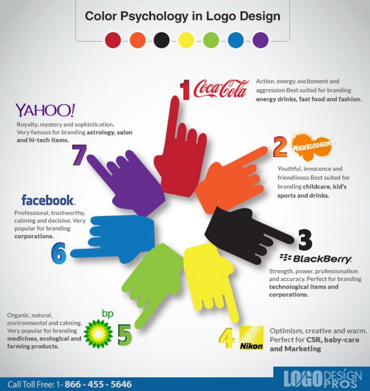 And this, again, means that improving the quality of court decisions is the painstaking work of many generations of Russians. nine0003
This, in my opinion, is the moral of the article under review.
Literature :
Ruger T.W., Kim P.T., Martin A.D., Quinn K.M. The Supreme Court Forecasting Project: Legal and Political Science Approaches to Predicting Supreme Court Decisionmaking // Columbia Law Review. Vol.104. 2004.
Medvedeva M., Vols M., Wieling M. Using machine learning to predict decisions of the European Court of Human Rights // Artificial Intelligence Law 28, 237–266 (2020).
Golushkov D.I. Motivations for Judicial Decisions: Do Russian Courts Always Decide Cases on the Basis of Legal Provisions? // Bulletin of Omsk University. Series "Right". 2018. No. 1 (54).
Pozdnyakov M.L. The Meaning and Ambiguity of the Accusatory Bias // How Judges Make Decisions: Empirical Studies of Law.