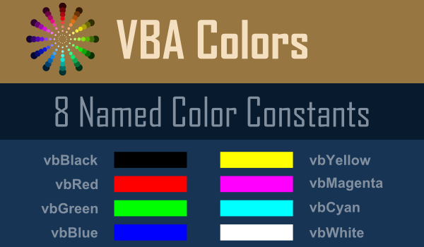
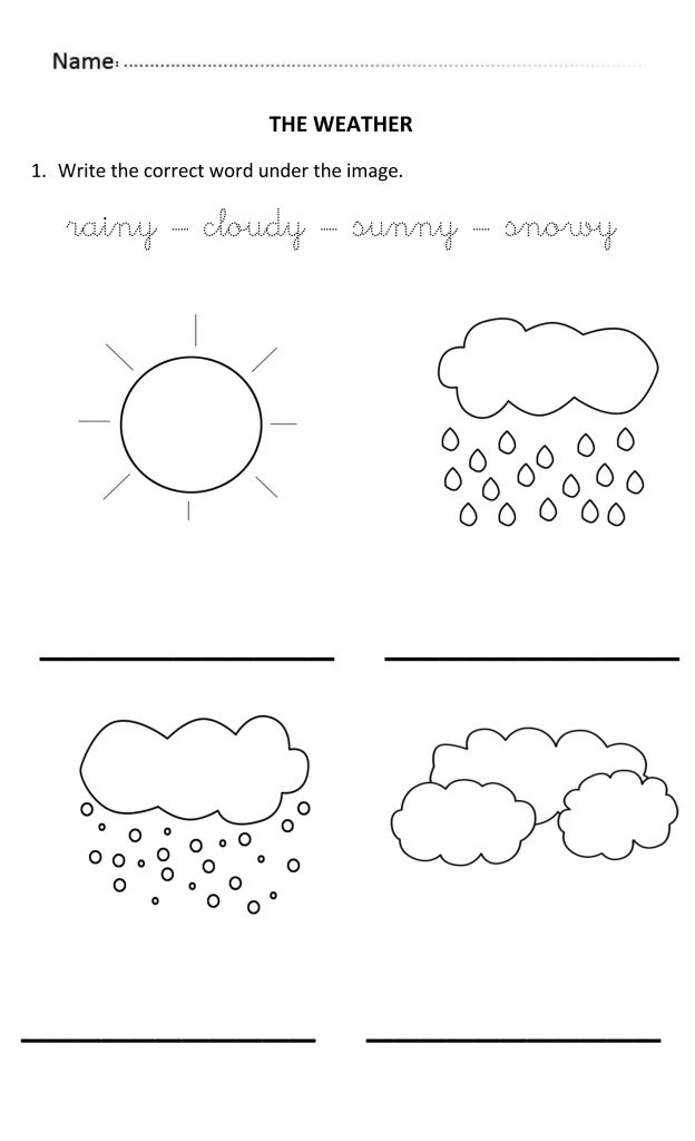
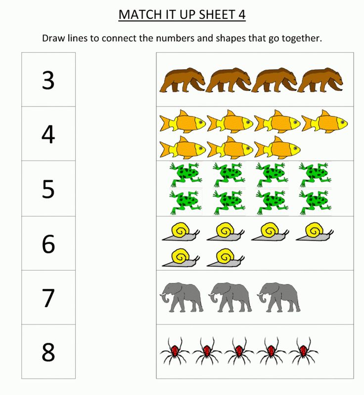
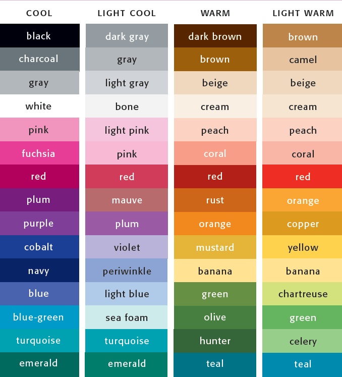
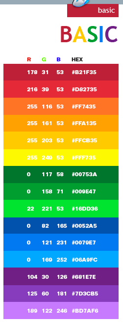
Basic 8 colors
What are the basic color names? Do we all agree and see them the same?
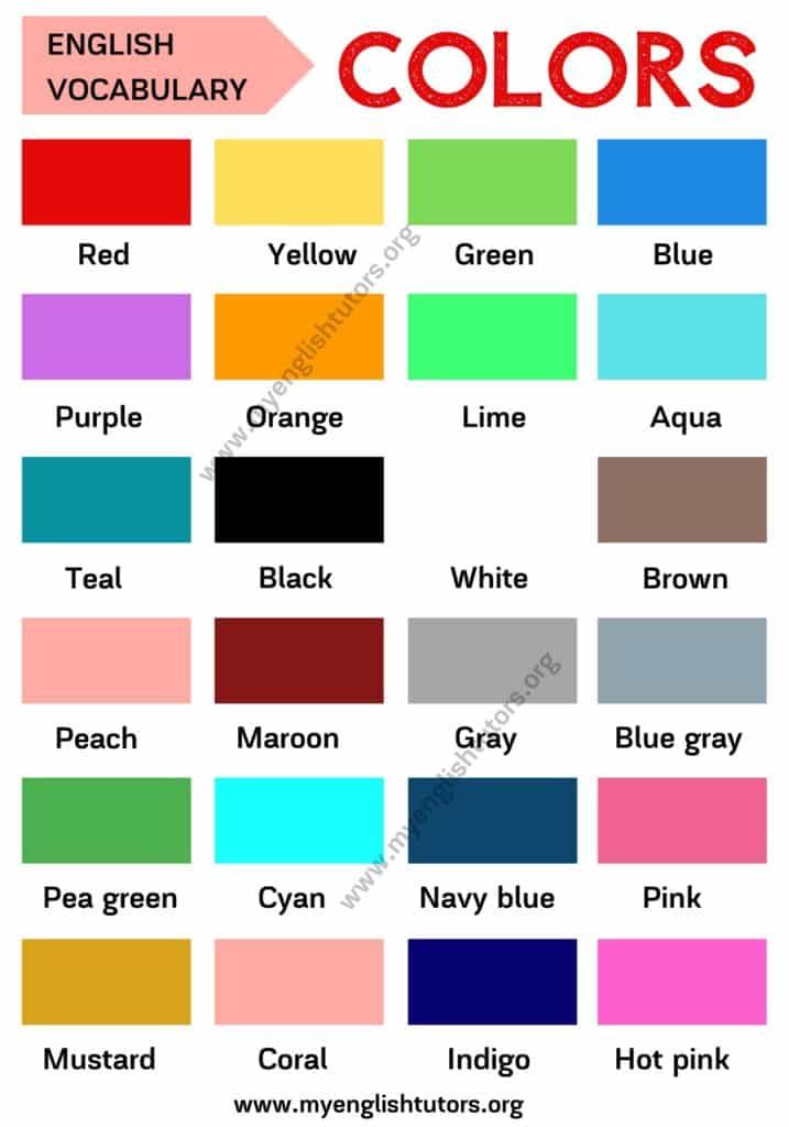
“We have only 11 unambiguous colour terms in English: White, Black, Grey, Yellow, Red, Blue, Green, Brown, Pink, Orange, Purple.” ~Berlin & Kaye Research 1969
This concept has been debated many times by a boatload of very smart people since 1969 and was revisited by the World Color Survey:
Recently the World Color Survey, a large-scale replication of Berlin and Kay’s experiments for which data has been collected from 110 pre-industrial societies, has reconfirmed the universal character of color categories (Kay & Regier, 2003; Kay et al., 2003; Regier, Kay, & Cook, 2005).
In summary, the centres of color categories of most cultures tend to fall in approximately the same positions; these are the positions known in English by the basic color terms black, white, red, yellow, blue, green and so forth.
A straightforward explanation for this universal character is that color categories are innate.
![]()
They are in a certain sense “hard wired” in the human brain. One view is that the categories are directly genetically encoded, and that every human being possesses a fully fledged repertoire of color categories, even though not all categories might be lexicalized (Rosch-Heider, 1972).
More subtle innatist accounts argue that certain neurophysical structures might be responsible for universal color categories.
Indeed, humans are a trichromatic species, meaning that anyone with normal color vision has the same three types of color-sensitive receptors in the retina.
Or, humans invariably process color in an opponent manner, placing white against black, blue against yellow and green against red. These shared neurophysical properties of color perception could possibly explain the shared categorization of color.
Source: Adaptive Behavior | First Published December 1, 2005 | Tony Belpaeme and Joris Bleys
I agree we all came pre-programmed (if you will) with an innate color sense and are naturally compelled to name and order color.
Without an established color order system, it is my opinion that once you get past a basic set of color terms, it becomes a hot mess of arbitrary, inconsistent, fussy and nonsensical color names.
Which is why I find words like beige, greige, khaki, putty, and sometimes even gray loosely descriptive – at best.
Unlike “pink” and “brown”, for example, they don’t say anything specific about color properties or what color sensation it is the person using those types of color names is experiencing.
In general, pink associates with light red and brown associates with dark orange and/or a mixture of hues. Known general color associations generally do a good job communicating the idea of a color to most people. . . in general. 🙂
Think about a box of crayons. While all the colors in the big box of 64 are fun, the basic eight are easier and more concise; I wonder if that’s why they are teacher preferred?
As a color consultant, when the loosely descriptive color names start to fly, I have to amp up the listening skills in order to hone in on what it is exactly the person means when, for example, they use the word “beige”.
Because unlike pink or brown, beige is all over the place and can mean pretty much anything. But, hey, that’s my job.
I’m the color expert and I’m supposed to know the difference between arbitrary color names and the orderliness of color systems. And it is indeed a stark comparison between arbitrary color names and ordered color systems and their identified hue families.
Each color order system identifies its own core hue families. The International Standards Organization recognizes four order systems: Munsell, NCS (Natural Color System), DIN 6164-2, and OSA-UCS.
I’m most familiar with Munsell and NCS and it’s interesting how their core hue family names align with Berlin and Kaye’s 11 color terms:
Munsell: Red, Yellow-Red (orange), Yellow, Green-Yellow, Green, Green-Blue, Blue, Purple-Blue, Purple, Red-Purple.NCS: Red, Yellow, Green, Blue, Black, WhiteBoth Munsell and NCS are based on human percepts of color but they differ. I teach you all about color systems like Munsell and NCS in my Camp Chroma Color Training program. Click here to learn more about becoming a certified Color Strategist.
Color Basics | Usability.gov
A color wheel is an illustrative model of color hues around a circle. It shows the relationships between the primary, secondary, and intermediate/ tertiary colors and helps demonstrate color temperature. Digital teams communicate exact colors through the use of hex codes.
Understanding the Color Wheel
Many color wheels are shown using 12 colors. Using this color wheel as an example, it can be read as follows:
- Three Primary Colors (Ps): Red, Yellow, Blue
- Three Secondary Colors (S’): Orange, Green, Violet
- Six Tertiary Colors (Ts): Red-Orange, Yellow-Orange, Yellow-Green, Blue-Green, Blue-Violet, Red-Violet, which are formed by mixing a primary with a secondary
It’s important to note that some people add more intermediates, for 24 total named colors, and some color wheels show interior points and circles, which represent color mixtures.
Color Temperature
The colors on the red side of the wheel are warm; the green side of the wheel has the cooler colors. These color temperature designations are absolute. More subtle color temperature relationships are relative, meaning that each color on the warm side of the wheel can be known as cool, and colors on the cools side of the wheel can be known as warm depending on the relationship to their neighboring color. Colors from the same hue, for instance red, can also be warmer or cooler than one another.
Color temperatures affect us both psychologically and perceptually by helping us determine how objects appear positioned.
| Warm Colors | Cool Colors |
|---|---|
|
|
|
Neutrals
Neutral colors include black, white, gray, tans, and browns. They’re commonly combined with brighter accent colors but they can also be used on their own in designs. The meanings and impressions of neutral colors depend more so upon the colors around them.
Color Models: CMYK vs. RGB
There are two models for colors. They have different purposes and different attributes. They are as follows:
- CMYK Color Models: Stands for cyan, magenta, and yellow. It applies to painting and printing. The CMYK model is a subtractive model, meaning that colors are created through absorbing wavelengths of visible light.
 The wavelengths of light that don’t get absorbed are reflected, and that reflected light ends up being the color we see.
 - RGB Color Models: RGB stands for red, green, and blue. It applies to computers, televisions, and electronics. The RGB model is an additive model, meaning that colors are created through light waves that are added together in particular combinations in order to produce colors.
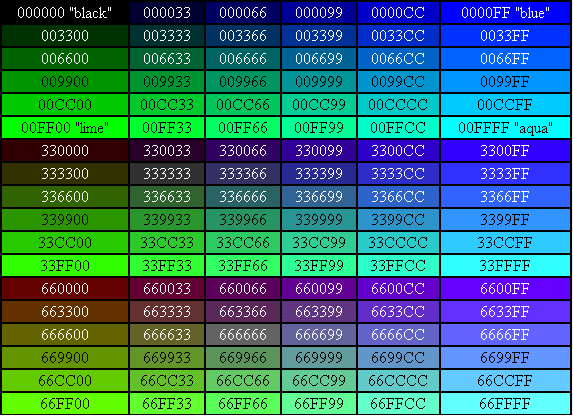
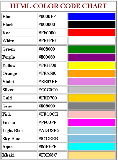
Hex Codes
To name colors in web design, teams use hexademal code. All hexadermal codes:
- Start with a hash mark (#)
- Consist of three pairs of characters sequenced together (totaling of six characters), with each pair controlling one of the primary additive colors (red, green, blue)
- Those six characters following the hash mark consist of ten numerals (0-9) and/ or six letters (a-f)
It is easy to identify patterns in the hex codes some colors; see SmashingMagazine’s great chart at the right for this. Some things to know include:
- 00 is a lack of primary
- ff is the primary at full strength
To find additive colors, start with black and change each pair to ff:
- #000000 is black (no primaries)
- #ff0000 is the brightest red
- #00ff00 is the brightest green
- #0000ff is the brightest blue
To find subtractive colors, start with white and change each pair to 00:
- #ffffff is white (all primaries
- #00ffff is the brightest cyan
- #ff00ff is the brightest magenta
- #ffff00 is the brightest yellow
It is also possible to abbreviate some hex numbers. For instances #fae expands to #ffaaee and #09b expands to #0099bb.
Additional Resources
- Color Meaning
- Color Pallets
- Color Theory for Designers, Part 1: The Meaning of Color
- The Code Side of Color
- Color Theory 101: Deconstructing 7 Famous Brands' Color Palettes
- Color
- Color Meanings
- Color Wheel Pro: Color Meaning
Color for teapots. Comprehensive guide for beginners.
 | by Anton Guk | Design Bar
 This article is based on Johannes Itten's The Art of Color and countless other articles on color theory. Here I tried to make a "fat-free" version of this knowledge, for easier understanding of the material. The article is suitable not only for designers, but also for all people who want to learn how to understand and work with color. In the article, you will learn about the physical properties of color, why we perceive it as such, what it can mean, and how to create harmonious schemes.
Dispersion of light
Isaac Newton was one of the first to be able to decompose white sunlight into a color spectrum - later called " Dispersion of light ".
The experience was as follows: he passed sunlight through a prism. In it, a beam of light was stratified into colors and displayed on the screen.
The cover of Pink Floyd's "Dark Side of the Moon" album, showing the dispersion of light. The colors that were displayed are called spectral or, more simply, pure colors. These are red, orange, yellow, green, blue and purple.
An interesting fact, it turns out that the number of colors in the rainbow depends on the country of residence. The Chinese believe that there are five colors in the rainbow. For residents of the United States, the typical answer would be six colors, while the inhabitants of Russia have seven of them (+blue). In fact, the entire spectrum is collected in the rainbow, but we can only see some of them.
If all these colors are passed back through a collecting prism, then we again get white.
Complementary colors
If we combine red + orange + yellow into one color, and green + blue + purple into another, and then mix the two resulting colors, we get white .
(red + orange + yellow) + (green + blue + purple) = white
Two colors that combine to give us white are called with complementary colors .
Example: If we remove one color from the spectrum, for example red, and use a lens to collect the remaining colors: orange + yellow + green + blue + purple, then the result will be green color. Because green is a complementary color to the red we removed. Why exactly such “green-red” ratios are described below.
Subtractive colors
If you put a filter that transmits only blue color in front of the light beam, and behind it a filter that transmits only red color, then both filters together will not let light through and will give black or darkness. Because the blue filter only passes blue light, and the red filter in turn absorbs everything except red (which has already been absorbed by the blue filter).
Colors absorbed in a physical experiment are also called subtractive .
Color Options
- Hue is what we mean by color. Blue, red, green, orange, purple and so on.
- Saturation - a color parameter that characterizes the degree of purity of a color tone.
- Brightness - indicates the degree to which the color differs from white or black.
What is RGB, CMYK, HEX and how do they differ
RGB ( R ed, G reen, B lue) is an additive ( addition ) color model. The main colors are red, green and blue. This means that when adding all the colors, we get white. This model is used in all electronic devices. Written as: rgb(0,0,0), each of the colors can vary from 0 to 255 inclusive, where (0,0,0) is black, (255,255,255) is white. Additionally, a fourth parameter can be added - alpha channel, which means how transparent the color is. Alpha channel can take values from 0 to 1, for example rgba(31,104,2, 0.8).
HEX is RGB in hexadecimal. It looks like #102945, the first two digits are for red, the second for green and the third for blue. Each character can take values: 0,1,2,3,4,5,6,7,8,9,a,b,c,d,e,f. Where #000000 is black and #ffffff is white.
CMYK ( C yan, M agenta, Y ellow, K ey color) — subtractive ( subtraction ) color scheme. Consists of cyan, magenta, yellow and key - black. This model is used in printing industry for color printing. Paper, like all materials, reflects light, so consider how much light is reflected from the surface. Despite the fact that black color can be obtained by mixing magenta, cyan and yellow dyes in equal proportions, for a number of reasons (color purity, paper overmoistening, cost, etc.), this approach is unsatisfactory, so black is used separately.
Why do we see colors like this?
Light waves themselves have no color. Color arises only when these waves are perceived by the human eye and brain.
The color of objects comes mainly from the absorption of waves. Yellow cheese looks yellow because it absorbs all other colors of the light beam and reflects only yellow. When we say "this cheese is yellow" what we really mean is that the molecular composition of the surface of the cheese is such that it absorbs all light rays except yellow. Cheese itself has no color, the color is created by lighting it.
If red paper (a surface that absorbs all rays except red) is illuminated with green light, then the paper will appear black to us, because green does not contain rays corresponding to red, which could be reflected by our paper.

The color itself does not express anything. Its content is determined by the context. The meaning of a color can only be determined by its relation to another color. If you depict a light figure on a white background, and the same figure on a black one, then on a white background it seems darker, giving the impression of light gentle warmth. On black, it becomes extremely light and acquires a cold, aggressive character.
According to one study, personal preferences, experience, upbringing, cultural differences and context often distort the effect individual colors have on us.
Users do not understand our color coding. Yellow means "cheerful" to you, but to others it may mean "not healthy" or "vomiting." Each person perceives colors very subjectively and it depends only on his context. He loves some colors and hates others. And it's largely unpredictable. You won't be able to guess.
Color is not verbal or rational. It is contextual and emotional.
Color is a powerful tool, but it doesn't make sense on its own.
An excellent article about yellow in cinema if you want to learn more about how context affects the meaning of color with real examples.
When people talk about color harmony, they rely solely on subjective feelings, while the concept of color harmony is an objective pattern. Harmony is a balance, a symmetry of forces. Our eyes demand and strike complementary colors (opposite, complementary) creating this balance. Gray is considered a neutral color, our eye does not create any additional color with it.
In order to create harmonious combinations, various color ordering systems have been developed. This is the color wheel and triangles for colors (image below). Opposite colors in this circle are complementary.
Color wheel according to Johannes Itten (1961)Composition schemes
The quantitative ratio of colors is important for color composition. It can be generally concluded that all pairs of complementary colors, all combinations of colors in the twelve-part color wheel, which are connected to each other through equilateral or isosceles triangles, squares and rectangles, are harmonious. These figures can be rotated within a circle, all combinations will be harmonious.
There are seven types of color contrasts:
- Hue contrast.
- Light and dark contrast.
- Contrast of cold ( blue, violet ) and warm ( orange, red, yellow ) colors. (Green can refer to both warm and cool colors, depending on which color it has more, yellow or blue).
- Complementary colors contrast (opposite in Itten's circle).
- Simultaneous contrast is the creation of the illusion of an additional color on an adjacent shade.
- Color saturation contrast (one color is bright and the other is faded).
- Contrast of the amount of color in relation to another color.
Below is a color hack by Laura Elisabeth. The entire article can be read here.
Base color selection
We have 10 million colors at our disposal, but we only need to choose one. This color will be the main one for our brand.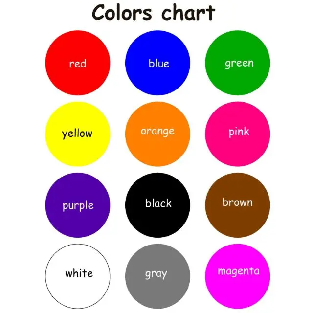
Justify the choice of color. Some tips on how to choose the main color:
- Use what you have. If the client already has a logo with a color set, this will usually be the starting color.
- Eliminate the colors of your competitors. If one of your strong competitors has its own brand color, then you don't need to copy it. Find competitor colors and remove them from your own color schemes.
- Think about your target audience. The colors for the funeral home and kindergarten sites are likely to be very different. Think about who will be using the site and how you want them to perceive it.
- But don't become a hostage to stereotypes. If you are designing a site for young girls, you should not use pink. Avoid clichés to gain credibility.
- Play "words". If you're treading water, write down all the words you associate with the client's business.
 Pick up associations until you get to the simplest things that can be associated with color.
You need to choose pure color, such as red, blue, green, cyan, pink, etc.
Next, go to the Dribbble or Designspiration site and click on “Colors”, you will see a palette of colors.
Colors at http://designspiration.net/Choose the best shade for your project. For a fresh and energetic brand, you will need lighter shades. For corporate serious sites, you should choose less bright shades.
Select a shade and see all the highlighted sites to see how our color has been used by other designers. After that, you must choose a shade with an eyedropper on the work you like. So we will already have the main color selected!
Creating a Palette
Most palettes have far more colors than you'll ever need, especially since we need to add, on average, three neutral colors to each scheme. If you try to add five or more neutral colors, you will end up with a mess. All you need is two colors:
- Primary color (which we have already chosen)
- Accent color (we will come back to this later)
- White (neutral)
- Dark gray (neutral)
- Light gray (neutral, optional)
How to find an accent color
Go to the Paletton website, enter your color in the dedicated field (bottom left). And choose one of the color schemes. If you don't like what you get at all, you can click on the "randomize" button and choose other similar shades.
How to find gray shades
For most web projects, I find it necessary to use only two shades of gray: light gray and dark gray. And you will have to use a lot of them. A dark tint is usually used for text, and a light tint is used to create borders with everything white (usually for the background).
To get a harmonious gray color according to the Erica method, we need to choose two standard gray colors. Then do the following:
- Create two shapes and fill them with #424242 and #fafafa .
- Create a fill layer on top of these two shapes.
- Change its color to the base color.
- Set the blending mode to "Overlay" and the opacity between 5 and 40%.
- Open the palette and copy the resulting values.
The color scheme is ready!
How to apply the color scheme
Start by designing with gray blocks. Only then start painting it.
The base color is used on both large shapes and icons.
Accent, stands out from the main color. It is used in very small areas - buttons and icons. The less you use this color, the more it will stand out .
Dark gray is the color we use for text, logos and icon outlines. (Don't forget to work out the colors for the icons - this greatly affects the overall picture).
White and light gray colors used as background.
Now that you know the basics, start creating your own palettes and patterns, experiment and practice, and then you will definitely succeed!
- http://paletton.
 com/ - color wheel for palettes
 - https://color.adobe.com/en/create/color-wheel/ - color wheel for palettes
- https://coolors.co/ - great random palette generator
- http://colorhunt.co/ - handpicked color palettes
- https://www.materialpalette.com/blue/yellow - compilation of material palettes based on 2 colors .com/all - colors in flat style
- http://swisscolors.net/ - matched colors in swiss style
- http://www.gradients.io/ - nice gradients
- http://uigradients.com/ - handy gradients
- http://hslpicker.com/ - handy color converter
§4 Basic, compound and additional colors. Fundamentals of painting [Textbook for uch. 5-8 cells]
§4 Primary, compound and complementary colors. Fundamentals of painting [Textbook for uch. 5-8 cells]WikiReading
Fundamentals of painting [Textbook for uch. 5-8 cells]
Sokolnikova Natalia Mikhailovna
Contents
§4 Basic, secondary and complementary colors
As you remember from the elementary school course, colors that cannot be obtained by mixing any paints are called primary.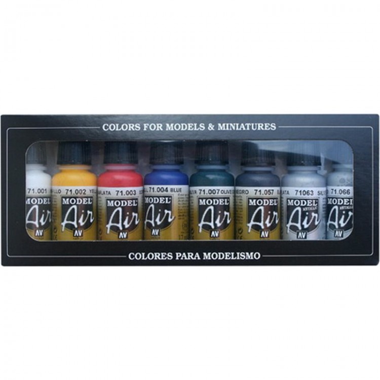 These are red, yellow and blue. On ill. 47 they are located in the center of the color wheel and form a triangle.
Colors that can be obtained by mixing basic colors are conventionally called compound or derived colors. In our example, they are also in triangles, but further from the center. They are orange, green and purple.
64. Basic colors
Drawing a diameter through the middle of the yellow color in the color wheel, you can determine that the opposite end of the diameter will pass through the middle of the purple color. Blue is opposite orange on the color wheel. Thus, it is easy to define pairs of colors, which are conditionally called complementary. Red will have green as an additional and vice versa. The combination of complementary colors gives us a feeling of a special brightness of color.
65. Complementary colors
But not every red will go well with every green. There can be many shades of red, green, blue, orange, yellow, purple and other colors.
If, for example, red is close to blue, then such red will also have yellow-green in addition.
We got acquainted with the color wheel of 12 colors, but you can make such a circle of 24 colors (Fig. 66). Such a color wheel allows you to more accurately determine the shades of additional colors, their pairs.
66. Color wheel (24 colors)
Name all the shades of this color wheel.
3. Additional information
3. Additional information We can briefly talk about the future life of a married couple. Henceforth, the woman spent her days in the gyneconitis, by which is meant all those premises that constituted the realm of the woman. Now only bedroom and dining room
SOME ADDITIONAL VERSIONS
SOME ADDITIONAL VERSIONS There is an assumption that Martynov, in relation to Lermontov, had a “Salieri complex” (Pushkin’s, who was mortally jealous of Mozart). It is possible that Lermontov was teasing Martynov's secret mistress, which caused
Additional materials
Additional materials The word "fountain" is from the Latin forts, "spring". Background in Roman mythology is the god of water sources. At Fons holidays, flower garlands were thrown into the springs and the wells were decorated. In different nations, the spring is a symbol of the cosmic center, Spirit
Additional materials
Additional materials At the end of the XVI century. At the direction of Boris Godunov, a high stone fortress, the White City, was erected around Moscow. By the end of the XVIII century. walls crumbled. Throughout Europe, the reconstruction of medieval city ramparts was then underway. Alleys were arranged on them, and
Additional materials
Additional materials * * *The monastery refectory (1504–1506) was built at the behest of Ivan III himself, who often visited the monastery: the abbot of the monastery at that time was the sovereign's confessor, Archimandrite Mitrofan.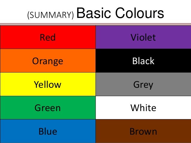 In addition, the king lived for a long time in his country palace for
Additional materials
Additional materials Many pages of Russian history of the 15th-17th centuries are connected with Kolomenskoye. The convenient location of the settlement at the intersection of the most important land and water routes leading to the capital, as well as the presence of natural barriers (from the north, marshy swamps
§5 Basic color characteristics
§5 Basic characteristics of color Each color has three main properties: hue, saturation and lightness. In addition, it is important to know about such color characteristics as lightness and color contrast, to get acquainted with the concept of the local color of objects and
Additional materials
Additional materials * * * Cosimo Medici was a firm and prudent politician, he created a state and ruled it for thirty years without exposing it to risk.