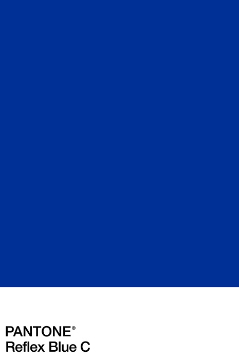
Pantone color blue
The Pantone Color of the Year
Classic Blue evokes feelings of calmness, clarity, and confidence in a space.
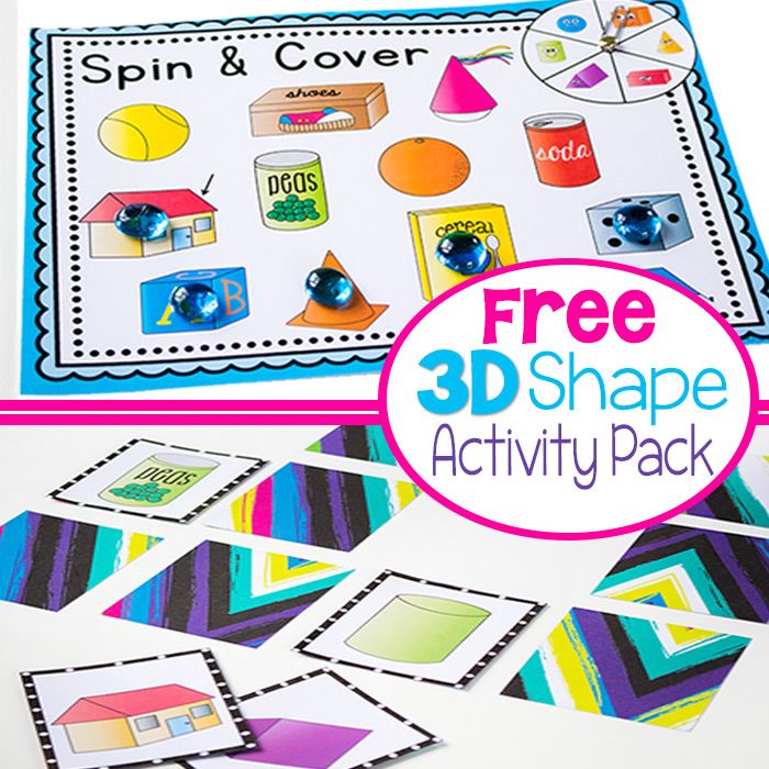
Scale Down with Artisan Accessories
Introducing pottery, vases, table-top sculptures, and lamps are a smart and simple way to tie color trends into the color strategy of your home. We saw a lot of blue accents brightening up the neutral color palettes at market. Have a look at some of these accessories that we saw:
Scale-Up in Upholstered Pieces
By choosing large pieces like your sofa or a pair of armchairs to be in this color, you can create a bold focal point and anchor for the color story of a room. We’re still seeing a lot of this color in velvet which is a client favorite around here.
- A Classic Blue sofa provides a bold focal point in a neutral room
- Classic Blue arm chair provides a bold anchor for the room
- Solid Classic Blue arm chairs bring rich color to a room of neutral earth tones
On the Floors
Using an area rug to introduce this color into your space is a great way to start trying different colors together. Blue pairs really well with other recent popular colors such as blush, coral, and green. We saw a lot of these pairings at the market as well. And depending on your style, you can look for different patterns to go in the room from geometric, to softer neutrals, or even florals.
- Here is a floor covering that uses classic blue highlights.
- Many patterns and styles can be chosen to match your style
- Classic Blue pairs well with other trendy colors
- Many patterns and styles can be chosen to match your style
On the Walls
While the accent wall trend has had a major moment in the last decade, we’re starting to see a movement toward whole rooms painted in deep, vibrant hues, as well as the incorporation of bold wallpaper choices. If Classic Blue speaks to you on a deep level, don’t hesitate to go all in!
- Show your personality with Classic Blue wallpaper
- Floral wallpaper in Classic Blue, rose, lime
- Let your wallpaper make a statement in Classic Blue and white
- Floral wallpaper in classic blue, royal blue, and sky blue
Adding Layers of Texture
Ditch the standard, drab fabrics and opt for something that shows your personality! Layering different patterns with pillows, throw blankets, and artwork adds texture and visual interest to your rooms. Fabric artwork is having a major moment right now and we love the dimension and softness these pieces introduce into space.
- Layer your room with texture using Classic Blue fabric artwork
- Show your personality with patterns and texture
- Add texture, softness, and dimension in Classic Blue
- Classic Blue patterned fabric art
Every Single Pantone Colour Of The Year From 2000 – 2023
We earn a commission for products purchased through some links in this article.
What's been your favourite?
By Olivia Heath
Pantone
For the Pantone Colour of the Year selection process, colour experts at the Pantone Colour Institute comb the world looking for new colour influences, from the entertainment industry to fashion, travel destinations and socio-economic conditions. Influences can also stem from new technologies, materials, textures, social media platforms and even upcoming sporting events that capture worldwide attention.
Then towards the end of each year, a defining colour for the forthcoming year – better known as the Colour of the Year – is announced. The new 'It' colour is typically announced in early December.
Laurie Pressman, Vice President of the Pantone Color Institute, says there's 'a misconception that we gather a bunch of colour influencers in a room one day and emerge with the decision'. That couldn't be further from the truth. The selection does not take place in one isolated meeting at a specific time of year. Instead, as Laurie explains: 'It is one long, continuously flowing conversation among a group of colour-attuned people.'
Pantone provides the universal language of colour, with the annual announcement (that has been established for more than 20 years) gaining global attention and influencing products across fashion, home furnishings, and industrial design.
The Pantone Colour Institute created the Pantone Colour of the Year educational program in 1999 to engage the design community and colour enthusiasts around the world in a conversation around colour. Here we take a look at all the defining colours chosen by Pantone so far, from Cerulean to Viva Magenta…
Pantone
1 of 26
2023: Viva Magenta
Viva Magenta is a nuanced crimson red with pink tones that presents a balance between warm and cool. Rooted in nature, this hybrid colour is powerful, empowering and assertive, but not aggressive – it encourages experimentation and self-expression without restraint.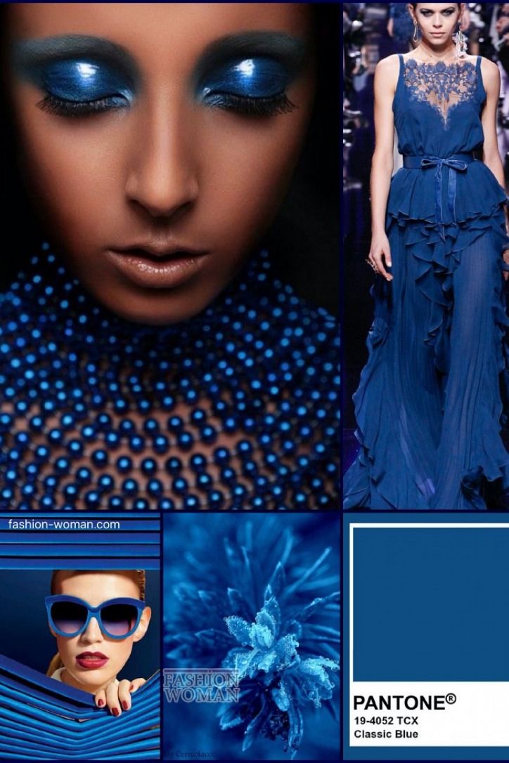 Ultimately, this electrifying, boundary-less shade promotes optimism, joy and strength.
Pantone
2 of 26
2022: Very Peri
Very Peri is a dynamic periwinkle blue hue with a vivifying violet red undertone. Futuristic in feeling and encouraging inventiveness and creativity, Very Peri blends the faithfulness and constancy of blue with the energy and excitement of red. A brand new shade, it marked the first time Pantone created a new colour in the history of its Colour of the Year forecasts.
Pantone
3 of 26
2021: Illuminating and Ultimate Gray (JOINT)
For the second time, the blending of two shades – Illuminating and Ultimate Grey – are chosen as the Pantone Colour of the Year.
Illuminating is a bright and cheerful yellow sparkling with vivacity; a warming yellow shade imbued with solar power.
Pantone
4 of 26
2021: Illuminating and Ultimate Gray (JOINT)
For the second time, the blending of two shades – Illuminating and Ultimate Grey – are chosen as the Pantone Colour of the Year.
Ultimate Grey quietly assures, encouraging feelings of composure, steadiness and resilience. The versatile grey shade resembles pebbles on the beach and natural elements whose weathered appearance highlights an ability to stand the test of time.
Pantone
5 of 26
2020: Classic Blue
An expansive presence, Classic Blue is evocative of the vast and infinite evening sky opening a world of possibilities.
Pantone
6 of 26
2019: Living Coral
Living Coral is an animating and life-affirming coral hue with a golden undertone that energises and enlivens with a softer edge.
Pantone
7 of 26
2018: Ultra Violet
A dramatically provocative and thoughtful purple shade, Ultra Violet communicates originality, ingenuity, and visionary thinking that points us towards the future.
Pantone
8 of 26
2017: Greenery
A refreshing and revitalising shade, Greenery is symbolic of new beginnings.
Pantone
9 of 26
2016: Rose Quartz and Serenity [JOINT]
For the first time, the blending of two shades – Serenity and Rose Quartz – are chosen as the Pantone Colour of the Year.
Serenity is weightless and airy, like the expanse of the blue sky above us, bringing feelings of respite and relaxation even in turbulent times.
Pantone
10 of 26
2016: Rose Quartz and Serenity [JOINT]
For the first time, the blending of two shades – Serenity and Rose Quartz – are chosen as the Pantone Colour of the Year.
Rose Quartz is a persuasive yet gentle tone that conveys compassion and a sense of composure.
Pantone
11 of 26
2015: Marsala
A naturally robust and earthy wine red, Marsala enriches our minds, bodies and souls.
Pantone
12 of 26
2014: Radiant Orchid
An enchanting harmony of fuchsia, purple and pink undertones, Radiant Orchid inspires confidence and emanates great joy, love and health.
Pantone
13 of 26
2013: Emerald
A luminous, magnificent hue, Emerald is the colour of beauty, new life and prosperity.
Pantone
14 of 26
2012: Tangerine Tango
Reminiscent of the radiant shadings of a sunset, Tangerine Tango is a vivacious, magnetic hue that emanates heat and energy.
Pantone
15 of 26
2011: Honeysuckle
A bright, sherberty pink shade, uplifting and optimistic, evoking nostalgic feelings of summertime.
Pantone
16 of 26
2010: Turquoise
Combining the serene qualities of blue and the invigorating aspects of green, Turquoise inspires thoughts of soothing, tropical waters and a comforting escape from the everyday troubles of the world, while at the same time restoring our sense of wellbeing.
Pantone
17 of 26
2009: Mimosa
A warm and engaging yellow. In a time of economic uncertainty and political change, optimism is paramount and no other colour expresses hope and reassurance more than yellow.
Pantone
18 of 26
2008: Blue Iris
Combining the stable and calming aspects of blue with the mystical and spiritual qualities of purple, Blue Iris satisfies the need for reassurance in a complex world, while adding a hint of mystery and excitement.
Pantone
19 of 26
2007: Chili Pepper
A deep, spicy red, its boldness is appealingly eye-catching, sophisticated and enticing. Chili Pepper connotes an outgoing, confident, design-savvy attitude.
Pantone
20 of 26
2006: Sand Dollar
Natural and organic, Sand Dollar – considered to express concerns about the 2006 economy – is a warm shade that relaxes and soothes nerves. It is also reminiscent of the desert and soft sandy beaches.
Pantone
21 of 26
2005: Blue Turquoise
Taking inspiration from the colour of the sea, the calming and reassuring Blue Turquoise is gentler in tone than true Turquoise.
Pantone
22 of 26
2004: Tigerlily
Bright, bold, passionate and rejuvenating, Tigerlily contains red and yellow and draws its inspiration from the flowers around us.
Pantone
23 of 26
2003: Aqua Sky
Soft, calm and cool, the blue-green Aqua Sky lends a serene look.
Pantone
24 of 26
2002: True Red
A vivid red, associated with love, passion and power, and chosen for its deep and meaningful hue.
25 of 26
2001: Fuchsia Rose
A bright, feel-good feminine colour, Fuchsia Rose is passionate, intense and exciting, yet also warm and endearing.
Pantone
26 of 26
2000: Cerulean
The official colour of the millennium is Cerulean Blue; the colour of the sky on a serene, crystal clear day. It connotes restful, peaceful and relaxing times.
These are the top 15 destinations for 2020
90,000 Pantone announces the color of 2020, Pantone® 19-4052 Classic Blue (classic blue)Presenting the color of 2020
Singleless presence, confident and sense of involvement
Karlstadt, New Jersey, US - December 5, 2019 - Pantone LLC, owned by X-Rite, Incorporated, a provider of professional color standards and digital solutions, announces PANTONE 19-4052, Classic Blue, as the Pantone® Color of the Year for 2020; a timeless and reliable shade, elegant in its simplicity. Associating with the sky at dusk, hopeful and thought provoking PANTONE 19-4052 Classic Blue highlights our need for a strong and stable foundation on which to build as we enter a new era.
“Today, the need for faith and trust is especially acute. And PANTONE 19-4052 Classic Blue, a strong and reliable blue hue, conveys that sense of confidence and constancy we can always rely on,” says Leatrice Eiseman, Executive Director of the Pantone Color Institute. “Giving us a deep emotional response, PANTONE 19-4052 Classic Blue is associated with building a solid foundation. Reminiscent of the endless, limitless evening sky, PANTONE 19-4052 Classic Blue makes us see things beyond the simple and obvious, stimulating us to think broader, encouraging us to think deeper, expand our perspectives and open up new streams of communication.” .
Traditionally perceived by our psyche as a soothing color, PANTONE 19-4052 brings a sense of peace and tranquility, offering a kind of refuge. Helping to focus and bring clarity, PANTONE 19-4052 Classic Blue re-centers our thoughts. The thoughtful blue hue of Classic Blue gives us resilience.
As technology continues to outpace the ability of humans to process new information, it's easy to see why we gravitate towards colors with a sense of honesty and the promise of protection. Non-aggressive and inviting, PANTONE 19-4052 Classic Blue is a color that is always easy to interact with. Associated with the return of another day, this universal favorite easily and comfortably enters our lives.
"Pantone's Color of the Year highlights the relationship between color trends and what's happening in our global culture right now, it's a color that reflects what people think they need right now," added Laurie Pressman , Vice President of the Pantone Color Institute. “As society continues to recognize color as a critical form of communication and a way to express and influence ideas and emotions, designers and brands need to use color to engage with audiences. The choice of Pantone Color of the Year shows a strategic direction in the world of trends and design, reflecting the work of the Pantone Color Institute, which seeks similar directions for brands and designers all year round.”
Classic Blue is trendy
PANTONE 19-4052 Classic Blue is a balanced and self-confident blue shade, elegant in its simplicity. Not tied to a specific gender or season, this base color pairs well with colors across the spectrum and is also strong on its own. Embracing the heritage of the past, yet very modern, the versatile PANTONE 19-4052 Classic Blue takes on a distinctive look when applied to a variety of materials, finishes and textures, from shimmery metallics, high gloss and high-tech materials to handcrafted and fragile fabrics.
Classic Blue in cosmetics
PANTONE 19-4052 Classic Blue perfectly enhances the individuality and beauty of eyes, nails and hair with a variety of finishes - from shiny and glamorous to dusty matte.
Classic Blue in Home Decor
Conveying a sense of protection, PANTONE 19-4052 Classic Blue is a home decor favorite. As a solid building foundation, PANTONE 19-4052 Classic Blue brings creative confidence to interiors by transforming spaces with unique color combinations and tonal expressions.
PANTONE 19-4052 Classic Blue applies easily to a wide variety of materials, textures and finishes. This is a reliable blue color that can take you in different directions, expressing tradition and elegance, as well as unexpected boldness.
Classic Blue in graphic design and packaging
PANTONE 19-4052 Classic Blue's association with the twilight sky we see every day conveys a sense of security and constancy. PANTONE 19-4052 Classic Blue is the perfect shade for many graphic design applications. This is especially true for packaging where PANTONE 19-4052 Classic Blue speaks of honesty, trust and reliability, which resonates with the modern consumer in a special way.
Classic Blue in food and drink
Blue foods and drinks, including PANTONE 19-4052 Classic Blue, are rich in anthocyanins. These associations allow similar products with shades of blue to convey the feeling of a solid foundation for good health. In addition to their natural health benefits, products in this shade also bring style and sophistication to any table.
Limited Edition Pantone 2020 Color Fans
Pantone is also releasing a limited edition Pantone Color of the Year 2020 Color Guides Pantone Formula Guides and Fashion, Home + Interiors Color Guides as collector's editions for designers to help them better integrate Classic Blue into your workflow and create the link between Color of the Year inspiration and the reachability and consistency of color that Pantone standards provide.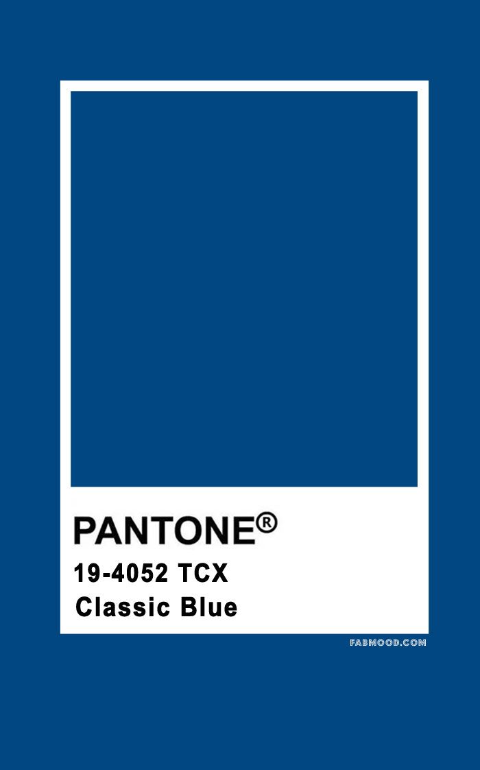 These fans will have a special "Color of the Year" cover and will contain information about the color Classic Blue. These fans are ideal gifts for experienced designers who are already up to date with the latest color trends, as well as beginners who want to spruce up their workspace with useful and beautiful tools.
Pantone Connect for Classic Blue in Digital Design
Pantone Connect, a very useful extension for Adobe Creative Cloud, includes five color palettes with Classic Blue. These Color of the Year themed palettes, like any other Pantone color, are viewable and integrated into design files in Adobe Photoshop, Illustrator, and InDesign. Pantone Connect also offers designers an easy way to convert any color to Pantone colors and collaborate on palettes with colleagues. Download Pantone Connect to start designing with Classic Blue today.
Pantone numbers and color coordinates
Fashion color system, Home + Interiors (cotton, TCX)
Pantone 19-4052 Classic Blue TCX 9000
CMYK: 100 76 25 0
9000 9000 9000 9000 9000 9000 9000 9000 9000 9000 9000 9000 9000 9000 9000 9000 9000 9000 9000 9000 9000 9000 9000 9000 9000 9000 9000 9000 9000 9000 9000 9000 9000 9000 9000 9000 9000 9000 9000 9000 9000 9000 9000 9000 9000 9000 9000 9000 9000 9000 9000 9000 9000 9000 9000 9000 000 129 L*a*b* (Illuminant D50, Observer 2°, Measurement geometry d/8 (SPIN), Measurement mode M2): 30. 59 -3.78 -36.11
HTML: 0f4c81
PANTONE MATCHING SYSTEM™ 9 Color System0012
The next compliance with Pantone 2154 C
CMYK: 100 65 0 27
SRGB: 0 70 128
HTML: 004680
Classic Blue 9000
Twilight in the desert Pantic and dumber dumb Surrounded by a palette of cool blues as well as warm and soothing tones, 4052 Classic Blue helps evoke a gentle soothing effect and a sense of peaceful calm.
Scheduled Swimming
A delightful tropical paradise, filled with blessing, charming color history of Underpass Switching. Classic black and white create a dramatic contrast with the depth and power of PANTONE 19-4052 Classic Blue to form the foundation of the palette.
Unconventional
Nothing captures the spirit of the unconventional better than an unusual and unexpected palette of colors.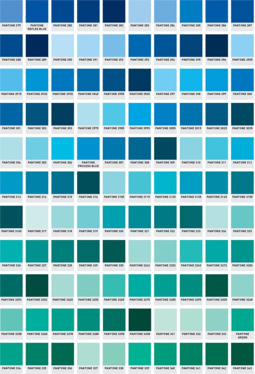 At the helm here is PANTONE 19-4052 Classic Blue, a shade that sets the stage for unique combinations, fun color combinations, outrageous and surprisingly bold fashion statements. About Pantone's Color of the Year
The selection process for the Color of the Year requires careful consideration and trending. To make the right choice every year, Pantone color experts at the Pantone Color Institute scour the world for new color trends. This may include the entertainment industry and film productions, touring art exhibitions and emerging artists, fashion, all areas of design, popular travel destinations, as well as new lifestyles and changes in socio-economic conditions. Trends can also be related to new technologies, materials, textures and color-influencing effects, social media platforms, and even upcoming sporting events that are attracting worldwide attention. For 20 years, Pantone's Color of the Year has been influencing design and product purchasing decisions across industries including fashion, interiors and industrial design, as well as product, graphic and packaging design.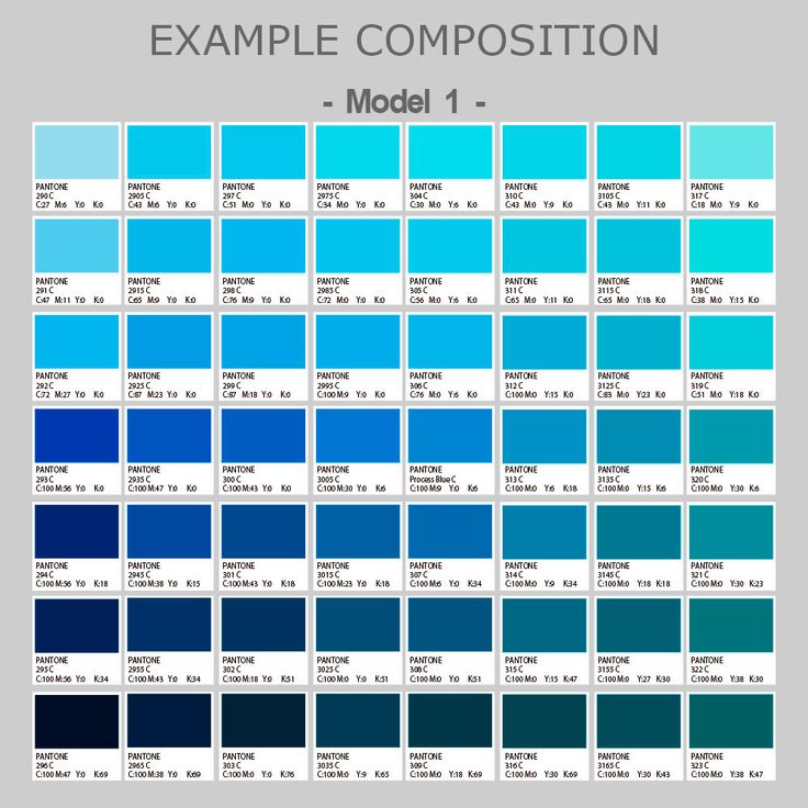 Previous Colors of the Year include:
• PANTONE 16-1546 Living Coral (2019)
• PANTONE 18-3838 Ultra Violet (2018)
• PANTONE 15-0343 Greenery (2017)
• PANTONE 15-0343 Greenery (2017)
- 3919 Serenity & PANTONE 13-1520 Rose Quartz (2016)
• PANTONE 18-1438 Marsala (2015)
• PANTONE 18-3224 Radiant Orchid (2014)
• PANTONE 18-3224 Radiant Orchid (2014)
-5641 Emerald (2013)• PANTONE 17-1463 Tangerine Tango (2012)
• PANTONE 18-2120 Honeysuckle (2011)
• PANTONE 15-5519 Turquoise / Turquoise (2010)
• PANTONE 14-0848 Mimosa (2009)
Blue3- Rice 3-PANTONE 14 Iris (2008)• PANTONE 19-1557 Chili Pepper (2007)
• PANTONE 13-1106 Sand Dollar (2006)
• PANTONE 15-5217 Blue Turquoise (2005)
• PANTONE 17-1456 Tigerlily (2004)
• PANTONE 14-4811 Aqua Sky (2003)
• PANTONE 19-1664 True Red (2002)
• PANTONE 17-2031 Fuchsia Rose (2001)
• PANTONE 15 -4020 Azure / Cerulean (2000)
Blue recognized as the color of 2020
- Operational printing house in Moscow
- News
- Blue is the Color of the Year 2020
We have good news for us (this is not a typo, just for us!). PANTONE Names 9 Color of the Year 20200011 Classic Blue (19-4052 Classic Blue) , comparing it with a calming presence, inner peace, confidence and a sense of belonging.
Shade is described by the color standard supplier as reliable and elegant in its simplicity. We agree with PANTONE (from the word "completely"), blue is a wonderful color. The Institute claims that this color is about trust and constancy. This idea also appeals to us, because you probably noticed that blue is our signature color . A Reliability, trust and constancy are exactly the corporate values that we strive to bring to the world.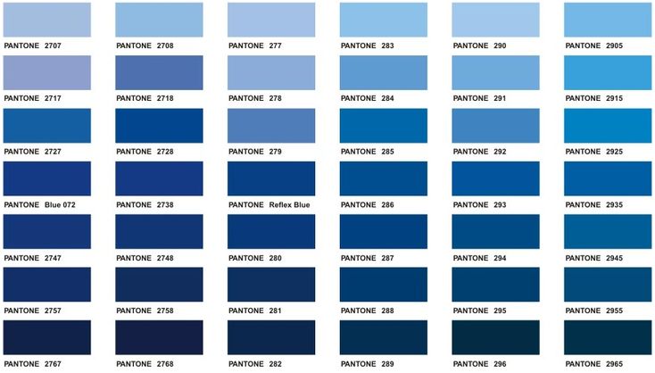
Executive Director of the Pantone Color Institute Leatrice Eiseman also notes that Classic Blue evokes a deep emotional response, helps to think wider and deeper, opens up new flows of communication.
It's worth remembering that Pantone's Color of the Year is quite a serious nomination in the world of color standards. The choice is made not by taste, but after analyzing the situation in the global culture of , based on the study of trends around the globe. To do this, employees throughout the year comb the entertainment industry, cinema, art exhibitions, all areas of design, popular travel destinations. Track changes in the way of life of society, as well as in socio-economic conditions. The trend is also influenced by new technologies and materials, social networks and even sports competitions.
Pantone proclaims the Color of the Year regularly. To confirm the diversity and impartiality of the choice, we attach list of the winning colors of recent years :
- 2019 – Living Coral / Living Coral (2019)
- 2018 - Ultra Violet / Ultra Violet (2018)
- 2017 - Greenery (2017)
- 2016 - Serenity and PANTONE 13-1520 Rose Quartz (2016)
- 2015 - Marsala / Marsala (2015)
The list is not complete, was chosen for the first time in 2000 as .