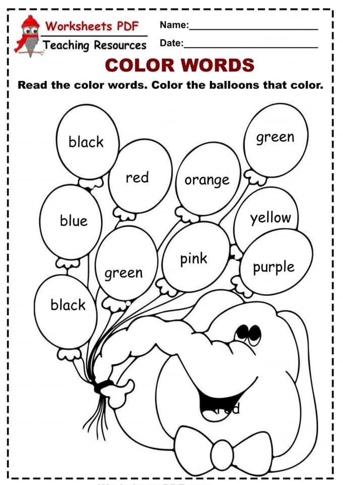
Teaching about color
How to Teach Color | Elements and Principles of Design
The third tutorial in our series, CONNECTING WITH THE ELEMENTS – How to Teach the Elements & Principles of Art, is color.
How exactly do you describe COLOR and why is it important?
After teaching children about Line & Pattern and Shape, there are many different paths you can follow when using the elements of art and principles of design as your curriculum guide.
For our own EPIC curriculum (a done-for-you curriculum availability only through The Sparklers Club), we recommend students learn about the elements COLOR after line, pattern and shape. This shows children how line and shape are used in art-making and then how colors can be used to create a beautiful, colorful work of art.
Teaching children about color theory, even the most basic concepts, sets students up with color mixing techniques to be reinforced with later lessons throughout the year.
Color Through the Grades
Kindergarten and first graders explores color by identifying the primary colors (red, blue and yellow) and begin basic mixing techniques to create secondary colors (orange, green, purple).
Second graders can focus on more specific goals of creating work or art using only primary colors to create a 6 color palette.
Third and fourth grade students can learn about warm and cool colors plus why warm/cool colors or analogous colors work so well together.
By fifth and sixth grade, students have experience with color theory basics. Now children can use their knowledge to make choices in their art to help make for more successful compositions.
What the VIDEO ART TUTORIAL on COLOR:
Want to watch the art tutorial video on Facebook? Click here to view on the Deep Space Sparkle Facebook page.
Download the Art Teacher’s Toolkit Guide for success in selecting lessons, planing your curriculum, finding the best art supplies and more!
Kinder – Third Grade
Play Doh Colorwheel – Manipulate colors by blending, kneading and rolling with basic play-doh. Template included in the free download on this page.
Colorwheel Clowns – Follow the steps to draw a fun clown then use primary colored paint to create secondary colors.
Colorwheel Scarecrows – Follow a simple scarecrow line drawing then use primary paint colors to create secondary colors.
Fish Painting – Using warm and cool colors plus tints.
Contour Cat – Explore warm and cool colors with this easy watercolor and pattern project.
Fourth – Sixth Grade
The Sketchbook Project – Learn to create tints and shades with this simple art activity that teaches children how to create their own tints and shades.
Teaching Color Theory – A fun acitvity that encourages children to consider a “recipe” for creating their own colors.
Introduction to Color
Introduction
Color and color theory form the foundation of art as well as design. Gifted children are often tuned in to the aesthetic nature of things at an early age and can appreciate the nuances of color, as well as the way colors are blended, tinted and shaded.
Guiding Questions
What is color? How do we represent and create color?
Learning Objectives
After completing this project, students will be able to:
- Identify color terms using the academic vocabulary of the discipline
- Evaluate the use of color in fine art painting
- Create a reverse color scheme of a painting
- Design an "eye spy" activity for a painting, focused on the use of color
- Conduct independent research on color and analyze that research
Lesson 1: Introduction to color
Look at this picture. What colors do you see? List the three colors you think are most easily visible in this painting.
How about this one? What colors do you see here? List the three colors you think the artist used most in this painting.
Three things to know about COLOR:
- Color is a way that we describe an object based on the way that it reflects or emits light.
- Your eye can see different colors because a part of your eye called the retina is sensitive to different wavelengths of light.
- Humans are what is called "trichromats," meaning our retinas have three different kinds of cells that can receive color. Those cells are called cones.
What is your favorite color? What do you think the most common favorite color in the world is? (Scroll down further to find the answer.)
To organize colors and show their relationship to each other, we use a color wheel. This shows the colors and how they are related to each other.
On a traditional color wheel, three colors are called primary colors. From these three colors, all of the colors on the color wheel can be made. The three primary colors on the traditional color wheel are red, yellow and blue. Can you find the primary colors on this color wheel? (Blue is the most popular color in the world.)
Lesson 2: The language of color
Like many disciplines, color has its own vocabulary. Watch the video below for an introduction to the language of color. Next, take the pre-assessment to see how much you already know about color's words.
Color Vocabulary Pre-Assessment
The chart that shows the relationship of different colors to each other is called the (1) _______________________. Instead of the word "color," one could also use the three-letter word (2) ________.
The three colors from which all other colors are made are called (3)________________ colors, and they are (4)__________, ____________, and ____________. Colors that are created by mixing equal parts of the colors above are called (5) _____________________ colors, and they are (6) _______________, _______________, and ____________________. Colors that are created from equal parts of each of the two kinds of colors above are called intermediate or (7)________________________ colors. When describing these colors, place the (8) ________________ color first.
Colors that are next to each other on the color wheel are called (9)___________________. Colors that are opposite to each other on the color wheel are called 10)_______________. When these colors are placed next to each other, they make each other seem (11) ____________________. When mixed equally, they create muddy tones like black, gray, and brown.
If you add white to a color, that is called a (12) ______________. If you add black to a color, that is called (13)_________________.
If something only uses one color, it is called (14)______________________________.
If something uses more than one color, it is called (15) _________________________.
If something is completely lacking in color, it is called (16)_______________________.
The colors on the green/blue/violet side of the color wheel are called (17) ___________. The colors on the red/orange/yellow side of the color wheel are called (18) __________.
When completed, check your answers. If you got at least 14 of the 18 correct, move on to Lesson 3 below. If you didn't, read more about basic color theory before you move on.
Lesson 3: Finding the colors
In the pictures below, you will find examples of many of the colors on the color wheel. Answer the questions that go with each picture.
This painting, called Landscape at Ceret, was painted by the Spanish artist Juan Gris.
In the painting, identify six places where you see the three primary colors. Then, identify two places where you see two primary colors next to each other. Place a checkmark on two places you see a primary color adjacent to a secondary color. Circle a place you see a shade of blue. Circle a place you see a tint of green.
This painting, Le Rifain assis, was painted by the French artist Henri Matisse.
This painting has a very narrow color palette. List the colors you see in the painting and identify them as primary (p) or secondary (s) or neither (n).
Below, you will find this same painting in black and white. Using colored pencils, crayons, or fine tip markers, color in the painting. Instead of reproducing the colors the way you see them in the painting on the previous page, select a complementary color (remember that those are opposite each other on the color wheel). For example, where you see green, color a corresponding shade or tint of red, and where you see blue, color in orange. Use Adobe's color wheel to find the complementary color — just spin the wheel until you see the color you are looking for, and its complement will be on the other side.
What did you notice in doing this exercise about how the feeling of the painting changed? Is the painting happier? More sad? Darker? Lighter?
In this painting by Johannes Vermeer called Girl with a Pearl Earring, the color palette is very limited, yet in an entirely different way from the Matisse painting shown before.
Originally, the dark background had a green glaze over it, but this is no longer visible. Imagine what the color green would have looked like next to the colors you can see now. Where do you think it would have made more difference, in the skin or the clothing?
Art historians have found that Vermeer used 11 pigment colors in this painting:
- white lead
- brown ochre (raw umber)
- yellow ochre
- charcoal black
- bone black
- vermilion (a red with an orange undertone)
- ultramarine (lapis lazuli)
- red madder
- indigo (deep, clear blue)
- red ochre
- weld (yellow)
This painting shows how complex color can become. Painters do not simply load their brushes with a color and add it to the canvas; they mix the colors on a palette first. Additionally, some of the colors Vermeer used are no longer visible. This can make it hard to detect the colors in the painting, but you may be able to see some of them. Knowing these things, what colors from the pigments listed above do you think you can find? It may help to to take a closer look at the painting.
Although the painting looks simple, upon close examination, it is a complex blend of colors. Create an "eye spy" activity for the painting, using this rubric. You may look at the National Book Fesitival for an idea (look at the poem at the bottom for an example of a rhyming, poetic form).
Lesson 4: Color research
Conduct a small research study on people's favorite colors. With help from your teacher or parents, identify four people you can interview. You will ask the questions below, and one more that you create (add that to the last, blank line).
Good research etiquette is that you will not interrupt, not share your own opinion to agree or disagree with the responses, and thank the person sincerely for his/her time.
Analyze your data. Did any patterns emerge of favorite or least favorite colors? Were the favorite colors of the people you interviewed stable or had they changed?
Add up the total number of the estimated color names and divide by four to find the average number of colors your interviewees think they can name.![]() How many of the favorite colors were primary colors?
How many of the favorite colors were primary colors?
How did your findings compare with what we know about the most popular color in the world? How many were secondary colors? What in your findings surprised you? What did you discover in the responses to the question you created? Let this rubric guide you.
Assessment
Lesson 1:
- Sunflower picture: Reasonable responses include blue, yellow, green, brown, and beige.
- Oceanscape: Reasonable responses include any combination of red, blue, white, or green.
Lesson 2: Color Vocabulary Pre-Assessment Key:
- color wheel
- hue
- primary
- red, yellow, blue (no order necessary)
- secondary
- green, orange, violet (no order necessary)
- tertiary
- primary
- analogous
- complementary
- brighter
- tint
- shade
- monochromatic
- polychromatic
- achromatic
- cool
- warm
Lesson 3: The initial activities in this lesson are subjective, to a great extent. If you desire to assess, look for full and reasonable responses. The rubric for the Eye Spy activity is included in the section.
Lesson 4: The rubric for the independent research is included in the section.
Extension
Read It!
Young Readers:
- The Color Kittens by Margaret Wise Brown
- Celebrity Cat: With Paintings from Art Galleries Around the World by Meredith Hooper
- Mouse Paint by Ellen Stoll Walsh
- Museum Trip by Barbara Lehman
- Color Dance by Ann Jonas
- White Rabbit's Color Book by Alan Baker
Older Readers:
- Color Theory: An Essential Guide to Colorby Patti Mollica
- Pantone: The Twentieth Century in Color by Leatrice Eiseman
Surf It!
- Practice mixing colors on your computer (UK only)
- Make a rainbow of color with milk
- Test your color vision
- Read about the history of the color wheel
- Read about people who see colors differently
- Learn more about Vermeer and Girl with a Pearl Earring at:
- essential vermeer 2.
 0
0 - Mauritshuis.nl
- girl-with-a-pearl-earring.info/
- essential vermeer 2.
Read online The Teaching about Color by Johann Wolfgang von Goethe – Litres
War'nicht das Auge sonnenhaft,
Wie könnten wir das Licht erblicken?
Lebt'nicht in uns des Gottes eigne Kraft,
Wie könnt'uns Göttliches entzücken? [1]
Preface
When you are going to talk about colors, the question naturally arises whether you should not mention light first of all. We will give a short and direct answer to this question: since so many different opinions have been expressed about light up to now, it seems superfluous to repeat what has been said or multiply the statements that have been so often repeated.
Actually, all our efforts to express the essence of some thing remain in vain. Actions are what we perceive, and a complete history of these actions would cover, no doubt, the essence of the thing. In vain do we try to describe the character of man; but compare his actions, his deeds - and you will get a picture of his character.
Colors are deeds of light, deeds and suffering states. In this sense, we can expect them to explain the nature of light. Colors and light stand, it is true, in the most exact relation to each other, but we must represent them to ourselves as characteristic of all nature: through them, nature is wholly revealed to the sense of sight, to the eye.
In the same way, the whole nature is revealed to another sense. Close your eyes, open, refine your ears, and from the gentlest breath to the deafening noise, from the simplest sound to the greatest harmony, from the most passionate cry to the meekest words of the mind - you will hear nature, and only nature that speaks, that reveals its being, its strength, his life and his relationships, so that the blind, to whom the infinite visible world is closed, can embrace the infinitely living world in what he hears.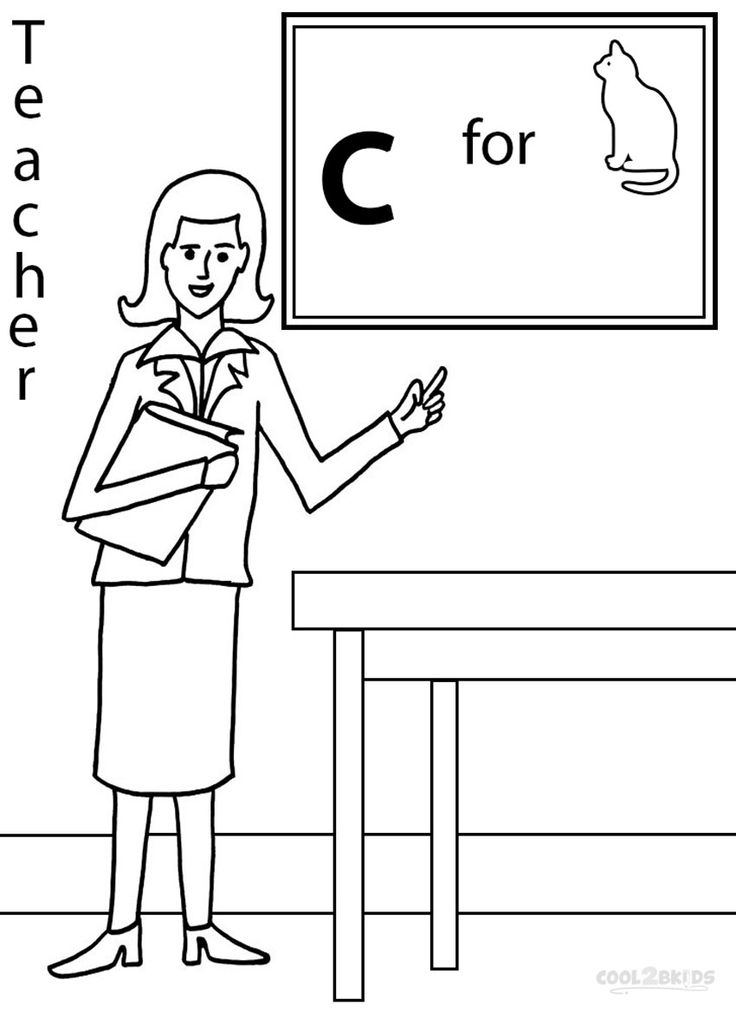
This is how nature speaks to other senses, both familiar and unconscious and unfamiliar sensations; thus she speaks to herself and to us through a thousand manifestations. To the careful observer, she is nowhere dead or mute; and even to an inert earthly body she gave a breastplate - a metal, in the smallest parts of which we could see what is happening in the whole mass.
No matter how long-winded, confusing and incomprehensible this language may often seem to us, its elements remain the same. Quietly tilting first one, then the other side of the scale, nature oscillates here and there, and in this way two sides arise, there arises an up and down, before and after, and all the phenomena that we encounter in space and time are determined by this duality.
We perceive these general movements and definitions in the most varied ways: either as a simple repulsion and attraction, or as a peeping and again disappearing light, as the movement of air, as a shaking of the body, as oxidation and deacidification; but always they connect or separate, set things in motion and serve life in one form or another.
Assuming that these two directions are unequal to each other in their effect, they tried to somehow express this ratio. Everywhere they noticed and called plus and minus, action and reaction, activity and passivity, advancing and restraining, passionate and moderating, male and female; this is how a language arises, a symbolism that can be used, applying it to similar cases as a likeness, a close expression, a immediately suitable word.
To apply these universal designations, this language of nature also to the teaching about colors, to enrich and expand this language, relying on the variety of phenomena studied here, and thereby facilitate the exchange of higher views among the friends of nature - this is the main task of this work.
The work itself is divided into three parts. The first gives an outline of the doctrine of colors. Innumerable occurrences of phenomena are subsumed in this part under the known basic phenomena, arranged in the order which the introduction is to justify. Here it can also be noted that, although we everywhere adhered to experience, everywhere we laid it as the basis, nevertheless we could not pass over in silence the theoretical view according to which this selection and order of phenomena arose.
And in general, the demand sometimes put forward, although it is not fulfilled even by those who put it, is extremely surprising: to present the results of the experiment without any theoretical connection and leave the reader, the student, to form a conviction for himself to his liking. But when I only look at a thing, it does not move me forward. Every looking turns into looking, every looking into thinking, every thinking into binding, and therefore it can be said that already with every attentive look thrown at the world, we theorize. But we do and apply it consciously, with self-criticism, with freedom and - to use a bold expression - with a certain irony: such a device is necessary so that the abstraction that we fear is harmless, and the experimental result we are waiting for is sufficiently alive and useful.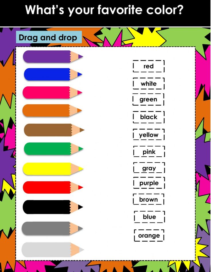
In the second part we deal with the exposure of Newton's theory, which imperiously and influentially closed the way to a free view of color phenomena so far; we contest a hypothesis which, though no longer considered valid, still retains traditional authority among men. In order that the doctrine of colors should not lag behind, as hitherto, so many better processed parts of natural science, the true meaning of this hypothesis must be clarified, old errors must be eliminated.
Since this second part of our work will seem dry in content, perhaps too harsh and passionate in presentation, then, in order to prepare for this more serious matter and at least somewhat justify this lively attitude towards it, let me give here the following comparison.
Newton's theory of colors can be compared to an old fortress, which was first founded with youthful haste by the founder, subsequently gradually expanded and furnished by him according to the needs of the time and circumstances, and strengthened to the same extent due to hostile collisions.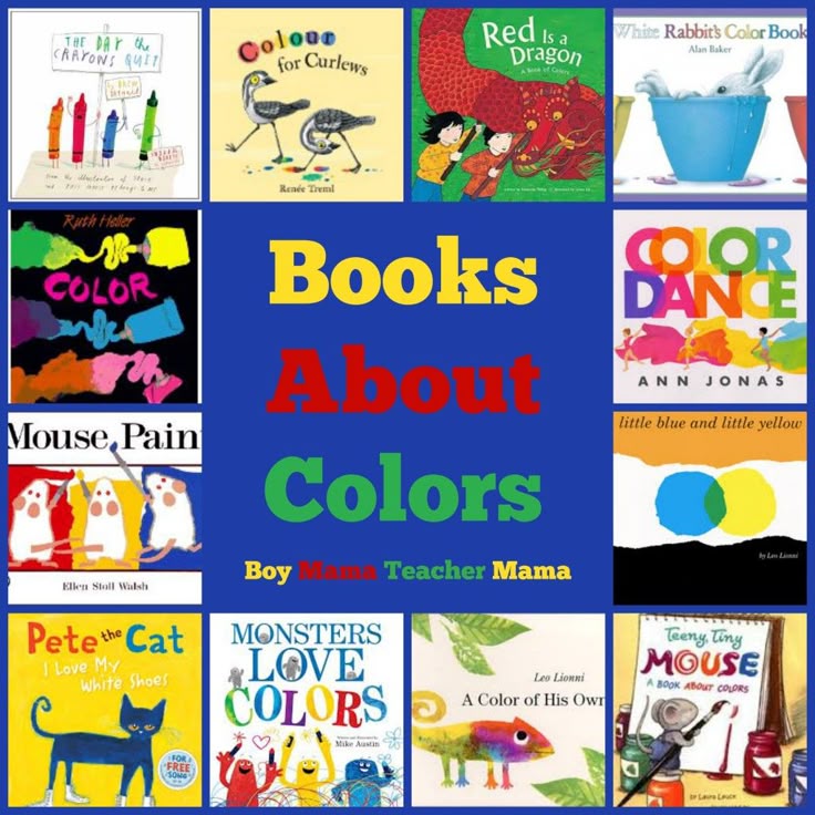
So did his successors and heirs. We were forced to enlarge the building: to add on here, to complete construction there, to build an outbuilding somewhere else - we were forced to because of the growth of internal needs, the pressure of external enemies and many accidents.
All these alien parts and outbuildings had to be connected again with the most amazing galleries, halls and passages. What was damaged by the hand of the enemy or the power of time was immediately restored again. As needed, deeper ditches were made, walls were raised and did not skimp on towers, towers and loopholes. Thanks to these careful efforts, a prejudice arose and was preserved about the high value of this fortress, despite the fact that architecture and fortification during this time were greatly improved and in other cases people learned to arrange much better dwellings and fortifications. But the old fortress was in honor, especially because it had never been possible to take it, that many assaults had been repulsed by it, many enemies had been put to shame, and it had always kept a virgin.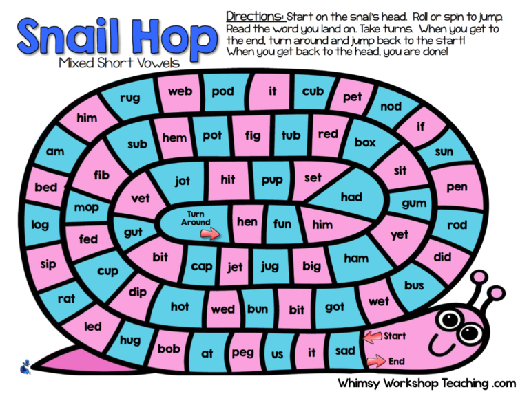 This name, this glory does not die to this day. It never occurs to anyone that the old building has become uninhabited. Everyone is again talking about her remarkable strength, her excellent device. Pilgrims go there to worship; sketched drawings of her are shown in all schools and instill in the receptive youth respect for the building, which meanwhile already stands empty, guarded by a few invalids who quite seriously imagine themselves fully armed.
Thus, there is no question of a long-term siege or strife with a dubious outcome. In fact, we find this eighth wonder of the world already as an abandoned monument of antiquity, threatening to collapse, and immediately, without any roundaboutness, we begin to demolish it, from the ridge and roof, in order to finally let the sun into this old nest of rats and owls and reveal to the eyes of the astonished traveler all this an incoherent architectural labyrinth, its appearance for the sake of temporary needs, all its random heaps, everything deliberately contrived, somehow patched in it.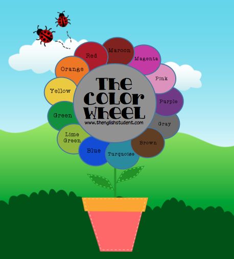 But to throw such a glance is possible only if wall after wall falls, vault after vault, and the garbage is removed as soon as possible.
To carry out this work and, if possible, to level the place, and arrange the extracted material so that it can be used again in a new building - this is the difficult task that we charged ourselves with in this second part. But if we manage, with joyful use of possible strength and dexterity, to tear down this bastille and acquire a free place, then it is not at all our intention to build up again and burden it immediately with a new building; no, we want to use it to present to the eyes of the viewer a marvelous series of diverse figures.
The third part is therefore devoted to historical research and preparatory work. If we said above that the history of man paints us his appearance, then it can also be argued that the history of science is science itself. It is impossible to achieve pure knowledge of what one possesses until one is familiar with what others have possessed before us.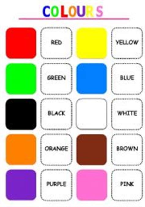 Those who do not know how to appreciate the advantages of the past, will not be able to truly and sincerely rejoice in the advantages of their time. But writing a history of flowers, or even preparing material for it, was impossible as long as Newton's teachings remained valid.0008 [2] . For never before has any aristocratic conceit looked at all those who did not belong to its guild with such unbearable arrogance with which the school of Newton rejected everything that was created before it and next to it. With annoyance and indignation, you see how Priestley [3] in his history of optics, and others before and after him, count the years of the “saved” world of flowers from the era of split (in their imagination) light and shrug their shoulders, looking at the ancient and newer writers who calmly followed the right path and left us individual observations and thoughts that we could not have been better able to produce and more correctly formulate.
From someone who wants to tell us the history of knowledge in any field, we have the right to demand that he tell us how people gradually became acquainted with phenomena, what fantasies, conjectures, opinions and thoughts arose about this. To state all this coherently presents considerable difficulties, and to write a history of any subject is always a risky business: with the most truthful intentions, there is a danger of becoming untruthful; more than that: whoever undertakes such a presentation announces in advance that he will bring something to the light, and leave something in the shade.
Nevertheless, the author was pleased with this work for a long time. But since for the most part only the plan stands before our soul as a whole, and its fulfillment usually succeeds only in parts, we have to give instead of history - materials for it. They consist of translations, excerpts, own and others' judgments, indications and allusions, and this collection, if it does not meet all the requirements, is nevertheless made - this will not be denied to him - with a serious and loving attitude to the matter. However, for a thinking reader, such materials, although to some extent processed, but not processed, will, perhaps, be all the more pleasant because he will be able to compose something whole out of them in his own way .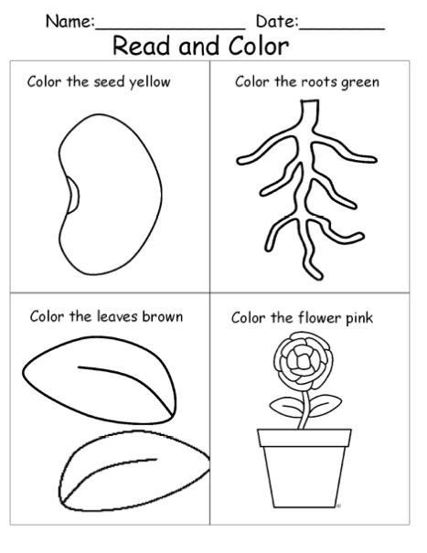 ..
..
In conclusion, it remains for us to mention the tables attached to this work [4] . And here we face the incompleteness and imperfection that our work shares with other similar works.
If a good theatrical play can be much, much more than half created on paper, but most of it is given over to the brilliance of the stage, the personality of the artist, the strength of his voice, the originality of his movements, even the development and mood of the spectator, then even more can be said this is about a book that deals with the phenomena of nature: in order to derive pleasure and benefit from it, the reader must, either in reality or in living fantasy, have nature before him. For the writer, in fact, should first give his listeners a visual representation of the original - phenomena that partly appear before us, in addition to our participation, partly can be deliberately and at will caused by special devices; after that, any commentary, explanation, interpretation would not be devoid of living action.
A very imperfect substitute for this is the tables usually attached to works of this kind. A free physical phenomenon, acting in all directions, cannot be contained in lines and outlined in a section. No one would think of illustrating chemical experiments with figures; with physical, closely related, this has become a custom, since something is achieved in this way. But very often these figures depict only concepts; they are symbolic aids, a hieroglyphic mode of transmission, which little by little takes the place of appearance, the place of nature, and serves as a hindrance to true knowledge, instead of promoting it. We also could not do without tables; but we have tried to arrange them in such a way that they can be used with a clear conscience for didactic and polemical purposes, and some of them even be considered part of the necessary instruments. And so it only remains for us to point to the work itself, prefaced by only one request, to which more than one author has resorted in vain and which is so rarely carried out, especially by the German reader of the Modern Times:0018
Si quid novisti rectius istis,
Candidus imperti; si non, his utere mecum [5] .
Introduction to an essay on the doctrine of colors
Si vera nostra sunt aut falsa, erunt talia, licet nostra per vitam defendimus. Post fata nostra pueri qui nunc ludunt nostri judices erunt [6] .
The thirst for knowledge first awakens in a person when he sees significant phenomena that attract his attention. In order for this attention to be preserved for a longer time, a deeper interest must be revealed, which gradually makes us more and more familiar with objects. Only then do we notice the great diversity pressing against us in a discordant mass. We are forced to divide, distinguish and compare again; it is through this that an order finally arises, the survey of which more or less satisfies us.
To accomplish this, at least to some extent, in any area, diligent and systematic studies are needed. That is why we find that people prefer by some general theoretical view, by some method of explanation, simply to eliminate phenomena, instead of taking the trouble to study the individual and build something whole.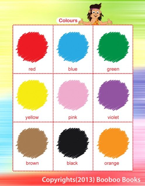
The experiment of establishing and comparing color phenomena was made only twice: the first time by Theophrastus [7] , the second by Boyle [8] . The real experience won't be denied third place.
History tells us the next. Here we will only note that in the past century there was nothing to even think about such a comparison, since Newton based his hypothesis on a complex and derivative experiment, to which they artificially reduced, pedantically placing them around, all other imposed phenomena, if they could not be silenced. and eliminate: this is what an astronomer would have to do if he would take it into his head to place the Moon at the center of our system. He would have had to make the Earth and the Sun with the rest of the planets move around the secondary body and, by artificial calculations and ideas, cover up and embellish the fallacy of his first assumption.
Let's go now, not forgetting what was said in the preface, further.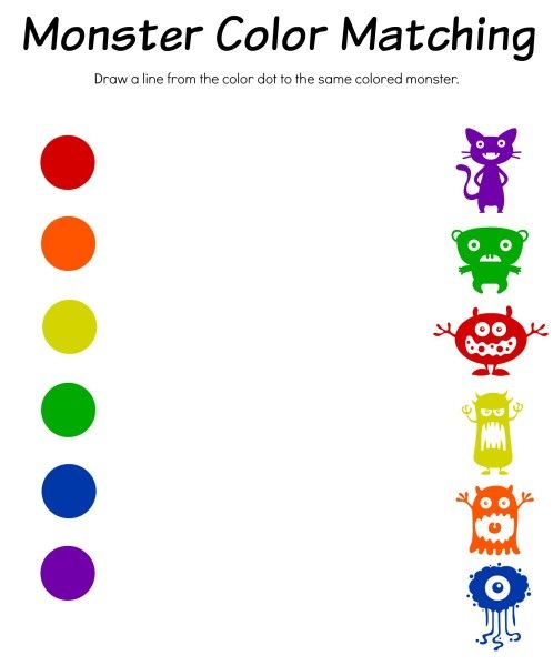 There we took the light as a given, here we do the same with the eye. We have said that all nature is revealed through color to the sight. We now assert, although it sounds somewhat strange, that the eye does not see form at all, and only light, darkness, and color together constitute what distinguishes for the eye object from object, and one part of the object from another. Thus, from these elements we build the visible world and thereby create the possibility of painting, which is able to call on the canvas a visible world, much more perfect than the real one.
The eye owes its existence to light. From the indifferent animal auxiliary organs, light brings to life an organ that should become its likeness; thus the eye is formed with the help of light for light, so that the inner light comes out to meet the outer.
At the same time, we are reminded of the ancient Ionian school, which repeated everything with such significance that only like can know like; so are the words of the ancient mystic, which we will convey in these rhymes:
War'nicht das Auge sonnenhaft,
Wie könnten wir das Licht erblicken?
Lebt'nicht in uns des Gottes eigne Kraft,
Wie könnt'uns Göttliches entzücken? [9]
No one will deny this direct relationship between light and the eye; but to imagine them as one and the same is already more difficult.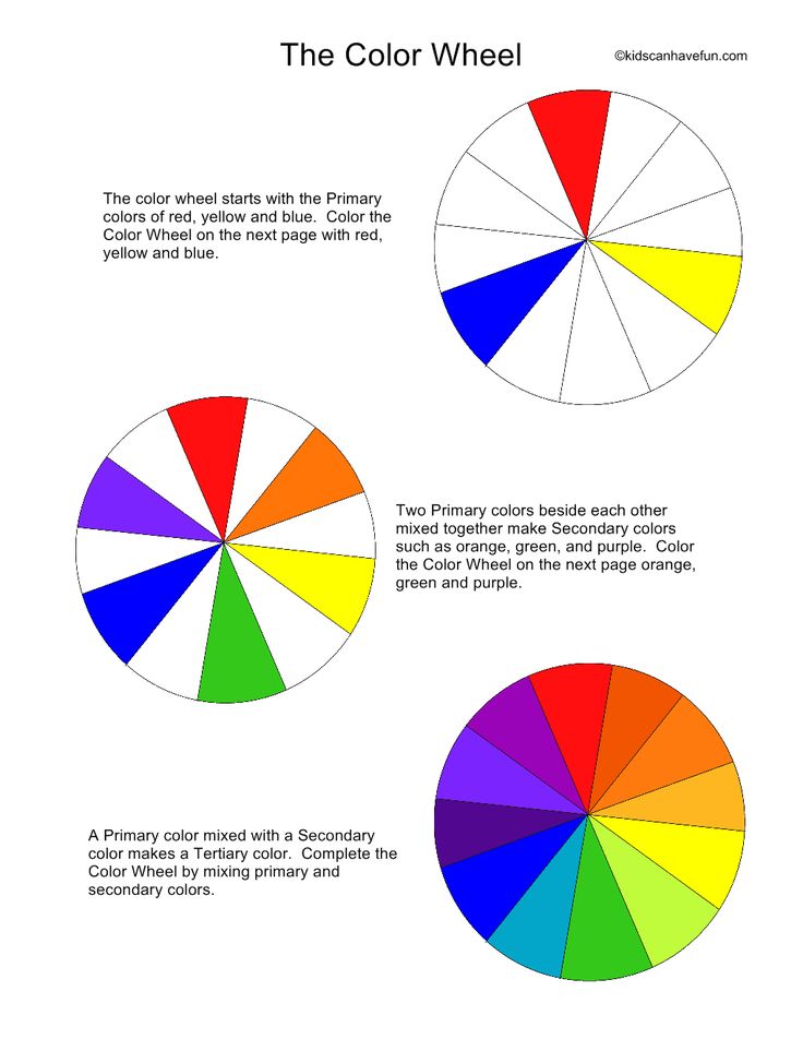 It will, however, be more understandable if we say that a resting light lives in the eye, which is excited at the slightest provocation from within or without. With the power of imagination, we can conjure the most vivid images in the dark. In a dream, objects appear to us in full daylight. In reality, we notice the slightest external influence of light; and even with a mechanical shock, light and colors arise in this organ.
But perhaps those who are accustomed to adhere to a certain order will notice here that we have not yet clearly stated what light itself is. We would like to avoid this question again and refer to our exposition, where we have shown in detail how color appears to us. Here we have no choice but to repeat: color is a regular nature in relation to vision. And here we must admit that a person has eyesight and knows the effect of nature on him: there is nothing to talk about colors with a blind man.
But lest it seem that we are already very cowardly avoiding explanation, we will state what has been said in the following descriptive way: color is an elementary phenomenon of nature, which is revealed to sight and is found, like all others, in division and opposition, confusion and combination, transmission and distribution, etc. , and in these general formulas of nature can best be contemplated and understood.
We cannot impose this way of imagining an object on anyone. Whoever finds it convenient, as it is for us, will gladly receive it. We also have little desire in the struggle and disputes to defend it in the future. For it has long been somewhat dangerous to speak of color, so that one of our predecessors ventures to say: when a bull is shown a red handkerchief, he becomes furious; the philosopher, on the other hand, begins to rage as soon as you talk to him about color in general.
To give, however, some account of our presentation to which we refer, we must first of all show how we have separated the various conditions under which color appears. We have found three kinds of phenomena, three kinds of colors, or, if you like, three aspects, the difference of which can be expressed in words.
First of all, we considered colors as belonging to the eye and based on its action and reaction; then they attracted our attention by themselves, as we noticed them on colorless media and with the help of these latter; finally, they interested us, insofar as we could consider them as inherent in objects. We named the first physiological, second - physical, third - chemical colors. The former are imperceptibly fleeting, the latter are transient, but nevertheless persist for a while, the latter are distinguished by great strength.
Dividing and demarcating them as naturally as possible for the sake of a didactic exposition, we have at the same time arrived at the result of an uninterrupted series, where fleeting colors are associated with temporary, and the latter, in turn, with permanent ones, and thus at the beginning thus carefully drawn distinctions were again abolished for a higher level of contemplation.
Following this, in the fourth section of our work, we gave a general expression to everything that had been said before about flowers under various, special conditions; here, in fact, an outline of the future doctrine of colors is given. At the present moment, we, looking ahead, will say only the following. Light and dark, light and dark, or, to use a more general formula, light and non-light are needed for color to arise. In the immediate vicinity of the light arises the color which we call yellow; the other arises directly near the darkness, we designate it with the word "blue". These two colors, when taken in their purest state and mixed with each other so that they are in perfect balance, create a third color, which we call green. But even separately from these two colors, a new phenomenon can arise when they thicken or darken. They then acquire a reddish hue, which can reach such a high degree that the original blue and yellow color can hardly be recognized. However, the brightest and purest red color can be obtained, mainly in physical cases, by connecting both ends of yellow-red and blue-red. Here is a living view of the appearance and emergence of flowers. But it is also possible, next to the specifically finished blue and yellow, to take the finished red and get regressively, by mixing, what we have achieved progressively, by means of intensification. With these three or six colors, which are easy to include in one circle, the elementary teaching about colors is the only one to deal with.
![]() All the rest, infinitely changing shades, belong more to the applied area; their place is in the technique of the painter, painter, in general - in life.
All the rest, infinitely changing shades, belong more to the applied area; their place is in the technique of the painter, painter, in general - in life.
Let's express one more general property: any color should be considered, undoubtedly, as half-light, half-shadow; that is why, when different colors, mixing, mutually cancel out the specific properties of each other, something shady, gray is obtained.
In the fifth section, we tried to set out those family ties in which our teaching about colors would like to be with other areas of knowledge and activity ...
On the part of the philosopher, we, it seems, deserve gratitude for the attempt to trace phenomena to their primary sources, to that point where we find in them only appearance and being, and where they do not lend themselves to further explanation. He must also be pleased that we have arranged the phenomena in an easily observable order, even if he does not fully approve of this order.
1. If the eye had not its own sunshine, how could we see the light? If the original power of God did not live in us, how could the Divine delight us? (German)
2. Isaac Newton (1642–1727) – English mathematician, physicist and astronomer. Goethe rejected his experience with the decomposition of white light into a spectrum using a prism and the theoretical conclusions from it and disputed point by point in the polemical part of his doctrine of color.
3. Joseph Priestley (1733-1804) - English naturalist, known mainly as a chemist (discovered nitrogen, some of its compounds, etc.).
4. Since the essay is abbreviated, only the drawing in the chapter "Integrity and Harmony" is reproduced.
5. If you know anything better than this, share it with me; if not, use it with me (lat.). Quoted from the Epistles of Horace (Episties I: 6.67-68).
6. Whether our cause is true or false, one way or another, we will defend it all our lives. After our death, the children who are now playing will be our judges (lat.).
7. Theophrastus (c. 370 BC - between 288 and 285 BC) - ancient Greek scientist, student and follower of Aristotle, "father of botany"; Goethe translated his doctrine of color and included it in the third part of his book (“Materials for the history of the doctrine of color”).
8. Robert Boyle (1627–1691), Anglo-Irish natural philosopher, physicist, chemist and theologian.
9. If the eye had not its own sunshine, how could we see the light? If the original power of God did not live in us, how could the Divine delight us? (German)
How color affects our emotions
Know YourselfAntistress
Today we understand how color affects our perception of the world. But two centuries ago this was not obvious. One of the first people to take color theory seriously was Johann Wolfgang Goethe. In 1810 he published his Doctrine of Color, the fruit of several decades of hard work.
Surprisingly, he placed this work above his poetic works, believing that “good poets” were before him and will be after him, and much more important is that he is the only one in his century “who knows the doctrine of color in the most difficult science truth."
True, physicists were skeptical about his work, considering it amateurish. But "The Doctrine of Color" was highly appreciated by philosophers, from Arthur Schopenhauer to Ludwig Wittgenstein.
In fact, the psychology of color originates from this work.
Goethe was the first to speak about the fact that "individual colors cause special states of mind", analyzing this effect both as a naturalist and as a poet.
Although over the past 200 years psychology and neurosciences have made great progress in the study of this topic, Goethe's discoveries still remain relevant and are widely used by practitioners, for example, in printing, painting, design and art therapy.
Goethe divides the colors into "positive" - yellow, red-yellow, yellow-red, and "negative" - blue, red-blue and blue-red. The colors of the first group, he writes, create a cheerful, lively, active mood, the second - restless, soft and dreary. Goethe considers green to be a neutral color. Here's how he describes the colors.
Yellow
“In its highest purity, yellow always has a light nature and is distinguished by clarity, cheerfulness and soft charm.
At this stage, it is pleasant as an environment, whether in the form of clothing, curtains, wallpaper. Gold in a completely pure form gives us, especially if brilliance is added, a new and high idea of \u200b\u200bthis color; likewise, a bright yellow tint, which appears on shiny silk, for example, on satin, makes a magnificent and noble impression.
Experience shows that yellow produces an exceptionally warm and pleasant impression. Therefore, in painting, it corresponds to the illuminated and active side of the picture.
This warm impression can be felt most vividly when looking at some place through yellow glass, especially on gray winter days. The eye will rejoice, the heart will expand, the soul will become more cheerful; it seems that warmth is blowing directly on us.
If this color in its purity and clarity is pleasant and joyful, in its full strength it has something cheerful and noble, then, on the other hand, it is very sensitive and gives an unpleasant impression if it is polluted or to a certain extent shifted to the side. cold tones. So, the color of sulfur, giving off green, has something unpleasant.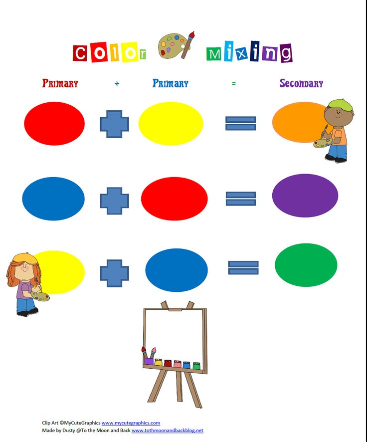
Red-yellow
“Since no color can be considered unchanged, yellow, thickening and darkening, can intensify to a reddish hue. The energy of the color is growing, and it seems to be more powerful and beautiful in this shade. Everything we said about yellow applies here, only to a higher degree.
Red-yellow, in essence, gives the eye a feeling of warmth and bliss, representing both the color of more intense heat and the softer reflection of the setting sun. Therefore, he is also pleasant in surroundings and more or less joyful or magnificent in clothes.
Yellow-red
“Just as a pure yellow color easily turns into red-yellow, so the latter rises irresistibly to yellow-red. The pleasant cheerful feeling that red-yellow gives us rises to unbearably powerful in bright yellow-red.
The active side reaches its highest energy here, and it is not surprising that energetic, healthy, stern people especially rejoice at this paint. A tendency to it is found everywhere among savage peoples. And when the children, left to themselves, begin to color, they do not spare cinnabar and minium.
It is enough to look closely at a completely yellow-red surface, so that it seems that this color really hit our eye. It causes incredible shock and retains this effect to a certain degree of darkening.
Showing a yellow and red handkerchief disturbs and makes the animals angry. I also knew educated people who, on a cloudy day, could not bear to look at a man in a scarlet cloak when they met.
Blue
“Just as yellow always brings light with it, blue can always be said to bring something dark with it.
This color has a strange and almost inexpressible effect on the eye. Like a color it is energy; but it stands on the negative side, and in its greatest purity is, as it were, an agitating nothingness. It combines some kind of contradiction of excitement and rest.
As we see the heights of the heavens and the distance of the mountains as blue, so the blue surface seems to be moving away from us.
Just as we eagerly pursue a pleasant object that eludes us, so we look at the blue, not because it rushes at us, but because it draws us along with it.
Blue makes us feel cold, just like it reminds us of a shadow. The rooms, finished in pure blue, seem to a certain extent spacious, but, in essence, empty and cold.
It cannot be called unpleasant when positive colors are added to a certain extent to blue. The greenish color of the sea wave is rather a pleasant paint.
Red-blue
“Blue is very gently potentiated into red and thus acquires something active, although it is on the passive side. But the nature of the excitement it causes is completely different from that of red-yellow - it does not so much enliven as it causes anxiety.
As the growth of color itself is unstoppable, one would like to go further with this color all the time, but not like with red-yellow, always actively stepping forward, but in order to find a place where one could rest.
In a very weakened form, we know this color under the name of lilac; but even here he has something alive, but devoid of joy.
Blue-Red
“This anxiety increases with further potentiation, and it can perhaps be argued that a wallpaper of a completely pure saturated blue-red color will be unbearable. That is why, when it is found in clothes, on a ribbon or other decoration, it is used in a very weakened and light shade; but even in this form, according to its nature, it makes a very special impression.
Red
“The action of this color is as unique as its nature. He gives the same impression of seriousness and dignity, as well-willedness and charms. It produces the first in its dark condensed form, the second in its light diluted form. And thus the dignity of old age and the courtesy of youth can be clothed in one colour.
The story tells us a lot about rulers' addiction to purple. This color always gives the impression of seriousness and magnificence.
Purple glass shows a well-lit landscape in a terrifying light. Such a tone should have covered the earth and sky on the day of the Last Judgment.
Green
“If yellow and blue, which we consider the first and simplest colors, are combined together at their first appearance at the first stage of their action, then that color will appear, which we call green.
Our eye finds real satisfaction in it. When the two mother colors are in a mixture just in balance, so that neither of them is noticed, then the eye and soul rest on this mixture, as on a simple color. I don't want to and I can't go any further. Therefore, for rooms in which you are constantly located, green wallpapers are usually chosen.
Text: Alina Nikolskaya Photo Source: Getty Images
New on the site
“Every day I promise myself not to pay attention to other people's words. But it doesn’t work”
How Pick’s disease destroys personality: a true story
My house is my rules: a chapter from Olga Primachenko’s bestseller “Tender to yourself”
For optimism, intelligence and peace of mind: what food will improve brain function - advice from nutritionists
“Sex with a man has come to naught.