Best colors for learning
The Effect of Color on Learning
Author: Dr. Christina Counts
Choosing the color palette for a space is important––being exposed to certain colors influences different behaviors, mood, and perceptions (“Color Psychology: How Do Colors Affect Mood & Emotions?”, 2020). That being the case, choosing the color palette for learning environments is particularly important, as color is 1 of 6 design parameters that have a 25% impact on learning (Barrett, Davies, Zhang & Barrett, 2015).
While creating aesthetically pleasing learning spaces is one reason to utilize color in schools, the effect of color on learning is a much more compelling motivation to implement particular colors in school environments. Each color in a learning space can have a different effect on students’ behavior and moods, making it an important part of the learning environment.
The effect of color on learning is an important consideration to make when designing a learning space. Here are some ways that four common learning environment colors affect student moods and behaviors:
- Red in Learning Environments
Red is a very stimulating color and is often associated with strength and courage. Red in a learning space can increase alertness, creativity, and excitement. A learning environment with red in the color palette can be energizing, motivating students and teachers to act and increasing attention to detail.
- Orange in Learning Environments
Orange is an energetic color that can increase alertness, excitement, and engagement. This hue signifies optimism and self-confidence, promoting happiness and energy. Orange may also promote collaboration in learning spaces.
- Green in Learning Environments
Green is a natural color and brings a sense of balance and harmony into a space. The calmness of green can symbolize relaxation, healing, and stability. A learning environment with green in the color palette may help relieve stress and provide a sense of security.
- Blue in Learning Environments
Blue is typically associated with trust, integrity, and peace. This color creates a positive, calming emotional response, generally reducing stress and making people happier. Blue in learning spaces may also inspire student creativity and exploration of new ideas.
The effect of color on learning is an important consideration to make when choosing colors for a learning space design. Every color in a learning space can influence students’ behavior and moods, whether it’s on the walls, floors, furniture, or learning materials. By considering the impacts each of these colors makes, it’s easy to choose a color palette that can help accomplish the goals of any learning environment.
MiEN Company’s design team can help you create the perfect color palette for your learning space’s aesthetic and learning goals. Once you have a design and color scheme for your space, MiEN Company’s wide range of fabrics and surface materials are easy to explore by color using our furniture partners’ online materials libraries. With all of the material and color options available at MiEN Company, you can create an environment that supports your learning goals.
References:
Barrett, P., Davies, F., Zhang, Y., & Barrett, L. (2015). The impact of classroom design on pupils’ learning: Final results of a holistic, multi-level analysis. Retrieved 1 February 2021, from http://dx.doi .org/10.1016/j.buildenv.2015.02.013
Color Psychology: How Do Colors Affect Mood & Emotions?. (2020). Retrieved 1 February 2021, from https://londonimageinstitute. com/how-to-empower-yourself-with-color-psychology/
Dr. Christina Counts, VP of Strategy and Development for MiEN Environments, is a proven leader with a successful background in transforming learning spaces to modern engaging learning environments. Dr. Counts has worked in education for over 17 years with experience as a classroom teacher, district instructional leader, school administrator, and digital and innovative learning designer. In her most recent position, Christina leads a team of professionals that support schools making the transition to a flexible, collaborative, & student-centered learning space.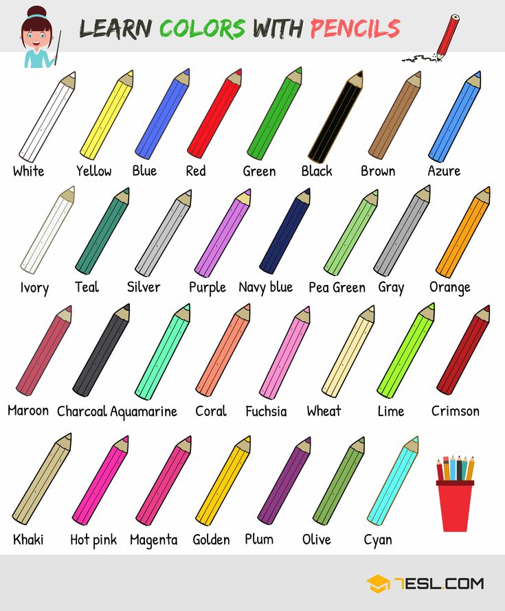 She holds a doctorate in K-12 Educational Leadership, National Board-certified, and Google & Apple certified. Dr. Counts envisions a learning space in which educators are empowered to transform education through design, technology and innovative instructional pedagogy to create learners ready for any future!
Tags :Higher EducationK12 EducationSchool DesignSchool Furniture
How Do Colors Influence Learning?
“Colors aren’t important.”
Oh yeah - then how do you explain traffic lights, warning signs, and rainbows? Color is important, and it’s time we pay attention to color in eLearning too.
Learning is a difficult field to understand, and there’s so much research out there discussing these issues that it’s hard to know where to begin. What’s pretty obvious though is that color plays a key role in creating an environment that fosters learning.
So let’s talk about color – What colors help learning? What colors might be annoying or distracting to online learners? And how can we mitigate that risk? That’s what we’ll be delving into here.
Not convinced? What If we told you that color, as part of the electromagnetic spectrum, is in its purest form energy, a wavelength, which has its own magnetic frequency? What if we told you that colors can affect neurological pathways in the brain? And that they can create a biochemical response? Now, facing that evidence, it’s clear that color has been overlooked for far too long. Dr. Robert Gerard recognizes this and has pioneered research, which suggests that every color has a specific wavelength, and each of these affect our body and brain in a different way.
Using the right color, and the correct selection and placement can seriously affect feelings, attention, and behavior when learning. It’s time that we leveraged that to our advantage. Even research with Alzheimer’s patients has shown that color cues improve memory and that learners recall images in color more easily than images in black and white – amazing, right?
Now listen, we’re not expecting you to be the next Picasso– but a fundamental understanding of which colors work will benefit your eLearning to no end. So that’s what we’re going to do now. We’ll be going through the colors and having a look at what they mean to you and your learners – and the biological response they can elicit. Bear in mind of course, that this isn’t a definitive science. It might be that you’re scared of blue because you’re scared of water – there are unique elements to color choice. But what we’re going for here is a broad-strokes approach that helps us appeal to the most learners with the right colors for our projects. Okay, boilerplate done, let’s begin.
Read more: The Complete Guide to Color Combinations in eLearning
You probably know this already, just by taking a look at a forest or a field. Low wavelength colors promote restfulness and calm, and they improve efficiency and focus.
So that’s why green is an excellent color for improving concentration. Apart from being one of the easiest colors on the eyes, it reminds us of nature. That’s why TV stars stay in the ‘green room’. It’s a relaxing space.
Green is a good color for keeping long-term concentration and clarity, making it a good choice for an office – as opposed to red, which is seen as stimulating and exciting. Maybe it helps in the short term, but stimulation has to tail off sometimes.
Interestingly enough, there’s some real scientific evidence for this. Some studies have shown that people who work in green offices have higher rates of job satisfaction, and consumers have been shown to spend more time shopping in stores that are painted green [1].
Another study, led by Dr. Kate Lee, examined 150 university students. She gave the group a boring, monotonous task that dragged their attention span to a breaking point, pressing a series of numbers over and over as they read off a computer screen. The students were told not to press keys when the number three appeared on the screen. Then break time came, and in a 40-second window half of the group viewed a green roof, while the others looked out onto a bare concrete roof. Amazingly, the research showed that students who looked at the green view made fewer errors and had overall better concentration. [2]
Dr. Lee hypothesizes that the green roof provided a ‘restorative experience’ which helped boost the mental resources of the students involved in the study. If true, that’s a major consideration. If your learners are tired and bored of their compliance material, add in a restorative green screen, a forest scene, or something else for a bit of a break. Lee believes that just a moment of looking at a green space could provide a moment of revitalization for workers who were struggling to concentrate.
Think about the orange sun setting over the horizon. Nice, right? It’s true, orange can be a welcoming and mood-lifting color for learners, which in turn promotes comfort and improves neural functioning.
Some theorists argue that an environment rich in the color orange increases the oxygen supply to the brain, stimulating mental activity while simultaneously loosening peoples’ inhibitions. An increased oxygen supply also leads to feeling invigorated and getting ready to ‘get things done.' Some have even suggested that test centers be painted orange to stimulate exam-takers.
But this comes at a cost – avoid bolder orange colors if your learners are young and naturally energetic. This isn’t a good color for those prone to overstimulation as well, for instance if your group of learners have attention deficit hyperactive disorder or another health concern which leads to easy overstimulation.
That’s not it on the science for orange, though – many studies have found that when colors are used to emphasize a feature or piece of content on the screen, learners’ attention levels increase. Of course, the best colors for this are warm colors, like orange. So we can say that when you’re looking to highlight certain facts or important information, orange can be a better choice than the traditional red. But, because of its energy and brightness, orange can be an overwhelming choice. Orange is, in other words, best in small doses.
The secrets of orange were known in ancient China too – in Feng Shui, orange is seen as a “yang” color which stimulates focus and promotes organization [3]. Of course, we need to remember that brightness and saturation also come into it, and too bright a color will probably give you a headache! Looking to the experts, color psychologist Angela Wright states that bright orange hues stimulate while low saturation is more soothing. So for boosting energy, go bold, and for relaxing, go mellow. Makes sense, huh?
So to close out orange as a color, in eLearning courses it can be used to highlight key facts and figures, communicate energy, life, and activity. Orange is a vibrant color that demands attention, giving it an edge as a choice for highlighting. But again, use with caution!
Read more: Color Psychology: Use Warm Hues to Energize Your eLearning
Some research suggests that people with highly intellectual work, which requires a high cognitive load, for instance, programmers or academics, are more productive in a blue environment. That said, though; we can’t keep life too monochromatic – it should be balanced with warmer colors. These can be found by using the opposite side of the color wheel.
Blue is best used for learning situations which are challenging. Blue paper, blue ink, or blue highlighting can be used to help improve reading comprehension too. Blue in general it seems is a relaxing and calming color, but lighter shades will seem more ‘friendly’ while darker ones seem a little more somber.
Back to the experts, many color psychologists recommend using blue colors, but adding a bit of extra kick with orange, especially for highlighting information (like we mentioned earlier!).
So in summary, blue is great for promoting high levels of thought, but too much can create a sense of detachment and coldness.
Read more: Color Psychology: Use Cool Colors to Set Just the Right Mood for Learning
Hopefully, by now you’re having a dramatic rethink of the color of your courses, your house, and maybe even your car. That’s great – that’s what we want. Take note of the lessons above and let us know how you’ve implemented them in your eLearning courses. Remember, color is fundamental to the human experience. It’s a huge part of our lives and our perceptions, and we should leverage that in our eLearning courses.
REFERENCES:
1.Effect of Different Colors on Human Mind and Body http://humannhealth.com/effect-of-different-colors-on-human-mind-and-body/243/8/
2. Seeing green boosts your concentration, research shows. May 25, 2015. http://www.smh.com.au/technology/sci-tech/seeing-green-boosts-your-concentration-research-shows-20150525-gh8udh.html
3. Best Color For Concentration And Productivity Is Orange http://www.huffingtonpost.com/2013/09/18/best-color-concentration_n_3949427.html
4. Brain-Based Learning by Eric Jensen, 2000 (p.54-70)
how different shades affect a person
The psychology of color is no longer a myth, but a scientific fact actually practiced.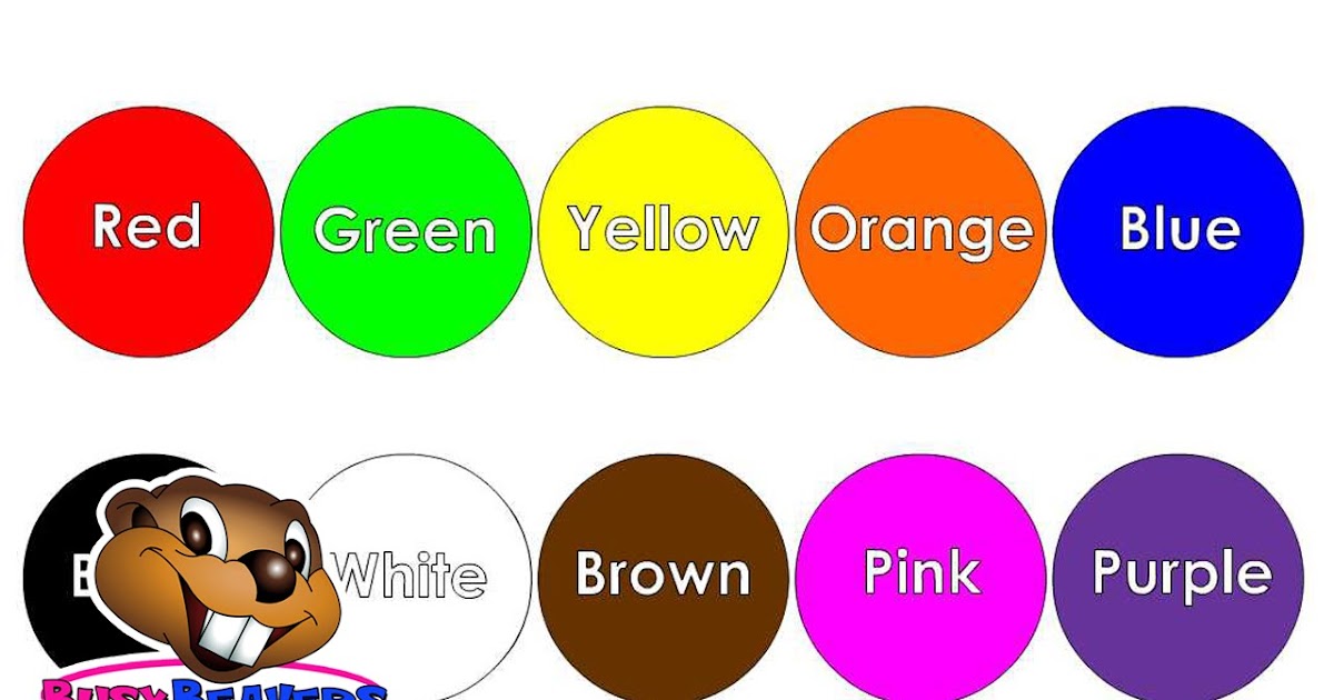 Knowledge about human perception of colors is used in their work by marketers, designers, advertisers, teachers and many other specialists. If you pay attention, you can trace the pattern of using different shades in advertising signs, price tags in a supermarket, website design, product packaging and much more.
Everyone knows that red accentuates attention and green helps to relax. In this article, we will cover more. Read how to make learning more effective with different colors.
Source: professionali.ruInfluence of colors
- red - excites the psyche, increases brain activity, increases concentration. However, an excess of this color can provoke aggression, since at a subconscious level, red is often associated with something disturbing;
- orange - improves mood, increases creative thinking, promotes active work. This color fills with a sense of success, solidarity and goodwill. Helps to cope with melancholy and depression.
 Orange is a safe color, there are no “contraindications” for its use;
 - yellow - just like the two previous colors, improves concentration. It is used by both office workers and creative people. Yellow gives a feeling of happiness and well-being, but in large doses it can provoke a headache;
- purple - activates intuition, has a relaxing effect, reduces physical and mental activity. In excess, it can cause fatigue and boredom. In small doses, it can reduce headaches and tension;
- blue - slows down activity, encourages unhurried analytical reflection. It is the color of discipline and tranquility. In excess, it can provoke depression, especially in melancholic people. It helps people who are too active to slow down and “come to their senses”;
- blue - has a relaxing effect, soothes and slightly "slows down" performance. Useful for people prone to stress;
- green is a neutral hue, somewhere between warm yellow and cool blue.
 This is the color of nature, it gives peace and harmony. It is used to treat depression: it improves eyesight and appetite, and helps restore well-being. In small doses, it promotes enthusiastic work. But there should be little green in the learning space: it can cause apathy and loss of interest in tasks;
 - white — the color of a sober mind and prudence. It clears the mind and calms the emotions. Do not use in excess: white can reduce performance and interest in activities. It is better to take it in small quantities or alternate with other colors;
- black - will not help with studies. In excess, this tone causes depression, lowers mood and physical well-being. In small quantities, it has no effect, it is neutral.
How to use colors
Room
Many schoolchildren and students prefer to study in a room with light or pale walls. It helps to relax and forget about deadlines. But this approach will not help to complete tasks on time, quickly learn the material and fix it in memory for a long time.
Curtin University did a study. According to him, a room with bright elements causes little discomfort for the student. And this, in turn, contributes to the concentration of attention and active brain activity.
Fill the room with large items in bright colors: yellow, orange, red. Paint the walls, hang colored curtains, buy bright bedding or a rug. Look for a houseplant with interesting flowering. For example, Anthurium has beautiful red leaves.
Source: urbanlook.ru, rastenievod.comFeel free to experiment with orange, use yellow a little less, and red should be at least.
Notes
One-color notes are not only visually boring, but also ineffective. Use highlights to highlight important information. For quick orientation in the abstract, you can follow the invented scheme.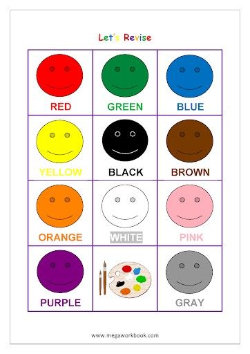 At the same time, choose colors according to the degree of their influence on brain activity. For example:
- red - highlight definitions;
- orange - clarification of list names;
- yellow - important facts in the paragraph;
- purple - interesting, but not very important information, etc.
Stickers
Have you ever wondered why manufacturers make stickers of different colors? Aesthetics plays a secondary role here.
These small sticky notes are used to quickly memorize necessary information. They can be used in different ways:
- In order of importance (the most important - on red, a little less significant - on orange, yellow, blue, light green, etc.).
- According to the level of complexity (the same as in the previous paragraph, only according to the degree of decreasing difficulty in memorizing information).
- Subject (terms for biology - in green, in physics - in lilac, in English - in yellow, etc.
 ).
).
There are also various options for using stickers:
- As bookmarks in a textbook/summary to quickly find the desired chapter.
- As "reminders" that can be stuck anywhere: monitor frame, mirror, refrigerator, room door, etc. It is important that these places often come into view. This technique is very effective and is often used in the study of foreign languages.
- As part of the planner, where the cases are listed in order of their importance. The planner template can be found here.
Reminder bracelet
If you tend to be distracted from important tasks, you can use an interesting life hack. A red bracelet will serve as a reminder that now you need to do business, and not listen to music on headphones. Also, red color will help to return the brain to an active state.
This technique can also be used instead of stickers. This will be effective if you have already learned the information and just want to fix it in memory. For example, a red bracelet is a theorem in physics, purple - a catchy English word that you often forget.
To relax
You need to rest, because overload reduces efficiency. To make your study breaks effective, use the psychology of color.
Green and blue will relieve stress, help you relax, free your head from unnecessary information and "reboot". Take a walk in a square or park, sit near a quiet pond. Fresh air and soothing colors will quickly put your thoughts in order.
If you feel that you are starting to lose heart over books, yellow and orange will help. These tones are able to improve mood and give a feeling of happiness. If it's warm autumn outside, step into the park and rustle your feet in the dry bright foliage. Or brew amber-yellow tea, enjoy its color and aroma.
Source: clubcha.ru Overworked, head buzzing? Dim the lights, light a lavender-scented candle, and lie back on your purple-lined bed. This color will relieve headaches and tension.
Man is the most interesting creature on the planet. Our psyche is so multifaceted that scientists have not yet studied all its secrets. But one thing is known: overworking is just as ineffective as procrastinating. If you feel that completing tasks is detrimental to your motivation to study, contact Phoenix.Help. Our experts will help to cope with any task.
The influence of primary colors on learning and perception
Have you ever wondered what is the effect of color on the perception of information?
This is a very important question, since a person receives 90% of the information about the world around him through vision. Colors play a very important role in this.
But many people are convinced that this is nothing more than fiction. They claim that the role of flowers in people's lives is insignificant. But then how to explain the effect on us of traffic lights, warning signs or rainbows?
Our perception of colors and the colors themselves are very important, it's time to pay attention to them. In this article, we will look at the effect of colors on a person's ability to learn and perceive information.
The effect of color on learning
All learning is a complex process. According to many studies, color plays a key role in creating a beneficial environment that promotes learning and helps to develop the potential inherent in a person.
So, for everyone who wants to facilitate the process of remembering this or that information, it is important to know which colors help to focus on learning, and which ones only distract and irritate.
If we consider color as part of the electromagnetic spectrum, then it is nothing but energy that has its own magnetic frequency.
What if we say that colors can influence neurological pathways in the brain and can create biochemical reactions in the brain? Hundreds of scientific papers prove this.
In one of these studies, the American doctor Robert Gerard proves that each color has its own unique wavelength, and all colors affect the human brain in different ways.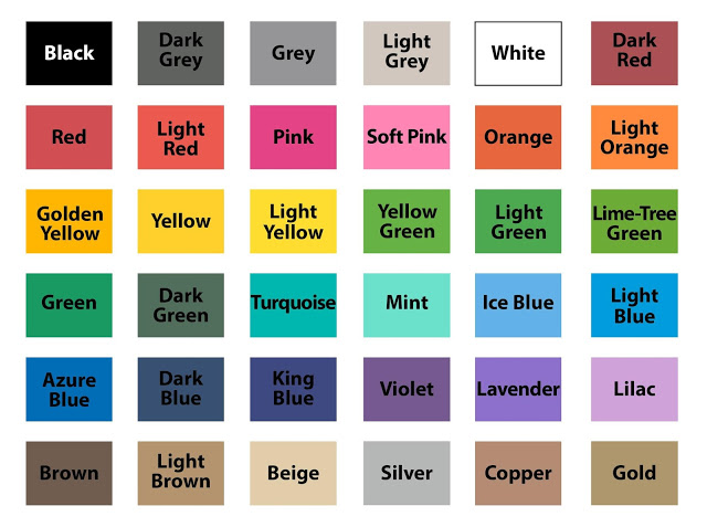
With the right colors for a classroom or online work program, people's attention and behavior can change dramatically. Color affects our psychological state.
Let's go through the colors and see what they mean to us as students and consider the biochemical reactions they can cause.
Keep in mind that the conclusions drawn are of a general nature, specific cases should be considered separately, since each person has his own characteristics.
We're going to use a broad approach that will help find the "right" colors for most knowledge hungry people.
So, why are the psychology of color and education inseparable concepts?
Green: the color of concentration
You can probably agree with this just by looking at a forest or a field. Green has a low wavelength, promotes calmness, and enhances efficiency and focus. That is why it is a great color to improve concentration. It reminds of nature and peace.
"Every shape has its own color, every color has a shape.
Daniil Granin"
Green is an excellent choice for the office, as it promotes long-term concentration and clarity, which cannot be said, for example, about red, which is considered exciting.
Interestingly, there is real scientific evidence for this. For example, Australian scientists conducted a study in which 150 students took part. The children participated in an activity that required a lot of concentration.
While the numbers were appearing on the computer screen, the students were required to press a key every time except for the number 3.
About halfway through the experiment, the students were given a short break and asked to look at the city from the classroom window. 50% of the whole group looked at the green meadow on the roof of a neighboring house, and the other half looked at a part of the same roof, but without greenery.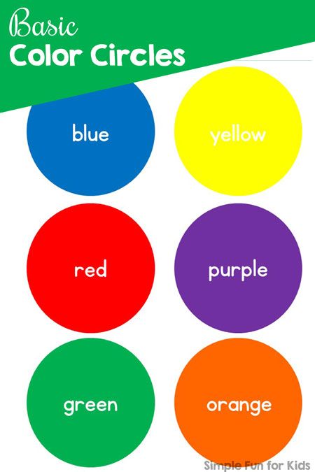
At the end of the break, the students who looked at the roof with grass made far fewer mistakes and showed excellent concentration, which was not the case with the other group members.
The experiment fully met expectations. Scientists have found that the color green ensures concentration on the task.
Orange: the color of life!
Imagine an orange sun setting on the horizon. It's great, isn't it? Orange color is able to cheer up, stimulate mental activity, it promotes comfort and improves the functioning of the nervous system.
The effect of orange on the perception of information is very positive. Studies claim that it increases the oxygen content in the blood and leads to a feeling of alertness and readiness for the most difficult tasks.
It is worth emphasizing when people are looking for some facts or important information, contact with orange increases concentration. But because of its energy and brightness, orange can be overwhelming at times. In other words, this color works best in small doses.
The secrets of orange are well known in feng shui, where it is regarded as the color "yang" which stimulates focus and promotes composure.
According to experts, it is better to choose a juicy orange color to improve working capacity, and a softer one for relaxation. Thus, orange should be used with caution, in some cases it helps to maintain concentration and working mood, while in others it is only a distraction.
Blue - the color of productivity
Quite a lot of scientific research tells us that people whose activities require a high cognitive load, such as scientists, doctors or inventors, are especially productive in rooms with blue and blue hues.
Blue works great in situations of high complexity. Blue paper, blue ink is good to use to improve the understanding of any task.
In general, blue seems to be relaxing and soothing, with lighter shades more "friendly" and darker ones a bit gloomy.