I like colors
I Like Colors – Creative Teaching Press
Sample Pages
Sample Pages
- DESCRIPTION
- REVIEWS
- specifications
DESCRIPTION
Cat and Dog paint their house with many different colors.
8 pages
Nonfiction: This book is based on nonfiction topics set in an illustrated story.
About Learn to Read Books
The Learn to Read books feature easy-to-read stories, rhymes, and songs that engage students’ attention and support their reading development by providing the following elements:
- High-interest topics for beginning readers
- Humorous or surprise endings that children love
- Predictable story lines with repeating text to help early readers develop reading strategies and build confidence
- Illustrations on every page that match the text to support word identification, boost comprehension, and expand vocabulary
- Lovable, humorous, and engaging characters that children will connect with and enjoy reading about
Based on Academic Content and Developmental Skills
Learn to Read books are tied to content subject areas to help reinforce critical standards-based skills. The inside front and inside back covers of each book feature:
- An overview of the phonics skills, sight words, vocabulary words, literacy concepts, and other learning skills introduced in each book
- Discussion questions to promote vocabulary development, reading comprehension, and connection with text.
- Extension activities to foster a deeper understanding and interest in the material.
Books That Children Love to Read!
We repeatedly hear from teachers and parents all over the world about how much their students LOVE the Learn to Read books and how the books get children hooked into learning how to read. This popular and time-tested series has sold more than 20 million copies, helping both children who are just beginning their reading journey and those who are struggling to gain literacy skills.
About the Learn to Read Authors
The Learn to Read book series was created by a team of veteran teachers and reading experts. Their extensive first-hand experience with teaching children how to read, along with their in-depth knowledge of literacy research and child development, has helped create a highly effective, engaging beginning reading series.
REVIEWS
SPECIFICATIONS
| Author | Rozanne Lanczak Williams |
| Fiction/Nonfiction | Nonfiction |
| Weight | 1.3 oz |
| Pages | 8 |
YOU MAY ALSO BE INTERESTED IN THE FOLLOWING PRODUCT(S)
QUICK VIEW
SKU: 3261
$74. 64
64
This pint-size book makes reading fun and affordable.Teachers and parents alike will find the clear text and attractive line drawings perfect for beginning readers. Great for Reading First, Phonics, and ESL/ELL! Comes with convenient, Velcro-close carrying case that holds the complete collection of 36 Itty Bitty Phonics Readers.36 books and storage bag set (3261)Includes 1 each of the following: What...
QUICK VIEW
SKU: 10651-CK
$107.76
Each book in this delightful collection introduces a different form of writing. These engaging tales by popular children’s author Rozanne Lanczak Williams use fun-loving characters to motivate and encourage young readers to want to write on their own. At the end of each book, a "Your Turn to Write" page provides entertaining activities designed to build K-2 writing skills. Children...
QUICK VIEW
SKU: 10650-CK
$107. 76
76
These readers are the perfect tool for helping students recognize sight words and providing emergent readers with books they can successfully read on their own. Each book introduces a new sight word within a delightful story. Written by popular children's author Rozanne Lanczak Williams, these fun books are the perfect complement to any emergent reading program! Great for ESL/ELL! This...
QUICK VIEW
SKU: 10654-CK
$86.95
Out of Stock
The hundreds of hands-on activities and engaging practice pages in First Grade Essential Skills book set will strengthen the most important grade-level skills across the curriculum to equip learners for academic success.Perfect for new teachers and homeschool families looking for a solid core of instructional materials. Also great for parents whose children need extra support or a challenge. Math—number sense,...
QUICK VIEW
SKU: 10655-CK
$86.95
Out of Stock
The hundreds of hands-on activities and engaging practice pages in Second Grade Essential Skills book set will strengthen the most important grade-level skills across the curriculum to equip learners for academic success.Perfect for new teachers and homeschool families looking for a solid core of instructional materials. Also great for parents whose children need extra support or a challenge. Math—number sense,...
QUICK VIEW
SKU: 10656-CK
$86. 95
95
The hundreds of hands-on activities and engaging practice pages in Third Grade Essential Skills book set will strengthen the most important grade-level skills across the curriculum to equip learners for academic success.Perfect for new teachers and homeschool families looking for a solid core of instructional materials. Also great for parents whose children need extra support or a challenge. Math—number sense,...
QUICK VIEW
SKU: 10657-CK
$86.95
The hundreds of hands-on activities and engaging practice pages in Fourth Grade Essential Skills book set will strengthen the most important grade-level skills across the curriculum to equip learners for academic success.Perfect for new teachers and homeschool families looking for a solid core of instructional materials. Also great for parents whose children need extra support or a challenge. Math—number sense,...
QUICK VIEW
SKU: 10658-CK
$86. 95
95
The hundreds of hands-on activities and engaging practice pages in Fifth Grade Essential Skills book set will strengthen the most important grade-level skills across the curriculum to equip learners for academic success.Perfect for new teachers and homeschool families looking for a solid core of instructional materials. Also great for parents whose children need extra support or a challenge. Math—number sense,...
I Like Colors by Barbara Jean Hicks
Diana
1,475 reviews5 followers
October 15, 2018This was a unique book. If it wasn't for the title, you'd never know it was about colors! The pages are filled with brightly colored animals surrounded by a black background...perfect for me, since I was doing DIY scratch-off paper, and this is very reminiscent. I enjoyed the way the animals were described in every way EXCEPT by their color. Very creative! It's a two-second book, but a fun one nonetheless.
- kids storytime
Barbara
276 reviews1 follower
April 29, 2008Summary (CIP): A vibrantly illustrated mixture of colorful animals, bugs, plants and people are woven together with shapes, patterns and rhyming text in this captivating unique concept book.
REVIEW: The art is predominant in this concept book which uses black background paper to contrast with brilliant oil pastels. The saturated, high contrast colors are a nice change from pastels or white backgrounds. Paired animals illustrate the concepts of opposites quick-slow), rhyming (wacky-quacky), and colorful patterns (striped-spotted). The relationship of one pair eluded me though; is alliteration the point of “fuzzy-friendly”?
The only review I found was for a wrong book by the same illustrator???
- picture-book-concept picture-books
June 21, 2010
Call me crazy, but when a children's book is called "I Like Colors," I kinda expect it to be about colors! Although the illustrations are colorful, the text doesn't name a single color. Of course, the adult reading to the child could point out the colors, but why not name the book "All About Opposites" or something that reflects the text?
- children library opposites
Edna
1,026 reviews3 followers
March 31, 2010The title of this book can be misleading; it does not identify colors although an adult reader can point and name colors from the bold and simple illustrations of animals and insects. The text contains words that are "opposites" such as "quick and slow."
- animals colors picture-books
December 28, 2015
This book was read for Wesley’s summer reading club. Wesley is my (soon to be five year old) son. This review is what we used for his reading club.
***
My mom and Wesley read books last night. This book really helped Wesley with his opposites.
April 29, 2016
despite the title, there are no color words used in the book. Many other concepts are touched upon with the simple text, but the colors themselves are only brought out through the vibrancy of the illustrations.
Read
April 24, 2012This is a great book to use to point out the different colors and ask for students response to do an informal assessment on colors.
- math morning-circle
April 24, 2012
I enjoyed reading this book as well. It is colorful and a great book to teach children about different colors.
- colors
August 26, 2014
Bright and colorful, contrasting with the dark background of the pages, this book captured color easily and brilliantly. Plenty of animals and insects to encourage talking and pointing.
- kid-s
Color psychology
Colors not only make our existence brighter, but also determine our mood, influence our thoughts and actions. Distinguishing colors, we better recognize the objects of the world around us, better cope with vital tasks. Colors also carry information important for communication. Since color influences people's daily behavior, it makes sense to understand how and why physical reactions to each color occur and how to best use this information in business and everyday situations.
Believe it or not, the color of your clothes can help you get promoted, convince in an argument, challenge friends to a frank conversation. Colors in the home encourage or discourage family conversation and can even cause insomnia. The colors of the packaging will unobtrusively inform you that there is a useful, expensive or fragile item inside.
Our emotional reaction to color is incredibly strong. The perception of color depends on the physiological characteristics of your eyes and on the state of the nervous system, life experience and the environment.
Scientists say that our eyes react to colors as radiations that have different wavelengths and are characterized by varying degrees of reflection, refraction and absorption. The eye perceives color, and instantly a process begins in the brain that responds to the peripheral nervous system.
For example, hot colors - red, orange and yellow - have the longest wavelength, which requires a significant amount of energy to be perceived. These are colors of an active-offensive nature, they have a stimulating effect on the brain, increase the purity of the pulse and breathing.
Conversely, cool colors, greens and blues, are shortwave and therefore easily perceived. The sedation they cause is associated with a slowdown in metabolism.
In addition to the natural reaction of our body, life experience plays an important role in the perception of color. We have been taught that pink is for newborn girls and blue for boys, that a bride's white dress indicates her purity and innocence, that red at a street crossing tells her to stop.
The color of the clothes is eloquent. Will you be aggressive if the service representative is dressed in all white or black?
Will a doctor who prefers a bright orange tie be trusted? Which female professional would you choose as your financial advisor, the one in the navy blue suit, or the one in the bright scarlet blouse?
The colors of clothes can give us confidence, strength, or vice versa, create a feeling of awkwardness. There are no "bad" or "good" colors, it's just about the possibility of choosing the types of color communication. This applies not only to the field of clothing, but also to the decoration of your home, advertising, graphic design, new product design and commercial decoration. Ask yourself why the guests were bored to the point of yawning at your party?
Maybe it's not the company, but the fact that the walls of your living room are painted lavender, that is, a color that invites you to take a nap and “pass out”.
Would you like your salary to be indexed higher than usual? Try wearing something red a few weeks before your annual assessment.
Chances are this eye-catching color will remind your boss of your request.
Influence of color
Since color subconsciously influences people's daily behavior, it makes sense to understand how and why certain reactions to color occur. What follows is a detailed explanation of our physical reactions to each color, while presenting typical psychological associations. Tips are also provided on how to best use this information in artistic, business and domestic situations.
Red
The red color indicates danger, excitement, passion, strength, aggression and success. This is not only an emotional, but also a physiological reaction. The color red causes shock, it completely captures attention and requires effort to perceive. Focusing on red leads to an increase in heart rate and blood pressure. Ever wondered why so many fast food restaurants are painted red? This color activates the salivary glands, which leads to feelings of hunger and tires the eyes, causing us to eat more and then leave the room faster.
Red is more noticeable than others. Due to its powerful effect on your peripheral nervous system, red can make you restless and restless. Casino owners have noticed that people bet more and play more risky with red, and therefore it is used in sectors where they play big. Red encourages people to make quick decisions. Red color also fills with energy and courage, gives a feeling of strength, thanks to which you can accomplish what you have planned. This is why politicians often wear red ties, especially before presidential elections. Red evokes strong emotions, including passion. A woman in red is often seen as flirtatious; game.
In China, red means good luck; brides are dressed in it, newborns are greeted with red eggs. Feng Shui advocates recommend using the color red to banish bad energy from your home. But in home decor, there are limits to red: use it only in rooms where you intend to work or spend time in conversations - in living rooms (if you use red for a
dining room, be prepared for the fact that guests will eat twice as much. Red color is preferable for walk-through rooms where you don't need to spend a lot of time - in halls and corridors. In the nursery, it can lead to insomnia.
- Intense red is a color that expresses speed, power, play, danger and passion.
- Red captures attention and brings objects painted with it to the fore.
- Red creates a feeling of warmth. Coffee seems hotter in a red cup than in a green one.

- Red is the first color you lose sight of at dusk; it is indistinguishable at long distances.
Yellow
Psychologists say that yellow is the happiest color of the spectrum, it inspires optimism and joy. The association with the sun gives yellow a special aura, denotes wisdom, intelligence, imagination, a tendency to spontaneity. Yellow color is instantly registered by the brain, stimulating its work and nervous system. The high visibility of yellow promotes fast, clear thinking, as suggested by the color theorist Faber Birren, who explored the use of colors in everyday life. It was Birren who invented at 1950s use the Yellow Pages directories to facilitate the monotonous work of telephone operators.
Later research confirmed Birren's theory, which found that in print the most distinguishable combination is black type on a yellow background, and it is this combination that is best retained in memory. No wonder this color is used for warning road signs and legal papers.
Yellow brings other colors to life, making hot colors dazzling and bringing cool colors back to life. That's why this color is a favorite in home interiors, filling any room with warmth and light.
The most common use of yellow is in the kitchen and dining room - it increases appetite.
In small doses, yellow contributes to the creation of a happy atmosphere for friendly conversations, however, prolonged proximity to a bright lemon color can cause brain overexcitation and anxiety.
In many countries, yellow means success, prosperity and power. In Japan, it serves as a symbol of generosity and nobility: in ancient times, Japanese warriors pinned yellow chrysanthemums on their clothes before the battle as a pledge of courage.
- Yellow is the happiest color on the spectrum and represents warmth, optimism and joy.
- Yellow actively protrudes into space, and therefore is considered the most noticeable color; it is preferred for road signs and various types of packaging.

- Yellow stimulates clear thinking. Black signs on a yellow background are the most distinguishable color combination in printing.
- Yellow activates other colors, making hot colors radiant and enlivening cool colors.
- The abundance of yellow can be tiring. Its muted tones are conducive to communication, while its golden tones are associated with the idea of wealth.
Orange
This color increases the flow of oxygen to our brain, enhances creativity. Orange is formed by mixing red with yellow, so it has the qualities of both colors. It has the energy and vitality of red and, like yellow, will create a feeling of happiness. Orange encourages spontaneity and pleasure. Bright orange is extremely eye-catching and is preferred by construction workers and traffic cops as a warning color. It is readily used in stores for sale announcements, as it is identified with good quality.
In more muted tones, like ripe pumpkins or autumn leaves, orange is reminiscent of autumn, harvest time. The color of ripe orange and persimmon has a sophisticated appeal that can be both elegant and exotic at the same time: just imagine the captivating color of terracotta. Terracotta is especially popular in exotic food and gourmet packaging.
Bright orange used in everyday life infrequently. Interior designers are advised to use it as punctuation marks, that is, selectively. When used wisely, orange can give the impression of surprise and chic, as if warming the room with the fire of a fireplace.
Orange is effectively used in advertising, packaging, because it has the ability to attract attention. Juicy orange color declares freshness, which makes it a preferred table decoration.
Peach tones are especially good for the home. They not only radiate warmth, but also give a feeling of hospitality; the light reflected from them, falling on the face, gives the skin a pleasant pinkish glow. These colors look great in both daylight and artificial lighting. Therefore, designers of expensive restaurants prefer a soft peach color, which also stimulates the appetite.
In color therapy, orange is valued for its stimulating and immune-boosting properties. It is considered to bring happiness. But it is not recommended for easily excitable people. The color orange has long been used on flags and coats of arms to show strength, endurance and success.
- Orange has a stimulating effect, gives the impression of friendliness, openness and adventurousness.
- Bright orange is highly visible, making it suitable for use in warning signals.
- Spicy (autumn) oranges are warm, exotic and inviting.
- Preferring orange colors are capable of creative thinking, full of enthusiasm, but prone to irresponsibility.
- Orange is active and therefore loved by children and athletes.
Green
This color is associated with ideas about life and growth, and is considered relaxing and soothing. Unlike other colors of the spectrum, green is perceived directly by the retina without any refraction. It is believed that it has healing properties, the ability to soothe and refresh. The more muted the green color, the higher its calming properties.
This is one of the reasons hospital walls are painted the colors of sea foam. And how not to remember the "green rooms" behind the stages of theaters and television studios, in which the actors relieve excitement and calm down before going on stage.
Depending on the shades, green reveals different possibilities.
Light green tones evoke spring and nature walks with their feeling of happiness and youth, but can also indicate immaturity, not without reason they say about beginners: “Still green”. Intense green is the color of mature trees, tall and resilient. This color is often found in the offices of lawyers and financiers. And in general, this is the color of money! Olive is associated with power and is used by the military, while green grass evokes new life and growth and symbolizes fertility. During the Renaissance, brides preferred to wear dresses of this color for weddings.
Shades of green can be used harmoniously in home decor. Bright green will bring a sense of the pulse of natural life into the house and “open” the interior to the park surrounding the house. Green colors are refreshing, making them indispensable in kitchens and dining rooms. Pale green evokes a nice clear feeling and is perfect for the nooks and crannies of the home like bathrooms and bedrooms. The green color combines humility, sophistication and a sense of antiseptic cleanliness, which is why it is used in the decoration of resorts.
Since shades of green give a feeling of cleanliness and freshness, they are especially popular on cosmetic boxes. In general, products in green packaging are perceived as environmentally friendly. The taste sensation of green is associated with astringency, and it is not surprising that it is often used for wine bottles.
- Pale green is a soothing and relaxing color. It helps improve vision.
- Bright green colors remind of spring and the energy of youth.
- Dark greens are associated with stability and growth.
- Around the world, green is a symbol of safety. Therefore, it is adopted to indicate the beginning of movement in traffic lights.
- People who prefer green are reliable and generous.
Blue
Light or medium blue tones are especially pleasing.
Indeed, if you look at the blue color persistently, this leads to a decrease in the frequency of the pulse and respiration and, for a while, lowers blood pressure.
Almost all of our associations with the color blue are positive. When we see blue or aquamarine, the sky and the calm sea come to mind.
In many national cultures, the color blue is associated with protection. In the countries of the Middle East, there is a belief that blue doors protect from evil spirits, while in the South-East of America, for this purpose, hallway ceilings are painted blue.
Before the invention of refrigerators, when food was stored in kitchens and pantries, these rooms were painted cobalt to repel insects, which are noted to avoid blue. Blue color in kitchens is popular in our time.
The blue color of the sea inspires loyalty and confidence. Therefore, blue is ideal for expressing frankness. During the election campaign, politicians often wear blue suits to inspire confidence.
The color of the sea wave inspires respect; the uniforms of the military and police are sewn from fabrics of its shades. Bright blues are ideal for outfits that you can wear to a party or social event, in which case you will get all the latest gossip, because you will be more frank than others.
Dark blue tones are associated with high social status, stability and dignity. The expression "blue blood" comes from Spain, where the aristocrats really believed that blue blood flowed in their veins. The same idea was held in ancient Egypt, where it was believed that varicose vessels are a sign of noble birth and beauty, which forced wealthy women to paint their legs with blue paint. For a long time, blue has been a symbol of fidelity, hope and faith.
In home décor, dark blue tones give a room a regal and serious feel, while lighter, brighter blue volumes add charm. It has been noticed that the color blue is associated with a sweet taste, which is why it is often used on packages of sugar and other sweets.
People are more productive in blue-colored rooms, and studies have confirmed that weightlifters lift more weight when they exercise in blue-painted gyms. Expensive cars are often blue or night silver, which symbolizes power and success, while sportier cars are painted in brighter colors.
- Almost all of our associations with blue are positive, which confirms its uplifting and peaceful nature.
- The color of the sea wave inspires respect, expresses loyalty, trust, reliability and integrity.
- Blue can push space apart, and it seems that time flows more slowly in his presence.
- In many cultures, dark blue is associated with wealth, and leaders are rewarded with a "blue ribbon".
Purple
Purple could be called the color of megalomania. In ancient times, it was so difficult to manufacture and therefore expensive that only the "cream of society" could afford to use it.
In ancient Rome, this color was intended for Caesars, senators and victorious generals. The higher the rank, the more luxurious the purple robe that
could be worn in public. Even today, American soldiers who are wounded in battle are awarded the Purple Heart for merit.
Purple represents wealth, royalty, it is extravagant.
This is the color of the robes of the clergy and prayer covers in Judaism.
It can be assumed that the exclusivity of purple compositions is due to the fact that they combine the exciting properties of red with the calmness of blue. This is the color of compromise. Passion, extreme courtesy, goodwill are attributed to people who prefer purple colors.
Depending on the shades, magenta can evoke different emotions. Dark plum has a mournful tone and a somewhat depressing character. In many countries, it is used at funerals instead of black.
Plum has a touch of mystery and magic that adds to its mystique and enhances its appeal. Royal purple, with its noble pedigree, is associated with ideas of power and authority and lacks the ascetic focus inherent in darker shades.
Due to the significant admixture of red, fuchsin carries large reserves of energy. These shades are considered energizing, "happy" colors, while other purple tones, such as lavender, create a romantic effect.
Due to the mixed feelings of purples, you rarely see them on packaging, household items and cars. If they are still used in advertising or in packaging, then, as a rule, this applies to goods for women. The magenta colors used in the decor bring a sense of drama and sensuality.
The color of lavender is delicate and calm, it is often used in bathrooms.
It, like the smell of this plant used against insomnia, is used in color therapy for lulling. It is believed that creative people love purple colors.
- Purple represents power, passion, sensitivity and luxury.
- Dark plum color is associated with ideas of the mysterious and spiritual, it is serious and noble.
- Lavender and violet colors have a romantic appeal.
- In magenta rooms, performance decreases as the color is drowsy.
- Purple is preferred by women.
Pink
It is said that optimists look at the world “through rose-colored glasses”. It is not surprising, therefore, that pink not only provokes friendliness, but also reduces malice and aggressiveness.
The contemplation of pink so dulls anger and physical strength that this color is actively used in correctional institutions and schools for difficult children in order to prevent antisocial behavior and reduce suicide attempts. In the same way, the football coaches of the host team order the visiting locker rooms to be painted pink in order to reduce their aggressiveness on the field.
Pink is a passive color, it calms and softens emotions, and this has been known since the 18th century, when it was believed that pink promotes digestion, and ash-pink came into fashion.
The idioms “pink dreams”, “life in pink” also testify to the properties of pink.
If red speaks of passionate love, then pink is more of tenderness, for example, to a child. That is why it is considered the color of femininity; pink underwear is chosen for newborn girls.
Hot pink is more energetic than muted shades because it has more red. And moderately saturated seems funny. That's why psychologists advise using pink in children's rooms.
Yellowish-pink tones are often used for beauty packaging because they are not only feminine, but also reminiscent of the natural complexion. Many popular brands prefer bright pink to make their packaging stand out.
Chromotherapy (color therapy) recommends pink for people who have difficulty calming down. No matter how difficult your day may be, seeing pink in front of you, you simply will not be able to maintain aggressiveness.
- Pink - the most passive of colors - provokes friendliness and reduces aggressiveness, both internal and external.
- The most feminine color, pink is associated with feeding and nurturing.
- Pink is calming and is believed to aid digestion.
- A hot pink with a lot more red, more energetic and fun.
- Men prefer pink tones with a yellowish tint.
Brown
Brown grounds. The color of the earth and tree trunks, it evokes memories of the fireplace and the house, and therefore is associated with ideas of comfort.
It has been noticed that shades of brown are especially popular during times of adversity and economic upheaval. Warm neutral tones are reminiscent of enduring values and inspire confidence that better times are near.
People who prefer brown are perceived as reliable, sincere and hardworking. This opinion is rooted in distant historical times, when bright colors were intended exclusively for royal families and the rich, while brown was given to the peasants; brown color united "humiliated and offended".
In a working atmosphere, brown relieves the feeling of depression.
In the US, during the turbulent 1980s, office workers wore gray, blue and black suits, and in the calm 90s. - Brown clothes.
In home interiors, brown is seen as a great equalizer,
"muffles" other colors, and at the same time - as a wood color - appropriate in any environment. In garden decor, earthy brown will serve as the basis for a palette of natural (natural) colors.
Muted neutral tones are often used in living rooms, in studios, as they create a friendly atmosphere. The texture combination keeps natural tones from becoming dull and can offer a soothing sensibility.
Pale neutrals make a room feel spacious and orderly, while dark browns can create a sense of security and coziness. Chocolate brown will make the walls of your home look richer and more solid. Brown color is widely used in packaging. Brown paper bags are reminiscent of the freshness of the forest. In the same vein, some cosmetics firms use recycled paper to reassure customers that they are using sustainable products.
- Brown is a warm, "cozy" color associated with the earth, trees, fireplace and home.
- There is a tendency to buy expensive items in neutral colors during periods of unstable economy. Brown makes it easier to choose, as it is considered timeless.
- This color is popular in clothing, people who wear it are considered open, reliable and sincere.
- Brown paper bags indicate the environmental friendliness of packaged products.
Gray
The best definition of gray is neutrality. It rarely happens that someone either loves or hates this color. The gray color does not scream about itself that it is loyal and trustworthy, like the color of the sea wave, or that it is dynamic, like the red. Gray is impassive, formal and full of dignity.
Gray lacks warmth, which makes it detached and solemn.
This freedom from emotional stimuli gives him an aura of power and wealth. Gray is always present in the wardrobe of a business person, for example, in the form of a formal suit with a thin stripe in anthracite color. Perhaps for this reason, prosecutors try not to come to courtrooms in gray suits, so as not to overwhelm jurors recruited from the townsfolk with their appearance. The icy coldness emanating from the gray color determines its use in office interior decoration. This color can not be classified as either friendly or repulsive colors, it simply inspires a sense of success and reliability.
Gray is associated with maturity and wisdom. It is believed that people with gray hair have gained knowledge and experience.
Designers who design packages are attracted by the gray color with its richness of shades and prestige. For luxury cars, silver shades are now chosen, similar to the color of platinum credit cards. Boutiques use gray boxes for packaging, suggesting that there are expensive gifts inside.
Metallic gray is associated with progress in science and technology, so it is used when presenting high-tech products. The best seller for expensive luxury cars is color, as it indicates the marvels of engineering that can be found under the hood. It is undeniable that there is a connection between silver and speed, and this is reflected in automotive advertising.
In interior design, dark gray can look dull. Light gray is more welcoming, but still none of its shades will be conducive to a friendly conversation. Shades of gray are suitable for rooms where they usually gather to relax peacefully.
The reaction to gray in the home depends on the climate. If the house is located in a foggy and rainy area, then gray rooms will look depressing.
So think twice before painting the walls of your dining room grey, especially dark shades. Perhaps it will not be devoid of elegance, but it will not add appetite.
- Gray is associated with impartiality, formalism, arrogance and conservatism.
- Unlike neutral brown, gray lacks warmth, making it aloof, solemn, and sometimes dull.
- Gray is associated with wisdom and maturity.
- Metallic gray is associated with ideas of progress, speed and professionalism.
- At home, gray looks cool and soothing, but does not encourage friendly conversation and appetite.
White
White is associated with purity, innocence, virtue and fidelity. No wonder it is popular at weddings.
In the old days, white robes testified to wealth. Before the advent of washing machines, only wealthy people could afford white clothes. It was assumed that a person in white clothes had a high social position - he did not have to do dirty manual labor.
Although many people think that white is the absence of color, it has more shades than any other color. To verify this, look at the store where they sell paint.
White symbolizes truth and justice. From childhood, we know that the "knight in white" will always come to the rescue, and the "little white lie" in the end will turn out to be not so much a lie. In the good old westerns, the good guys always wore white hats and the bad guys always wore black.
The ancient Greeks always wore white underwear at night in order to have good dreams.
In India, China and Japan, white symbolizes death, as it is identified with angels and heaven.
Medical devices are most often white in color, apparently emphasizing the sterility and cleanliness inherent in healthcare facilities. Staff white coats, white bandages and cotton wool come to mind.
- White symbolizes purity, innocence, goodness and truth.
- Although white is a neutral color, it is considered cold because it is associated with snow and ice.
- White is often used to express sterility and safety.
- In international law, the white flag is considered a call for a truce.
- White is used on packages of dairy products and refined products.
Black
Undoubtedly, black is the most authoritarian and overwhelming color of the spectrum.
It is associated with death and darkness, creates an unsettling feeling of the unknown. Black is the color of mystery. People fear that the world may disappear into a black hole, and if a black cat crosses the road, then expect trouble. The impression generated by the black color is endowed with great power.
Security guards, bodyguards and special agents prefer black uniforms. Expensive limousines and government cars are usually black in color to convey that those in the car are important people.
In the 16th century Queen Anne of England introduced the tradition of wearing black clothes as a sign of mourning. Since then, in many countries of the world, widows wear black dresses for the rest of their lives.
In the world of fashion, black is truly ubiquitous. These days, the multi-purpose "little black dress" modeled by Coco Chanel remains a hallmark of high style.
If the invitation to the reception says “black tie” ( black tie ) , then this emphasizes the importance of the event and conveys the information that the dress should be strict, since the meeting will be of an official nature.
- Black is authoritarian and in large doses can give the impression of aggressiveness.
- Black is considered conservative and respectful.
- In heraldry, black is a symbol of sorrow.
- Black gives a sense of weight and depth. It seems to people that black figures weigh more than the same white figures.
Thus, there is no doubt that color affects people and plays a significant role in the most diverse areas of our lives.
On the problem of the relationship between color and human character
Article is considered the problem the relationship of a person's preferred color to his character. Analyzed basic colors and their features.
Keywords: color, character, influence of color, relationship, human
Color plays a very important role in human life. Each person gives his preference to one, and sometimes two or three colors, but the feeling that any color evokes can change over time. Despite this, psychologists based on color preferences will be able to draw conclusions not only about the character, inclinations and psychological state of a person, but sometimes even about the mindset and even the state of health.
Many scientists have studied the influence of color on a person. J. W. Goethe developed the “Teaching about Color”, and was also the first to propose a clear system describing the impact of various color impressions on the human psyche. In his work, he formulated psychological states that are associated with the perception of contrasting color combinations. He also singled out two effects of color on a person: physiological (on the human body) and psychological (on his spiritual world). W. Wundt argued that color, as an exteroreceptor stimulus, not only evokes certain emotions, but is also an exceptionally convenient means for objectifying a person's emotional experiences. L.P. Urvantsev reports on the presence of a relationship between color preferences and the factors of "extraversion" and "neuroticism" according to Eysenck. And the Swiss psychologist Max Lüscher at the end of 19In the 1940s, he developed a color test with which you can study the psycho-physiological state, stress resistance, communication skills of a person, identify the causes of stress and find out the mood. This test is based on the study of the relationship between positive or negative perception of color and attitudes towards certain types of activities, emotional state. It is often used by modern psychologists. [3, c. 184]
This article is also a kind of psychological test. Based on the preference of any color, each person will be able to independently draw a conclusion about their psychological characteristics.
White is the color of purity, light, brilliance and much more. Not much can be said about the character of a person who loves white, since almost everyone likes this color. But it is still possible to describe such a person. White lovers are critical, cautious and very attentive. Such natures are characterized by simplicity and innocence, because this color is often associated with childhood. People who prefer white color have high self-esteem, they are in control of themselves and look at the world with optimism. Such people are very wise and intelligent. In life they prefer calmness and peace. They have a well-developed intuition, they are religious and believers. Since white is the color of purity, such a person is distinguished by accuracy in everything, this can even be attributed to negative traits, as well as fastidiousness.
Dislike of the white does not mean that such a person is disorganized or untidy, but it is unlikely that he has a passion for order. Such people are very relaxed and it is pleasant to spend time with them. [1, p. 56]
The first associations that arise with blue are harmony, tranquility and purity. About lovers of this color, we can say that they are modest, calm, reliable and trusting melancholic, with developed logical thinking. A high sense of duty makes such people prudent, responsible and conservative, and they think twice before saying or doing something. Love for comfort and harmony speaks of their punctuality and clear schedule of life. Risk and conflict in the life of "blue" people are rare. Such people do not like noisy companies, they replace them with strong friendships, and their relationships are usually built on intimacy and mutual assistance. Therefore, they are hard pressed by any betrayal and disappointment. Also, lovers of blue constantly need the support of their loved ones. The negative feature of this color is that these people get tired quickly, so they often rest.
In the rejection of the blue color, a person is revealed who wants to give the impression that he can do everything in the world. But, in essence, he is a model of uncertainty and isolation. Also, dislike for the blue color means anxiety, restlessness, the need to break out of the surrounding monotony. [5, p. 132]
Green is the color of nature and life. People who love this color have a confident and balanced character. They also differ in perseverance and stubbornness. More often they are good citizens, caring parents, generally kind and generous people. They communicate well with others because they have well-developed compassion, they love and know how to care. These people are very principled and tough in their views, so often they should think about the fact that others also have the right to their own opinion. Perhaps, if they put themselves in the place of another person, they will achieve not only success in life, but also acquire real friends, which they lack so much. These people are those behind whom loved ones feel like they are behind a stone wall. They make their friends and loved ones feel safe and secure. Lovers of green have high moral values. They love to live “right” and want to be appreciated by others. They live according to their own plan and strictly follow it. Such people are very smart and quickly understand new ideas, and achieve their goals persistently and secretly.
 But despite this, they like to avoid difficulties and problems. The risk for such people is also unacceptable. The disadvantages of "green" people include envy, and sometimes love for gossip.
Light green lovers are very gentle people who appreciate cooperation. They are characterized by a sense of justice, goodwill and sociability. They are characterized by punctuality and a high mind, and they also know how to say exactly what is expected of them. Their disadvantage is that they absolutely do not know how to refuse anyone or anything. [43, p. 222]
Anyone who does not like the color green is afraid of everyday problems, the vicissitudes of fate, in general - all difficulties. Picnics and parties, and even trips to visit relatives, are not for such people. Such people have problems with communication, because they always think that others want a lot from them.
Red is the color of passion, this color symbolizes energy, strength. Lovers of this color are strong-willed, powerful, sociable, but quick-tempered people, moreover, altruists. Only extroverts can become such people. They usually feel an unbridled desire for success and victories, and this stimulates them to activity in all directions. The fullness and thirst for life makes them live a life filled with bright events and new impressions. The impatience of such people comes to inconstancy, and stubbornness and self-confidence often prevent them from remaining objective in their judgments. They always act in their own way, even if they asked for advice. People around are always interested in such people, because they encourage them to act, because of this, "red" personalities often participate in the fate of others. In general, the world would be a boring place without the "red" people. [4, p. 22]
People who do not like this color have an inferiority complex, a tendency to solitude, fatigue, irritation, dislike of quarrels.
Passion for burgundy color is rarely seen among young people, usually burgundy fans are “grown-up” red lovers, that is, those who have made important conclusions in life. Individuals who love the burgundy color already know how to restrain their passions, more disciplined. In all other respects, they are similar to lovers of red.
Individuals who love the burgundy color already know how to restrain their passions, more disciplined. In all other respects, they are similar to lovers of red.
Yellow fans are extroverts who like to hide their real emotions. According to its qualities, yellow means wealth, dreams, fantasies, courage, joy, intimacy, youth, as well as envy and jealousy. All people who love the color yellow have their own trait - this is the desire to comprehend everything new and possess it. No one loves new gadgets and other technology as much as lovers of this color. In life, such people strive for happiness and achieve it, as well as all their goals. They make friends with difficulty, because they carefully choose their environment.
Lovers of yellow have a rich imagination and creative thinking, but this does not prevent them from an analytical approach to assessing reality. Also, these people are endowed with good intelligence. They also have humor, but not knowing the measure, they often offend others with it. Having physical laziness as a negative trait, “yellow” people often work with their heads, but the work must also be new and creative, they will perform their daily routine without desire and not very well. [1, p. 50]
Those people who do not like yellow are usually pessimistic and withdrawn, it is difficult to get to know them. The result is important to them, because they do not like disappointments. They also do not like new ideas and new things, so they will often choose everything they know.
Brown - more often means earth, wood, but sometimes chocolate. This color is the color of reliability and harmony. People who choose this color have responsibility, a sense of duty and an even character. They are characterized by conservatism and patience. First of all, they value quality, comfort, simplicity and home, and also appreciate traditions. Love and the desire for power help these people stand firmly on their feet, and if they set a goal for themselves, they will achieve it no matter what. But before making a decision, these people will think for a long time. Brown lovers usually do what really benefits, and do everything in good faith. Browns are good friends because they are loyal and will never let you down. But at first glance it may seem that they are quite strict and cruel towards others. Such people also do not like smart companies, most likely they will choose loneliness and silence. Among the shortcomings of amateurs can be called excessive thrift. And the worst thing for them is to lose control of the situation, because everything in their life they like to keep everything in their hands. Also, such people are annoyed by those who act too quickly without thinking. [3, c. 243]
It can be said about non-lovers of brown that they are quite impulsive, witty and generous people who find ordinary things boring. These people have many friends, they are usually bright and prominent.
Pink is the color that combines passion and purity. It is associated with romance, freshness, sophistication and tenderness. Pink lovers are passionate but sensitive natures who tend to be the center of attention without noticing others, and like to impose their point of view, while being overly caring. A person who loves this color is always in a world of dreams and expectation of miracles. Therefore, the harsh reality often unsettles him and deals a serious blow. But such a perception of the world allows them to maintain peace and nervous system, as well as quickly calm down after scandals and problems. Therefore, such people remain children until old age, and in this state they usually live to a ripe old age. Because of fantasies, they overestimate their strength and promise much more than they can deliver, so they let others down. And their ideas and plans are just illusions. Active sports, nature walks, hiking - all this is not for "pink" people, they will replace it all with homeliness and comfort. [5, p. 94]
People who like beige are people with a pure and open soul. Such people value practicality, quality and neutrality, therefore, in a difficult situation, they adhere to a neutral position. They also have the same traits as people with a favorite brown color, but only in a milder form. Creamy beige has yellow traits, and pink shades of beige have pink traits. Pale beige color speaks of a boring and tedious life, a hatred of the ordinary.
Orange is the color of extroverts who have good intuition and are prone to daydreaming. This color is preferred by active impulsive people who like to be the center of attention. In life, they are always optimists who love the world, themselves and their friends, so they do not tend to worry over trifles. Such people are quite brave and curious. "Orange" people are sociable and their mood is able to cheer up others. Also, lovers of the orange color have inconstancy, in love they are independent and ready to conquer new worlds. A negative feature of this color is a tendency to lies and hypocrisy.
Peach shades are calmer and less aggressive than orange. They are also charming and friendly, but in communication they are even softer. These people love to work. [3, c. 153]
If you don't like the color orange, it means that parties, fun, showing off and loud laughter are not for such people. Because of this, it is difficult for such people to find a new relationship; they will prefer a narrow circle of relatives to a huge number of friends. Their friends are usually for life.
Purple is the color of extraordinary and creative introverts who love freedom and independence, strive for harmony in everything. They also stand out for their observation and variability. Such people tend to succeed in everything, but this does not prevent them from being very generous. Purple lovers are very intelligent, but the mind is given to them by nature and it is very difficult for people around them to understand it, so they choose friends who are similar to themselves. Also, lovers of purple like everything mysterious, unsolved and inexplicable, that is, everything paranormal, they often have well-developed intuition. They love speed and are not afraid of danger, but with all this they have very poor health.
If you do not like purple, then this means that you are a materialist, straightforward and open with your interlocutor in communication. You usually dislike arrogant and superficial people. [1, p. 98]
People who like lilac color strive for perfection in life. They dream of world peace, because of this, as it were, they live not here and not now. Also, lovers of this color often feel above everything that happens and are not interested in it. Lilac lovers have a creative mind and love to support talented people. Also, such people appreciate expensive and beautiful things and know how to use them, have good taste and a sense of style, so the appearance of a new person, as a first impression, is very important for such individuals. They are interested in noble ideas, but they are not going to embody these ideas with their own hands. For others, such people are witty and charming, but they are really cold and aloof, they just hide it well. The characteristic features of this color are: romance, nostalgia, sophistication, aristocracy and a tendency to sentimentality.
If people do not like this color, then the approach to life of such people is businesslike. This means that they love straightforwardness, live in the present and do not recognize superficial behavior.
Blue is the color of affection, fidelity, peacefulness, innocence, well-being, tranquility, at the same time it is the color of freedom and carelessness. This is the favorite color of infantile people, and if an adult chose it, then one can easily say that he retained the character of a child. Lovers of this color are devoted to mothers and revere them, for them mother is the closest person. Such people quickly become discouraged, but despite this, such people love to live beautifully, adore success and recognition, they achieve great success in their favorite work, realize all intentions. In love relationships, they can hardly endure separation from their loved ones.
Lovers of light blue usually cannot stand loneliness and are afraid of it. Therefore, they are very sociable and they have many friends, they are often in a team, in society. Such people love water, they are often drawn to the sea. [3, c. 298]
Those who prefer dark blue are very religious, seek knowledge, believe in the other world, and love to travel.
If you do not like blue, then this is a sign of inner restlessness and a desire for change that will help from depression and passivity.
Blue-green (turquoise) color is an indicator of the nervous system, lovers of this color have a tendency to neuroticism, they are usually introverts. Such people are characterized by low self-esteem, difficulty in choosing, but still they are highly creative people. Those who like this color have tense nerves, those who like it more are overstressed, those who reject it have an already exhausted nervous system. In the language of flowers, this color means: cold, ice, depth, pressure, tension, vanity, prestige. Lovers of this color have certain qualities, such as: seriousness, adherence to principles, pedantry, attentiveness. Also, such a person is afraid to make a mistake, lose what he has achieved and cause unnecessary criticism in his address. It is very important to protect such a person from excessive regulation, it is necessary to give him more freedom, to encourage initiative.
Salad color - not many people like it. It is considered the favorite color of people with an imperious character, a cynical outlook on life and a desire to subjugate everyone around. Lettuce lovers love to be in charge, both at work and in the family. The disadvantage of such people is the fear of active actions and the fear of making a mistake, because of this they do not act alone. But they like to push others to be active and wait for the result. [3, c. 356]
If you like gray, this is a clear sign that you are tired. This color is chosen by introverts who do not worry about their life, because it was for her that they aspired.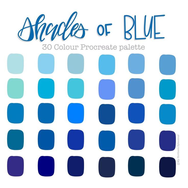 The level of intelligence and imagination of such people is not high, usually they are very limited people. Gray is usually not born, but becomes due to circumstances, the first lovers of this color are closed, quiet, timid people who trust few people. Gray lovers usually seek calmness in everything. In their opinion, there should be no unrest in life, so they avoid them. When making any decision, they will think and doubt for a long time.
They do not want to occupy leadership positions, as well as declare themselves, but they do their work honestly and conscientiously, although you will not get help from them. Also, "gray" people are very fond of personal space.
Dark gray lovers have an increased logic of thinking, they are very creative personalities. They solve the most difficult problems with ease. Also, lovers of this color love order, so everything is laid out on the shelves.
Light gray shades speak of reasonable, intelligent and impressionable personalities. Their openness allows them to quickly find friends. But it is difficult to communicate with such people, because they do not like restrictions and prohibitions, so they try to avoid even difficulties. The disadvantages of such people can be their absent-mindedness, but despite this, they always have a lot of ideas and plans. [3, c. 119]
Those who do not like this color are usually prone to impulsiveness and emotionality, frivolity.
Black color usually symbolizes a gloomy perception of life, but in fact there is a lot of fire, passion and rebellion hidden in it. A person who chooses this color is not self-confident, often prone to depression, unhappy. But his emotions are uncontrollable and unpredictable because they overwhelm him completely. The first goal pursued by black lovers is power. Power over people, power over your life, that is, complete control of circumstances. Their second goal is to hide their inner world, because this is the only way they feel safe. And in general, they like to be perceived as mysterious personalities, although there is no mystery in them either. Intimacy for "black" people plays an important role, as they are passionate personalities, love to love and be loved. [3, c. 176]
Lovers of black work consistently, they will always finish what they started. But such people do not need authorities, they are always guided by their opinion, because of this they often have problems. Such people are always ready for action, but never think about the consequences, because in their reality everything is much simpler than in reality. And their determination always helps to reach their goal. People who do not like the black color give the impression of eternally joyful and good-natured personalities. Usually this turns out to be just a mask, behind which some traumatic experiences for the individual are hidden. Most likely, such people feel uncomfortable in the company of people with sophisticated manners. They prefer sincere people who do not burden themselves and others with the conventions of social status.