Science primary colors
|
|
||||||||||||||||||||||||||||||||||||||||||||||||||||||||||||||||||||||||||||||||||||||||||||||||||||||||||||||||||||||||||||||
|
Primary ColorsThe human eye is sensitive to a narrow band of electromagnetic radiation that lies in the wavelength range between 400 and 700 nanometers, commonly known as the visible light spectrum. The colors red, green, and blue are classically considered the primary colors because they are fundamental to human vision. All other colors of the visible light spectrum can be produced by properly adding different combinations of these three colors. Moreover, adding equal amounts of red, green, and blue light produces white light and, therefore, these colors are also often described as the primary additive colors.
As illustrated by means of the overlapping color circles in Figure 1, if equal portions of green and blue light are added together, the resultant color is cyan. Similarly, equal portions of green and red light produce the color yellow, and equal portions of red and blue light yield the color magenta. The colors cyan, magenta, and yellow are commonly termed the complementary colors because each complements one of the primary colors, meaning that the two colors can combine to create white light.
The complementary colors (cyan, yellow, and magenta) are sometimes alternatively referred to as the subtractive primaries. This is because each one can be formed by subtracting one of the primary additives (red, green, and blue) from white light. For example, yellow light is seen when all blue light is removed from white light, magenta when green is removed, and cyan when red is removed. Consequently, when all three of the subtractive primary colors are combined, all of the additive primary colors are subtracted from white light, which results in black, the absence of all color. Thus far this discussion has centered on the properties of visible light with respect to the addition and subtraction of transmitted visible light, which is often visualized on the screen of a computer or television. In the first photograph on the left, a playing card, a green bell pepper, and a cluster of purple grapes are illuminated with white light and appear as one would expect to see them under natural lighting. In the second photograph, however, the objects are illuminated with red light. Note that the playing card reflects all of the light that strikes it, while only the grape stem and highlights on the grapes and pepper reflect the red light.
The human eye can perceive very slight differences in color and is believed to be capable of distinguishing between 8 to 12 million individual shades. Yet, most colors contain some proportion of all wavelengths in the visible spectrum. What really varies from color to color is the distribution of those wavelengths. Over the years, various classification systems have been devised to systematically express color in terms of these concepts. One of the most widely accepted has been the Munsell Color Tree, which appears below in Figure 3. As illustrated, each color in this system is represented by a distinct position on the tree. Hue color value is represented by placement on the circumference, saturation by the horizontal distance of the color from the central axis, and brightness by the vertical position on the trunk. When learning about color, it is also important to consider pigments and dyes, which are responsible for much of the color that appears on Earth. For instance, the natural protein pigments that are contained in eyes, skin, and hair reflect and absorb light in such a way that creates a beautiful diversity of appearances in the human race. In order to achieve a similar diversity of color in inanimate objects, such as automobiles, airplanes, and houses, they are frequently coated with pigment-containing paints and portray different shades through the process of color subtraction. Printed items, such as books, magazines, signs and billboards, create colors in the same fundamental way, but through the help of dyes or inks, rather than pigments. All color photographs, and other images that are printed or painted, are produced using just four colored inks or dyes--magenta, cyan, yellow (the subtractive primaries) and black. When an image is being prepared for printing in a book or magazine, it is first separated into the component subtractive primaries, either photographically or with a computer as illustrated above in Figure 4. Each separated component is then made into a film that is used to prepare a printing plate for that color. The final image is created by sequentially printing each color plate, one on top of another, using the appropriate ink to form a composite that recreates the appearance of the original. Paint is produced in a somewhat similar manner. Again, only the subtractive primaries and black are required. Base pigments containing these colors are mixed together to form the various colors used in final paint preparations.
A clear understanding of the color concepts previously discussed is extremely important when using a microscope to view and capture color images. Contributing Authors Mortimer Abramowitz - Olympus America, Inc., Two Corporate Center Drive., Melville, New York, 11747. Shannon H. Neaves and Michael W. Davidson - National High Magnetic Field Laboratory, 1800 East Paul Dirac Dr., The Florida State University, Tallahassee, Florida, 32310. BACK TO LIGHT AND COLOR Questions or comments? Send us an email.
© 1998-2022 by Michael W. Davidson and The Florida State University. All Rights Reserved. No images, graphics, scripts, or applets may be reproduced or used in any manner without permission from the copyright holders. Use of this website means you agree to all of the Legal Terms and Conditions set forth by the owners.This website is maintained by ourGraphics & Web Programming Team in collaboration with Optical Microscopy at the National High Magnetic Field Laboratory. Last modification: Friday, May 20, 2016 at 09:22 AMAccess Count Since March 10, 2003: 185535Visit the websites of our partners in education: |
|||||||||||||||||||||||||||||||||||||||||||||||||||||||||||||||||||||||||||||||||||||||||||||||||||||||||||||||||||||||||||||
 For instance, yellow (red plus green) is the complement of blue because when the two colors are added together white light is produced. In the same way cyan (green plus blue) is the complement of red, and magenta (red plus blue) is the complement of green light.
 Most of what is actually seen in the real world, however, is light that is reflected from surrounding objects, such as people, buildings, automobiles, and landscapes. These objects do not produce light themselves, but emit color through a process known as color subtraction in which certain wavelengths of light are subtracted, or absorbed, and others are reflected. For instance, a cherry appears red in natural sunlight because it is reflecting red wavelengths and absorbing all other colors. The series of photographs presented below in Figure 2 helps further illustrate this concept.
 The majority of the red light is being absorbed by the grapes and pepper. The third photograph shows the objects under green illumination. The different radiation wavelength causes the symbols on the playing card to appear black and the body of the card to reflect green light. The grapes reflect some green light, while the pepper appears normal, but with green highlights. The fourth photograph illustrates the objects under blue illumination. In this situation, the grape cluster appears normal with blue highlights, but the stem is invisible because it blends into the black background. The body of the playing card reflects blue light and the symbols appear black, while the pepper only reflects blue light as highlights.
 The predominant wavelengths of a color determine its basic hue, which can be, for example, purple or orange. It is the ratio of the dominant wavelengths to other wavelengths, however, that determines the color saturation of the sample and whether it appears pale or deeply saturated. The intensity of the color and reflectivity of the object being imaged, on the other hand, determine the brightness of the color, which controls, for instance, whether something appears dark or light blue.
 Mixing inks or dyes of these colors in differing proportions can produce the colors necessary to reproduce almost any image or color. The three subtractive primaries could, in theory, be used alone. However, the limitations of most dyes and inks make it necessary to add black to achieve true color tones.
 Microscope light sources are usually tungsten-halogen bulbs that can emit a bright light with a color temperature around 3200 Kelvin. To the observer, this appears as white light that can be absorbed, refracted, reflected, polarized, and/or transmitted by a specimen on the microscope stage. The rules of primary colors apply to how the specimen interacts with microscope light and what colors are displayed as the sample is visualized in the eyepieces. The same rules also apply to the film used to capture photomicrographs.
Why are red, yellow, and blue the primary colors in painting but computer screens use red, green, and blue?
Category: Biology Published: January 22, 2015
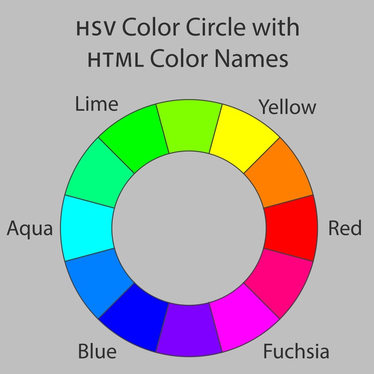
The color system that best matches the human eye is the red-green-blue color system. For additive color systems like computer screens, the primary colors of this type of system are red, green, and blue. For subtractive color systems like inks, the primary colors of this type of system are the opposites of red, green, and blue, which are cyan, magenta, and yellow. The red-yellow-blue painting color system is effectively a corruption of the cyan-magenta-yellow system, since cyan is close to blue and magenta is close to red. Public Domain Image, source: Christopher S. Baird.
Red, yellow, and blue are not the main primary colors of painting, and in fact are not very good primary colors for any application.
First of all, you can define any colors you want to be the "primary colors" of your color system, so that other colors are obtained by mixing the primary colors. Although there may be an infinite number of color systems, they are not all equally useful, practical, or effective. For instance, I am free to create a color system where I define light blue, medium blue, and violet as my primary colors.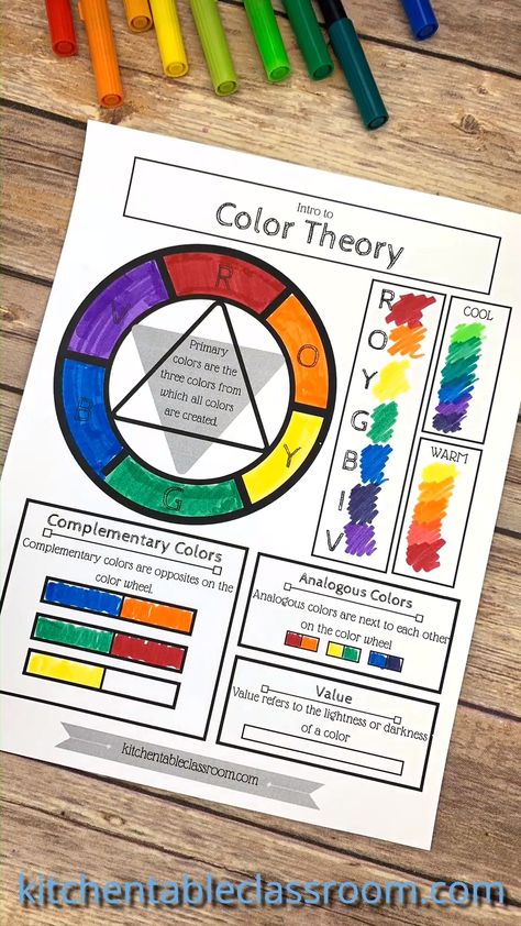 Even though I am free to define my primary colors as such, this color system is not very useful in general because no amount of mixing of these primary colors will produce red, orange, yellow, etc. Therefore, we should make a distinction between a color system and an effective color system. The effectiveness of a color system is best measured as the number of different colors that can be created by mixing the primary colors of the system. This set of colors is called the "color gamut" of the system. A color system with a large gamut is more able to effectively represent a wide variety of images containing different colors.
The most effective color systems are those that closely match the physical workings of the human eye, since it is ultimately the human eye which experiences the color. The human eye contains a curved array of light-sensing cells shaped like little cones and rods. Colored light is detected by the cone cells. The cone cells come in three varieties: red-detecting, green-detecting, and blue-detecting. They are so named because the red cone cells mostly detect red light, the green cone cells mostly detect green light, and the blue cone cells mostly detect blue light. Note that even though a red cone cell predominantly detects the color red, it can also detect a little bit of some other colors. Therefore, even though humans do not have yellow cone cells, we can still see yellow light when it triggers a red cone cell and a green cone cell. In this way, humans have a built-in color decoding mechanism which enables us to experience millions of colors, although we only have vision cells that predominantly see red, green, and blue. It should be obvious at this point that the most effective color systems are ones that closely match the human eye, i.e. color systems that mix red, green, and blue light.
There is a slight complication because there are really two main ways to create a light beam. We can either create the light directly using light sources or we can reflect white light off of a material that absorbs certain colors. A system that creates light directly is called an "additive" color system since the colors from the different light sources add together to give the final beam of light. Examples of additive color systems are computer screens. Each image pixel of a computer screen is just a small collection of light sources emitting different colors. If you display an image of a pumpkin on your computer screen, you have not really turned on any orange-emitting light sources in the screen. Rather, you have turned on tiny red-emitting light sources as well as tiny green-emitting light sources in the screen, and the red and green light add together to make orange.
The top image shows how red, green, and blue add to make other colors, such as in computer screens. The bottom image shows how cyan, magenta, and yellow subtract to make other colors, such as in inks. Public Domain Image, source: Christopher S. Baird.
In contrast to an additive system, color systems that remove colors through absorption are called "subtractive" color systems.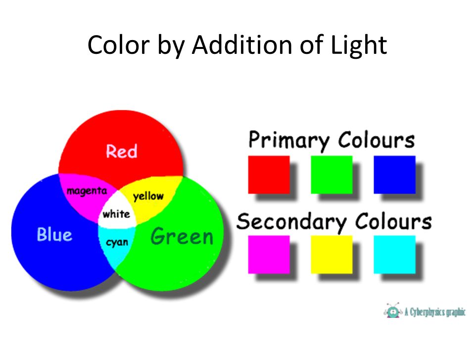 They are called this because the final color is achieved by starting with white light (which contains all colors) and then subtracting away certain colors, leaving other colors. Examples of subtractive color systems are paints, pigments, and inks. An orange pumpkin that you see printed in a newspaper is not necessarily created by spraying orange ink on the paper. Rather, yellow ink and magenta ink are sprayed onto the paper. The yellow ink absorbs blue light and a little green and red from the white light beam, while the magenta ink absorbs green light and a little blue and red, leaving only orange to be reflected back.
There are therefore two equally-valid methods for creating color: additive systems and subtractive systems. With this in mind, there are thus two color systems that are most effective (i.e. most able to match the human eye): (1) an additive system that creates red, green, and blue light and, (2) a subtractive system that creates red, green, and blue light.
For an additive system, light is created directly. This means that the primary colors of the most effective additive color system are simply red, green, and blue (RGB). This is why most computer screens, from iPods to televisions, contain a grid of little red-, green-, and blue-emitting light sources.
For a subtractive color system, a certain reflected color is obtained by absorbing the opposite color. Therefore, the primary colors of the most effective subtractive system are the opposites of red, green, and blue, which happen to be cyan, magenta, and yellow (CMY). This is why most printed images contain a grid of little cyan, magenta, and yellow dots of ink. Cyan is the opposite of red and is halfway between green and blue. Magenta is the opposite of green and is halfway between blue and red, and yellow is the opposite of blue and is halfway between red and green.
In summary, the most effective color systems are red-green-blue for additive color systems and cyan-magenta-yellow for subtractive color systems.
So where did the red-yellow-blue color system come from that they teach in elementary school? Typically, students first encounter color concepts when painting in an art class in grade school. Paint is a subtractive color system, and therefore the most effective primary colors for painting are cyan, magenta, and yellow. Note that high-quality paintings typically do not use just three primary colors since more vivid scenes can be achieved using dozens of primary colors. But when teaching art, it's easier to start more simply; with just three primary colors. Now, to a little grade-schooler, the words "cyan" and "magenta" don't mean much. Furthermore, to an undiscerning youngster's eye, cyan looks awfully close to blue and magenta looks awfully close to red. Therefore, cyan-magneta-yellow becomes corrupted to blue-red-yellow. Elementary art teachers either ignorantly perpetuate this less effective color model (because that's how they were taught as children), or intentionally perpetuate it (because it's just too hard to teach six-year-old's the difference between cyan and blue). Historical tradition was also a prime driver of the red-yellow-blue color system since it was historically thought to be effective before the details of human vision were understood.
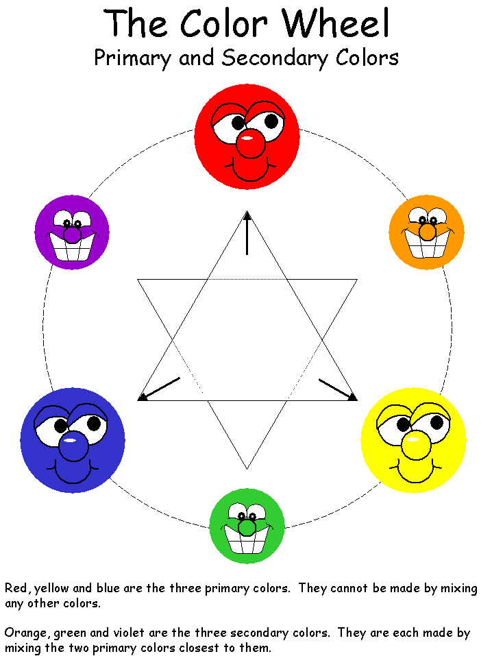 Since the red-yellow-blue color system is less effective, it is not really used anywhere these days except in elementary school art.
Topics: CMY, RGB, color, color mixing, color theory, light, primary color, primary colors, vision
3. The main stages in the history of the development of the science of color
-
Development color sciences in XVII c. I. Newton's discoveries..
Pursuing telescope improvements. Newton paid attention to that. what image, given by the lens is colored around the edges. He became interested in this and the first "explored the diversity of light rays and the resulting singularities flowers like no one had ever seen before suspected" (words from the inscription on tombstone of Newton). Rainbow coloring of the image given by the lens, observed, of course, before him. It was it is also noticed that iridescent edges have objects viewed through a prism. A beam of light rays passing through prism, painted around the edges.
Newton I guessed to send to the prism of light beam of small cross section. bundle sunlight passed into the darkened room through a small hole in shutter. Falling on a glass prism, he refracted and gave on the opposite wall elongated image with iridescent color alternation. stylized a depiction of Newton's experience is shown in Figure 16. Following a centuries-old tradition, according to which the rainbow was considered consisting of seven primary colors. Newton also identified seven colors: purple, blue, cyan, green, yellow, orange and red. Samu Newton called the rainbow strip the spectrum.
|
|
Rice. 16
Closing red glass hole. Newton I saw only a red spot on the wall, closing with blue glass, observed the blue spot, etc. It followed from this that not prism colors white light assumed before. Prism does not change light, but only decomposes it into its constituent parts (see fig. I).
|
|
Rice. I. Scheme of white light decomposition using prisms. Different colors match waves of various lengths. No definite does not match the wavelength of white light.
White light has a complex structure. Out of him you can select bunches of different colors, and only their joint action causes we have the impression of white. In the very Indeed, if with the help of the second prism, rotated 180° relative to the first, collect all the beams of the spectrum, then again white light will be obtained (see fig. II). Highlighting any part of the spectrum, for example green, and making the light go on through one prism, we will no longer receive further color change.
|
|
Rice.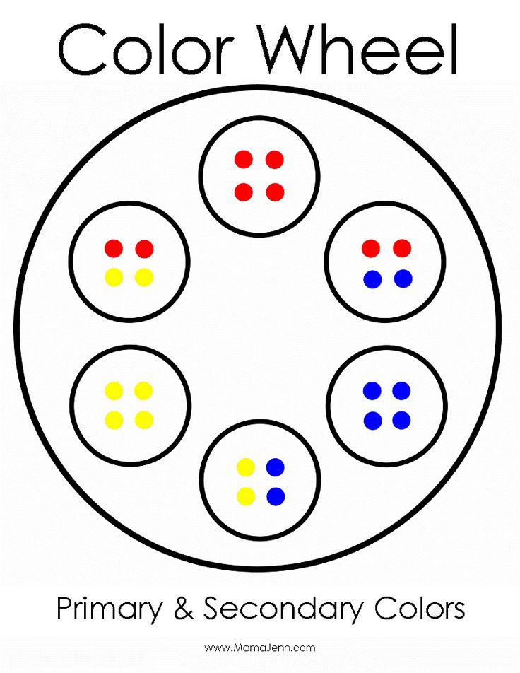 II. Decomposition and synthesis of white light with using prisms.
Another Newton's important conclusion formulated in a treatise on "Optics" as follows: "Light bundles that differ in color are different according to the degree of refraction "(for them glass has different characteristics refraction). Most strongly refracted violet rays, less than others - red. Refractive index dependence light from its colors Newton named dispersion
Considering historical development of the science of color, three main periods can be distinguished which are different interpretation of the nature of color. The first characterized by a lack of precise scientific approach to natural phenomena; the second is the period of scientific knowledge various private areas and, finally, the third is the period of creation of scientific systems.
At first acquaintance with the doctrine of color seems strange that its development so little influence was exerted by the artists.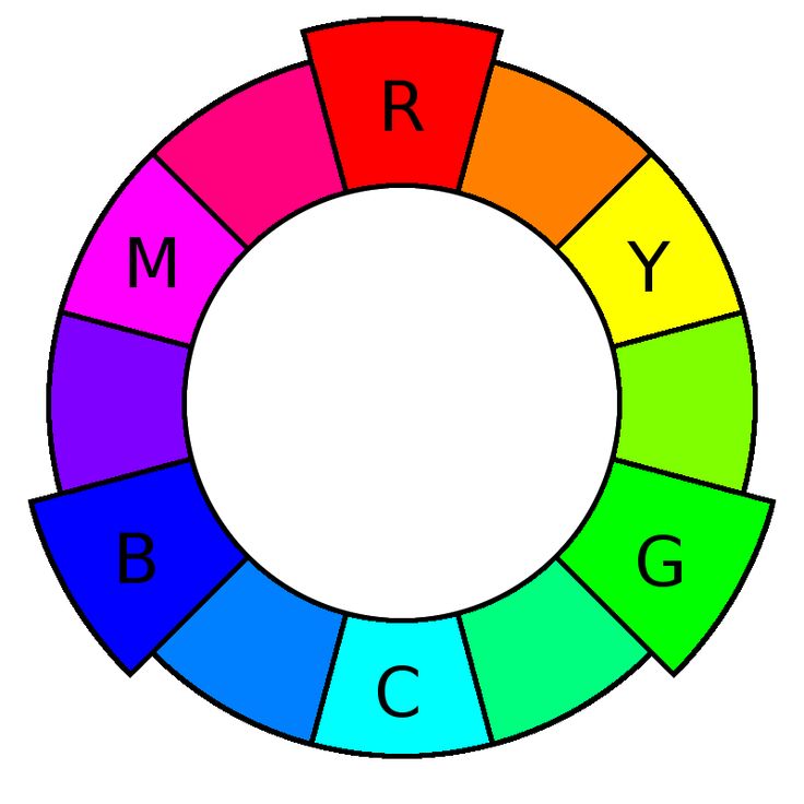 But a historical overview of this doctrine shows how closely the problem colors are related to issues of light, vision and with the area of emotional human experiences.
By studying dealt with these issues at the time philosophy and only later - natural and technical sciences.
AT era of antiquity and the Middle Ages significant progress has been made in the use of color. Explained it's mostly subtle feeling colors; about the nature of the same color in those days there were only very vague ideas.
Only Isaac Newton put an end to it pre-scientific period in the history of development teachings about color and created the foundation for this doctrine based on laws natural sciences. This first step, of course, could not prevent the fact that in the future time still often met unscientific ideas about color.
AT teachings about color are intertwined philosophical, aesthetic and natural sciences Problems.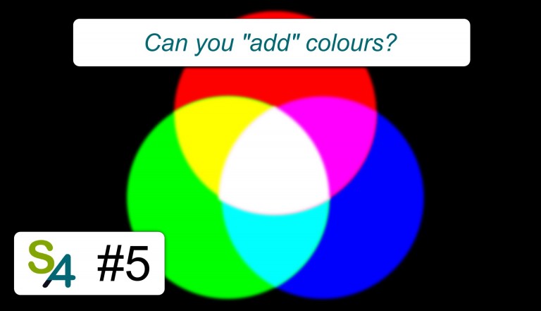 Very difficult to study color issues the fact that all these sciences have different ways of looking at phenomena, different research methods and, Finally, different terminology.
Third, modern period (starting with Wilhelm Ostwald) is characterized by the development comprehensive theory, improvement colorimetry (color measurements), color organization, and accumulated considerable experience in areas of color design space. This creates an opportunity for scientific reasoned, purposeful applying color in all those areas, where there is a need for color decoration.
Visible radiation - electromagnetic waves perceived by the human eye [1] . Sensitivity of the human eye to electromagnetic radiation depends from length waves (frequencies) radiation, while the maximum sensitivity falls on 555nm (540 terahertz), in the green part of the spectrum .
First explanation of the spectrum of visible radiation gave Isaac Newton in book "Optics" and Johann Goethe in work "The Theory of Flowers".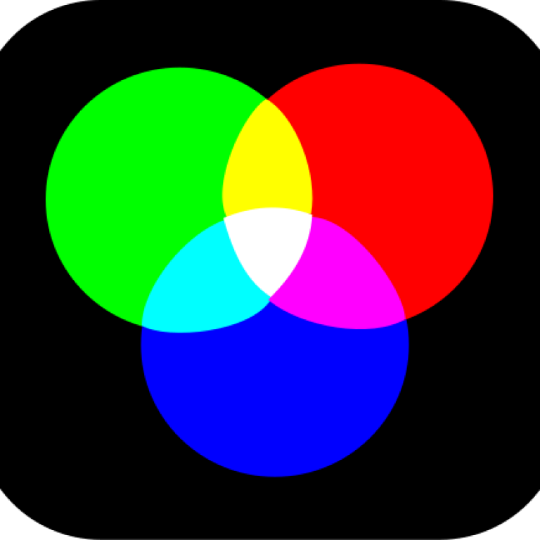 Newton first used the word spectrum (lat. spectrum — vision, appearance) in print in 1671 year, describing their optical experiments. He made an observation that when a beam of light hits a surface glass prism at an angle to the surface, some of the light is reflected and some is transmitted through the glass, forming multi-colored stripes. The scientist suggested that light consists of a stream of particles (corpuscles) different colors, and that particles of different colors move at different speeds in a transparent environment. According to his assumption, the red light was moving faster than purple, hence the red beam deflected on the prism is not as strong as violet. Because of this, there was visible spectrum of colors.
Newton divided the world into seven colors: red, orange, yellow, green, blue, indigo and purple. The number seven he chose out of conviction (derived from ancient Greek sophists) that there is a connection between flowers, musical notes, objects of the Solar systems and days of the week [6][8] .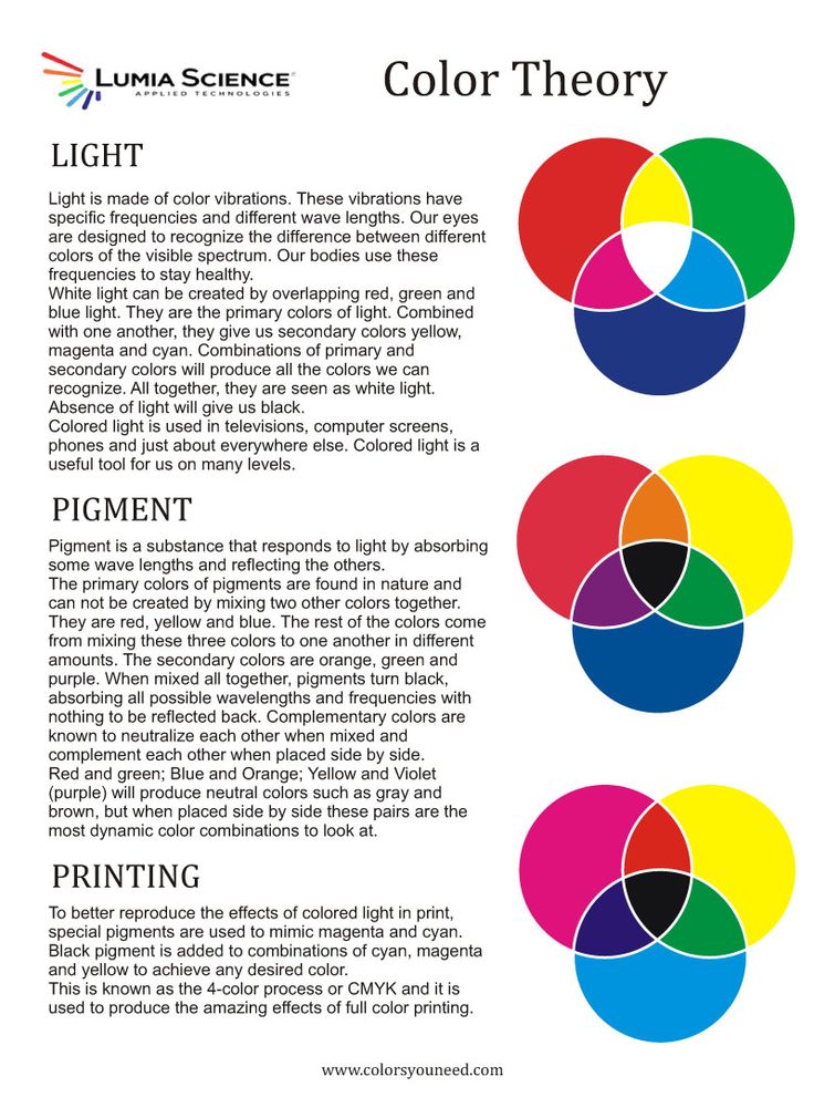 The human eye is relatively weak receptive to indigo color frequencies, so some people can't tell the difference it from blue or purple. Therefore, after Newton, it was often proposed consider indigo not independent color, but only a shade of purple or blue (however it is still included to the spectrum in the Western tradition). In Russian Indigo tradition corresponds to the color blue.
At decomposition of a white beam in a prism a spectrum is formed in which the radiation different wavelengths are refracted under different angles. The colors in the spectrum that is, colors that can be obtained with light of one length waves (more precisely, with a very narrow range wavelengths) are called spectral flowers [12] . Primary spectral colors (having own name) and emission characteristics of these colors, presented in the table ( in example 2 colors suggest) :
| Color | Range wavelength, nm | Range frequencies, THz | Range photon energy, eV |
| Violet | 380-440 | 680-790 | 2. |
| Blue | 440-485 | 620-680 | 2.56-2.82 |
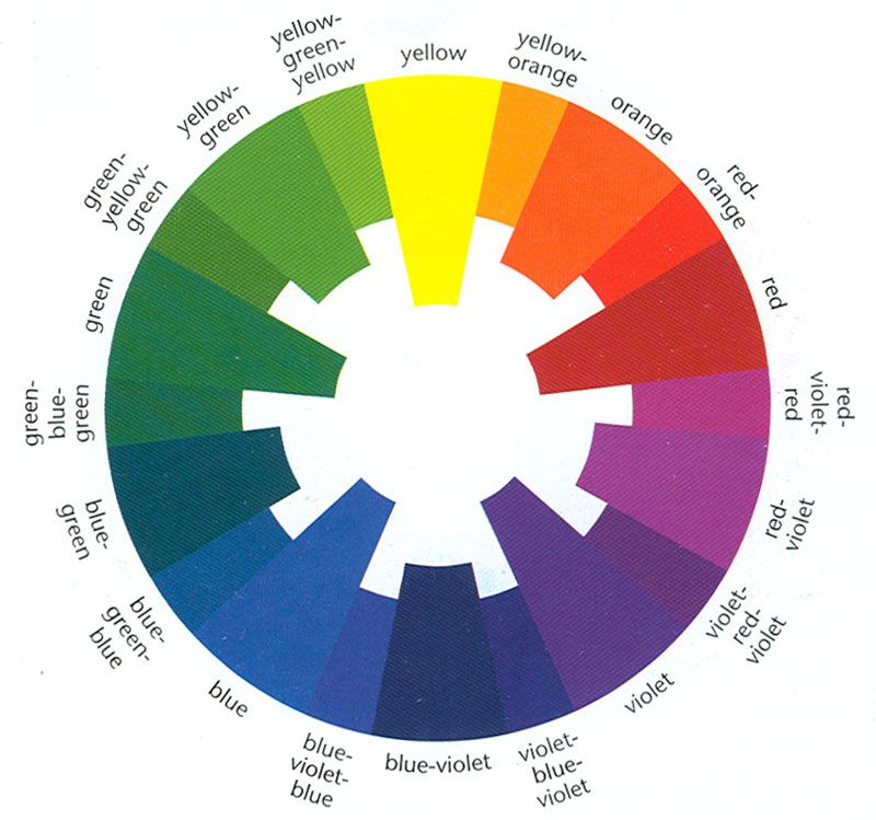 82-3.26
 Ticket 5
Relative brightness
brightness (relative brightness) is the ratio the amount of light reflected from given surface, to the magnitude of the flow light falling on her. measured reflection coefficient ρ (rho). Comfortable measure brightness with a scale achromatic (gray) colors, reflectance of which is measured in advance with a leukometer, photometer. Saturation, or purity, colors depend on the degree "dilution" of the spectral color tones in white, black or gray (times -
personal lightness). The more "impurity" of white (or gray), the less saturated -
pure is the color tone. He brightens or darker than 100% pure color tone. For example, green color having a color tone λD - 530 nm and saturation (purity) - 0. 7, represents is a spectral color tone with a length wavelength 530 nm, consisting of 70% pure green (given color tone
) and 30% white.
Maximum saturation colors is spectrum and magenta colors (non-spectral).
Colors with a strong chromaticity are called n and with y-
u e n n y m i.
M well saturated colors are colors that "diluted" to some extent achromatic, for example: pale green, pale blue, light lilac, pink, light orange, beige, a also dark blue, brown, dark green, dark red, gray purple, dark brown, grey-blue, cherry-black.
Quality characteristics of chromatic colors is
chromaticity: hue and saturation (purity), achromatic
colors - only lightness. Saturation colors (as well as brightness) are not the same in relation to each other. Yellow least saturated in the spectrum, towards the edges spectrum saturation increases. But on lightness (brightness) yellow dominates over other spectral colors.
Achromatic (i. e. colorless) color - name illogical, but accepted and established in floristry. From the point of view of the spectral color theory is a misnomer achromatic flowers (black, grey, white) flowers, since they are devoid of main characteristic of chromatic colors - color tone, as well as saturation. If the purity of chromatic spectral colors is 100%, then the purity hue and saturation achromatic colors is 0. Therefore cannot be taken literally collocations: white, grey, black colors, but to such phrases accustomed to, they are comfortable in conversational and professional vocabulary, and therefore established themselves in floriculture. Mixing chromatic and achromatic colors forms the whole wealth of complex (mixed) colors and their shades observed by us in nature and man-made object-spatial environment. it beige, brown, olive, green-brown, bluish and reddish brown, all colors shades of gray (with different amounts gray of different lightness in mixtures with chromatic colors) and many others colors.
Relationship basic color characteristics be presented in conditional graphics color coordinate systems space.
Ticket 6
Concept "degree of whiteness", in what units it is measured. Give examples substances with different degrees of whiteness.
WHITE. The term whiteness in its content close to the concepts of brightness and lightness, however, unlike them, it contains a shade of high-quality and, even in some measure of aesthetic characteristics. What is whiteness? If lightness characterizes perception of brightness, then whiteness characterizes the perception of reflective capabilities. The larger the surface reflects the incident light, so it will whiter. Theoretically, this surface reflecting all the rays falling on it, however, in practice, such surfaces does not exist.
Body, which does not reflect light at all, called absolutely black. But this too theoretical concept. Because blackness visible, which means it reflects at least some bit of light.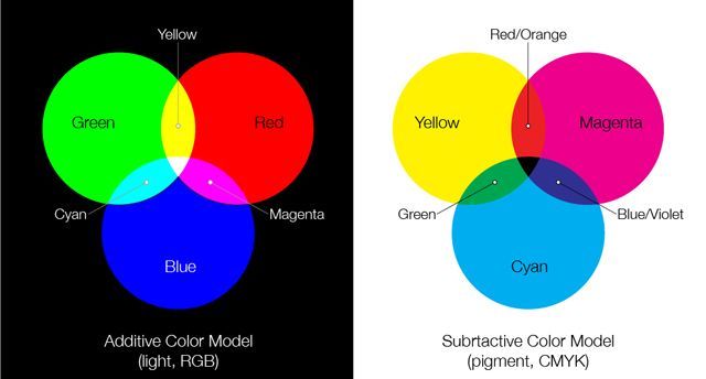
Artist Evans defined as follows difference between white, gray and black: “White is a phenomenon related to completely to the perception of the surface, gray - perception of relative surface lightness, black - positive perception of insufficiency incentive to ensure adequate vision."
On practice achromatic colors at comparison always have some color shades.
PERMANENT WHITENESS. The phenomenon of color constancy or light comes down to the fact that, despite to volatility and volatility light received by the retina signals, in perception we get more or less permanent image corresponding to real object.
White a sheet of paper is perceived as white, and in weakly, and in a brightly lit room.
Visual the evaluation of the surface whiteness depends, thus, from the amount of light, reflected by the surface, and from the installation perception.
Ticket 7
Color tone
COLOR TONE. The fact that artists, and ordinary people, called a color, in color science it is called color tone. So, for example, they say about color and tonal relationships. Such the use of the term color excludes the ability to see in it at the same time and color and light. We have chromatic and achromatic colors. Color tone is general concept and rather does not refer to a separate color spot, but to the subject in general, in our individual vision. This concept can be applied in the sense of: good in color, does not feel color and etc. By hue we mean that which allows us any chromatic color attributed by similarity to that or a different color of the spectrum ... Grass - green, rye is yellow, the sky is blue.
If lightness depends on the amount of reflection colorful spot of radiant energy, then color tone is mainly determined wave composition of the reflected light flow.
Color - the property of bodies to create certain visual sensations depending on reflected wavelength. Lightness - quantitative characteristic, and color tone - qualitative, characterizing monochrome of the reflected wave.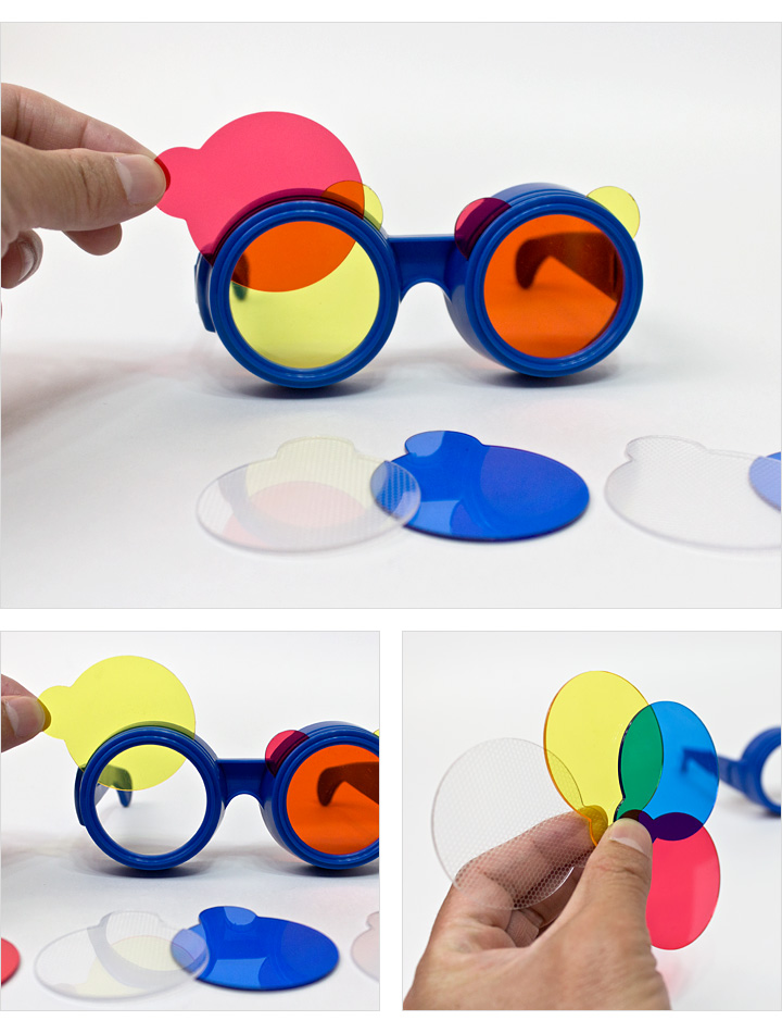 Terms lightness and hue are closely related in its content with the concepts of light and color.
Ticket 8
Lightness
Lightness-degree difference between this color and black measured by the number of discrimination thresholds from this color to dark. Lightness- it is a sign that determines the color as light or dark. In the color wheel yellow has more lightness, and the smallest purple.
LIGHT or TON. Any colors and shades can be compare by lightness, that is, determine which one is darker and which one is lighter. Lightness is a quality inherent in both chromatic and achromatic flowers. Any chromatic color can be compare in lightness with achromatic color.
Various variants of paint of the same color, but strengthened or weakened, are called shades or tones. Under the tone mean the amount of light reflected by the surface. Tone - quantity light contained in a given color. Tone, that is, the degree of light saturation, and lightness is known to be integral quality of any color.
Simple and a clear description lightness in relation to the color gave German scientist who studies colors, Ostwald, who believed that lightness of each color spot depends on two components - lightness achromatic gray, which is in all colors, and from your own lightness color rays. We can say that the color the same color can be lighter and darker without changing color. Alberti by wrote on this occasion: “The admixture of white is not changes the kind of color, but creates it varieties." The difference in lightness gives and creates a sense of volume.
-
What is chromatic and achromatic colors?
Such colors like black, white and gray are called achromatic . They have only one characteristic. - lightness. Basically, determined the amount reflected from the surface Sveta. Depending on the illumination and ability of a surface to reflect color in one quantity or another, you can make a certain range of achromatic tones, starting with white and ending black.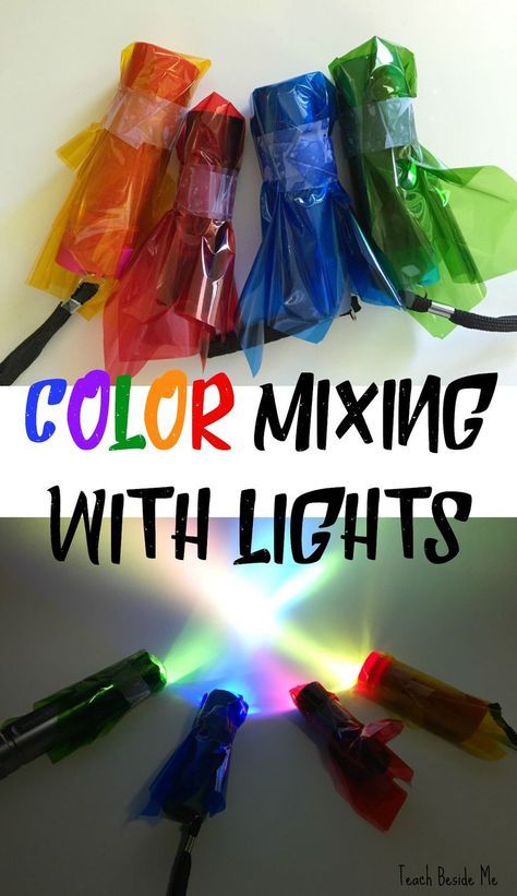 The paradoxical names "achromatic color" is that this word translates as "colorless color"
Really, on the one hand, black-white-gray can see it as the opposite color, and on the other hand, we we have, like other colors, but, therefore, there is no reason not to consider them also colors like everyone else colors.
Black gradation and white are called achromatic ( " off-color " ).
Chromatic are the seven basic tones of the light spectrum - red, orange, yellow, green, blue, blue, purple.
Chromatic are also all derivatives of the seven tones of the spectrum, except for mixing additional, destroying each other.
Each chromatic tone (part of the color spectrum) characterized by a certain length wave oscillations of the electromagnetic field earth. The human eye perceives light reflected by the surface material bodies, and since each surface (in dependence on physical and chemical body properties) reflects only a certain range oscillations of the electromagnetic field, we we see these surfaces painted.
The qualities of chromatic tones are determined concepts: saturation, brightness, lightness.
* Chromatism was the name given to the course of Impressionism during French painting in the late XIX - early XX century
Separation colors into chromatic and achromatic practically necessary.
Located in descending order of lightness (from lightest achromatic color) form a series, in which can be divided into 5 main steps:
-
black
-
dark gray
-
gray
-
light gray
-
white
*For scientific purposes achromatic series much more varied.
-
Basic color characteristics.
Study ancient stone age cultures show that already at that time people gave special importance to three colors: red, black and white. These colors had a symbolic and magical meaning. At North American Indians the universe is served by the number 4 (the world It has four cardinal directions) and the number of symbolic There are also four colors: white, red, black and blue.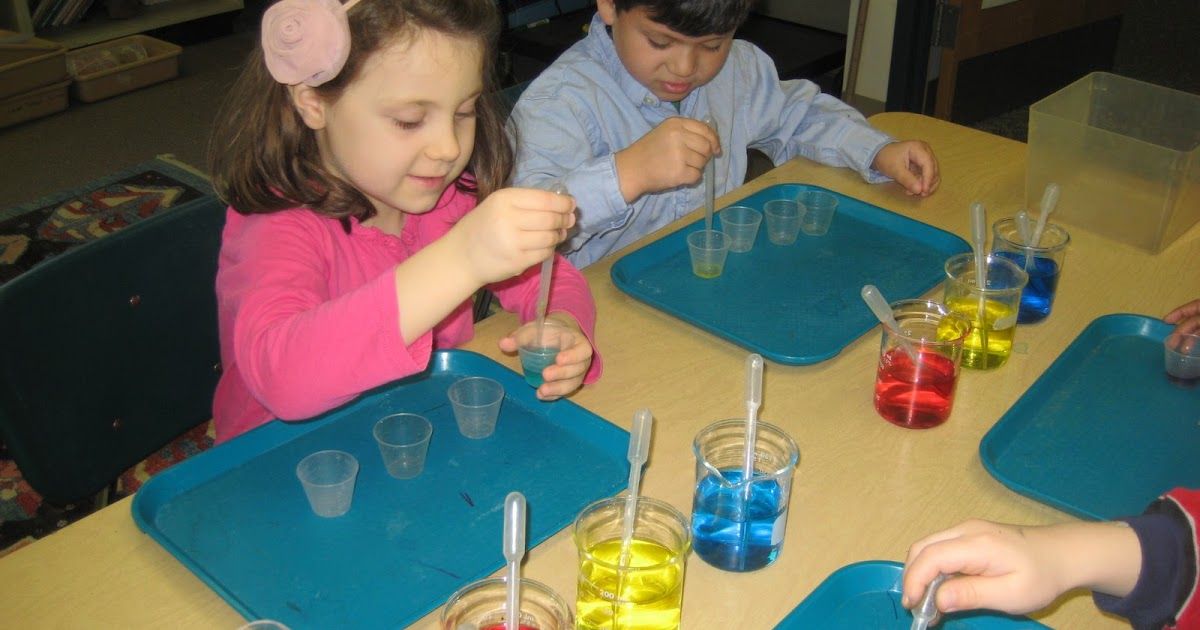 Among the ancient peoples of the East (China, India) art flourishes, the space system develops, and together with her - color. In ancient China's main "space-forming" number becomes 5. 1. Green - blue: spring, tree, east, jupiter, The Dragon. 2. Red: summer, fire, south, Mars, Phoenix. 3. White: autumn, metal, west, Venus, Tiger. 4. Black: winter, water, north, Mercury, Turtle. 5. Yellow: end of summer, earth, center, Saturn, Snake. AT ancient egypt color system has 6 colors: red, yellow, green, blue, white, black. In ancient Greece by four primary colors considered: black, red, white, yellow. Of course, the ancient Greeks distinguished green and blue colors and enjoyed them, but not considered them to be the main ones, because did not give them a "cosmic" meaning. So, the color systems of the ancient world can be called mythological. But already in ancient Greece appears attempt to classify colors on natural scientific principles. Great Greek thinker Aristotle noticed that the color is the tightest connected in a way with light and impossible without Sveta.
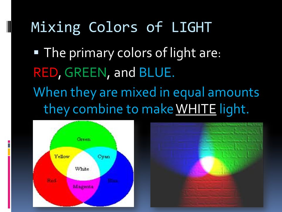 Various chromatic colors are different degrees confusion light with darkness. White, black and all gray are called achromatic flowers.
Color - one of the main visual characteristics the environment, perceived human consciousness, means identification of its properties, formation visual and emotional images that give an objective useful information about the environment and influencing biological state and psychological human tone.
*Color, so it has a physical nature, and its aesthetic qualities perceptions depend on comparisons, comparisons.
Fundamentals of color science - Studiopedia
Share
Architectural tools. Color Science
LECTURE SUMMARY
II course
(spring semester)
Lecturer:
Ph.D. arch., associate professor
Puntus V.A.
St. Petersburg
2010
Lecture No. 1 harmony, color language, color harmony and color culture.
Color is a feeling that occurs in the organ of vision when exposed to light, i.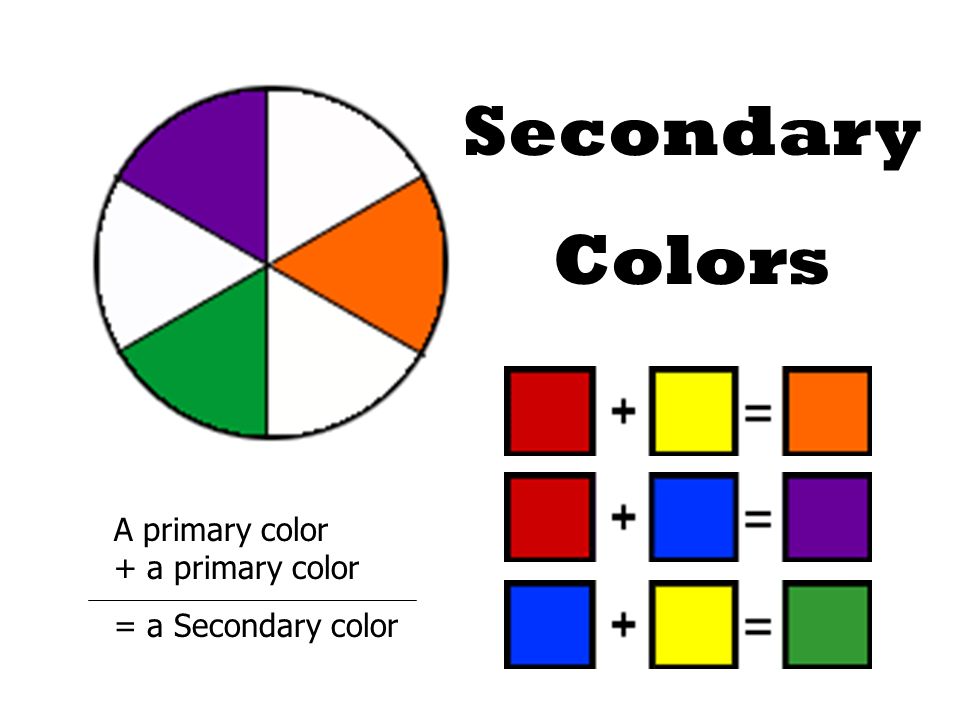 e. light + vision = color.
The colors are divided into:
§ Cool colors are blue-violet to yellow-green.
§ Warm colors are those located in the chromatic circle, starting with yellow and ending with red-violet.
Also, all colors are divided into: chromatic, achromatic, semi-chromatic.
Achromatic - white, black, and all shades of grey.
Chromatic colors - all spectral and many natural.
Semi-chromatic colors - earth colors, i.e. colors mixed with achromatic colors.
In the history of color science, it is customary to distinguish two stages of color classification: before the 17th century and the 17th century - today .
In the first mythological stage 3 colors stood out: red, white, black (blood, milk, earth). AT Ancient Egypt The relationship to color depends on how sunny it is. Basically, the Egyptians distinguished the following colors: ocher, blue, gold and green.
During the period Greco-Roman antiquity in the 5th c. BC. Empedocles claimed that the universe is made up of: water (black), air (white), fire (red), and earth (yellow, ochre). And everything else is obtained by mixing these four elements. Aristotle singled out 3 primary colors: white (water, air, earth), yellow (fire), black (destruction, transition state).
And Planid in his "Natural History" identified 4 primary colors: red, white, yellow and black. Empedocles and Planides used visual impressions to determine the primary colors, while Aristotle determined them experimentally.
Western Europe of the Middle Ages is characterized by color symbolism. White color symbolizes Christ, God, angels, is a pure immaculate color. Yellow is a symbol of enlightenment, the action of the Holy Spirit. Red - fire, sun, blood of Christ. Blue is the color of the sky, the abode of the Lord. Green is the color of food, vegetation, the earthly path of Christ. Black is an underground color, the color of evil, the Antichrist.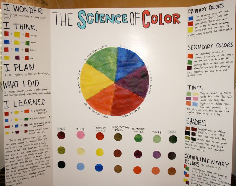
Purple is the color of contradictions. Also quite interesting is the anti-system of colors, which included "extinguished" colors, i.e. any color combined with brown. In the Near and Middle East in the Middle Ages the idea of color develops under the sign of Islam. Since the 7th century, the same colors have been valued as in Western Europe, only green stands out: this is the color of the Garden of Eden. Favorite type of color composition - multicolor or polychromy. During the Renaissance , the ancient and medieval color classifications became widespread in Europe, supplemented by Leonardo da Vinci's "almost painterly" color system, which was based on the minimum palette of the painter. Leonardo Da Vinci believed that there were 6 primary colors: red, yellow, green, blue, white, black.
In the XVII-XIX centuries in Europe a new stage begins in the history of color classification. The foundations of modern scientific concepts of color were laid by I. Newton in his work “The New Theory of Light and Color” published by him in 1672. Newton introduces the scientific symbolism of the separation of colors into two parts: objective (physical) and subjective, associated with sensory perception.
After receiving the solar spectrum and giving an explanation of its nature, Newton laid the foundation for a linear systematization of colors. He divided these colors into homogeneous (primary, or simple) and heterogeneous (derivatives). Seven "simple" spectral colors and one - purple, formed by mixing the extreme colors of the spectrum, served as the basis for the systematics of colors in the form of a circle.
In the 17th century Europe dominated by two styles: 1) Baroque: the superiority of color is praised. 2) Classicism: only shades of colors are valued, the basis is muted colors.
In the 18th century baroque turns into rococo. There is an attraction to the asymmetry of the composition, decor (soft detailing of forms), a combination of bright and pure tones of color with white and gold.
Goethe at the end of the century proposed a new way of classifying colors according to the physiological principle. Colors: red, orange, yellow, green, blue, purple.
The triangle shows the three primary colors used by artists. The remaining colors (orange, green, purple) are obtained by mixing the primary ones.
In the 19th century, romanticism emerged in Europe. Subsequently, its occurrence leads to the emergence of two opposite directions: naturalism (meticulous transmission of all colors, tones, shades) and impressionism (transmission of images).
At the same time, Goethe's contemporary Philipp Otto Runge developed his color classification system using the principle of a globe or ball.
Figure 4. Classification of colors according to the globe principle
or ball.
A twelve-colored natural circle is placed around the equator, the upper pole is covered with white, the lower - with black.
Between the pure, variegated colors of the equator and the non-colored poles, there are mixtures of respectively pure paint with white (pastel colors at the top of the ball) or black (dark shades or darkenings at the bottom of the ball). Each point on this colored globe can be conditioned by longitude and latitude, which makes it possible to determine the name of the color by means of the corresponding number system. In such a system, he provided for all the transitions from any color to any.
In the Art Nouveau era color becomes a symbol. Features of Art Nouveau aesthetics:
1) Preference for muted, dark colors, complex nuances, many shades with a narrow palette, the addition of metallic pigments (gold, silver, bronze)
2) Color becomes more a means of expression than imitation.
3) Indicates the tendency of the color to approach the music.
Scientist Ostwald improved the Runge sphere system. He takes a circle, divides it into 24 parts, paints each spectrum in a certain color, but represents all colors in the form of a closed color body, consisting of two cones united by a common base. The single axis of the cones is an achromatic series: the upper point is white, the lower one is black.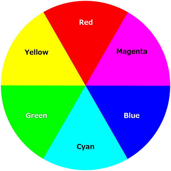
Around the circumference of the base are the most saturated spectral colors (colors of the rainbow), which are arranged in a certain sequence: red - orange - yellow - green - blue - blue - violet. ("Every hunter wants to know where the pheasant sits").
To determine the color, a system of psychophysical characteristics is performed. These are:
§ Hue is the quality of a color when this color can be equated to one of the spectral colors. In other words, it is the name of the color itself.
§ Lightness - (degree of color difference from white) - quantitative differences within the same color. This is the presence in the color of one or another amount of white or black.
§ Relative brightness is the ratio of the amount of flux reflected from a given surface to the amount of flux incident on it.
§ Saturation - (the degree of difference of color from equal lightness gray) - the degree of difference between a chromatic color and an equal lightness achromatic color.