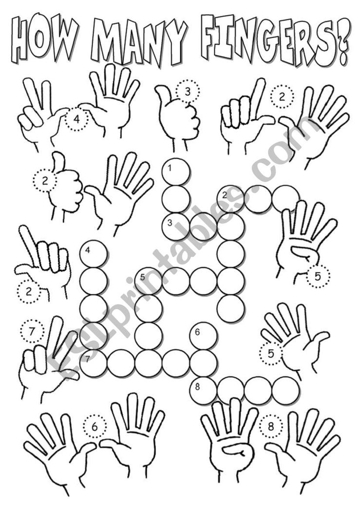
How to learn color
Color Theory - Understanding the 7 fundamentals of color
Logos, websites & more…
Logos, websites, book covers & more…
Get a design
Color theory is both the science and art of using color. It explains how humans perceive color; and the visual effects of how colors mix, match or contrast with each other. Color theory also involves the messages colors communicate; and the methods used to replicate color.
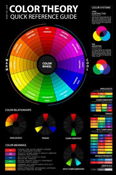
In color theory, colors are organized on a color wheel and grouped into 3 categories: primary colors, secondary colors and tertiary colors. More on that later.
Via unsplashSo why should you care about color theory as an entrepreneur? Why can’t you just slap some red on your packaging and be done with it? It worked for Coke, right?
Color theory will help you build your brand. And that will help you get more sales.
Let’s see how it all works:
- RGB: the additive color mixing model
- CMYK: the subtractive color mixing model
- Color wheel basics
- Hue, shade, tint, tone
- Complementary colors
- Analogous colors
- Triadic colors
- Why color theory is important
Understanding color
–
People decide whether or not they like a product in 90 seconds or less.90% of that decision is based solely on color.
Color is perception. Our eyes see something (the sky, for example), and data sent from our eyes to our brains tells us it’s a certain color (blue). Objects reflect light in different combinations of wavelengths. Our brains pick up on those wavelength combinations and translate them into the phenomenon we call color.
When you’re strolling down the soft drink aisle scanning the shelves filled with 82 million cans and bottles and trying to find your six-pack of Coke, what do you look for? The scripted logo or that familiar red can?
People decide whether or not they like a product in 90 seconds or less. 90% of that decision is based solely on color. So, a very important part of your branding must focus on color.
RGB: the additive color mixing model
Additive color mixing. If you (like me) have a hard time wrapping your head around how red and green mix together to make yellow, watch this YouTube video.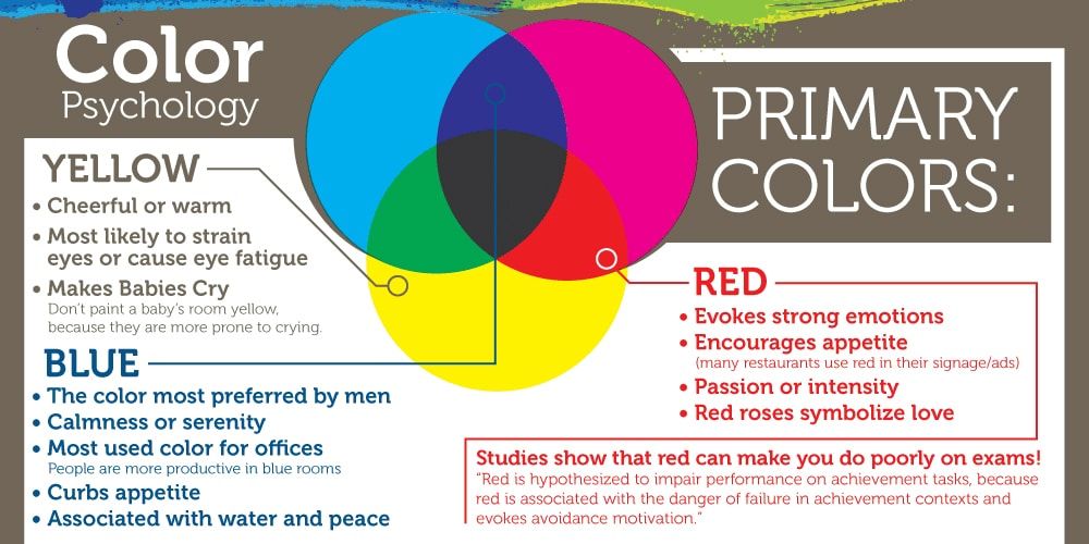
Humans see colors in light waves. Mixing light—or the additive color mixing model—allows you to create colors by mixing red, green and blue light sources of various intensities. The more light you add, the brighter the color mix becomes. If you mix all three colors of light, you get pure, white light.
TVs, screens and projectors use red, green and blue (RGB) as their primary colors, and then mix them together to create other colors.
Why should you care?
Let’s say you have a very distinct brand with a bright yellow logo. If you post the logo on Facebook, Twitter or your website and don’t use the correct color process, your logo will appear muddy instead of that bright yellow. That’s why, when working with files for any screen, use RGB, not CMYK.
CMYK: the subtractive color mixing model
Any color you see on a physical surface (paper, signage, packaging, etc.) uses the
subtractive color mixing model. Most people are more familiar with this color model because it’s what we learned in kindergarten when mixing finger paints. In this case, “subtractive” simply refers to the fact that you subtract the light from the paper by adding more color.
Traditionally, the primary colors used in subtractive process were red, yellow and blue, as these were the colors painters mixed to get all other hues. As color printing emerged, they were subsequently replaced with cyan, magenta, yellow and key/black (CMYK), as this color combo enables printers to produce a wider variety of colors on paper.
Why should you care?
You’ve decided to print a full-color brochure. If you’re investing all that money into your marketing (printing ain’t cheap!), you expect your printer is going to get the colors right.
Since printing uses the subtractive color mixing method, getting accurate color reproduction can only be achieved by using CMYK. Using RGB will not only result in inaccurate color, but a big bill from your printer when you’re forced to ask them to reprint your entire run.
The color wheel
–
I don’t know about you, but when I was a kid, the best part about going back to school in the fall was getting that new, pristine 64-count box of Crayola crayons. The possibilities seemed endless. Until I’d inevitably lose the black crayon.
Understanding the color wheel and color harmonies (what works, what doesn’t and how color communicates) is just as exciting as that new box of crayons. No really.
Being able to understand the terms and processes that go along with color will help you knowledgeably communicate your vision with your designer, printer, or even (maybe) an Apple Store Genius.
Color wheel basics
The first color wheel was designed by Sir Isaac Newton in 1666 so it absolutely predates your introduction to it in kindergarten. Artists and designers still use it to develop color harmonies, mixing and palettes.
The color wheel consists of three primary colors (red, yellow, blue), three
secondary colors (colors created when primary colors are mixed: green, orange, purple) and six tertiary colors (colors made from primary and secondary colors, such as blue-green or red-violet).
Draw a line through the center of the wheel, and you’ll separate the warm colors (reds, oranges, yellows) from cool colors (blues, greens, purples).
Warm colors are generally associated with energy, brightness, and action, whereas cool colors are often identified with calm, peace, and serenity.
When you recognize that color has a temperature, you can understand how choosing all warm or all cool colors in a logo or on your website can impact your message.
Hue, shade, tint and tone
Let’s go back to that 64-pack of crayons from our first day of school. (Remember “raw umber”? What is an umber anyway, and is it actually better raw than cooked?) Anyway, you might be wondering, how we got from the twelve colors on our original color wheel to all those crayons? That’s where tints, shades, and tones come in.
Simply put, tints, tones and shades are variations of hues, or colors, on the color wheel. A tint is a hue to which white has been added. For example, red + white = pink. A shade is a hue to which black has been added. For example, red + black = burgundy. Finally, a tone is a color to which black and white (or grey) have been added. This darkens the original hue while making the color appear more subtle and less intense.
Color schemes
Let’s talk schemes… (And not the kind that cartoon villains concoct. Bwahaha!) We’re talking color schemes. Using the color wheel, designers develop a color scheme for marketing materials.
Complementary colors
Complementary colors are opposites on the color wheel—red and green, for example.
Logo design by Wiell for Pepper PoweredBecause there’s a sharp contrast between the two colors, they can really make imagery pop, but overusing them can get tiresome. Think any shopping mall in December. That being said, using a complementary color scheme in your business marketing offers sharp contrast and clear differentiation between images.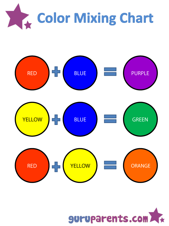
Analogous colors
Analogous colors sit next to one another on the color wheel—red, orange and yellow, for example. When creating an analogous color scheme, one color will dominate, one will support and another will accent. In business, analogous color schemes are not only pleasing to the eye, but can effectively instruct the consumer where and how to take action.
The Tostitos website uses an analogous color scheme. Notice the bright orange navigation bar draws the eye to explore the site, and accent-colored links at the bottom direct hungry consumers with the munchies to “Buy Online.”
Triadic colors
Triadic colors are evenly spaced around the color wheel and tend to be very bright and dynamic.
Using a triadic color scheme in your marketing creates visual contrast and harmony simultaneously, making each item stand out while making the overall image pop.
Burger King uses this color scheme quite successfully. Hey, is it lunchtime yet?
But really, why should you care about color theory?
Two words: branding and marketing.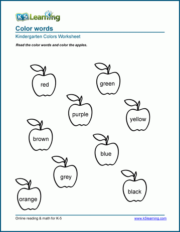
No wait, three words: branding, marketing and sales.
With this basic knowledge about colors and color schemes, you’re prepared to make effective branding decisions. Like what color your logo should be. Or the emotions that colors evoke in a consumer and the psychology behind color choices on your website.
Think it doesn’t matter? Take a look at this article on color combinations from hell. It just hurts.
Not only can knowledge of color theory guide you in your own marketing, it can also help you better understand what your competition is doing.
Web design by mute_workWeb design by Mila Jones CannWeb design by MercClassIn a side-by-side comparison of three law firm web pages, you’ll notice a variety of analogous color schemes. Blue is generally associated with dependability, brown with masculinity, and yellow with competence and happiness. All of these are positive associations in a field that stereotypically has negative connotations, such as dishonesty or aggression.
Making your brand stand out and appeal to your target, plus understanding that poor colors can mean poor sales—that’s why you should care about color theory.
Want to know more about the emotions that colors evoke, and how color psychology can help you in selecting the best colors for your logo?
Get expert help branding your business
Our designers can create the perfect look for your brand.
Get branding
This article was originally written by Peter Vukovic and published in 2012. The current version has been updated with new information and examples.
Color Theory - Understanding the 7 fundamentals of color
Logos, websites & more…
Logos, websites, book covers & more…
Get a design
Color theory is both the science and art of using color. It explains how humans perceive color; and the visual effects of how colors mix, match or contrast with each other. Color theory also involves the messages colors communicate; and the methods used to replicate color.
In color theory, colors are organized on a color wheel and grouped into 3 categories: primary colors, secondary colors and tertiary colors. More on that later.
Via unsplashSo why should you care about color theory as an entrepreneur? Why can’t you just slap some red on your packaging and be done with it? It worked for Coke, right?
Color theory will help you build your brand. And that will help you get more sales.
Let’s see how it all works:
- RGB: the additive color mixing model
- CMYK: the subtractive color mixing model
- Color wheel basics
- Hue, shade, tint, tone
- Complementary colors
- Analogous colors
- Triadic colors
- Why color theory is important
Understanding color
–
People decide whether or not they like a product in 90 seconds or less.90% of that decision is based solely on color.
Color is perception. Our eyes see something (the sky, for example), and data sent from our eyes to our brains tells us it’s a certain color (blue). Objects reflect light in different combinations of wavelengths. Our brains pick up on those wavelength combinations and translate them into the phenomenon we call color.
When you’re strolling down the soft drink aisle scanning the shelves filled with 82 million cans and bottles and trying to find your six-pack of Coke, what do you look for? The scripted logo or that familiar red can?
People decide whether or not they like a product in 90 seconds or less. 90% of that decision is based solely on color. So, a very important part of your branding must focus on color.
RGB: the additive color mixing model
Additive color mixing. If you (like me) have a hard time wrapping your head around how red and green mix together to make yellow, watch this YouTube video.
Humans see colors in light waves. Mixing light—or the additive color mixing model—allows you to create colors by mixing red, green and blue light sources of various intensities. The more light you add, the brighter the color mix becomes. If you mix all three colors of light, you get pure, white light.
TVs, screens and projectors use red, green and blue (RGB) as their primary colors, and then mix them together to create other colors.
Why should you care?
Let’s say you have a very distinct brand with a bright yellow logo. If you post the logo on Facebook, Twitter or your website and don’t use the correct color process, your logo will appear muddy instead of that bright yellow. That’s why, when working with files for any screen, use RGB, not CMYK.
CMYK: the subtractive color mixing model
Any color you see on a physical surface (paper, signage, packaging, etc.) uses the subtractive color mixing model. Most people are more familiar with this color model because it’s what we learned in kindergarten when mixing finger paints.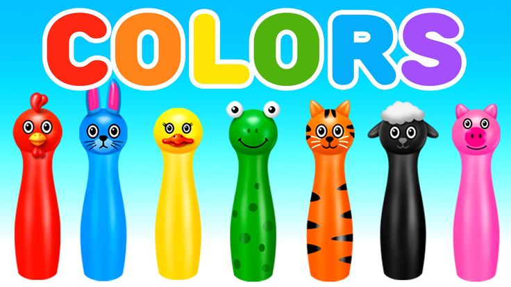 In this case, “subtractive” simply refers to the fact that you subtract the light from the paper by adding more color.
Traditionally, the primary colors used in subtractive process were red, yellow and blue, as these were the colors painters mixed to get all other hues. As color printing emerged, they were subsequently replaced with cyan, magenta, yellow and key/black (CMYK), as this color combo enables printers to produce a wider variety of colors on paper.
Why should you care?
You’ve decided to print a full-color brochure. If you’re investing all that money into your marketing (printing ain’t cheap!), you expect your printer is going to get the colors right.
Since printing uses the subtractive color mixing method, getting accurate color reproduction can only be achieved by using CMYK. Using RGB will not only result in inaccurate color, but a big bill from your printer when you’re forced to ask them to reprint your entire run.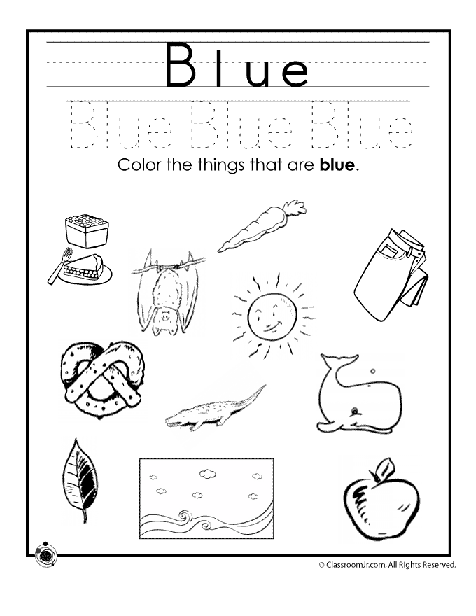
The color wheel
–
I don’t know about you, but when I was a kid, the best part about going back to school in the fall was getting that new, pristine 64-count box of Crayola crayons. The possibilities seemed endless. Until I’d inevitably lose the black crayon.
Understanding the color wheel and color harmonies (what works, what doesn’t and how color communicates) is just as exciting as that new box of crayons. No really.
Being able to understand the terms and processes that go along with color will help you knowledgeably communicate your vision with your designer, printer, or even (maybe) an Apple Store Genius.
Color wheel basics
The first color wheel was designed by Sir Isaac Newton in 1666 so it absolutely predates your introduction to it in kindergarten. Artists and designers still use it to develop color harmonies, mixing and palettes.
The color wheel consists of three primary colors (red, yellow, blue), three secondary colors (colors created when primary colors are mixed: green, orange, purple) and six tertiary colors (colors made from primary and secondary colors, such as blue-green or red-violet).
Draw a line through the center of the wheel, and you’ll separate the warm colors (reds, oranges, yellows) from cool colors (blues, greens, purples).
Warm colors are generally associated with energy, brightness, and action, whereas cool colors are often identified with calm, peace, and serenity.
When you recognize that color has a temperature, you can understand how choosing all warm or all cool colors in a logo or on your website can impact your message.
Hue, shade, tint and tone
Let’s go back to that 64-pack of crayons from our first day of school. (Remember “raw umber”? What is an umber anyway, and is it actually better raw than cooked?) Anyway, you might be wondering, how we got from the twelve colors on our original color wheel to all those crayons? That’s where tints, shades, and tones come in.
Simply put, tints, tones and shades are variations of hues, or colors, on the color wheel. A tint is a hue to which white has been added. For example, red + white = pink. A shade is a hue to which black has been added. For example, red + black = burgundy. Finally, a tone is a color to which black and white (or grey) have been added. This darkens the original hue while making the color appear more subtle and less intense.
Color schemes
Let’s talk schemes… (And not the kind that cartoon villains concoct. Bwahaha!) We’re talking color schemes. Using the color wheel, designers develop a color scheme for marketing materials.
Complementary colors
Complementary colors are opposites on the color wheel—red and green, for example.
Logo design by Wiell for Pepper PoweredBecause there’s a sharp contrast between the two colors, they can really make imagery pop, but overusing them can get tiresome. Think any shopping mall in December. That being said, using a complementary color scheme in your business marketing offers sharp contrast and clear differentiation between images.
Analogous colors
Analogous colors sit next to one another on the color wheel—red, orange and yellow, for example. When creating an analogous color scheme, one color will dominate, one will support and another will accent. In business, analogous color schemes are not only pleasing to the eye, but can effectively instruct the consumer where and how to take action.
The Tostitos website uses an analogous color scheme. Notice the bright orange navigation bar draws the eye to explore the site, and accent-colored links at the bottom direct hungry consumers with the munchies to “Buy Online.”
Triadic colors
Triadic colors are evenly spaced around the color wheel and tend to be very bright and dynamic.
Using a triadic color scheme in your marketing creates visual contrast and harmony simultaneously, making each item stand out while making the overall image pop.
Burger King uses this color scheme quite successfully. Hey, is it lunchtime yet?
But really, why should you care about color theory?
Two words: branding and marketing.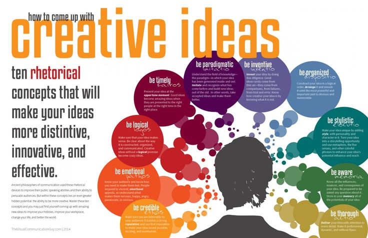
No wait, three words: branding, marketing and sales.
With this basic knowledge about colors and color schemes, you’re prepared to make effective branding decisions. Like what color your logo should be. Or the emotions that colors evoke in a consumer and the psychology behind color choices on your website.
Think it doesn’t matter? Take a look at this article on color combinations from hell. It just hurts.
Not only can knowledge of color theory guide you in your own marketing, it can also help you better understand what your competition is doing.
Web design by mute_workWeb design by Mila Jones CannWeb design by MercClassIn a side-by-side comparison of three law firm web pages, you’ll notice a variety of analogous color schemes. Blue is generally associated with dependability, brown with masculinity, and yellow with competence and happiness. All of these are positive associations in a field that stereotypically has negative connotations, such as dishonesty or aggression.
Making your brand stand out and appeal to your target, plus understanding that poor colors can mean poor sales—that’s why you should care about color theory.
Want to know more about the emotions that colors evoke, and how color psychology can help you in selecting the best colors for your logo?
Get expert help branding your business
Our designers can create the perfect look for your brand.
Get branding
This article was originally written by Peter Vukovic and published in 2012. The current version has been updated with new information and examples.
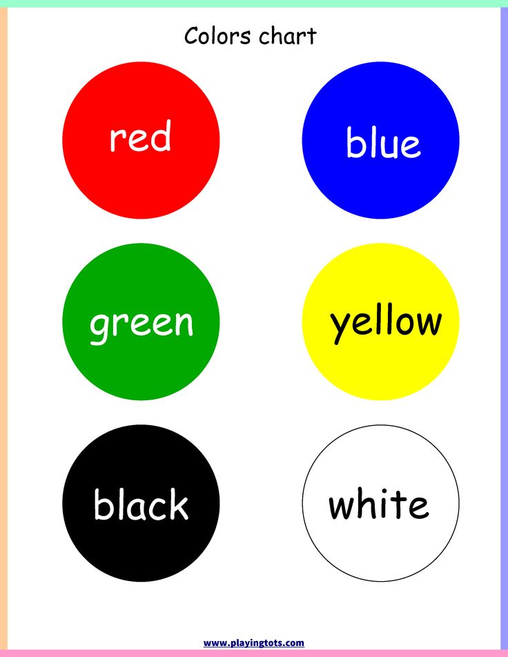
How to learn colors with a child (30 recommendations)
Author Marina
Today I've put together some tips on how to learn colors with a child. For me, this is also a useful selection that will help in teaching my son. There are many games and activities on the Internet and books, but still I have a fairly large number of questions on this topic. And since I often approach something thoroughly, decided to first collect recommendations on how to learn colors with a baby, and then start playing. In total, it turned out 30 tips, which, I hope, will help you too.
READ ALSO: 30 tips for reading to young children
- Even before you start learning colors, call your baby not just the object “car”, but “red car”, “green leaf” . The child will get used to the sound of the name of the color and this will help when you start learning the colors themselves.
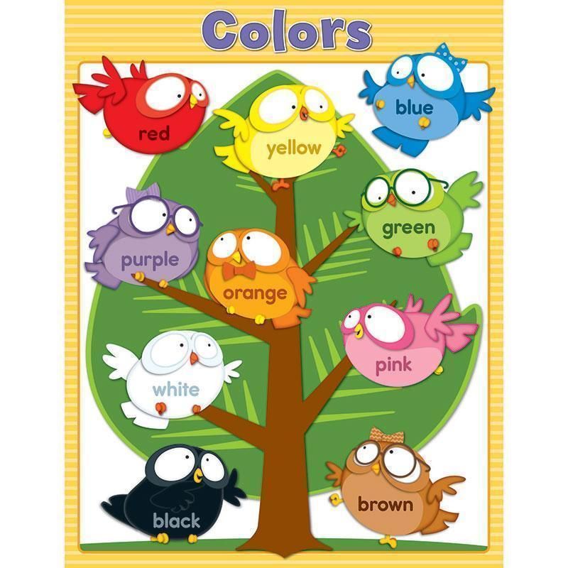
- Start learning colors from four main ones: red, yellow, blue and green . Then all the rest.
- The following colors to study: orange, white, blue, violet, grey, black, pink, brown .
- Prepare flower cards. The baby will be distracted by toys and objects, so it is better to start learning color from a card, and then move on to surrounding objects and games.
- Learn colors gradually and consistently . One color first. When you realize that the child has learned it, go to the second.
- Do not distort the names of colors into “green”, “violet” . Name colors clearly and uniformly.
- When you teach a color to your child, look for it everywhere and show your child : on the street, at home. Then ask the child to find this color in different objects that surround him.
- Do not study one after the other, or at the same time similar shades of colors, for example, green and light green. The child will be confused.
- Ask the child to bring a toy of a certain color , so you will understand if he remembered the color.
- Possible aids for the study of colors : crayons, pencils, balloons, pyramid, mosaic, Lego-type construction sets, colored paper.
- Pronounce the names of colors with an object differently “Red car”, “red car” . So that the child does not perceive color and object as one word.
- Set aside time each day to study colors . But throughout the day, still ask the child about the color of different objects that are nearby.
- When dressing your baby, name the color of the clothes . Ask him to bring blue socks, a red jacket.
- Don't force your child to learn colors. All learning should take place during the game , unobtrusively and exciting.
- Don't use the "yellow like a car" analogy because cars come in different colors. This will confuse the child.
- Do not rush your child to answer . And if he finds it difficult, or makes mistakes, help him.
- To help mom, there will still be books, cartoons, games, applications on the phone or tablet, with which it will be easier for the child to remember colors.
- Teach your child to sort objects by a certain attribute, and then by color. For example, put together Lego bricks of the same color in a box.
- Do not ask the child to name a color. At first it will be enough if he just points at him.
- Do not rush to teach your baby a lot and quickly! Everyone has their own pace.
- One of the best ways to study colors is creativity. Then the child not only sees the color, he constantly uses it in drawing, modeling and remembers it easier.
- You can start learning colors almost from the first months of life , when you carry your baby in your arms, show different objects and tell him about them. Then, along with the name of the item, you need to indicate the color.
 A purposefully begin to learn colors somewhere from 2 years old . But it all depends on the child and the desire of the mother. There are a lot of examples when children under 2 years old already knew all the primary colors and even some shades.
 - Show your child the same objects of different colors more often: cubes, mosaics. So that he would rather remember that color is only a property of an object.
- Do not set yourself up for long sessions. The attention of young children is very difficult to keep. If you managed to do it for 2-5 minutes, that's already quite a lot. At 4-5 years old, children can concentrate on classes for 15-20 minutes. The main thing is regularity .
- To memorize and practice colors, you can use rhymes and riddles.
- You can study the colors and shades that prevail in a particular season , for example,
in spring - green, light green;
summer yellow;
in autumn - brown, orange;
in winter - blue, white, light blue.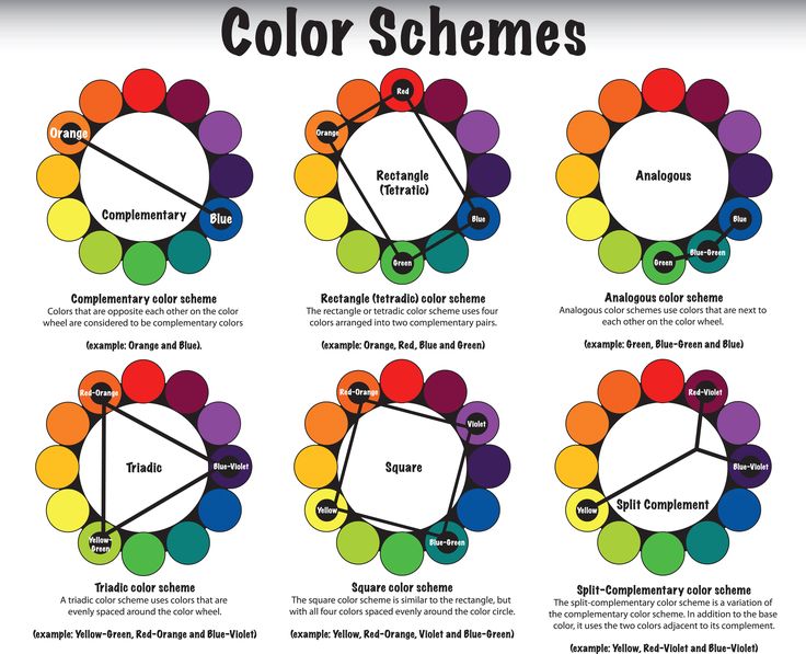
It will be easier for you to find objects of the corresponding color that surround you. - Eating is a great time to talk about flowers. Fruits, vegetables, children's dishes - enough different colors to repeat and study the material using their example.
- Use coloring books while learning about colors. Help your child choose the right color to decorate objects.
- Arrange colorful days. On the day of the red color - wear something red yourself from clothes, similarly look for red clothes for a child, draw with red pencils, crayons, drink from a red cup, etc.
- Never compare your child to others. All children are unique. Only your patience and regular exercise will help the baby master the colorful world of flowers.
Please leave your feedback or comment. I'm very interested in your opinion!
In case of full or partial reprint of materials, an active link to the site www.
 a-ideas.com.ua is required.
 Learning colors: how to teach a child to distinguish colors and shades
It is generally accepted that by the age of three a child should learn to distinguish between primary colors. This skill is an important part of sensory development, it gives the child the opportunity to see the world in a new way. Often, if the baby does not know or confuse colors, parents have concerns about the pace of development of the child. Do I need to worry if the study of colors is not easy for a child? How to teach a child to distinguish colors? You will find answers to these questions in our article.
At what age does a child begin to see colors?
Studies have shown that children begin to perceive colors by 2-3 months. The first colors a child sees are yellow, orange, red, green. At this age, babies can already react differently to their toys of different colors (for example, a red rattle can please a child more than a blue one), look at bright pictures with enthusiasm.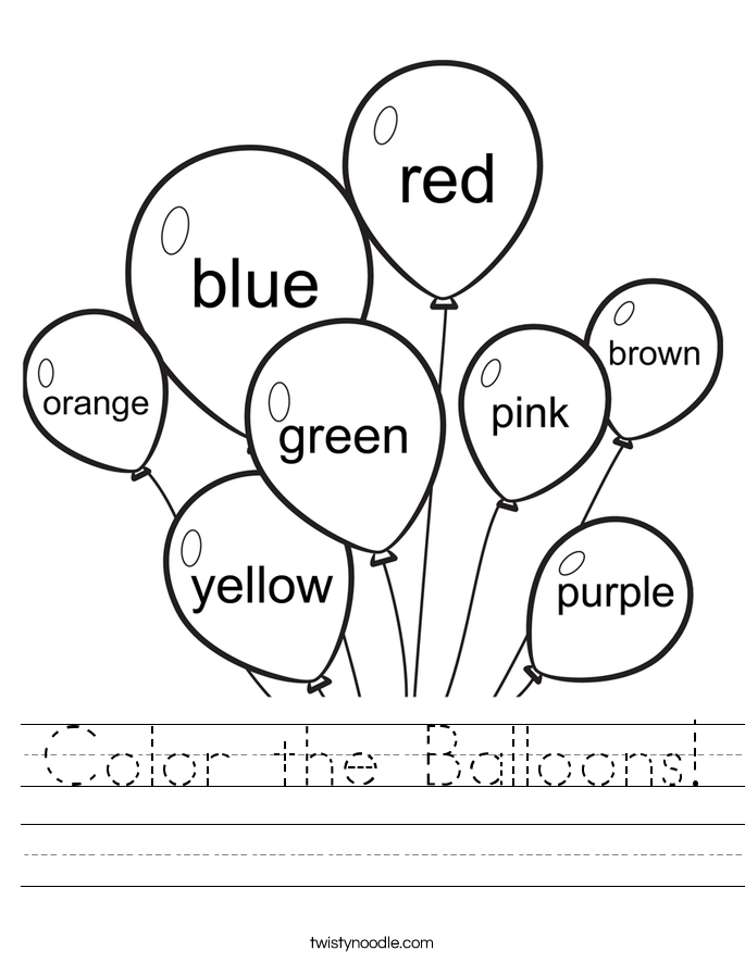 The baby's world quickly acquires colors, but if we talk about the ability to consciously find an object of the right color, then usually it appears in children at the age of one and a half. It is at this age that it is optimal to start learning colors in a playful way. You can voice the names of flowers to a child for up to a year, this will only benefit him. But do not demand too much from the baby, remember that his brain is actively developing, and as soon as the time comes, you will certainly see the results.
To see if your child is ready to learn colors by playing with building blocks, ask your child to point to a part that is the same color as yours. If the baby can find objects of the same color, then he is quite ready to memorize the names of colors.
Learning colors in everyday life
Children get most of their knowledge about the world in everyday life: communicating with adults and peers, observing nature, playing.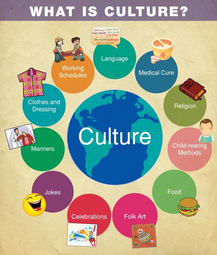 The study of flowers is no exception. Sometimes a child does not need to do special exercises to learn to recognize colors. For this, it is enough that he hears the name of the color and associates it with a specific thing. During daily activities, voice for the child what color the objects are around. Whether you are drawing, playing with blocks, looking at cars in the yard, reading, swimming, eating, dressing - in each of these situations, you can gently teach your child to distinguish colors.
It is important that the study of colors does not turn into torture. You should not constantly test the child's knowledge by asking him which color is which. Soon the baby may just start to ignore you. “Let's paint the sun yellow!”, “What a delicious green cucumber!”, “Oh, where did the blue cube go? Here he is!" are examples of how you can gently help your child remember colors.
Games for learning colors and their shades
In order to get your baby interested in learning colors or to reinforce the knowledge they already have, you can invite your child to play special “color” games.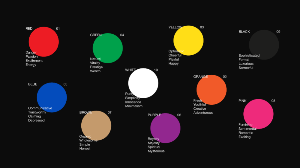
Color sorting
Sorting games are designed to help children learn to classify objects into groups by color. Any materials at hand can be items for sorting: toys, covers, designer parts, cubes, buttons, cereals, pencils, etc. You can organize the game in various ways:
You can come up with as many options for sorting by color, it all depends on your imagination. So that the child does not lose interest in the task, connect the plot of the game with his favorite characters, toys (for example, a cat will eat from a yellow bowl, and a baby elephant from a red one, etc.).
Match a Pair
To help your child learn colors, you can use tasks from the Match a Pair series. Ask your child to find a petal for a bug, a pot for a flower, a roof for a house, etc. You can present the baby with a deliberately wrong option and ask to correct the mistakes.
Pick up a patch
Show the child the picture with the missing details. Ask him to fill in the gaps (this can be done with plasticine, pom-poms, caps, cards, etc.).
Color Lotto
At the age of about one year, children begin to be interested in various lottos. In the color lotto, the task is to collect pictures of the same color on the card.
Colored Sensory Boxes
Create a sensory box for your baby where everything is the same color. During the game, the child will be able not only to remember the color that he sees, but also to develop fine motor skills, tactile sensitivity, thinking, and imagination.
Color days
This is one of the most interesting and popular ways to teach your child to distinguish colors. Its essence is that during the day (or several days) you draw the child's attention to objects of a certain color. For example, on a yellow day, you can dress in yellow clothes, play with yellow toys, draw a yellow chicken. Surrounded by one color, the baby will easily remember it.
Cards for learning colors
You can learn colors with your child using cards. With the help of Doman's "Colors" cards, you can introduce your baby not only to the main colors, but also to different shades. It is important not to overload the child with unnecessary information about the names of 10 shades of green or red. Learn only those shades whose names you can use in the game and life.
Board games for learning colors
Board games are a great way to learn about colors and consolidate knowledge about them. Currently, the stores offer a wide range of similar games for every taste and budget. Choose a game that suits your child.
Educational cartoons
There are many educational cartoons on the Internet that will help your child learn colors quickly. Here is one of them:
Educational books
If your little one loves to listen to stories and look at pictures, this is the way for you. We all remember the wonderful story of V.G. Suteev "Rooster and paints", by S.Ya. Marshak has a whole “Colorful book”. You can also find many educational books that will become your faithful assistants.
Conclusions
We have listed for you different color learning games. In order for a child to master the concept of color well, it is worth adhering to a number of principles: do not rush the baby, provide a variety of material for games, discuss what you see.
Conclusion
You can start studying colors from a very early age, the main thing is that it is interesting for the child. It is impossible to specify clear age limits when a child should learn primary colors. This process, like all development, is individual for each baby. The Sozvezdie Development Center has created a Montessori environment for kids, aimed at the comprehensive development of the child. In the classes "Together with Mom" children in a playful way get acquainted with the concepts of color, shape and size, do thematic creative work.