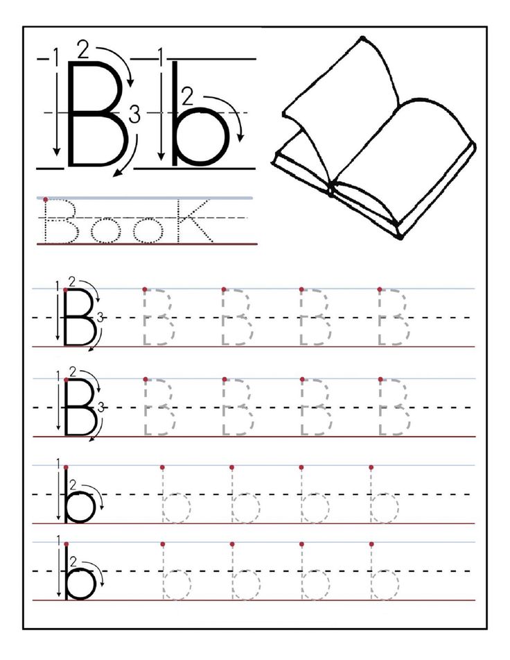
Learn how to print
Top Ten Things You Should Know About Learning to Print
Taunia Clouthier BSc, MSc (OT), OT Reg. (ON)
~ 5 minute read
1. Pre-printing strokes l − ○ + / □ \ × Δ
Prior to printing letters, children should know how to draw these shapes. Typically, around two years of age, children will develop the vertical line. By six years of age, most children are able to draw all of the shapes. Usually, it is not until a child can consistently copy a triangle that they will have success with learning to print all of their letters. Practice these strokes with your child to develop a stronger foundation for letter formations!
2. Trunk strength and shoulder stability
In order to develop the finer movements our hands require for grasping and manipulating a pencil, a child must have the upper body strength and stability to facilitate such fine movements. This can develop naturally through play.
Playgrounds are a great way to build strength! Climbing up slides and swinging across monkey bars are fun ways for growth! In addition, any pushing or pulling activities such as wagons or sleds, as well as any weight bearing activity such as animal walks (i.e. bear walk, crab walk) are effective ways to build strength and stability.
3. Fine motor skills
The thumb, index finger and middle finger are our ‘skilled fingers’. We want them to be as efficient and strong as possible to help achieve an efficient grasp and control our pencils on paper. Provide daily opportunities for fine motor and hand strengthening activities. Using household items such as clothespins and spray bottles can help develop strength in the fingers. Picking small items up and placing, them into containers (i.e. coins into a piggy bank; cheerios into a bowl) can help with fine motor development. Do a quick internet search for “Fine Motor Activities for Children” to learn more fun ways to develop this skill.
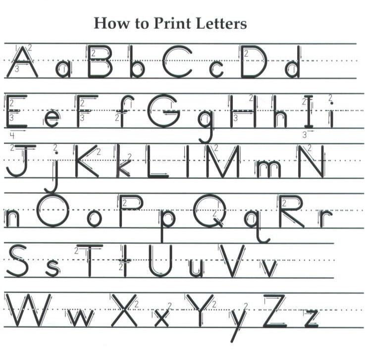
4. Capital letters
Capital letters are easier for kids to print! They all start at the top, they are all the same height and they all occupy the same vertical space. Capital letters all look different and are easier to identify. Several lower case letters look the same and it is a matter of where the ‘stick’ goes that defines the letter. i.e. “ a, b, d, g, q” are all circles with sticks! It is easy to place the stick on the wrong side or in the wrong place. “A B D G P Q” are all formed differently and have a very distinct look.
Introducing capitals first can build a strong foundation leading to more success with lower case printing. Lower case letters are then easier to learn because c o s v w x y z are the same as their capitals AND j k t p and u are similar to their capitals. After learning capital letters, children will be skilled with all capitals and nearly half of the lower case alphabet!
5.
 Letter play
You do not have to use a pencil to learn letters! In fact, letter play is a great way for a variety of ages and skill levels to learn the correct formations through fun and motivating multi-sensory activities. Once a child is ready to manipulate a pencil, they will already be familiar with how to form the letters correctly.
Letter play examples:
- Finger tracing over tactile letters (i.e. sand paper letters)
- Build letters on mats with playdough
- Draw letters in the air
- Draw letters in sensory bins
- Wet bins: pudding, whip cream, yogurt
- Dry bins: salt, beans, pasta
6. Pencil grasp
A great strategy to help develop efficient grasps is to use short 1-2 inch writing tools. Break your crayons and cut (or sharpen down) your pencils and pencil crayons! If a child does not have the option to hold the writing tool with the whole hand, it will force them to use their fingers and help facilitate development of an efficient grasp.
7. Printing on lines
There are many types of lined paper available for printing. Some can be too complex and/or visually confusing to children. Starting with a double line can build a good foundation to transition successfully to a variety of styles. For more details on the double line please check out this link from Learning without Tears https://www.lwtears.com/programs/double-lines
8. Spacing
Children have to learn proper spacing between letters and between words. Spaghetti and meatballs is a fun way to teach this concept. Spaghetti spaces between letters and meatball spaces between words. Using props adds some multisensory learning to this concept and makes it more fun! For the noodles, you can use dry or cooked noodles or Wikki Stix. For the meatballs, you can scrunch up a small piece of paper, Wikki Stix or a pipe cleaner into a small ball.
If a child continues to have difficulty with spacing concepts, try using boxes to print in. One letter per box and one empty box between words.
| T | h | e |
| c | a | t |
|
|
|
9. Consistency and practice
Learning or re-learning to print takes time and practice. Try to be consistent with how you teach your child. For example, using the same language and drawing the letter the same way each time you teach it. Become familiar with proper stroke sequences and model the letter to your child. Your child can imitate you and draw their own letter onto their paper.
Should you wish to complete printing practice with your child, investing in a printing program may be beneficial to you. Most programs have everything readily available and guides to help you teach. For example, the Handwriting without Tears printing books from Learning without Tears.
10. See an Occupational Therapist (OT)
OTs are skilled healthcare professionals that can assess your child’s printing abilities. If you feel your child may have challenges in this area and are unsure what to do, contact an OT. They can help determine your child’s strengths and weaknesses and provide recommendations to help develop the skills required to become successful with written communication.
About Taunia Clouthier
Taunia Clouthier is an Occupational Therapist who brings 10 years of experience working within the School Health Support OT Services, where she assumes a consultative role in supporting children, parents and staff within the school environment. The skills and knowledge that she has gained over the years has inspired her to create FUNctional Therapy in 2018, a company in which she can further share her knowledge and passions through direct services and workshops. She is very passionate about providing education and believes it is one of the keys to successful growth and development in children.
References
Beery K.E. & Beery N.A. (2010). The Beery-Buktenica Developmental Test of Visual-Motor Integration Sixth Edition Administration, Scoring and Teaching Manual. 30-47
Handwriting Without Tears. (2018). Get Set For School. Readiness & Writing Pre-K Teacher’s Guide
DISCLAIMER: This document reflects the views of the author. It is Autism Ontario’s intent to inform and educate. Every situation is unique and while we hope this information is useful, it should be used in the context of broader considerations for each person. Please contact Autism Ontario at [email protected] or 416-246-9592 for permission to reproduce this material for any purpose other than personal use. © 2021 Autism Ontario 416-246-9592 www.autismontario.com
Learn How To Design For Print
You’ve no doubt heard that Adobe products will no longer support Type1 fonts. Although Photoshop support ended in November 2021, January 2023 will end support for InDesign. Having had a mac, and fonts, since 1992… I have designed hundreds if not thousands, of projects built with Type1 fonts which comprise the majority of the thousands of fonts I own on my computers.
I was recently working on edits to a book and was having numerous problems with the Type1 fonts ScalaSans and Minion Pro. I decided to use the Adobe Cloud Open Type versions, but alas it did not include the small caps, ornaments or the figures… all of which I had used in Character and Paragraph Styles for the project. Which meant I had to rebuild the style sheets that used these fonts with the Adobe OpenType versions and give up on some of the features that made me choose that typeface in the first place. 🙁
This led to hours and hours of research about what exactly was going to happen in January! Oy.
After watching a few videos and reading numerous articles I identified all the Type1 fonts on my systems and pulled them into a collection (FontBook) or removed them from the system (FontExplorer – which is also being discontinued! I am so sad, it has been THE BEST MOST SOLID FONT MANAGEMENT SOFTWARE EVER IMHO). I won’t be using them on projects going forward and didn’t want them gumming up my fonts menus.
I also decided that rather than sell my mid2012 MacBookPro running CS6 I am going to keep it to edit legacy projects with OSX intact. How long this will be a viable solution is dependent on several factors, but with a souped up SSD drive inside… I am hoping it will be very stable.
To sum up what I have learned over the past few weeks, the challenge will be in editing and repurposing files built with Type1 fonts.In order to edit a file built with a Type1 font after January 2023:
- You will have to substitute the font in InDesign CC as Adobe will no longer “see” the Type1 font on your system.
- If you substitute for the OpenType version (on your hard drive) of your Type1 font you will very, very, likely have reflow issues.. Some OpenType versions are completely different!
- You can edit the file on an older system and the pdf will work just fine in InDesign or other software that can handle a pdf.
If you have the original purchase receipt you may be able to get an upgrade via the foundry, for a discount. Sadly I do not think this is a viable option for many individuals and businesses. Who has a receipt for a font that was purchased on a floppy disk? Who keeps emails for 20 years?
Software exists to convert a Type1 font to OpenType. Here are some caveats:
- Your conversion done on your desktop may not match other conversions. This may start a chain of nightmares when sending files to printers.
- Web based converters cannot handle Mac Type1 but they can handle windows.
How about the future? As of today Mac OS 12.5 still recognizes Type1 fonts but that might not always be true. I will not be using Type1 fonts in any project except for maybe personal stuff.
I think the best our design/print community can do is to prepare for longer times to prep files and make edits to projects created with Type1 fonts, and if possible keep a legacy machine going for those edits. By talking to customers now you can prepare them for the time and costs involved in this transition. And for goodness sake, don’t give this time away!
I am a big believer in not leaving things to the last minute. And if you have down time and know about projects that will come in for edits after January 2023… take a look now and see what you will be up against.
Sticky post
Back in the olden days of digital prepress and printing, when proofs bore no resemblance to what would show up on press, the designer would be invited to a “press check” at the printing plant. This was so that the designer could approve and sign off on the actual job in addition to already having signed off on proofs (I use the term proofs loosely, compared to what we have today they were stabs in the dark. It’s a whole other post, but there’s a difference between a proof predicting how the printed job will look and the proof showing what the file looks like when printed to SWOP standards. Like I said, it’s another post.)
So you might be invited to do a press-check. Or your boss might say, I need you to press-check every job that prints, or agency standards may dictate mandatory press-checks. The reality is there are only a few circumstances today that warrant a press-check. After learning what those circumstances are, you can decide if you want to tell your boss whether or not you need to be out of the office for half a day, I will leave that up to you ;-).
So when do you need to be at a press check? What’s changed since the dawn of digital prepress? Today we have contract proofing that really predicts what the printed job will look like. We have drawdowns made by very precise ink mixing technology. We have papers with plate curves loaded into press control panels with scanning densitometers built-in! I mean, wow, what can go wrong?
If it is a routine printing job probably nothing will go wrong, but not every job is routine.
These situations call for a press check:
- If your printer’s workflow is Gracol certified and you are uneasy about the way the proof looks, do a press check.
 If you are uneasy about the proof and your printer is not Gracol certified and says “We will make sure it looks like you want on press” demand a press check.
 - If you are printing on colored paper
- If your design calls for overprinting
- If the paper is “unusual,” or you are working with synthetic papers, suede finishes, etc.
- If your printer said, “We haven’t done this before, but let’s give it a shot.”
- If your printer wants you there.
- If you are mixing a spot color with process colors, such as Hexachrome, hifi or touch plates.
- If you will get fired if the color is not “perfect.”
- If you are using a printer for the first time.
- If you are using a printing method you have never used before, or you are experimenting.
If you choose to be at a press check for a job, then you MUST take responsibility for decisions made there. It’s best to be aware of your responsibilities during a press check. So what should you be doing at the press check? Really, all you have to do is look at the proof you signed off on, compare it to the press sheet and make sure they are very similar. Sometimes an exact match is unrealistic. There is some etiquette and protocol to being on a press check. There’s also etiquette and protocol on the part of the printer. Here are the manners from both sides:
Customer Etiquette
- Do be on time.
- Don’t use the press check to check for trim, bleeds, spelling, dates, phone numbers, addresses, or anything that should have been caught on the proof.
- Do check that what is on the plate is what was on the proof (i.e., the same file, same edition, etc.) We’ve all seen a wrong file make it to plating or on press.
- Do make sure the proof you signed off on is at the press check so you can compare its color and content to what is being printed. If changes were marked on the proof, check that they are on the press sheet.
- Do compare drawdowns, if you have them, and make sure they match the press sheet if you approved drawdowns before going on press.
- Don’t freak out at however much money your employer is spending and decide to question everything.
 That press is costing at least several hundred dollars an hour, and every minute you tie up is time the printer cannot sell again. Your printer will get annoyed if you consistently make press checks take more time than necessary, or he may start to include that cost in your future estimates.
 - Do recognize that making changes on press, such as a copy change that needs a new plate or a color change, are billable alterations.
- Do try to see your project with a fresh eye. If you go in looking for a specific problem, you are going to miss the giant red flag staring you in the face.
- Do not be afraid of speaking up. A press check can be intimidating. If you have a concern, voice it.
Printer Etiquette:
- Do be on time. Respect your client’s time if you want her to respect yours. Notify the client if you are running more than an hour behind schedule.
- Do have the client’s signed-off proof and drawdowns ready and available. A client standing around and waiting for someone to dig up the proof makes your print shop look disorganized.
- Don’t steamroll the customers into making a decision. If there’s a tough call, help them weigh their options. Make a pro/con list. Be supportive and share your expertise. Bring in senior management if that’s not your strong suit.
- Do provide a clean, quiet area for your clients to wait between checks. Ideally, give them internet access so they can work, and coffee, tea, water, and some kind of snack. Nobody wants to have a hangry customer!
- Don’t get your wires crossed. If the client asks for something and the rep and pressman instantly contradict one another with a yes and a no, that isn’t good. Decide who is going to answer questions at the outset.
- Do give your clients a trimmed-out sheet for their boss. Everyone back at the office wants to see what the new brochure/gift card/packaging looks like.
- Do listen to your customers and don’t feel personally insulted if they find something wrong during the press check. (We once had a brilliant New York agency-trained art director say that the 7pt.
 font wasn’t trapping correctly to the background solid, and she wanted a loupe to check. Damn if she wasn’t right! She earned our respect for doing her job and displaying her training and technical knowledge.)
 - If your customer hasn’t had a plant tour or you’ve added a capability, show him what you are up to. I have never seen a designer or print buyer who wasn’t curious about the goings-on at a printing plant. Now that the technology has changed so much and press checks are infrequent, giving a customer a tour makes even better sense.
- Do take the time to introduce your client to the other team members who keep the jobs running smoothly, such as the production staff, estimator, prepress person, receptionist, etc.
- If your customer has never been on a press check, give her the low down on what she should be looking for. This is your opportunity to train your client.
There is stuff on the press sheet that is for the pressman to measure what the press is doing.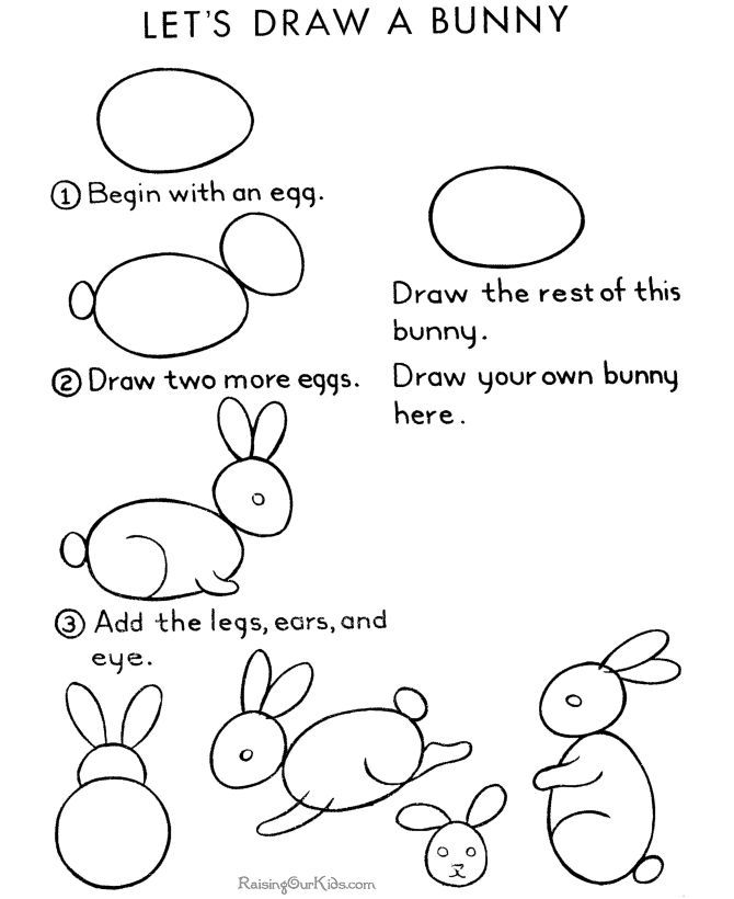 You do not need to know how to read the registration marks, slur marks, color bars, gray balance or any of that. It might seem a little scary to see all that stuff on the press sheet but it will be trimmed off and will not wind up on your job.
When you are done, ask for a press sheet to take back to your team and you are outta there! Wanna know more? Download a sample chapter of my book about the Press Check.
Do you have a press check experience to share? Please comment, I would love to hear it, good or bad!
SaveSave
I’ve been traveling a lot lately, speaking in Kansas City MO and Greensboro NC and meeting talented, passionate creatives and craftspeople who love, love love, print! It’s so much fun to be a part of this community of makers. I always return re-invigorated and re-passionated about our industry.
If you haven’t yet had a chance to participate in SF Design Week, here’s an incentive… I will be speaking Friday at the VMA Design Conference and am just tickled pink to be included in the line-up of great speakers! Here’s a link and discount code: FRIENDS that you can only get from a speaker like yours truly! Join the hundreds of graphics peeps that will be in SF and tackle the rest of 2018 with some deep inspiration, intention, and tools to get the job done!
Last week I was interviewed by Deborah Corn, who is an amazing force in the printerverse! Here’s a link to the interview, listen as Deborah asks me some great questions about my book “Designing for Print” and it’s potential for the holiday season!
Have a great week!
This is an article I wrote for Printing Impressions a while ago and rather than rewriting it, I think it is still apropos in its entirety. If you are a designer or a printer, you can use this to reach out to your customer/vendor and start a dialog that will improve your work and your project. Speaking of which, on May 1st I will be speaking in Kansas City, MO about collaboration between printer, designer, and marketer. If you are in the neighborhood, I would love to shake your hand. Here’s the link.
10 Things Printers can Teach Designers:
Designers are visual people and the best way to teach a visual person is to show them. Graphic designers are also curious people who generally like to see how things work. We all walk around with our cameras all day, lauding their efficiency for email, Slack, twitter and more. But it is the instant transmission of images and videos that make showing easy-as-pie.
Here are 10 ways you can use your smartphone to reach out to your designer clients, add value to your company website and make life easier for yourself. (Sales managers, appoint one person to collect this kind of knowledge and disseminate to the whole sales team. )
)
1. Coated vs. Uncoated. Sit down with a designer and have two paper swatch books in front of you and explain coated paper versus uncoated paper. You will have saved yourself countless hours of “it looks like postcard paper” descriptions, and the like.
2. Bleeds. Take a video of your guillotine cutter in action, preferably a job with a bleed. Zoom in on the crop marks, text it to your designer client. (Put it on your website too!)
3. Grain. Look in your sample room for something with a nice black solid. Pull two samples. Fold one sample with the grain. Fold the other sample against the grain. Put them side-by-side folds-up and photograph with your phone. Open the image and crop to relevant image area and mark as a favorite in your phone for quick retrieval.
4. Waste=Cost. Show your client an illustration of paper waste for various page sizes. Here are some examples you can use: (Put it on your website too!)
5. Quantity matters. Walk into your pressroom and film a sheet-fed press at the delivery end while it is running for 30 seconds. Confirm run speed with pressman. Text video to the client explaining that’s how long it takes for (insert quantity here) brochures/posters, etc. to run through the press and why they should opt for digital printing on this short run. (At 15,000 iph 30 seconds is 125 sheets, 8-up that’s 1000 pieces!)
6. Printing is green. Calculate how many pounds of trim, corrugated and electronics you recycle each year (if your trim is picked up and weighed by a recycler they have this info). Next time your vendor picks up a container run out to the parking lot and take a pic. Put the photo on your website with an infographic of the tonnage you recycle annually. Explain that the trim and corrugated goes into future recycled paper products.
7. Ink can change color. Show your client this photo. Explain that the ink formulas with a high percentage of opaque white (basically all pastels) will shift within a year (swatch on left was two years old, on right 6 months, when photographed). Share that pastel colors are great for a short-lived item like an invitation not so great for an identity system.
8. Paper makes a difference. Next time you’ve got an attractive job with photos that’s going to run on white paper, order some extra sheets of ivory, canary and grey uncoated paper. Add those colored sheets to the job and photograph the same detail area of all four colors. Make a montage (easy with the Layout app for iPhone). Send this montage to a client who is wondering about running a job on colored stock and put it on your website too.
9. How to read a swatch book. Oh boy, if I had a penny for every time a customer found the “perfect paper” in a swatch book and placed an order specifying that sheet only to find out there wasn’t enough, or it wasn’t stocking or that the chosen color had been discontinued… This is a great topic to discuss at a quick lunch with a new customer. Text her an image showing how to look up the date of a swatch book. Then bring her some lunch and a few swatch books and show her how to “read” it.
10. Art takes time. Text your idea of a rudimentary schedule to your client as a pdf graphic they can print out and pin to their idea wall. Next time they are working with a client to develop a timeline they won’t guess and it saves them and you a call/email.
I know that some will think that answering questions and fielding problems bring value to a client, and they do. But do they bring value to a business owner? If staff is reacting/interacting at the 100-foot level, how are they going to interact at the 30,000 foot level with intention? Focus on the little things with intention and planning and then the 30,000-foot questions aren’t as scary. What are your clients’ plans for next year? Are you discussing budgets internally? Are they planning on launching any new products or services within the next six months? These conversations are really easy when “what do I need a bleed for” is taken care of.
(all images from “Designing for Print, the Art & Science, used with permission please repost with credit)
Touch typing training on the keyboard - Ratatype
Touch typing training on the keyboard - RatatypeThe main idea of touch typing is that each finger has its own key zone. This allows you to type without looking at the keyboard. Exercise regularly and thanks to muscle memory, all your ten fingers will know where to press.
Typing posture
- Sit straight and keep your back straight.
- Keep your elbows bent at a right angle.
- Head should be slightly tilted forward.
- The distance from the eyes to the screen should be 45-70 cm.
- Relax the muscles of the shoulders, arms and hands. The hands may touch the table a little at the bottom of the keyboard, but do not put your body weight on your hands so as not to overexert your hands.

Original
position
Bend your fingers a little and put them on the keys FYVA and OLJ, which are in the middle row. This line is called the BASIC LINE because you will always start with these keys and return to them.
The A and O keys have small protrusions under the index fingers. They allow you to navigate the keyboard blindly.
Keyboard layout
The position of the fingers on the keyboard
The color of the keys on this keyboard will help you understand and remember which finger to press which key.
- Press the keys only with the finger designated for them.
- Always return your fingers to the starting position "FYVA - OLJ".
- When typing, imagine the layout of the keys.
- Set a rhythm and keep it as you type.
 Press the keys at the same interval.
 - The SHIFT key is always pressed by the little finger on the opposite side of the desired letter.
- Beat the space with the thumb of the left or right hand, as you prefer.
At first, this printing method may seem inconvenient. But don't stop. Over time, everything will turn out quickly, easily and conveniently. For best results, choose a touch typing course for your keyboard layout and language.
Movement
fingers
Do not look at the keyboard while typing. Just slide your fingers over the keys until you find the main line.
Limit the movement of the hands and fingers to a minimum, only to press the necessary keys. Keep your hands and fingers as close to the starting position as possible. This will increase the speed of typing and reduce the load on the brushes.
Keep an eye on your ring fingers and little fingers, as they often go unused.
Print speed
- Don't try to type at the speed of light right away. Start accelerating only when all 10 fingers are used to pressing the correct keys.
- Take your time when typing to avoid mistakes. The speed will increase gradually.
- Always skim the text one or two words ahead.
- Complete all lessons on the Ratatype Keyboard Trainer. And your speed will be higher than the average typing speed.
Take care of yourself
Take a break if you feel like you are slipping and making a lot of mistakes. A short break will restore strength and attentiveness.
Popular touch typing questions and tips
- How to type correctly?
It's very simple, the main thing is to follow a few basic rules.
- Correct typing posture - sit upright, screen at eye level, at a distance of 45-70 cm, keep your back straight, elbows bent at right angles, relax the muscles of the shoulders, arms and hands.
- Always start typing with the FYVA OLJ keys (this line is called the main line) and return your fingers to the same position.
- Press the keys only with the finger intended for them. Our color scheme will help you with this.
- The SHIFT key is always pressed by the little finger on the opposite side of the desired letter. Beat the space with the thumb of the left or right hand, whichever is more convenient for you.
- Don't peek at the keyboard. Just slide your fingers over the keys until you find the main line. Keep hand and finger movements to a minimum, sufficient to press the desired keys. Keep your hands and fingers as close to the starting position as possible.
- Start accelerating only when all 10 fingers are used to pressing the correct keys.
- How to learn to type quickly?
The main thing is to practice a lot and practice regularly. With each lesson passed, muscle memory will improve and all your ten fingers will know where to press.
With only 15-30 minutes of practice a day, in a couple of weeks you will know the exact location of each key without even looking at the keyboard. But remember, it's important to learn0123 is correct . If you don't learn the right positions, you're just wasting your time.
Don't forget to check your progress from time to time - just take the typing speed test.
- How to type with all fingers?
The main idea of typing with all fingers is that each of them has its own key zone. This allows you to type faster without looking at the keyboard.
It is important to press the keys only with the finger intended for them. The color of the keys on the keyboard will help you understand and remember which finger to press which key.
- What is the correct printing technique?
On Ratatype you can learn touch typing with all fingers. The main idea of the technique is that each finger has its own key zone. This allows you to type without looking at the keyboard.
Our research shows that printing with this method can increase print speed by up to 20%. You can read more about this tee technique in our touch typing article.
Exercise regularly. Take a break if you feel like you are slipping and making a lot of mistakes. A short break will restore strength and attentiveness.
- How long does it take to learn to type?
The key to success in any activity is regular training. As soon as you miss a lesson, you lose the time that you have already spent on learning. Therefore, try to set aside 2-4 weeks for regular training every day for 30 minutes.
- How often should I do typing exercises?
As in any business, regularity is the key to success. It will take a lot of practice to consolidate muscle memory and it is important that the sessions are regular.
Daily exercise for 15-30 minutes will bring more benefits than two hours of training once a week. During short workouts, it is easier to maintain concentration and make time for them much easier.
Practice whenever possible and not only with Ratatype. Try to practice touch typing skills while communicating on social networks or when performing non-urgent work tasks.
Typing speed testing is also a practice. Take the test from time to time to see how much your speed has improved.
- How to type without looking at the keyboard?
You can't learn touch typing if you keep peeking. Therefore, try to remember the location of the letters on the keyboard (our first 4 lessons teach just that).
It seems too slow at first, but gradually you can increase the print speed. The next 4 lessons will consolidate this result. Complete the first 8 typing lessons on the keyboard, get all the rewards and in a few weeks you won't even remember that you typed differently.
Online Print Speed Test - Ratatype
Online Print Speed Test - RatatypeI'll teach you how to type faster with touch typing
Type a short text.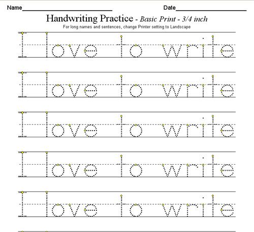 Check how many characters per minute you type in Russian, Ukrainian or English and amaze your friends or employers with a typing speed certificate.
PASS A PRINT TEST
| certificate | speed | precision |
|---|---|---|
| platinum | 350 cpm | 99.5 % |
| gold | 250 cpm | 98.7 % |
| silver | 200 cpm | 96 % |
Pass the test as many times as you want and on any layout.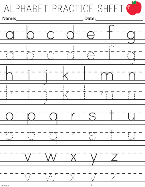 Only the best score will count. So don't be afraid to try again! Also, check your ranking in the top scores table after passing the typing speed test and try to become a winner. Pass a print test
Why take the
print speed test?
To know your typing speed and accuracy, see if you need to improve. The average print speed is 200 cpm, try to beat it! You can take the test multiple times and see how your typing speed improves over time.
After completing the online test, you will receive a typing speed certificate that you can attach to your resume, show to your teacher or brag to your friends.
How we measure
print speed?
We measure typing speed in characters per minute - how many characters per minute you typed without typos. A "character" is any character, including spaces. We take into account only correctly typed words.
So if a typo is made, the character count stops until you correct it.
The test will only take 2-3 minutes!
Take the test as long as you want. There are no restrictions.
Grab your keyboard and measure your typing speed!
Pass print test
Print speed questions
- How can I check my typing speed online?
Print speed can be tested on Ratatype, just take the test and see the result.
You can also get a speed certificate on Ratatype:
- Fill out the registration form.
- Pass the print speed test.
- Right-click on the certificate and select "Save Image" if needed.
- How is print speed and accuracy measured?
- For languages using the Cyrillic alphabet, the typing speed is measured in characters per minute (how many characters per minute you typed without typos).
 A sign is any character, including spaces.
 - In languages with the Latin alphabet - words per minute . Word - 5 characters including spaces.
- Printing speed is sometimes measured as beats per minute . Then the unit of measurement is not only the number of characters typed, but also the number of keystrokes like Shift and Alt.
Ratatype print speed is measured in cpm for Russian and Ukrainian. And for the rest - in w/min. During testing, only correctly typed words are taken into account. Therefore, if you make a typo, the speed calculation stops until you correct it.
Typing accuracy is the percentage of correctly entered characters to the total number of characters in the text.
- What is a good speed?
There is no definite answer to this question. But if you look at the average typing speed on the keyboard, which is 207 characters per minute, then we can say that a good typing speed is above average.
For example, 225 cpm and above is considered good for office workers. For secretaries - more than 300 characters / min.
For children, the typing speed standards are different:
- elementary school - 40-75 characters per minute;
- medium - 75-125 characters/min;
- senior - 100-175 characters / min;
- students — more than 150 characters/min.
- What is the average touch typing speed?
Average print speed is only 207 characters per minute. To improve your typing skills and learn how to type like a pro, you need to constantly practice.
Remember: practice, practice and more practice. Studies have shown that consistent practice can help you outperform the average typing speed by up to three times. You can check typing speed online with Ratatype.
- What is the fastest print speed?
1080 characters in one minute on an IBM electric typewriter - the fastest typing record set by Stella Pajunas at 1946 year. Barbara Blackburn is the current champion in English typing. During a test in 2005, she reached a typing speed of up to 1060 characters per minute on a Dvorak keyboard, a simplified version of the QWERTY layout familiar to us.
Sean Vrona set another record in the Ultimate Typing Championship - 1280 characters per minute. Vrona also unofficially broke Blackburn's typing record by maintaining 870 characters per minute for 50 minutes. Although this record is not recognized by Guinness, because the team did not track it.
Try setting a new typing record with Ratatype, it only takes a couple of minutes to test your typing speed.
- Is the print speed of 100 cpm good?
Depends on age. For example, for elementary and middle school children, this is a good speed.
For high school and adults, 100 cpm is considered low. Take a typing course and your typing speed will increase.