Colours and the kids
C A T K
GO DEEPER
CATK is a creative company based in Berlin.
Brand Artworks
Allspring
Allspring
Visual Language
Covestro
Covestro
TV Channel Idents
Brand Assets
Brand Assets
Alipay+
Alipay+
Visual Translation
New Photography
Rimowa Artifacts
Rimowa Artifacts
TV Channel Idents
TV 2 Norway
TV 2 Norway
Algorithmic Poems
Visual Language
Chobani
Chobani
Thoughts on Color Harmony
Taupe Magazine
Taupe Magazine
Visual Brand Systems
Campaign Film
ISSEY MIYAKE BAO BAO VOICE
ISSEY MIYAKE BAO BAO VOICE
A.I. Research Project
Shroooms
Shroooms
Brand Development
Virgin Media
Virgin Media
Visual Language Development
Home Noir Dynamic Type
Home Noir Dynamic Type
Research Project
Out Of The Box
Out Of The Box
Research on Light and Structure
Visions of Places
Visions of Places
Tangent Garment Care
Tangent Garment Care
Creative Direction,
Illustration
Visual Language,
Design,
Motion
Webby Awards Connecter
Webby Awards Connecter
Creative Direction,
Illustration
Tag Arkitekter
Tag Arkitekter
Motion,
Audio
xBox One
xBox One
Creative Direction,
Illustration
Phil Collins Delete Beach
Phil Collins Delete Beach
Creative Direction,
Motion
New Tendency
New Tendency
Creative Direction,
Product Images
Surfaces and Patterns
Surfaces and Patterns
Illustration
VIZIO XLED
VIZIO XLED
Visual Language,
Illustration
Motion,
Audio
Matter
Matter
Research,
Motion,
Audio
Nike Hyperdunk
Nike Hyperdunk
Creative Direction
Html 5
Html 5
Creative Direction,
Illustration
Nike Flyknit
Nike Flyknit
Creative Direction,
Illustration
Camry 2017 Campaign
Camry 2017 Campaign
Creative Direction,
Product Images
IBM Cloud
IBM Cloud
Visual Language
Robot Studies
Robot Studies
Research,
Visual Language,
Motion,
Audio,
Illustration
United Talent Agency
United Talent Agency
Brand Image Systems
ISSEY MIYAKE BAO BAO VOICE
ISSEY MIYAKE BAO BAO VOICE
Campaign Film
Design Consultation
IBM Security
IBM Security
CHOBANI COMPLETE
CHOBANI COMPLETE
Product Launch
Jordan Flight Tour
Jordan Flight Tour
Visual Language
Jordan Brand 30th Anniversary Pearl
Jordan Brand 30th Anniversary Pearl
Visual Language
Nike Energy Pack
Nike Energy Pack
Creative Direction
IBM iX
IBM iX
Creative Direction
TOKYO SMOKE
TOKYO SMOKE
Product Launch
CITRIX REBRAND
CITRIX REBRAND
Brand Assets
Algorithmic Poems
Magazine Feature on Color Harmony
Colors
Colors
TV 2 Norway
TV 2 Norway
TV Channel Idents
Rimowa Artefects
Rimowa Artefects
New Photography
Visual Translation
Alipay+
Alipay+
Brand Image Assets
Brand Assets
Pfizer
Pfizer
TV 2 Idents 2022
TV 2 Idents 2022
TV Idents
IBM Masterbrand
IBM Masterbrand
Brand Assets
Visual Language
Allspring
Allspring
Product Images and Brand Assets
Covestro
Covestro
Visual Language
IBM zNext
IBM zNext
Launch Video for the zNext Platform
Forskningsrådet
Forskningsrådet
Brand Assets
By using this website, you agree to our use of cookies.
C A T K
GO DEEPER
CATK is a creative company based in Berlin.
Brand Artworks
Allspring
Allspring
Visual Language
Covestro
Covestro
TV Channel Idents
Brand Assets
Brand Assets
Alipay+
Alipay+
Visual Translation
New Photography
Rimowa Artifacts
Rimowa Artifacts
TV Channel Idents
TV 2 Norway
TV 2 Norway
Algorithmic Poems
Visual Language
Chobani
Chobani
Thoughts on Color Harmony
Taupe Magazine
Taupe Magazine
Visual Brand Systems
Campaign Film
ISSEY MIYAKE BAO BAO VOICE
ISSEY MIYAKE BAO BAO VOICE
A.I. Research Project
Shroooms
Shroooms
Brand Development
Virgin Media
Virgin Media
Visual Language Development
Home Noir Dynamic Type
Home Noir Dynamic Type
Research Project
Out Of The Box
Out Of The Box
Research on Light and Structure
Visions of Places
Visions of Places
Tangent Garment Care
Tangent Garment Care
Creative Direction,
Illustration
Visual Language,
Design,
Motion
Webby Awards Connecter
Webby Awards Connecter
Creative Direction,
Illustration
Tag Arkitekter
Tag Arkitekter
Motion,
Audio
xBox One
xBox One
Creative Direction,
Illustration
Phil Collins Delete Beach
Phil Collins Delete Beach
Creative Direction,
Motion
New Tendency
New Tendency
Creative Direction,
Product Images
Surfaces and Patterns
Surfaces and Patterns
Illustration
VIZIO XLED
VIZIO XLED
Visual Language,
Illustration
Motion,
Audio
Matter
Matter
Research,
Motion,
Audio
Nike Hyperdunk
Nike Hyperdunk
Creative Direction
Html 5
Html 5
Creative Direction,
Illustration
Nike Flyknit
Nike Flyknit
Creative Direction,
Illustration
Camry 2017 Campaign
Camry 2017 Campaign
Creative Direction,
Product Images
IBM Cloud
IBM Cloud
Visual Language
Robot Studies
Robot Studies
Research,
Visual Language,
Motion,
Audio,
Illustration
United Talent Agency
United Talent Agency
Brand Image Systems
ISSEY MIYAKE BAO BAO VOICE
ISSEY MIYAKE BAO BAO VOICE
Campaign Film
Design Consultation
IBM Security
IBM Security
CHOBANI COMPLETE
CHOBANI COMPLETE
Product Launch
Jordan Flight Tour
Jordan Flight Tour
Visual Language
Jordan Brand 30th Anniversary Pearl
Jordan Brand 30th Anniversary Pearl
Visual Language
Nike Energy Pack
Nike Energy Pack
Creative Direction
IBM iX
IBM iX
Creative Direction
TOKYO SMOKE
TOKYO SMOKE
Product Launch
CITRIX REBRAND
CITRIX REBRAND
Brand Assets
Algorithmic Poems
Magazine Feature on Color Harmony
Colors
Colors
TV 2 Norway
TV 2 Norway
TV Channel Idents
Rimowa Artefects
Rimowa Artefects
New Photography
Visual Translation
Alipay+
Alipay+
Brand Image Assets
Brand Assets
Pfizer
Pfizer
TV 2 Idents 2022
TV 2 Idents 2022
TV Idents
IBM Masterbrand
IBM Masterbrand
Brand Assets
Visual Language
Allspring
Allspring
Product Images and Brand Assets
Covestro
Covestro
Visual Language
IBM zNext
IBM zNext
Launch Video for the zNext Platform
Forskningsrådet
Forskningsrådet
Brand Assets
COLORS AND THE KIDS
Schönhauser Allee 163
10435 Berlin
Germany
+49 30 54 73 42 50
hello@catk. de
de
For job and intern inquiries please visit our jobs page.
Google Maps Directions
COLORS AND THE KIDS
Schönhauser Allee 163
10435 Berlin
Germany
+49 30 54 73 42 50
For job and intern inquiries please visit our jobs page.
Google Maps Directions
We are a creative company specializing in the fields of design, motion, and music.
Our studio in Berlin works closely with leading brands worldwide, creating meaningful and forward-thinking content together.
We have a unique structure that is partner-led and based on deep friendships and the shared compassion for our work.
We help our clients to think about new perspectives and lead them through a wholesome and thoughtful process for every project.
Our company name helps us to reaffirm our core beliefs every day again, trust our intuition and stay
open-minded without any prejudice.
We are a creative company specializing in the fields of design, motion, and music.
Our studio in Berlin works closely with leading brands worldwide, creating meaningful and forward-thinking content together.
We have a unique structure that is partner-led and based on deep friendships and the shared compassion for our work.
We help our clients to think about new perspectives and lead them through a wholesome and thoughtful process for every project.
Our company name helps us to reaffirm our core beliefs every day again, trust our intuition and stay
open-minded without any prejudice.
Newsletter
Newsletter
Subscribe
Subscribe
Social
Social
Soundcloud
Vimeo
Soundcloud
Vimeo
Selected Clients
Selected Clients
Apple, IBM, Microsoft, Google, Nike, Issey Miyake, Samsung, AliPay, American Express, Kenzo, Dior, Rimowa, ONiO, Oppo, TV 2, Riot, Porsche, Mercedes Benz, Chobani, Citrix, Sonos, Dunkin Donut, Benetton, Dove, Covestro, Red Bull, Pfizer, SumUp, Vodafone, BMW, Volvo, Toyota, United Talent Agency, Canopy Growth, Art Directors Club, League Of Legends, Impossible Foods, DAAD, Conde Nast, Future Publishing, O2, West, Spring, VW, X-Box, Virgin, Virgin Media, Athletics, Bold, ANTI, Vizio, Viessmann, New Tendency, adam&eveDDB, Saatchi & Saatchi, The New Company, Collins, Wolff Olins, 2x4, Kunsthalle Bern, ZKM Karlsruhe and various independent clients.
Apple, IBM, Microsoft, Google, Nike, Issey Miyake, Samsung, AliPay, American Express, Kenzo, Dior, Rimowa, ONiO, Oppo, TV 2, Riot, Porsche, Mercedes Benz, Chobani, Citrix, Sonos, Dunkin Donut, Benetton, Dove, Covestro, Red Bull, Pfizer, SumUp, Vodafone, BMW, Volvo, Toyota, United Talent Agency, Canopy Growth, Art Directors Club, League Of Legends, Impossible Foods, DAAD, Conde Nast, Future Publishing, O2, West, Spring, VW, X-Box, Virgin, Virgin Media, Athletics, Bold, ANTI, Vizio, Viessmann, New Tendency, adam&eveDDB, Saatchi & Saatchi, The New Company, Collins, Wolff Olins, 2x4, Kunsthalle Bern, ZKM Karlsruhe and various independent clients.
Selected Exhibitions, Awards and Talks
Selected Exhibitions, Awards and Talks
The Imitation Game, Vancouver, 2022
ADC Awards, Silver Cube, 2022
D&AD, Wood Pencil, 2022
Best Awards, 2022
Eurobest, 2021
University of Applied Sciences Trier, 2021
Under Consideration, 2021
Page Magazine, 2021
Stash Media, 2021
New Digital Design Forum, 2021
Filmakademie Baden-Württemberg, 2021
Imagine Science Films, New York, 2019
Pukkelpop Festival, Belgium, 2019
Bauhaus-Symposium, Hong Kong, 2019
Digital Graffiti, Miami, 2019
Stash Magazine, 2019
Taupe Magazine, 2019
Design Fabric Festival, Mumbai, 2018
+81 Magazine, Tokyo, 2018
Us By Night, Antwerp, 2017
Hau, Berlin, 2016
ECAL, Lausanne, 2015
By using this website, you agree to our use of cookies.
The influence of color on the psyche of children, the psychology of color in a child
Surely you have noticed that if a child likes a certain color, he chooses it in everything. Clothes, toys, accessories, and even balloons or ice cream should be in your favorite color. And nothing can be done - such a period.
In fact, children are instinctively drawn to those colors that are most pleasing and useful to them at this stage of development. Scientists have proven that colors have the ability to have a powerful effect on the psyche. This is especially true for children, because the visual perception of the child helps him to know the world. Color can bypass the “barrier” from our consciousness and act on an unconscious level. This property is used in alternative medicine - color therapy.
How color affects the child's psyche
The action of color can calm or invigorate, cheer up and relieve tension. In addition, color can enhance brain activity, affect the intelligence and self-esteem of the baby. That is why it is worth taking seriously the choice of colors for a child's room or wardrobe. A well-chosen combination will stimulate the development of the child, create an atmosphere of harmony, and also contribute to the formation of good taste.
Each color has its own characteristics. What shades are most favorable for children? Let's figure it out.
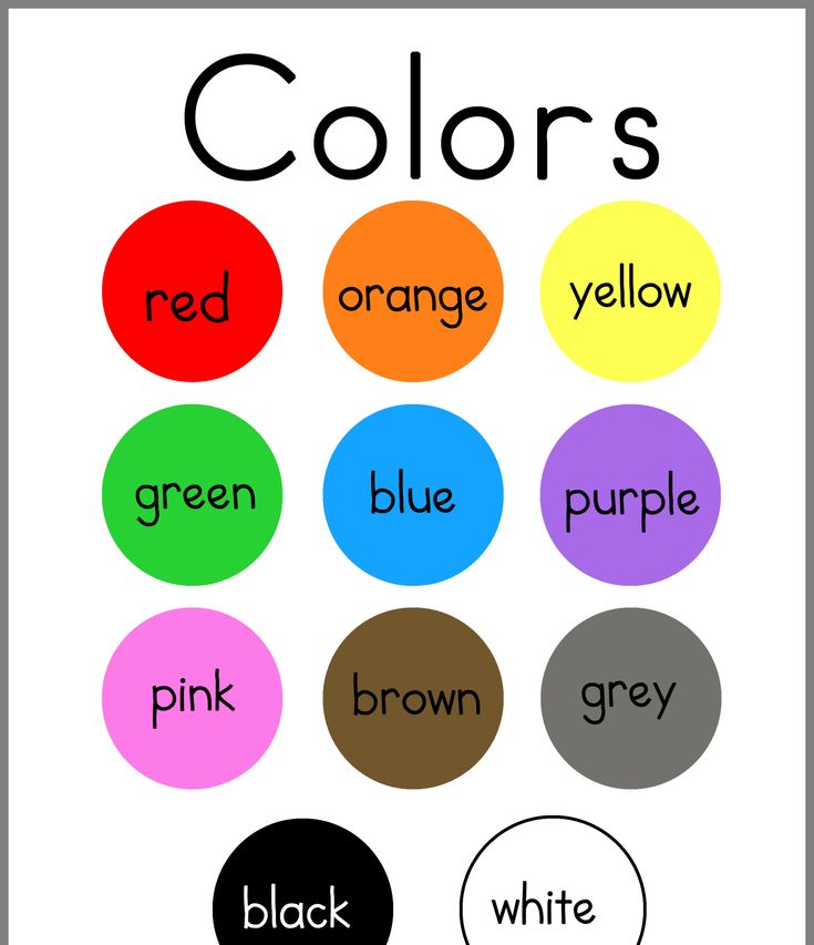
WHITE
This color is considered neutral. By itself, it is not capable of evoking bright positive or negative emotions, but is a background for other shades. As a rule, children do not choose white as their favorite, but it is always present in clothes. An integral part of the wardrobe is stylish white T-shirts with inscriptions and drawings, classic shirts and blouses.
White is perfect for newborns, symbolizing tenderness and innocence.
As for the child's room, white is preferred for the ceiling and the top of the walls. Dark tones can cause a depressed state or even depression.
BLUE
Until recently, it was considered an exclusively male color. And to this day, passers-by, seeing a baby in blue, confidently say: “What a cute boy!”. Fortunately, modern manufacturers of children's clothing and interior items are moving away from stereotypes, successfully using different colors in collections for boys and girls.
Blue and all shades of blue are associated with the sea, the sky - something boundless, strong and peaceful. Contemplation of the blue color calms, reduces pressure and temperature, dulls pain. In addition, it is good for the eyes and has an awakening effect in the morning due to its "coolness". This color is considered a shade of courage and strength, well suited for decorating children's rooms.
GREEN
The variety of its shades is striking and pleasing to the eye: emerald, light green, olive and khaki. The color of nature and life itself. Associated with growth, development and prosperity.
The psychology of the green color is as follows: it helps to relax, calm down, arouse interest in understanding the world, pacifies nerves and blood pressure. If your child is already calm and balanced, then do not be zealous with green. Perhaps you should consider more "disturbing" shades.
PINK
Of course, we cannot ignore the favorite color of little princesses. If you have a daughter, you probably remember how, with her birth, pink objects slowly but surely began to fill the house. At first it was the first blanket and ribbon on the envelope for discharge from the hospital. Then bodysuits and sliders, rattles and bottles began to appear. Later - pink dresses, hair clips, bracelets and handbags.
When the baby moved to a separate room, she demanded pink wallpaper, a crib and a chest of drawers. No other options, of course, were considered. A similar period happens in the life of almost every girl. In part, we impose this stereotype ourselves. After all, everyone knows that boys are blue, and girls are pink.
Someone is afraid of pink madness, but excitement is unnecessary here. Firstly, the color itself has a beneficial effect on the emotional state of children. It calms, improves mood, encourages creativity. Secondly, there are many shades of pink: from cold and restrained to bright fuchsia. Dilute pink with neutral gray for a noble combination that is great for a child's room. And finally, love for this color, as a rule, passes with age.
RED
Perhaps the most exciting color. It burns like a flame or the sun at sunset, attracts attention and arouses interest. Red is able to cheer up even the most calm children. The color of leadership and energy. This color causes activity, mobility, appetite and interest in learning.
It has to be used carefully. Small bright accents in the interior or wardrobe are acceptable and even welcome. But prolonged contemplation of red can lead to excessive excitability, sleep disturbance and aggression.
YELLOW
No less bright than red, but at the same time it has a completely different effect on the human psyche. Yellow is associated with sunlight, fluffy chicken, fragrant lemon and a warm autumn day. It soothes, warms and uplifts the mood. This color is able to defeat depression and blues. It does not have an exciting effect, but gently stimulates.
Yellow items are great for children's interiors. This shade improves brain activity, promotes learning and the development of intuition, and also gives joy. Yellow is almost perfect, but overly excitable people should be careful with it.
ORANGE
Another juicy color that gives mood. It has the freshness of orange juice, the brightness of summer flowers and sunlight. Orange is the color of energy, expression, extraversion. He is impulsive and invigorating.
The action of the orange color stimulates the child's communication skills, knowledge of the world, as well as appetite. If the baby is shy and not very active, orange can help. Add brightness to the interior or wardrobe, and the effect will not keep you waiting. In addition, orange ensures the healthy functioning of all body systems, and also strengthens psycho-emotional stability. An indispensable color for children's environment.
PURPLE
Imagination draws lilac and lavender, delicate violets and shades of sunset. Deep and even intelligent color. It is a symbol of spiritual development and enlightenment.
The use of purple in the interior of the room has a beneficial effect on the psyche of the child. Gives a feeling of peace, enhances empathy and intuition. The strength of this color is in harmony. Purple is liked by both girls and boys, so feel free to make a choice in its favor.
TURQUOISE
This shade gives us the sea, a bright sky on a sunny day, jewelry with turquoise. Pleasant to the eye, refreshing, invigorating.
This color promotes creativity and self-expression, calms, but at the same time gently stimulates to action. The use of turquoise color is possible both in the wardrobe of boys and girls. Great for a child's room, uplifting and relaxing.
GRAY
At first glance, it may seem bleak and dull. We call gray a rainy day, clouds in the autumn sky or a bad mood. In fact, the effect of gray on a person is very beneficial. It instills confidence, reassures. Gray perfectly dilutes brighter colors in the interior or wardrobe.
Does your daughter like lots of pink? Add discreet gray to it and get a noble combination. This color harmoniously looks with many rich shades, calming them. Do not be afraid of gray, but it is not advisable to overdo it.
HOW TO APPLY KNOWLEDGE ABOUT COLORS
As you can see, having studied the psychology of color, you can carefully influence the psyche and mood of the child. Some shades soothe and relax, others invigorate and give strength. When choosing a color, be guided by the temperament and character of the children, and also take into account their biorhythms and condition at a particular point in time.
For example, in the morning we all lack vigor. Serve your little one breakfast on an orange plate and you'll energize them for the day ahead. But in the evening it is better to listen to fairy tales, wrapped in a soft green blanket.
For walks on a gloomy autumn day, wear boots and a raincoat in rich colors. Such clothes will cheer you up. And when choosing pajamas, give preference to calm tones.
A room of energetic fidgets is best decorated in neutral colors. Shy and less active will help to liberate bright accents in the interior.
Now you are armed with knowledge, but do not forget to rely not only on theory, but also on the preferences of the baby. After all, the main thing is that the color is pleasant and pleasing to the eye.
The influence of color on a child from the point of view of psychology and medicine
Colors are one of the most unique and rich decorations of our life. Color perception is an important step in the development of the baby. The color scheme surrounding the child, whether it be the color of clothing, a children's room or a playground, has a significant impact not only on the development of speech and vision, but also on the child's psyche and body as a whole.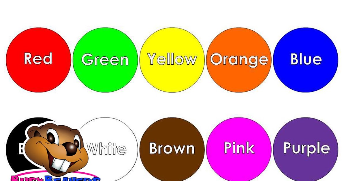
As a result of numerous studies, it was determined what effect a certain color has on a child. If you use this knowledge, you can choose colors depending on the purpose of any of the children's items, as well as use them correctly in the children's play space.
Red is a strong irritant for a child. Even in the calmest children, it can cause excessive activity. At the same time, it gives joy to both children and adults. Do not use it in the children's bedroom, so as not to prevent the child from sleeping peacefully. Especially, you should not use red for a hyperactive baby, so as not to increase nervousness and excite aggression.
Pink color, depending on the brightness of the shade (bright, reddish), encourages action. At the same time, the soft shade will soothe the baby.
Yellow is considered the color of harmony. It is able to cause joyful sensations in the child, and also stimulates children to concentrate. Especially, the yellow color has a beneficial effect on an excited, nervous child prone to tantrums.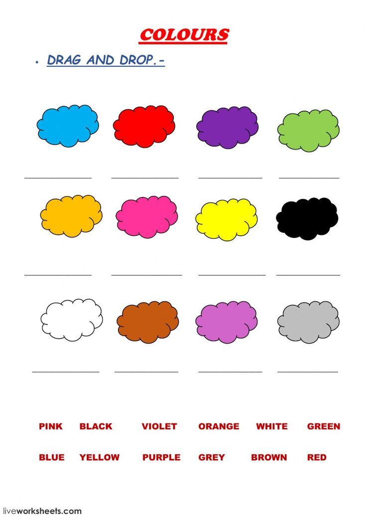 Also, yellow color increases appetite.
The green color has a significant impact on the development of the child. Encourages interest in learning and knowledge of the world around. Shades of green build self-confidence, instilling courage in the child. But do not get too carried away with green, especially if your child is phlegmatic. Otherwise, it will completely lose activity.
Blue can be called the color of purity and depth. Its shades, even in the most passive child, can arouse interest in something new, awaken the imagination. In color therapy, blue is used to combat stress. At the same time, in a sensitive baby, a rich blue color can cause an unconscious feeling of anxiety. If you are faced with the task of drawing the child's attention to something specific, then be sure to try to use at least a little blue.
Blue color is simply indispensable for stress. It is always lightness, freshness and weightlessness. Blue shades have a calming and relaxing effect on the child's body.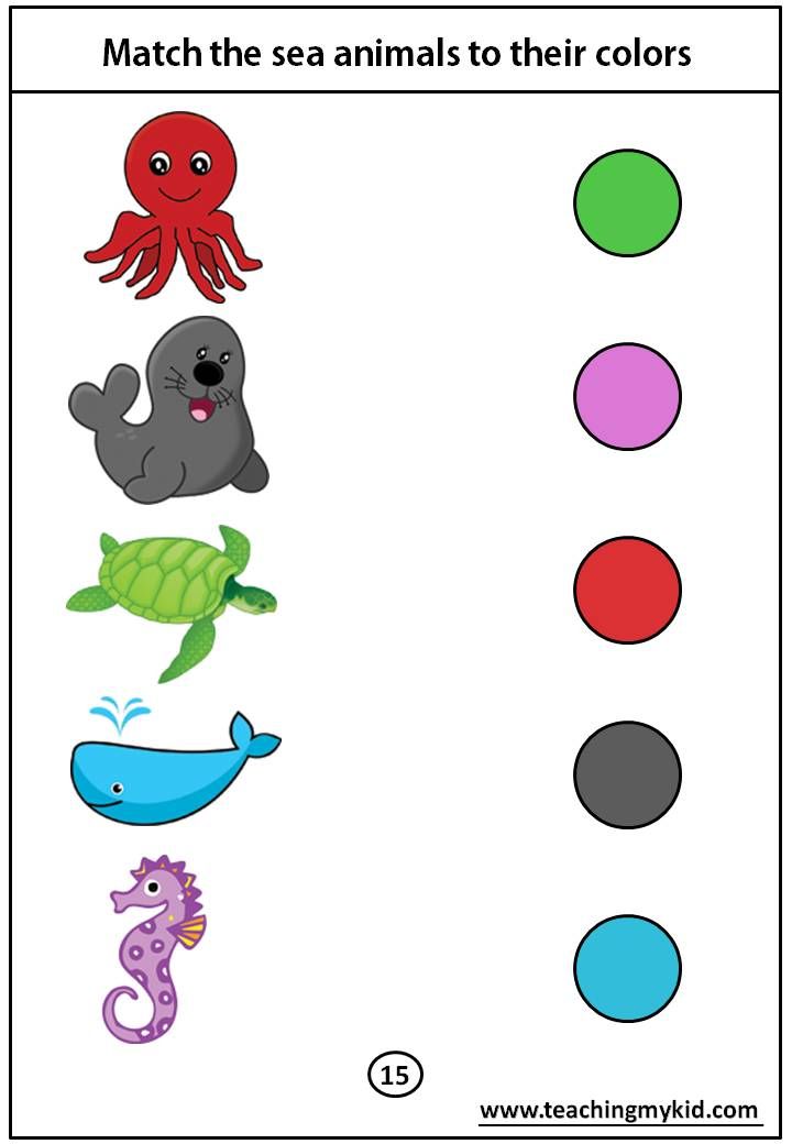 From a medical point of view, it has been proven that the color blue can lower blood pressure. Blue shades help relieve tension, but you should not oversaturate the children's space with this color, so as not to cause a feeling of cold and alienation.
White color can create a favorable background for children's perception, as it is devoid of emotional aggressiveness. Therefore, using it in the interior helps the child to calm down and improve well-being. At the same time, white should be used with caution, as it can increase a child's sense of insecurity. Beige color in its psychological properties is similar to white. Gray color calms and reduces activity.
Black is not the color of childhood. Often it is interpreted as the absence of color. A large amount of black can be oppressive and cause fear in a child.
Brown color symbolizes confidence and calmness, but it is not able to evoke strong emotions. In large quantities, it weighs down.
Orange, like red, is the color of an impulse aimed at interacting with the outside world.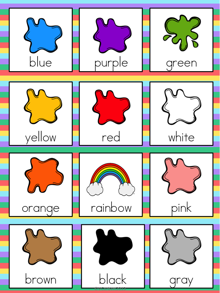 Surrounded by orange, the child is better able to tolerate being alone. Its use increases activity and sociability, which is often necessary for lethargic and inactive children. Orange is a great mood booster.
Violet color symbolizes spiritual perfection, purity, abundance and enlightenment. It evokes in children a sense of peace and inner harmony.
Understanding the impact each color has on the child, you can not only beautifully, but also usefully decorate the children's space. Using color, you can create a more comfortable play area, a playground, a room for classes and recreation. There should be a lot of all the colors in a child's life. The main thing is to maintain a reasonable balance.
Red color promotes the activation of blood circulation, normalization of metabolism, and also stimulates brain activity. In the winter season, when we are all prone to colds, color therapy recommends seeking help from red, which helps to slow down and stop the inflammatory process.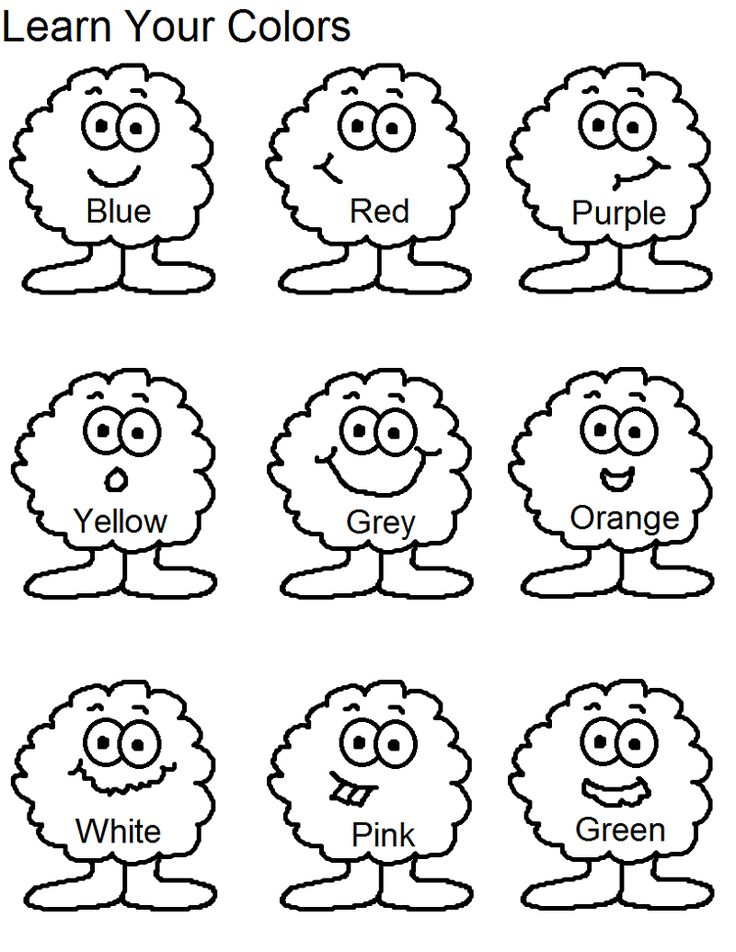 Muscles are also able to respond to red. It promotes relaxation of muscles and joints.
Orange. In color therapy, orange is used for any disorders of the gastrointestinal tract, kidneys and bladder. If a person suffers from a pulmonary, cardiac or endocrine disease, doctors recommend getting orange curtains. It will have a more than positive effect on the body. The orange color is credited with the ability to balance the hormonal state of the body and cleanse any system of the body from mucus.
Yellow. The area of influence of yellow color on our body is the entire digestive tract. Its most beneficial effect is in violation of the liver. With careful use, diseases of the skin and the central nervous system are cured. In color therapy, yellow is called the color - "orderly". It cleanses the body of toxins, controls weight, as it stimulates the secretion of gastric juice necessary for digestion.
Green directly appeals to nature, therefore, apparently, it stimulates well all restorative processes: fusion of fractures, growth of new tissues of all kinds.