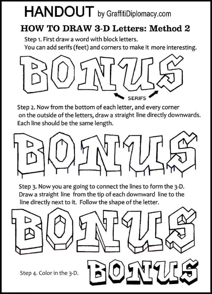
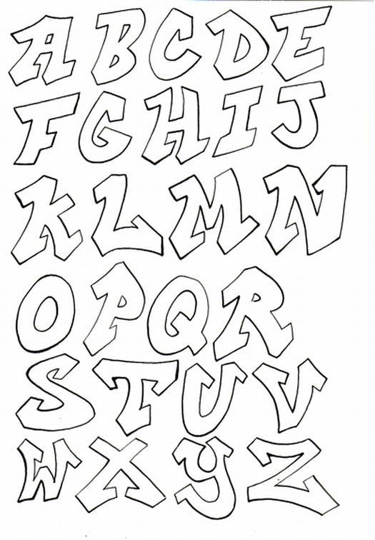
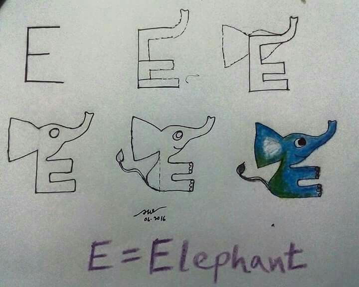
Fun ways to draw letters
10 Super Easy Hand Lettering Techniques with an Artful Spin
The end results of hand lettering are fun, beautiful, often mesmerizing, and leaving many of us thinking, “I could never do that.” But you can! We have it on good authority that hand lettering doesn’t have to be difficult. In fact, you can create easy to intricate letters from A-Z. Joanne Sharpe shares 10 hand lettering techniques, from simple to complex, that are all simple to follow and fun to do, excerpted from her book Artful Alphabets.
And remember rule #1 for hand lettering: enjoy the process and embrace “imperfections” as you go! If you purchase your copy of Artful Alphabets now, you will also get a bonus hand lettering lesson free!
10 Hand Lettering Techniques from Easy to Intricate
Hand lettering art can absolutely be a stress-free process, as you explore the components of letters and how they become art images. These hand lettering techniques are somewhat easier than traditional calligraphy or type design because your personal handwriting will be used as the style foundation for each new alphabet and won’t require involve years of practice for immediate success.
As we get started, keep in mind it’s OK to copy at first to get comfortable and confident with the creative lettering process. Be inspired by each sample alphabet and imitate the details. But don’t ever be afraid to put a little spin on the ideas to make the hand lettering reflect your own personal style and your creative voice.
Artful Calligraphy
If you’ve never had formal lessons in calligraphy, try using a specific calligraphy marker to make a stylized alphabet with your own handwriting. You can achieve a lettering look unique to you using the features of a chisel-tip marker and being comfortable with your hand movement and letter formation.
Materials list:
- Black Elegant Writer Calligraphy Pen, medium point
- Bristol paper
- Ruler
- Waterbrush
1. Create guidelines that are 1-inch (25mm) tall. Inside the lines, hold the Elegant Writer medium-sized calligraphy pen at a 45-degree angle and write the upper and lowercase alphabet.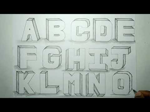
2. On the next row, write the letters with the same pen but on a slant for a slightly more stylized look.
3. On the next row, write the letters at a back and forth slant with a flourish at the end, making the 45-degree angle of the pen do the work for you. You can also explore a new look by wetting the edges of the letters with a waterbrush to let the ink pool out.
Great Gray Shadows
Create some dimension and drama using a basic chisel-tip-marker font with gray shadows along each letter. This bold hand lettering technique is super simple yet always impressive.
Materials list:
- Black and gray Copic permanent markers
- Bristol paper
1. Write the alphabet using the broad chisel tip of a black permanent marker to create the uppercase bold alphabet.
2.
Use the pointed tip of the chisel to draw the lowercase alphabet.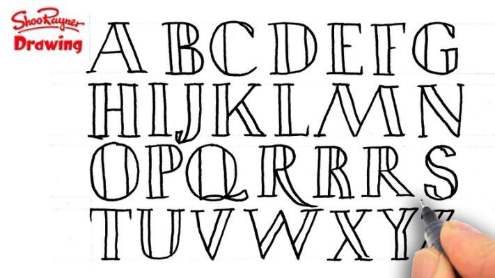
3. Using the brush end of a gray permanent marker, add the shadow along the left edge of each letter so the light seems to come from the right.
Matisse Inspired
Study famous artists and their signature styles, techniques and characteristics to create new letters. This sampler imitates the typical colors, bulbous shapes and moving line forms in the art of Henri Matisse. What other artists could inspire letterforms?
Materials list:
- Bristol paper
- Pencil
- Prismacolor markers
1. Study the style of your favorite artist and sketch the alphabet on the paper using a pencil. This hand lettering example uses the whimsical colors and letter shapes inspired by Henri Matisse. Identify characteristics of Matisse’s style such as the color palette, brushstrokes and line formation that could be used as letters. Use the stylized shapes on each alphabet letter.
2. Color the hand-drawn letters, creating rounded edges, drips and split tips to make a complete alphabet.
Watercolor Puddlers
Let puddles of watercolor create colorful, light and airy letters.
Materials list:
- No. 4 and 6 round brushes
- Waterbrush
- Watercolor paints, liquid and pan
- Watercolor paint
1. Lightly pencil the outline of a hollow alphabet if you need to. Using a paintbrush, write the letter of the alphabet with clean water, creating a water path. It will take a few tries to gauge just the right amount of water. You don’t want too much or too little, so experiment and practice first.
2. To paint the letters, drop in watercolor paints and let the colors pool, allowing them to migrate and swirl to fill the letterform. This works especially well with liquid watercolor. Watch the color spread throughout the letter, giving it a somewhat marbled look. Tilt the paper as needed to allow the color to spread through the water. Let the letters dry overnight and then erase the pencil lines.
Seurat’s Dots and Dashes
The style of artist of Georges Seurat is a playful inspiration for an artful alphabet font. Using dots and dashes of color in the impressionistic pointillism style creates an optical treat as the energetic filler for hand-drawn letters.
Materials list:
- Bristol paper
- Eraser
- Pencil
- Prismacolor markers
1. Draw chunky block letters with a pencil. I made some of my letters overlap one another.
2. Using the tip of the end of a marker, add dots to the letterforms. Applying different amounts of pressure will create different-sized dots. Within each letter, use a dark, medium and light shade of the same color to create variation.
3. Erase the pencil lines so the dots and dashes create the letterforms.
4. In other letters, use the bullet tip to fill the letters with dashes going in a variety of directions.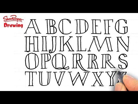 Combine dots and dashes within a letter for even more variation.
Floating Feathers
There is so much imagery that can be used as inspiration for letter making. Here I choose feathers and an extra-fine pen to draw letterforms that create a whole alphabet.
Materials list:
- Black uni-ball Vision pen
- Bristol paper or cardstock
- Eraser
- Pencil
1. Sketch the alphabet in upper and lowercase using a pencil. Elongate or change the letter shape slightly to make a more interesting letter. Using a black permanent pen, turn the stem of each letter into the center of a feather with wavy feather lines coming out from it.
2. Add dots around the letters to give them an airy, floating appearance. Erase any visible pencil lines.
Watercolor Ombré
Draw big, bold letters and add watercolor paint in the colors to create a blended, ombré effect.
Materials list
- Eraser
- No.
 4 or 6 round paintbrush
 - Pencil
- Water container
- Watercolor paint
- Watercolor paper
1. Draw the alphabet in chunky, stylized block letters using a pencil. Fill the shape with clean water (mine is slightly blue here so it photographs clearly).
2. Load a brush with watercolor paint and apply it to the top of the letter.
3. Rinse your brush and gently guide some of the paint from the top of the letter down into the water puddle to create an ombré effect. Work from dark at the top to light at the bottom. Let your alphabet dry completely and then erase the pencil outlines.
Decorative Creative Cursive
Embellish simple, personal handwriting with bold and expressive lines, decorative details and movement in a stylized script or cursive.
Materials list:
- Black Faber-Castell PITT Artist Pen
- Bristol paper or cardstock
- Eraser
- Pencil
1. Write the alphabet using a combination of print and cursive letterstrokes. Allow the letters to be fun and whimsical. They don’t have to match.
2. Using black permanent pen, thicken the letters by reshaping and adding weight to random areas.
Bonus tip for better letters: Embellish each letter by drawing leaves or flowers that “grow” off the letterforms or decorate the interior of a letter. Expand the size of the letters by creating spaces to fill with pattern or color. Add a light color shadow and tiny dots around the letters to add interest.
Font in Floral
Embellish simple letterforms with elaborate, colorful and hand-drawn floral and leaf patterns.
Materials list:
- Black ZIG Writer pen
- Eraser
- Markers, watercolor paint or colored pencils
- Pencil
- Watercolor paper
1. Use a pencil to create rounded block letters. Fill the letters with assorted flower shapes and designs using a black waterproof pen. Go all the way to the edges of the letters with the designs.
2. Erase the letterforms leaving just the linked flower design. Add color to the letters using markers, watercolor or colored pencil.
Storybooks and Scenery
Create an optical illusion or trompe l’oeil scenes inside chubby alphabet letters. Draw landscape imagery, such as a garden or beach, so the art reads across the letters.
Materials list:
- Black Platinum Carbon pen
- Colored pencil
- Eraser
- Pencil
- Prismacolor markers
- Watercolor paints and brushes
- Watercolor paper
- Water-soluble markers
1. Sketch the alphabet with a pencil. Outline the letters to create large, soft block letters.
2. Inside the letters, draw scenes or words that illustrate a particular word.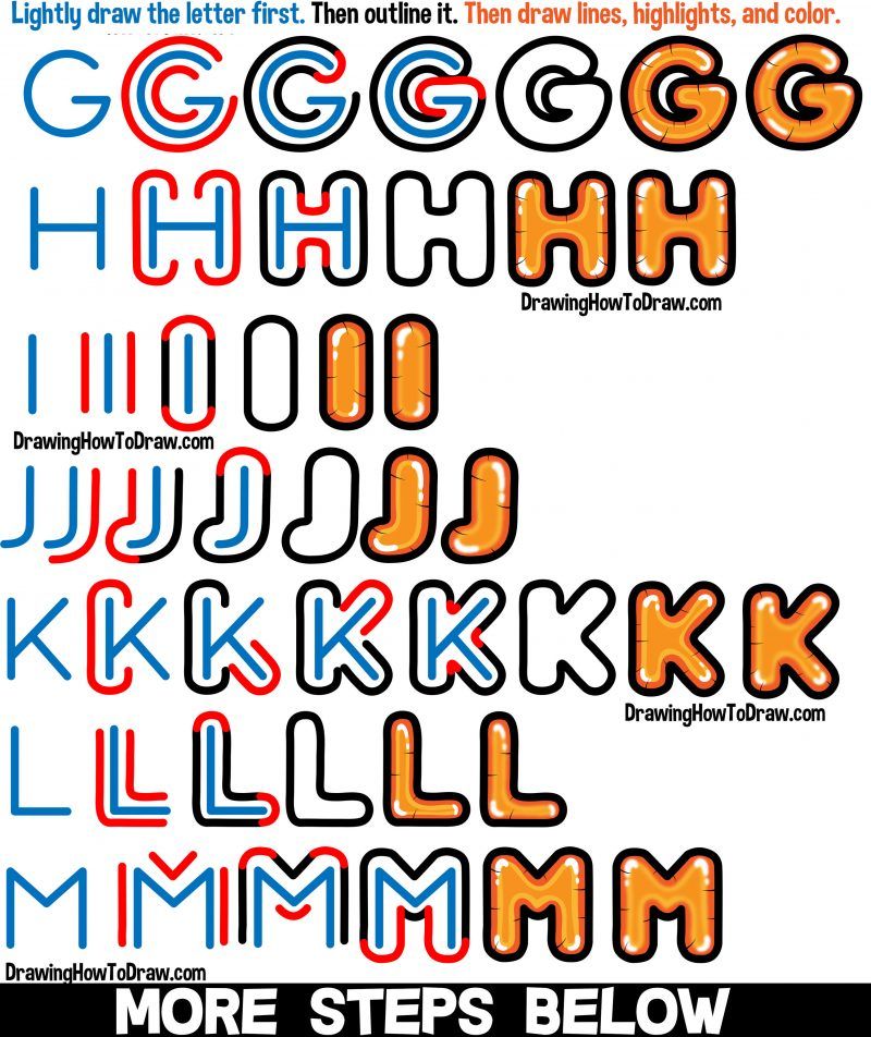 In the sample, I illustrated a beach scene insight the word “bliss.” Use ink to go over the scene. Do not ink the outline of the letters.
3. Color the scene with colored pencils, permanent markers, water-soluble markers or watercolor paint. Erase the remaining pencil lines so the letters are created by the sketches inside.
Having a “Look”
If you think all my letters look similar, you are correct. A personal lettering style should reflect and identify the individual creator. All the sample alphabets illustrated here use my personal print or script handwriting as the foundation. Handwriting is unique to each of us, and it’s my hope that as you are inspired by each one of my hand lettering techniques, your personality and style will shine through.
While you work on your artful alphabets and styles, allow your own handwriting to evolve and influence what you create so when someone looks at your lettering, they recognize you in the lettered messages.
You can use your artful hand lettering in many ways, including but not limited to:
- Art journaling
- Card-making
- Planners and bullet journals
- Scrapbooking
- Decorative invitations and announcements
- Envelopes
- Canvas wall art and paintings
- Room décor
- Party and celebration décor
- Handmade gifts and wrapping paper
- Cake decorating
- Signs and banners
Your Next Steps
Did you enjoy these hand lettering techniques? Tell us which one is your favorite in the comments. And, be sure to check out Joanne Sharp’s Artful Alphabets. This easy-to-follow and exciting resource includes 55 inspiring hand lettering techniques and ideas. Why not try them all?
For a limited time when you buy Artful Alphabet you will receive a FREE Lettering Lesson! Get yours now!
Hand Lettering Basics: A Tutorial for Beginners
Logos, websites & more…
Logos, websites, book covers & more…
Get a design
Everyday and everywhere, you are surrounded by letters and written messages. From logotypes to posters, billboards, t-shirts or book covers, letters not only tell a story but evoke certain emotions as well. What if, instead of using an already existing font, you could draw beautiful hand lettering that’s full of personality?
Even if you’ve already dipped your toes into the infinite universe of hand lettering, or you’ve thought about trying it out but weren’t sure where to start, you are in the right place! We’re going to take a look at the essentials that you need to start this wonderful journey of hand lettering.
I’ve been hand lettering for a little over a year, and it all started when a weekly challenge popped up on Instagram and I decided to enroll. I previously played around with calligraphy, but I wasn’t really sure what the difference between that and hand lettering was. I had zero experience, never taken a class, never watched someone do it live. I just thought it would be fun—and it was! Since then, I’ve been lettering almost daily, and learning this skill has been one of the best things I’ve ever done!
By the end of this article, you’ll know the basics of hand lettering and have the confidence to create your own pieces!
What is hand lettering?
—
Many people out there confuse hand lettering, calligraphy, typesetting and type design and use the term “type” or “typography” to refer to all of these.
Type design
Type design is the process of making typefaces which all of us can use. A type designer creates systems of letters, making sure that all letters of the alphabet work together in endless combinations.
Typesetting simply means arranging type that’s been created by a type designer in a given layout. This might be as simple as a black and white newspaper or as complex as a typography-driven brochure.
Back in the day, this was done by hand. Today, we do it all on a computer.
Dynamic and unique typesetting by the famous Russian designer Alexey BrodovitchCalligraphy
Calligraphy is flawless, gorgeous handwriting. After many years of practice, calligraphers use muscle memory to perfect their style so that the next time they gets commissioned to create a wedding invitation, for example, they can perfectly write all the copy on the first try. Although hand lettering often imitates calligraphy, the process behind the two is very different.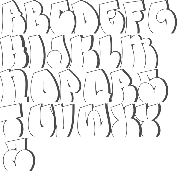
Hand lettering
Finally, hand lettering is the art of drawing letters and can take on many shapes and sizes, from traditional-looking letters to intricate, detailed and not-so-obvious looking ones. This can be done in any style, on any material, with any media.
Even though there are no rules in hand lettering, there are still guidelines that we need to take into consideration.
How to start hand lettering
—
Before we start, let’s take a quick look at how hand lettering can be used. You might be surprised to see just how many ways there are to use this art form!
Magazine covers by Lisa Taniguchi Book covers by MkyLogo designs by VU designPins by Ann ChenCoasters by April MoralbaMurals by Pandr Design Co1. Get your tools
You don’t need any fancy tools to be a hand-letterer. When I started to get into lettering, I thought I needed the most expensive and professional pens, judging by all those super-duper shots from Instagram.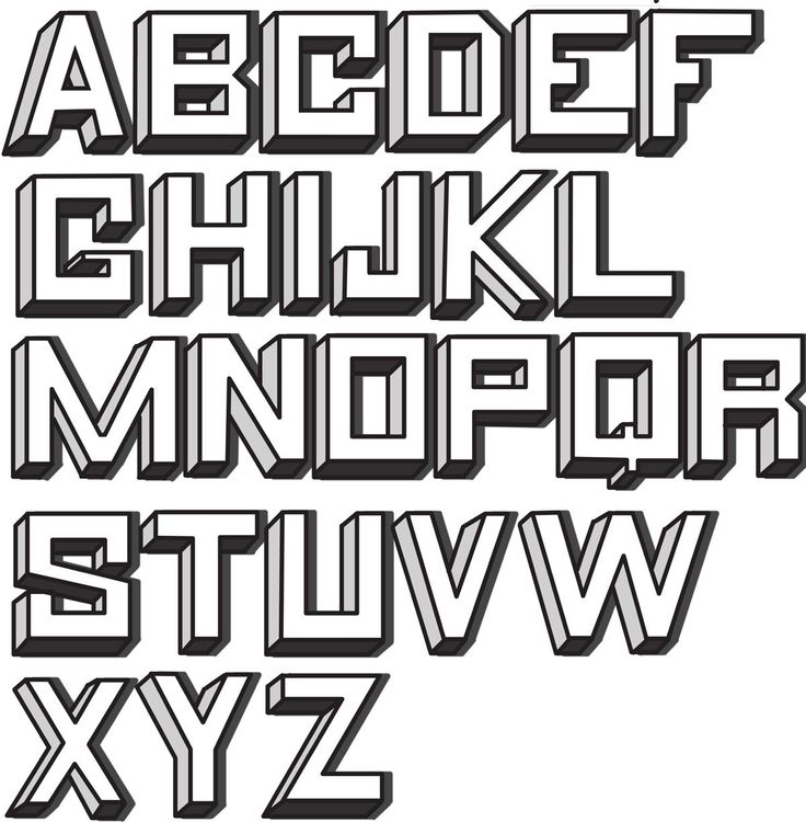 I bought a bunch of brushes and pens which I probably used… five times?
The only tools you will truly use are a pencil, paper, eraser and ruler. If you want your lettering to look calligraphic, consider using the proper calligraphic tools (such as brush pens or nibs), but you can do just fine without (more on that later).
If you want to bring your lettering in the digital medium, there are a few ways to make it happen. To start digitally from scratch, use a graphic tablet or an iPad Pro and Apple Pencil to draw. Or scan your piece, and edit it in Photoshop or Illustrator by using the built-in tracing option or by tracing it yourself using the Pen tool.
2. Know about letter construction and relation
Guidelines are very important in the process of drawing letters. They help you keep your letters in proper proportion so they’ll have a harmonious relationship between one another.
by MkyThe ascender line shows how long the ascender of a lowercase letter should be (like l, h, b). The cap height is the height of an uppercase letter. The x-height is the height of a lowercase letter and the line that holds the crossbar. The baseline is where all letters rest. The descender line shows how long the descender of a lowercase letter should be (like p, j, g).
In some cases, you’ll have to slightly ignore these guides and make some optical adjustments.
Here is a technique I’ve learned from Martina Flor. No matter what style of lettering you use, there are a few basic shapes that we work with—shapes she calls “mother forms.” We have rectangular shapes (like the letters H or E), triangular shapes (like the letters V or A), rounded shapes (like the letters O or C) plus the combination of all of these.
by MkyIf you have all these shapes on the same baseline, all the exact same size, the circle and the triangle would look significantly smaller than the rectangle. Why? Because the square touches the baseline and cap height with its entire border, while the circle and triangle don’t.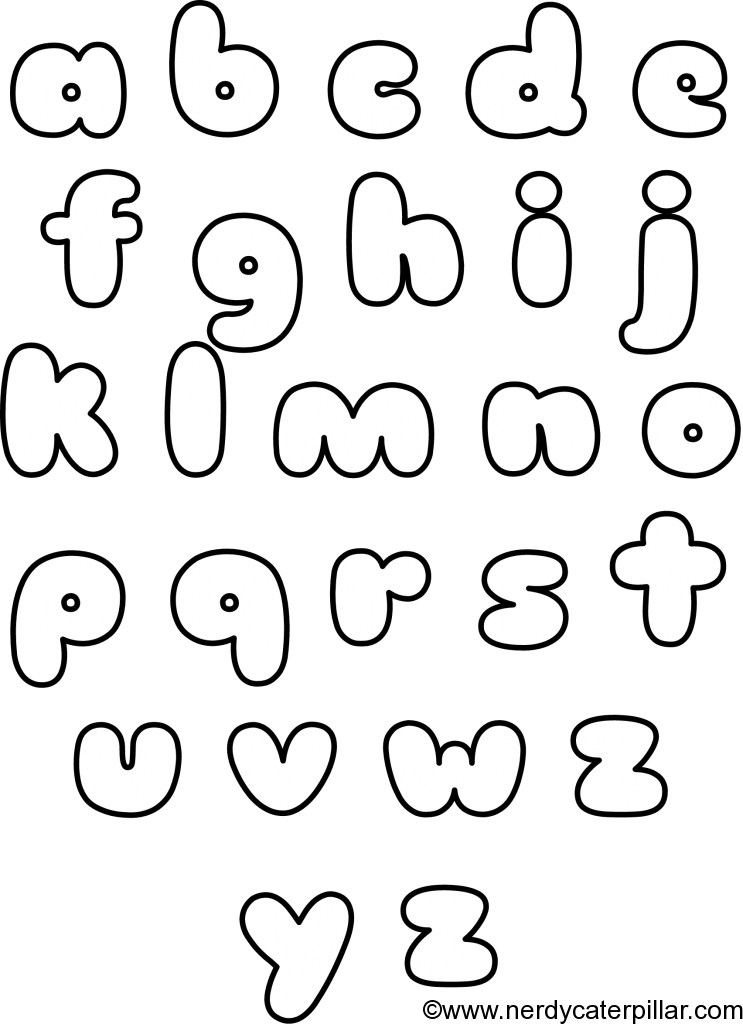
Even if technically they are the same size, optically they’re not. This is when you’ll use your eyes and instincts to enlarge those letters just a little over the baseline and cap height. How much should you enlarge them? Well, that’s up to you! In time, you’ll find it easier until you’ll do it without even thinking about it. The same rule goes for the lowercase letters, too.
3. Learn the anatomy of letters
Before you dive into the actual lettering, it’s important to know the most commonly used terms, so that next time you’ll be able to call the ‘little thing on the end of a lowercase letter’ by its proper name—a terminal. Once you know these terms, you’ll be able to talk with anyone about this topic.
Here are the ones you’ll use the most:
by Mky4. Choose a lettering style
This is where we go wild! As a letterer, you have to know all the different styles so you can choose the one that fits your current project the best. Knowing the basic styles will help you create endless variations of the same letter.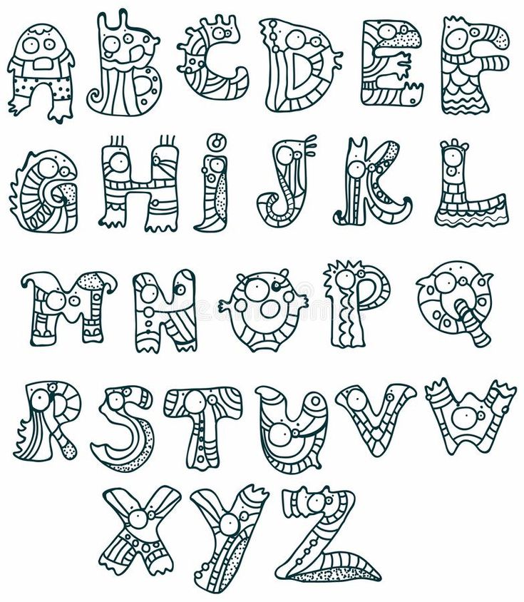
We still have some rules to play by, but your imagination can go crazy!
The most important rule to keep in mind at all times is legibility. You can create the most ornate, fancy looking E, but at the end of the day, if it can’t be easily recognized as an E you failed. Since there’s not just one right way to draw an E (except for its basic skeleton, which can still be modified), it’s up to us to decide how to draw it.
Perfect example of dynamic and festive serifs by Alix NorthrupReady? Here we go!
Serif lettering
A serif is the small line attached at the end of a letter’s stroke. Initially, it was invented to help with legibility but designers and letterers have pushed it and reinvented it many, many times, creating some really funky and interesting serifs.
Within this category, there are many other styles. We’ve got old style serifs, transitional serifs, didone or modern serifs, glyphic serifs or slab serifs. Whoa, right?
Let’s take a look at what all these look like:
by MkyAnd here are a few examples of all the ways you can use them:
by MkySans serif lettering
Simple yet bold sans serif lettering. Play with your x-height for a more dynamic look. Artwork by Olga Muzician.
“Sans” means without. So this category of lettering contains typography that has no lines attached to the ends of each letterform. Sans serif lettering is often used to convey a more contemporary style.
Even though these letterforms have a more basic structure than serifs, there are still a number of creative ways to do this. You might think there’s not much you can do with something so simple, but let me prove you wrong!
by MkyLet’s see a few of these in action:
by MkyScript and brush lettering
Super clean and sweet monoline script lettering. Sometimes less is more! Artwork by Jenny Nyman.Script and brush lettering refers to letterforms that are connected to each other. This can be very formal looking and elegant, playful or even super trashy. This style imitates calligraphy, but instead of drawing the letters with a single movement of the hand like you would in calligraphy, you draw the letters from many little pencil strokes to build that look.
The most important rule to keep in mind is that a letter’s upstroke is always thin, and its downstroke is always thick. Up thin, down thick. You minimize the pressure of the pen on the ups, you push and create more pressure on the downs. Up thin, down thick. Up thin, down thick. That’s just four words to memorize!
You can also play around with a brush pen or different nibs to get the feel of the stroke so that you’ll know what you have to imitate.
by MkyThese are the three basic lettering styles. Tweak them however you please, and get to some really crazy, funky looking letters.
Make the letters very slim or very fat. Invert the weights to get that groovy feel. Add a super heavy weight contrast. Use really crazy serifs or flourishes.
by MkyGreat example of combining all lettering styles in one piece by Jessica MolinaThere’s really no limit to what you can achieve. Just have fun with it!
5. Add dimension, details and decorative elements
Now that you are more familiar and comfortable with the basic style categories, let’s take a look at what we can do to make them more interesting and decorative.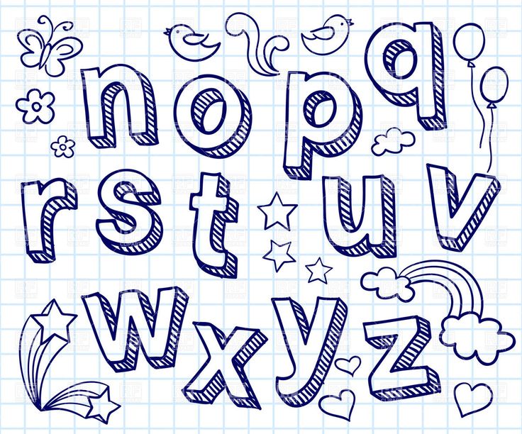
Adding dimension and shadow
When we talk about dimension, we’re talking about three types of shading: the drop line, drop shade and drop shadow. You can create these by drawing the same shape behind your main one. Simple as that. If you got comfortable with creating these you can play around with them and make some really interesting shadows to make your letterforms even more expressive.
For example, you can create a vanishing point and connect all the edges of the letter (or word) to the same point, or you can have some really heavy, bold shadows, playing with the positioning.
by MkyIf you have all your dimension added you can go ahead and add even more depth. Decide where your light source is coming from and draw the dark parts in wherever the light wouldn’t touch your letter.
Lovely piece that uses subtle and simple details on the letters by Alexiane DavenportAn easy way to figure this out is if you imagine your letter is an actual object on a table.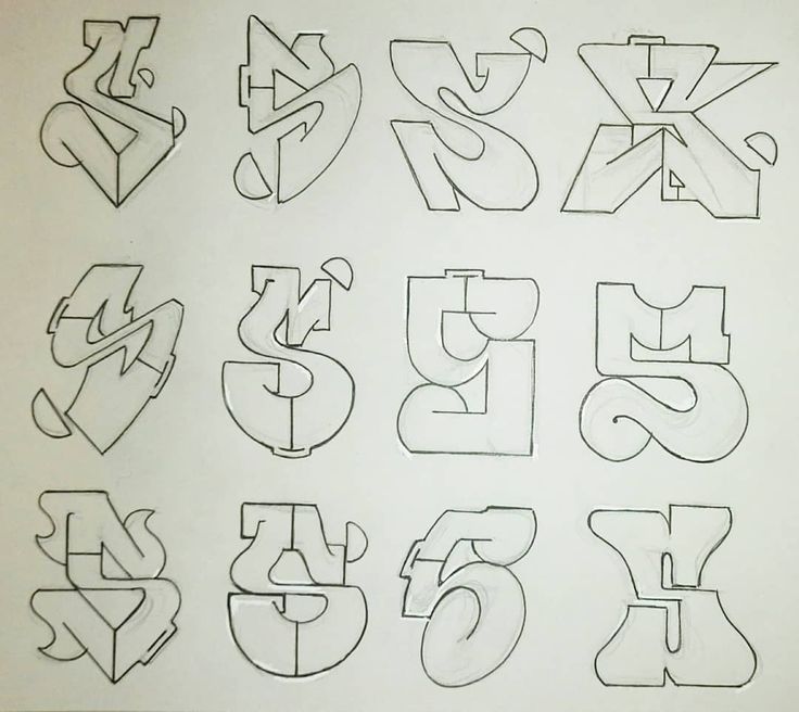 Look at different objects in your room, both rounded and rectangular, to get a feel of how the lights and shadows play on it. It takes a little practice to get it right, but hey, practice makes perfect!
Add details
Sometimes you will need to add some details on the letters themselves. Add anything from a simple inline to intricate flourishes and shading. Let’s take a look at just a few examples:
by MkyThere is no rule for how to add these, except for keeping the letterforms legible and relevant to your project.
Adding decorative elements
At times, you’ll want to fill the empty space around your letters. Again, keep the letters readable at all times.
by MkyMake sure you don’t go too crazy with the flourishes and little decorative elements. Or if you choose to go crazy, do it in a way that fits your concept and style.
Gorgeous example of flourishes. Notice how, even though the artist went crazy with them, they don’t make the word less legible or the overall look crowded.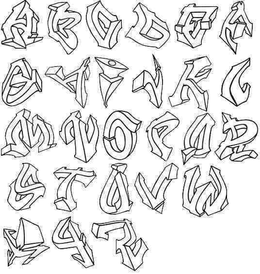 Every little curve has its place and purpose. Artwork by Vera Drmanovski.
These flourishes and swashes can be part of your letters or stand on their own. Either way, they can help balance out your composition and make your letters stand out.
You don’t have to go crazy with decorative elements to make a piece wonderful. In this case the designer uses an illustration and little hearts to emphasize the written message. Artwork by Soniaydesigns.5. Draw expressive letterforms
Let’s do some actual lettering!
As a hand letterer you need to be able to express feelings and emotions solely with the style of the drawn letters. For example, you most probably won’t be using a decorative, circusy slab serif for the title of a fancy event invitation (except if it’s a circus conference?) or a sophisticated script lettering for a sports magazine cover.
Practice by trying to illustrate random words with the help of letters. Pick your word and think about what feelings can that word evoke. Write a list with everything that comes to your mind when you think about the given word. You can write objects, feelings, styles, anything. The longer the list, the better.
You don’t have to use each of these ideas, but it’s useful to see them all and use the ones that fit your concept the best.
After you feel like you got everything you need, start drawing. At first, focus solely on getting the idea from your head to the paper. Don’t get precious with your sketches. Don’t focus on details, and don’t get sad if you mess it up. A sketch is supposed to be messy! Try to sketch fast, without overthinking it and listen to your instincts. Sketch out more than just one concept for the chosen word so that you’ll be able to choose the best.
by MkyA little trick about sketching is to always start with the skeleton of the letters and add weights after. You’ll have a solid foundation to build on so you’ll be able to concentrate on the very construction of the letters.
Also, try to not only draw the word in a certain style, but use objects to represent it.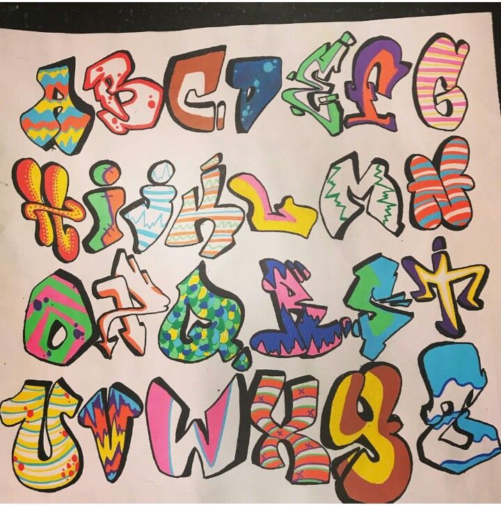 For example, you might build the word ‘bones’ from little letter shaped bones or draw actual melting letters for the word ‘melt’.
After you’ve narrowed it down to one concept per word, keep sketching and refining. This is where you add dimension, flourishes and decorative elements. Reference your list to use relevant elements!
by MkyNow, instead of using one style to define the word, use many different styles to give the same word different meanings.
Follow the same pattern: choose your word, write the list and get sketching! Again, don’t get precious with your initial sketches, just let your ideas flow. Think about the many emotions one word can evoke. You’d be surprised to see how the vibe of one word can change just by drawing it differently.
by MkyPretty fun, isn’t it? You can repeat this exercise daily and you’ll start to see improvement sooner that you might expect. Don’t forget to keep your letters legible, but allow yourself to make mistakes!
Bring hand lettering to your own designs!
—
If you made it through this tutorial, you’re awesome and one step closer to mastering the art of hand lettering.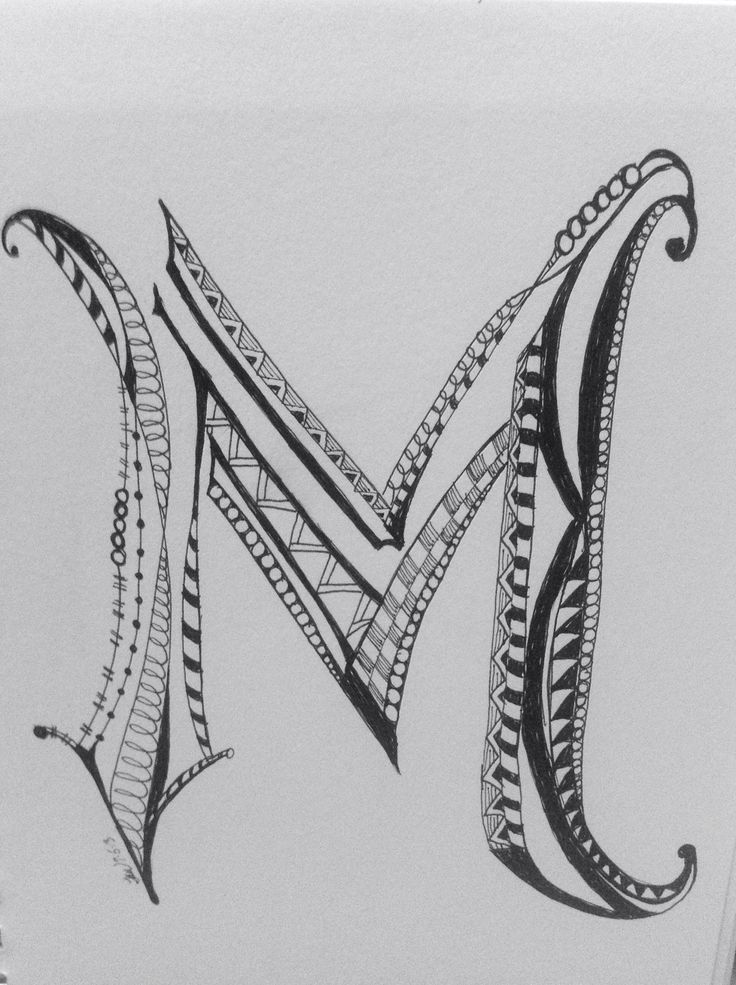 Be proud! I know that getting started can be intimidating, but you’ll soon find that hand lettering can be such a fun form of art.
You probably have the urge to jump into hand lettering head first, and start drawing intricate, detailed quotations. But first, get comfortable with drawing a single word. You can’t build a house if you don’t have strong bricks, right? With these basics, you have endless possibilities to draw letters and improve your skills.
Once you start creating, share your work with the world! Remember, everyone started out as a beginner, and everyone needs their fellow artists to give them a little nudge every now and then.
>> Ready for the advanced class? Read our tutorial to hand lettering quotes and sentences.
How to draw letters? 12 tricks of a professional letterer
Creativity
How to draw letters? 12 tricks of a professional letterer
March 10, 2020 24 674 views
Elena Isupova
We have been in love with lettering for a long time.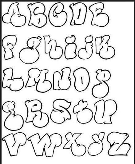 If you are also partial to dancing inscriptions, whimsical flourishes and neat serifs, this article is for you. It contains tricks for drawing letters from the book "About lettering" by Jessica Hisch. She is a master: she participated in the creation of book covers, magazine illustrations, logos and invitations to a Hollywood party. Take your pencils!
Readability
It is of primary interest to customers. There are letterforms (often handwritten) that always irritate people. It is necessary to make sure that none of them merges with the other, which means limiting the number of loops.
Pro lettering
Round letters
Slightly extending beyond the baseline and topline of characters (uppercase or lowercase). This is called optical compensation, and the elements of the letters themselves that extend beyond the line are sometimes called droop. Due to this, the contact surface with the base line and the top line of the letter O is the same as that of other letters, and the height of all letters is the same in appearance.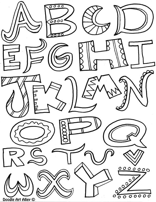
Symmetry
Symmetry in letter design has nothing to do with mathematical symmetry. You adjust each sign to achieve a balance between it and the negative space around it. B, P and R may look very similar, but they have different semi-ovals depending on the density and background.
Negative (white) space
Inside and around a letter in a design, it is no less important than the characters themselves. It affects readability and tells you how to draw letter fragments. The author of the book advises to create such an inscription, all parts of which are well balanced and with the same "color" throughout (if you squint, there should not be large holes between or within the letters, or parts that are too dark compared to other letters).
Rungs
Rungs do not have to be at the same height. The ideal center for different letters is likely to be different. In A, the crossbar should be placed lower (given a little negative space in the intra-letter gap), in E, a little higher than in F (F has a lot of white space below compared to E), and in H, just above the center line.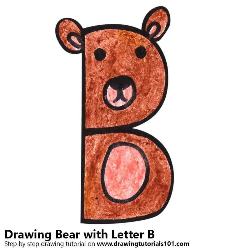 When located exactly in the center, it would seem that it is lower. It's like framing a picture. Always leave some margin at the bottom, otherwise the framed work will look low-set. Our eyes play tricks on us: perfectly centered objects seem slightly weighted at the bottom.
Style/mass of the letter
When choosing the thickness of the lines of the letter, start from the composition or its part, from how it should “sound”. If individual words need to be emphasized, make the letter more saturated. If the goal is to create subdued and elegant lettering, the style will be lighter.
Contrast
In a contrast style, the main lines will be emphasized thick, and the additional lines will be thin. Didot and Bodoni typefaces have become firmly entrenched in the fashion industry, as a result, contrasting fonts began to seem stylish and feminine.
In non-contrast, the main and additional strokes are approximately the same in thickness.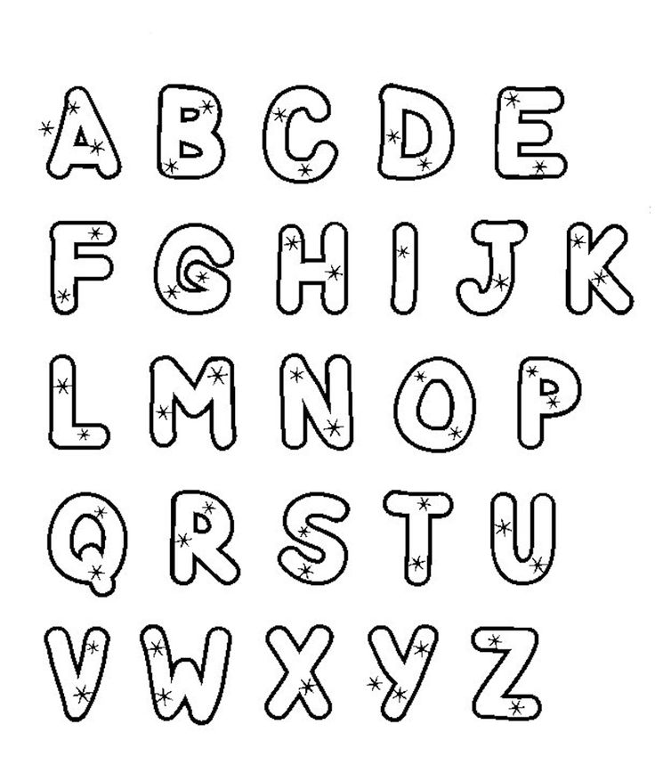 In monospace lettering, there is no difference between main and additional strokes (such an inscription looks like it was laid out with a piece of thread - it has a uniform thickness). In design, high-contrast fonts are used for signage or headings, while low-contrast fonts are used for body text.
Pen logic
If you remember pen logic, you can easily guess how thick and thin strokes are arranged: thin strokes are used for ascending lines, and thick strokes are used for descending (when working with a pointed pen, you can understand why the movement of the pen up in an attempt to draw a thick stroke leads to paper tearing and ink splattering). When sliding towards you, the tip of the pen does not cling to anything and the ink falls freely. If the letter looks strange, ask yourself: "Did I follow the logic of the pen, did I reverse the contrast?" If you are not following the logic of the pen, convince everyone that you are doing it on purpose.
Placement of serifs
Many people have doubts about where to place serifs. In calligraphy, they are located at the beginning and end of a stroke, and now you will find out where serifs should be in Latin letters. For lowercase letters (b, d, h, k, l), serifs are used only on the upper descenders on the left (ascending stroke). On the baseline, they can be double-sided (as in the base l) or be at the bottom right (downstroke). On the top line of the line, they are one-sided at the beginning of the letter and sometimes two-sided. Take a closer look at how type designers place serifs in classic (and modern polished) typefaces.
Strokes
Look at the word you have drawn and choose the most appropriate places for strokes. Usually these are ascenders or descenders, to the left of a capital letter or on the last descending stroke of a word. In decorative lettering, the height of the decorative elements is not important, the main thing is that they be in their place and look like a natural continuation of the letter, and not an arbitrarily stuck element.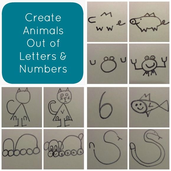 Make sure the strokes look like they were drawn with the same tool as the letter (unless, of course, you intended to intentionally depict them otherwise). Try not to overdo it.
Linear volume, volume, shadow
These three options are borrowed from sign painting, but they perfectly bring letters to life. Learn to think like a signpainter, ask yourself: “How can I do this with the fewest strokes?”. This will determine which side these elements will be placed on (usually they are located on the left).
Hatching and other decorations
There are a million ways to decorate a letter. You can shade one or both sides, add interesting crossbars to A, H, E and F, inner shadow and decorative elements, several levels of shadows - even to the horizon.
Explore decorative typefaces and Victorian lettering, vintage maps with whimsical city names, marvel at beautiful signpainting around the world, or explore woodblock lettering sets.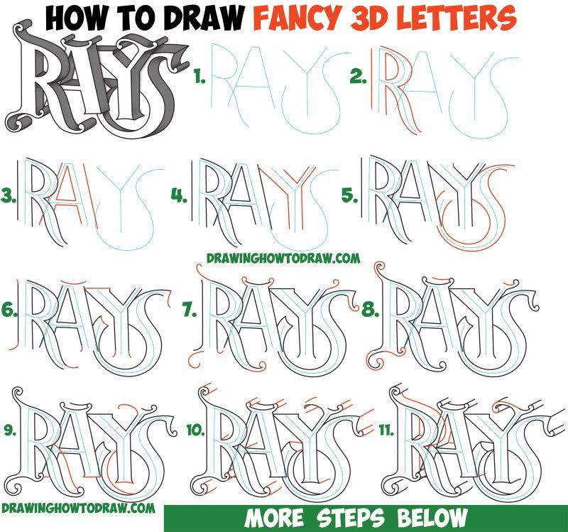 Absorb everything.
Based on the book "About Lettering"
Post cover - illustration from the book
LETTERING FOR BEGINNERS - how to draw beautiful letters
Calligraphy is about as old as the ability of a person to express his thoughts and feelings through writing, so calling lettering a fresh direction will not work with all desire. However, right now, in the age of digital art, when a drawing or an inscription of any complexity can be created using a computer, the art of drawing beautiful letters by hand has gained a second wind!
With the help of lettering, you can design everything: a signboard, advertising, a restaurant menu, postcards, and the most remarkable thing is that almost everyone who has the desire and patience can learn how to draw stylish fonts! How to draw the first beautiful letters, where to start mastering simple and complex fonts, what a beginner needs to know about lettering, we will tell in our article for the most creative readers :).
How to prepare
Before you start mastering the art of lettering, it is important to take care of a comfortable workplace and quality tools. You should be as comfortable as possible during the creative process. It is better to free the table from everything superfluous so that you have somewhere to turn around. Don't forget about good lighting: in order to learn calligraphy faster, you need to see perfectly how and what you are doing.
Lettering is an art that requires certain tools. The basic minimum of accessories looks like this:
- Fountain or ballpoint pens, mechanical or lead pencils, markers (you can look for stationery for drawing letters on the Coupon at nice prices with cashback). By the way, it is quite possible to create both independent works with a pencil and a rough basis for further painting over with ink if you are afraid to draw clean with a pen. When choosing a fountain pen, pay attention to the pen - it should be hard enough and still draw smooth lines.
 If you decide to stay on ballpoint or gel pens, choose them so that it is convenient for you to work with them.
 - Thick and smooth unlined paper, and you can purchase two sets - rough and fine, you can also use sketchbooks for lettering. Avoid coarse-grained rough paper, especially if you are going to draw with ink - the pen tip will cling to it, leaving blots, and the high absorbency of this texture will blur the contours of your letters.
- A supply of quality black ink if you intend to draw with a fountain pen. Of course, black is not the only color that can be used in lettering, but it is best suited for beginners: drawing in black, you will immediately see all your mistakes.
- A paper holder that keeps the paper from slipping out from under your hand.
- Special writing board that can be placed under the paper. In extreme cases, you can take 5-6 sheets of plain paper - the main thing is that your "canvas" does not fidget on the table and does not interfere with your drawing.
If you're going to use ink, make sure you have a non-terry towel and a cup of water at your workspace before you start writing so you can clean your pen. The jar of ink should have a wide enough neck so that when you lower the pen into it, you do not touch the walls of the container with it. Place the jar itself at a convenient but safe distance so as not to inadvertently touch it with your hand and knock it over. If desired, it can even be attached to a table or something stable with duct tape.
Ready? And now let's learn how to draw letters!
Where to start
No art form can be mastered in a rush, and lettering is no exception, even if it's not painting in the Da Vinci style :). In order to learn how to draw beautiful inscriptions from scratch, you first need to understand the basic principles of constructing letters and letter combinations.
Warm-up exercises
Before you draw letters, practice creating simple geometric shapes, patterns, smooth curved lines - in other words, all those elements that fonts are built from.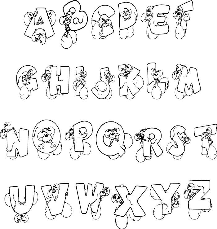 Take a ruler, draw lines on paper, and on each line draw the same figure several times. So you fill your hand, learn to maintain an equal distance between the elements, learn to control the pen.
The most important thing in this business is to take your time and strive to ensure that your slowness is compensated by the accuracy of drawing and the clarity of the lines. If you are not sure that you can immediately draw samples of ideal letters and elements for yourself, buy or print copybooks that show how to draw Russian letters and letters of the English alphabet, which are most popular in lettering.
How a letter is built
The first rule that a beginner in lettering should remember is that any typeface is a system in which all elements are somehow repeated and echo each other. To make it easier to navigate this system, remember the following designations, which determine the details of the font:
- Basic - bold vertical and diagonal strokes, which should look the same within the same inscription.
- Connecting - additional strokes that are drawn more subtle.
- Baseline - an imaginary straight line on which all the letters of the inscription are arranged in a row (so that they do not go up or down).
- Descenders and descenders - details, strokes, swirls that extend beyond the baseline.
- Intra-letter gaps - holes in letters formed by ovals and semi-ovals (by the way, the latter should be the same thickness as the main strokes).
- A drop is a plastic element that decorates the ends of letters, but it is not found in all fonts.
- Influx - a line forming an oval or semi-oval.
- Aprosh, letter spacing - the distance between adjacent letters.
How to draw letters
In lettering, as in ordinary drawing, whether graphics or painting, there is a universal principle: "from the general to the particular." This means that you first need to make a sketch, and then string details and beautiful elements onto the frame.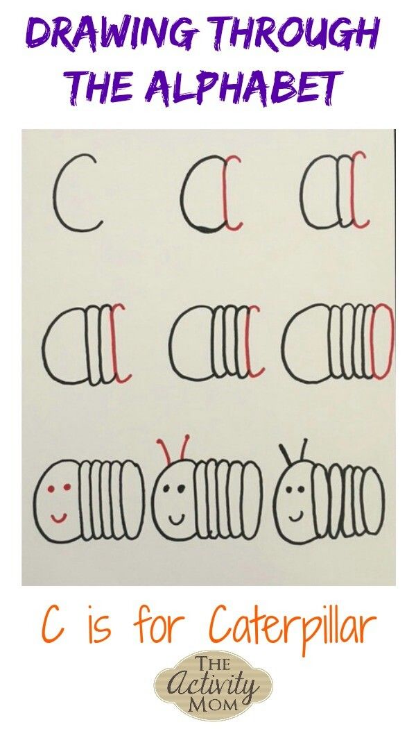
So, let's draw a letter:
- We outline the ratio of width to height with light strokes to set the dimensions of our letter.
- Schematically mark the main and connecting strokes and, if available, draw ovals and semi-ovals.
- We outline the finished frame with details, clearly trace all the lines, paint over where necessary.
Draw words
Strokes make letters and letters make words. And in order for the font to look harmonious, it is important to maintain the correct distance between the letters. Correct does not mean the same, because all the letters of the alphabet, whether Cyrillic or Latin, have a different shape, which means that the gaps between them must be different. How to learn it? First of all, you need to trust your own eyes, but then practice and a few simple principles that you need to remember will help:0003
- The largest distance should be between two vertical strokes that are next to each other.
- If the vertical stroke is adjacent to the rounded detail of another letter, the distance should be slightly less.
- Even smaller should be the distance between two rounded strokes located side by side.
- The minimum distance is between straight or rounded elements that are located next to diagonal strokes (letters of this design include A, U, G, and also G and T, if imaginary lines are drawn between their extreme points).
By following these simple rules, your fonts will look nice and even. And so that the result is not only in words, but also in deeds, let's practice and do simple exercises for beginners that will help you master the basic principles of lettering and learn how to draw beautiful letters.
Exercises
Pangram
Using the font shown below, write the phrase "Eat some more of these soft French rolls and have some tea!". Why is this exercise perfect for training? This phrase is a pangram, that is, it uses all the letters that are in the alphabet, which means that by drawing this phrase, you will get acquainted with all the options for strokes and lines.
Life hack: don't try to get perfectly straight lines like you're a typewriter :). In lettering, a slight carelessness is valued, which is characteristic of hand-drawing, so when drawing letters, you can afford to add more liveliness and mobility to them.
Video Lesson: Exercises for Hand Setting
If you have mastered the pangram drawing, you have a desire to learn further, and you are interested in new exercises, we recommend that you watch this short video, which clearly shows how to train correctly in order to get your hand on simple elements :
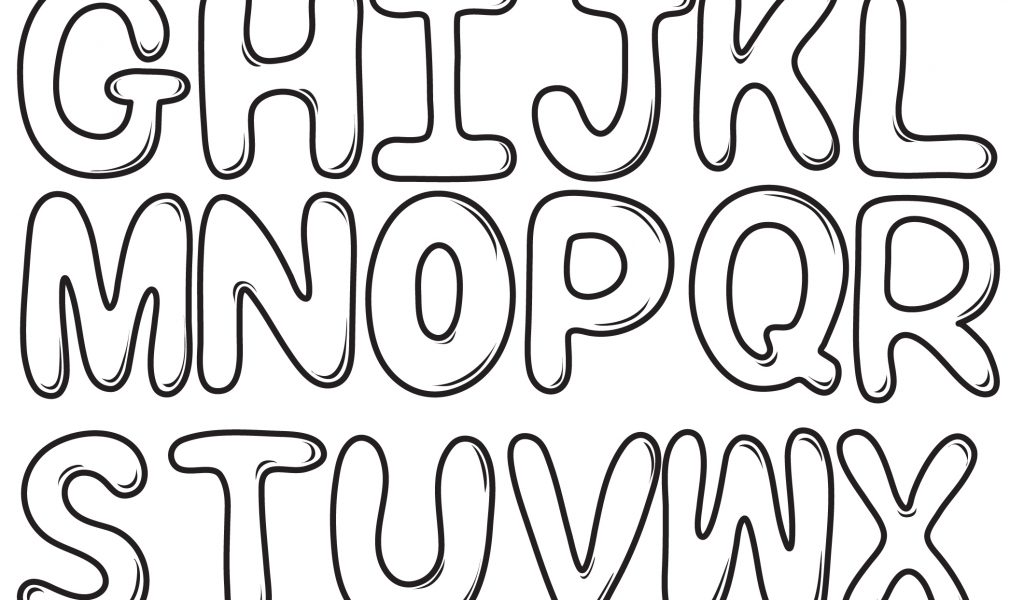
Copy fonts
One of the best ways to master lettering and learn how to draw beautiful spectacular inscriptions that will not be ashamed to decorate a card or a gift for a birthday or any other holiday is to copy various fonts and decorative elements. To keep the practice fun, choose styles and embellishments that truly inspire your creativity. And to make it easier for you to choose, we suggest that you familiarize yourself with the options for stylish fonts, which you will see just below 🙂
Beautiful basic fonts
One of the easiest options to start with is a Soviet font, angular, without smooth lines and decorations.
And this font is also a greeting from the past :). Drawing such letters, you will remember the old Soviet cartoons with branded captions on the screen saver.
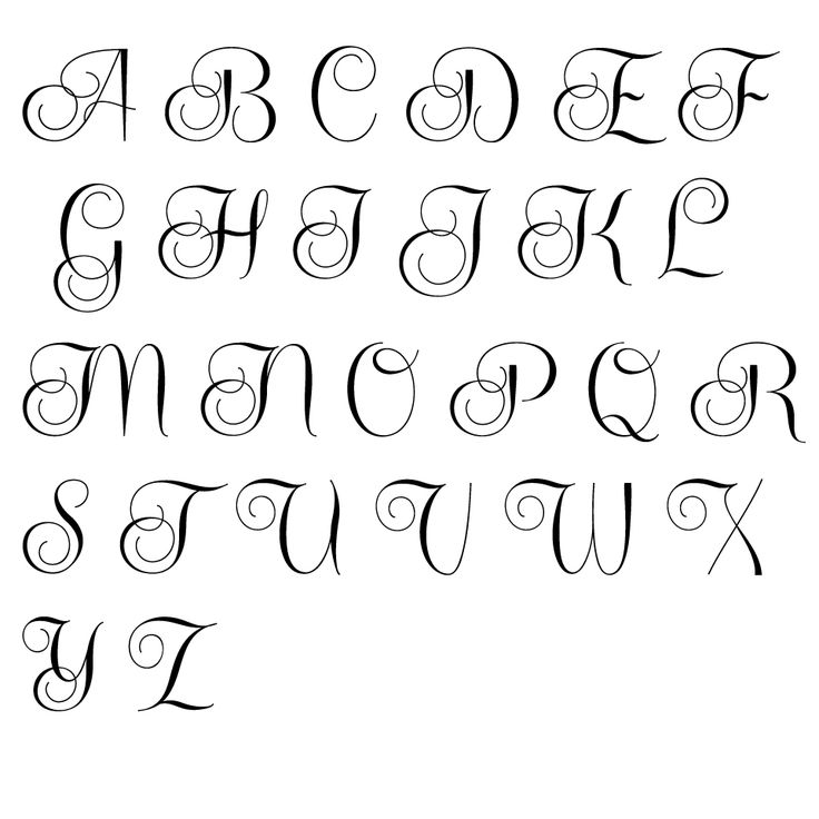
A little more nostalgia and fabulous mood will give you the English alphabet in Disney style.
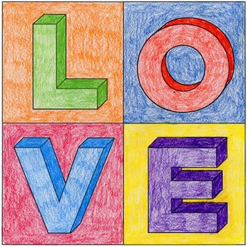
Playful fonts for signs, postcards and motivating captions in a personal diary or sketchbook.
You don't have to write in black on white if you can write in white on black :).
Options for those who have already managed to get their hands on and are ready to climb to more difficult levels:
Have you ever practiced lettering? Or maybe you want to learn? Share your favorite fonts and video tutorials!
Daria Pogrebnaya
I write articles on various topics: tourism, beauty industry, useful tips, posters, creativity.