Into 2 space
How Do We Launch Things Into Space?
The Short Answer:
We launch things into space by putting them on rockets with enough fuel — called propellant — to boost them above most of Earth’s atmosphere. Once a rocket reaches the right distance from Earth, it releases the satellite or spacecraft.
Watch this video about how we launch things into space! Click here to download this video (1920x1080, 48 MB, video/mp4).
We launch satellites and spacecraft into space by putting them on rockets carrying tons of propellants. The propellants give the rocket enough energy to boost away from Earth’s surface. Because of the pull of Earth’s gravity, largest, heaviest spacecraft need the biggest rockets and the most propellent.
The GRACE Follow-On spacecraft launched into orbit in May 2018. Credit: NASA/Bill Ingalls
How does a rocket lift off?
More than 300 years ago, a scientist named Isaac Newton laid out three basic laws that describe the way things move. One of the laws says that for every action, there is an equal and opposite reaction. This is the most important idea behind how rockets work.
Credit: NASA/JPL-Caltech
If you see pictures or videos of a launch, you’ll see exhaust streaming out the bottom of the rocket. Exhaust is the flames, hot gases and smoke that come from burning the rocket’s propellants.
The exhaust pushes out of a rocket’s engine down toward the ground. That’s the action force. In response, the rocket begins moving in the opposite direction, lifting off the ground. That’s the reaction force.
Once a rocket launches, will it keep going?
It’s not that simple. Earth’s gravity is still pulling down on the rocket. When a rocket burns propellants and pushes out exhaust, that creates an upward force called thrust. To launch, the rocket needs enough propellants so that the thrust pushing the rocket up is greater than the force of gravity pulling the rocket down.
Credit: NASA/JPL-Caltech
A rocket needs to speed up to at least 17,800 miles per hour—and fly above most of the atmosphere, in a curved path around Earth. This ensures that it won’t be pulled back down to the ground. But what happens next is different, depending on where you want to go.
How to Orbit Earth:
Let’s say you want to launch a satellite that orbits Earth. The rocket will launch, and when it gets to a specific distance from Earth, it will release the satellite.
Credit: NASA/JPL-Caltech
The satellite stays in orbit because it still has momentum—energy it picked up from the rocket—pulling it in one direction. Earth’s gravity pulls it in another direction. This balance between gravity and momentum keeps the satellite orbiting around Earth.
Credit: NASA/JPL-Caltech
Satellites that orbit close to Earth feel a stronger tug of Earth’s gravity. To stay in orbit, they must travel faster than a satellite orbiting farther away.
The International Space Station orbits about 250 miles above the Earth and travels at a speed of about 17,150 miles per hour. Compare that to the Tracking and Data Relay Satellites, which help us get information to and from other NASA missions. These satellites orbit at a height of more than 22,000 miles and travel much slower—about 6,700 miles per hour—to maintain their high orbit.
Credit: NASA/JPL-Caltech
How to Get to Other Planets:
If you’re trying to get to another planet, you’ll need a fast-moving rocket to overcome Earth’s gravity. To do that, you’d have to speed up to around 25,000 mph. But you’ll also need to figure out the best time to leave Earth to get to that planet.
For example, Mars and Earth reach their closest distance to each other about every two years. This is the best time to go to Mars, since it requires the least amount of propellant and time to get there. But you’ll still need to launch your rocket at the right time to make sure the spacecraft and Mars arrive at the same place at the same time.
Check out this video if you want to learn more about how to get to Mars. Credit: NASA/JPL-Caltech
You’ll also have to carefully plan your travels if you want to travel to the outer solar system. For instance, if you’re sending spacecraft to study Saturn, do you want to encounter Mars and Jupiter on the way there?
If you liked this, you may like:
How Does GPS Work?
Launch a rocket from a spinning planet
Make a topographic map!
TIME for Kids | Do We Still Need to Send People into Space?
- Space
September 8, 2022
Brian S.
 McGrath
 Did you know that humans haven’t walked on the lunar surface since the Apollo 17 mission, in 1972? With NASA’s Artemis missions, astronauts could soon be on the moon again—and eventually on Mars. Artemis I will take an Orion spacecraft on a journey around the moon and back. No crew members will be on board. But in 2025, NASA plans to begin setting up a base camp for astronauts, near the moon’s south pole. They’ll study how long-term space travel affects humans.
The possibilities are exciting. But is space travel worth the dangers it poses to astronauts? We have plenty of technology for safely exploring space: probes, telescopes, rovers. Do we really need to send people? We asked TFK Kid Reporters to weigh in on this question.
Elisha Lee, 11
Wilmette, llinois
We still need to send humans into space. Earth could become overpopulated. If we fail to address climate change, the planet could become uninhabitable. We’ll need to go to space to survive.
With the Artemis missions, we could establish a moon base. That would be a step toward the bigger goal of reaching Mars. We need to find out if living on Mars is possible. The robotic missions send back a lot of information. But it won’t be enough to help us understand how we’d fare on another planet. Only human exploration can prepare us for that future.
Lino Marrero, 15
Frisco, Texas
As a future aerospace engineer who believes in the promises of space, I also believe in automated space technology. Sending humans to space was a good idea in the 1960s. It made us feel proud of human potential. But at that time, we didn’t have powerful space telescopes like Hubble or Webb. Or robots like the Mars rover. It’s time to reconsider how we go to space. Sending robots costs less than sending humans. Robots can stay in space longer and don’t make mistakes. And robots’ lives are not at risk. If damaged, they can be repaired or replaced. Their scientific returns are too great to ignore.
Orion Jean, 11
Forth Worth, Texas
I believe sending humans to space is still a necessity. Automated spacecraft, like the uncrewed Orion that’s headed for the moon, may have certain advantages. But there’s no substitute for human exploration. Think back to the Apollo missions and how they inspired us as a nation. That can happen again, with benefits that will continue into the future.
The experiences of the first American crew returning to the moon will inspire the next generation of STEM leaders. That generation of scientists will unlock new mysteries, and answer the questions we haven’t yet thought to ask.
Shaivi Moparthi, 13
Sugar Land, Texas
Space travel can take a huge toll on the human body. Two of the most dangerous aspects of going to space are radiation and microgravity. They can lead to weakened bones and cell damage. Astronauts also experience fatigue and depression from long periods of isolation. Living in a spacecraft is not easy.
Advanced technologies like artificial intelligence and robotics have transformed space missions. Rovers and robots can perform as well as, or better than, people. They could stay on the moon or Mars for decades, doing research, with no danger to human life.
Kellen Bhatt, 11
Alpharetta, Georgia
Humans should continue going to space. Astronauts still face dangers, but practice makes perfect. As research and technology develop, we’ll find ways to keep astronauts safe. We’ll also find ways to reduce the impact of low gravity on the body and protect astronauts’ health.
And let’s not forget what we’ll gain from human experience. Robots can gather information. But they can’t respond like humans in all situations. We couldn’t rely on them to develop a space colony that would be fit for humans. We shouldn’t let them handle all the missions.
Samirah Horton, 13
Brooklyn, New York
We should not send humans into space, at least not now. Sending humans into space costs a lot of money. For example, it’s estimated that by 2025, NASA will spend $93 billion on the Artemis moon program. That same money could be used for solving problems on Earth. We could invest in cleaner energy to fight climate change, or fund research for curing diseases. I’m not saying that space exploration should never happen. But for now, we should explore space with the technology we have, and focus on addressing the problems we have on Earth.
The Next Debate! Should kids have smartphones? Email your opinion to [email protected] by October 21. Your response might be featured in an upcoming issue.
*Submissions have been edited only for length and clarity. They are not intended to reflect the views of TIME for Kids. Ages are accurate as of the time of submission.
Are two spaces better than one? Feedback on a new study / Habr
Several people have asked me to comment on a new scientific study called “Two spaces are better than one? The Impact of Dot and Comma Spacing in Reading, by Rebecca Johnson, Becky Bui, and Lindsay Schmitt.
In apparent contradiction to Betteridge's rule, the study claims that two spaces after a dot make it easier to read. It also goes against my longstanding advice to use only one space between sentences.
Since the study costs $39.95 per PDF, I'm sure social media naysayers were quick to declare a two-space victory without buying or reading the work itself. But I did both.
(A secret for the researchers of the two gaps: I suggest that you consider publishing the paper for free, as this may be the last time the topic of your scientific work follows the mass Internet obsession).
Indeed, the authors found that two spaces after the dot gave a "small" but "statistically... significant" improvement in reading speed - about 3% - but it is curious that only those readers who already use two spaces after the dot themselves when print. For ordinary "one-spacers" no improvement was noticed.
In addition, the researchers only tested samples of a monospaced font on screen (like the one shown below). They haven't tested proportional fonts, which they say are much more common. They also didn't test the effect of two spaces on printed text. The authors acknowledge that any of these test arrangements may affect the results.
As a result - a small difference, and only in a limited category of respondents, with numerous reservations. I'm afraid there's nothing interesting here.
Of course I don't argue with the study. This is science! I only have a few questions mentioned below. But overall, this is an example of why reading readability is often of little use to practicing typographers. The typography is broad and deep, and research can only test narrow assumptions.
While I will continue to read future research on this topic—budget permitting—but first of all I want to agree with the final thought of the researchers: “There are probably more important things worthy of such passionate debate.”
Combat
Perhaps passionately arguing about silly topics is the raison d'être of the Internet. The trolls have been trying to drag me into an argument about two spaces for ten years. At first I indulged them. But not for long.
Why? Spoiler: I really don't care how many spaces you put between the sentences of . One? Two? Seven? π/4? Everyone goes crazy in their own way.
Typography is not a science. As with the language itself, there are some structural and practical conventions. If your goal is to influence the reader, then it's best to be aware of these conventions because they can help. Conversely, departing from these conventions may have undesirable consequences.
But in the end it's up to you. I have never presented myself as the best connoisseur or typographical police. I try to teach these typographical conventions to writers because they are not traditionally taught in language and literature classes. (Although they should, because in the digital age, typography skills seem to be just as important as typing skills.)
Even if the typography genie gave me one wish, I wouldn't waste it on eliminating extra spaces between sentences. I would correct the overuse of CAPS, which is a truly bad habit.
If there is room for wiggle room and choice, I talk about it. The reader should develop their own judgment about typography, and not just adopt my opinion, as victims of a cargo cult. I strictly adhere only to those typographical conventions that are firmly rooted. In other words: let's not waste energy arguing the undeniable.
That's why I start with one space between sentences. Not because it's so important. Because the rule is so well rooted. This is a litmus test for typography naysayers: if you can't agree that professional typographers always use one space between sentences, you'll probably find the other rules generally boring.
Ten years ago I challenged the skeptics to show me one book, newspaper or magazine that uses two spaces between sentences. Nobody has done this so far.
The role of research
I once spoke about typography to a group of law professors at the University of California. At the end, one of them, a well-known empiricist in the faculty, said: “Matthew, this is all very interesting, but why don’t printers solve these questions with the help of empirical research? You can’t leave it up to subjective consideration which typeface is better.”
“Great idea, professor. By the way, have you researched which article with a review of the law is more likely to extend your position at the university? How many words should be in the first sentence? Average number of vowels in a paragraph?
I didn't say that, I just thought. Obviously, this was not a serious question. The professor thought typography was a stupid topic, so he dismissed it with an empirical argument: not enough objective research.
What I actually said to him is more like this: "Typography - like language and any other form of human expression - does not belong to the realm of strict objective truth."
A good selection of useful research over the years can be found in Sophie Beyer's Letters to Read: Designing for Readability (see bibliography).
This does not mean that typographers are hostile to the idea of research or that readability cannot be tested empirically. In contrast, many typefaces have emerged from empirical research, for example:
- The Retina typeface is designed (originally for Wall Street Journal ) to remain legible on low-quality newsprint. Designer Tobias Frere-Jones studied how ink bleeds on newsprint and made cutouts to compensate. Although these "ink traps" look strange at large sizes, they are invisible at small sizes. And instead of weird bubble shapes, the letters just look right.
- A new Clearview font designed by Don Meeker and James Montalbano has been approved for use on federal highways. Road signs need to be readable by drivers at various speeds and light levels - and the font has been tested under these conditions.
- Microsoft's Sitka font, designed by Matthew Carter, also came about as a result of Windows screen readability research.

The above examples have one important common property. In each case, the designer was tasked with optimizing readability in specific context . Therefore, it was possible to narrow the research topic enough to make the results verifiable. (It is important that for these projects there was also a customer who paid for testing). In turn, these tests have yielded sufficiently accurate results to become a concrete type design guide. In short, empirical research has been useful precisely because of the narrowness of the problem area.
Back to the law professor's question: if we continue the process, can we find the best font for everything? Looks hopeless. Research by its nature tests narrow problems. As I said in What Is Good Typography, typography cannot be reduced to a math problem with one correct answer. Similarly, it is difficult to imagine a narrow study of typefaces whose results are extrapolated to any possible context.
However, while empirical research does not solve many typographic problems, typography cannot be called a pure whim. For different problems, you can formulate typographic criteria and understand which solutions are not suitable for them. Indeed, it is always a good idea to "research" the intended context before developing a typographic solution. For example, for presentations, I recommend turning off the lights while working on the slides to better mimic the classroom environment. This is not an empirical study. But it's better than nothing.
Thus, typography functions as a written language itself. We can – and should – pragmatically narrow the space of possibilities. But in choosing from these possibilities, art, humanity and expressiveness are manifested. Just as no one will name the best sentence to start a scientific article, so no one will choose the best font for it.
New study evaluation
Thus, if the question first arises when evaluating a study, "What did it find?" , then the next question will be "What did it even check?"
First, let's be clear that this study did not test . While the article cites 48 sources—many psychologists and some of the Internet critics mentioned above—it doesn't explicitly cite any typography experts. Not me, not Eric Spikermann, not Robert Bringhurst, not Ellen Lupton, not Brian Garner, not Chicago Style Guide , nothing at all.
But it seems right. Why? None of us adhere to this rule as an empirical statement. We also do not invite to disputes. We are simply reporting that there is a longstanding convention based on professional practice: one gap. We offer no deep explanation of this rule any more than a dictionary tries to explain why love , carrot and mother-in-law do not rhyme. I'm not even suggesting that the rule has always been that way (it isn't) or always will be (typographic practice is changing, albeit slowly). But here and now, the practice — and hence the rules — are quite clear.
I think the authors of the study made the mistake of starting with the erroneous premise: "There was a lot of discussion about how many spaces should follow a full stop" and then summarizing "arguments . .. on both sides." This is a dubious foundation for a scientific thesis because it establishes a false equivalence. What would we think if a newspaper article began "There has been a lot of discussion about whether people have landed on the moon..."? The fact that some people on Reddit have a long discussion about this topic does not mean that there is "a lot of discussion" in a reasonable sense. It would be more fair to admit: “Established practice provides for one gap, although a dedicated minority still favors two. We wanted to find out: is there an empirical difference?
The false equivalence fallacy also makes me question the true motives behind this study. The authors seem to be interested in justifying the American Psychological Association, which standardized two gaps in its style guide a few years ago. As the document explains, the APA initially justified the decision on the basis of "ease of reading comprehension" despite "the lack of direct empirical evidence to support these claims. " But the article's final paragraph begins: "In summary, the current results provide empirical evidence for a change made to the APA manual that identifies...two gaps." Why would any research psychologist waste time and budget on this? Especially since the APA has already come to terms with the prevailing practice. Mystery. [Addendum: Lead author Rebecca Johnson confirmed in an interview that the aim of the study was to empirically justify the APA].
Not sure what to conclude about a professional association of scientists that rejects evidence and authority in other areas.
Anyway, back to science. The study measures the difference in the performance of reading paragraphs of text with different numbers of spaces: one and two spaces after periods and, interestingly, after commas. The subjects were 60 Skidmore College students, "native American English speakers with normal or corrected normal vision." In the study, subjects first typed a paragraph of text so that the researchers could classify each of them as accustomed to one or two spaces—also an interesting detail of the experiment.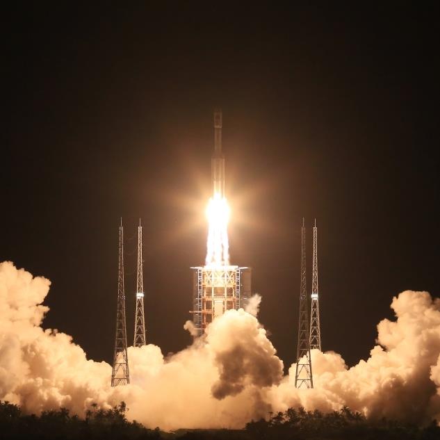
Subjects were then asked to read a series of 20 "experimental paragraphs" of 71 to 166 words. To confirm understanding, after each item, a question was asked for understanding. This determined the speed of reading and the accuracy of understanding. In addition, while reading, the direction of gaze of each subject was tracked using a special device to collect additional data on the effect of spaces on reading.
Typography in research
So what did these “experimental paragraphs” look like? The article says that the text was set to "14 point Courier New font" with "four times" line spacing, which I understand to be 56 points. The authors don't mention line widths, font colors, or backgrounds (although those settings would also affect readability).
So my best guess of what this text looked like is to take a paragraph of 84 words:
Waking up one morning from a restless sleep, Gregor Samsa
found that he had turned into a terrible insect in his bed.
Lying on his armor-hard back, as soon as he raised his head, he saw
his brown, protruding belly, divided by arcuate scales,
on top of which he could hardly hold on, ready to finally slide off
0003
blanket. His numerous, pathetically thin legs compared to the rest of the body
swarm helplessly before his eyes. It wasn't a dream. His
room, a real, perhaps too small, but ordinary room, rested peacefully
within its four well-known walls.
Paragraphs did not print, but were displayed on a "21" NEC Accusync 120 Monitor" running Windows (version not specified). This CRT display, released in 2002, supports resolutions up to 1600×1200 pixels. However, CRTs can work with multiple resolutions, and the document does not say exactly which one was used in this case - another setting that affects readability, since it changes the apparent font size. However, this is about what you would find in a psychology department at a liberal arts college—equipment installed two technology cycles ago—though not what most readers use today.
To get a more accurate impression of the actual display, here is the same text displayed by the Windows XP virtual machine:
At the outset, I said I agree with the study and its conclusions. However, I can't help but note that this style of typography is neither familiar nor realistic. This applies to the monospaced font, size, and line spacing. (Of course, the paragraph in the example doesn't follow the most basic body text rules given on this Practical Typography site.) Perhaps such differences help to isolate the problem of two spaces relative to one. Or maybe they deliberately exacerbate the problem by making the surrounding text harder to read. Given that in a previous text readability study, lead researcher Rebecca Johnson used Calibri with normal spaces.
Am I being biased and unfair? I don't think. Researchers mention these details so that others can evaluate the validity of their methods and therefore their conclusions. They are inextricably linked. But no printer will defend the readability of text in Windows on a 2002 CRT display. It was terrible then, and it's even worse now. Today, text is even easier to read on entry-level smartphones. And while no monospace font excels in readability, Courier New is one of the worst in that regard. At the time, I described him as "disgustingly... skinny, lumpy, and downright ugly."
There is no evidence that the researchers consulted the printer on the design of the study. For me it would be better to consult. Not because others are better at it. Rather, because such cooperation could lead to the organization of tests with more fruitful results. In its current form, the researchers tested the readability of text from typewriters. Since a computer can render any font in any size, it is better to use a wider variety of typography. Given the ease of printing samples, I don't think it's necessary to rely solely on an ancient CRT.
But like I said, I'm not the printing police. And definitely not the typographic-scientific police. While I accept the findings of the study, the typographical conventions seem overly—and unnecessarily—artificial. Yes, science is real. But this is a double-edged sword. We are committed to following the footsteps wherever they lead. But sometimes the tracks are not far and get lost.
Research results
Let's give credit to the authors, they do not overestimate their conclusions. (Well, except for the title of the work). According to the study, there are “statistically significant and… detectable” improvements due to two spaces after the dot: Some subjects read passages of text faster without losing comprehension.
But this conclusion comes with significant caveats:
- The measured improvement was in reading speed, not text comprehension, and was "small in magnitude" - about 3%.
- "Understanding accuracy was high under all conditions." That is, understanding did not improve from two spaces instead of one.
- "Expressions .
 .. were relatively short and perhaps not long enough or difficult to detect subtle differences" between one and two spaces.
 - The authors acknowledge the problem I mentioned above: that "paragraphs ... are presented in a monospace font" and that "word processors today use proportional fonts."
- They also acknowledge my more general point about unnatural examples and that results "may differ when presented in other fonts (or other writing systems)".
But here is the main thing that nullifies all the results. Recall that the subjects were divided into two groups of subjects: those who usually type with one space and those who type with two. 'Small' improvements in reading speed found is only for those subjects "who already adhered to this two-space convention". For the rest, no benefit was found.
For me, this is the most interesting part of the study. Here is the chart with the results (on the left, those who type with one space, on the right, with two):
Notice four aspects from the chart.
- For single-space characters, the reading speed practically does not change regardless of spaces.
- Two-space characters show a significant improvement in reading speed when reading text at intervals that are match their own typing style - that is, two spaces after dots and one space after commas.
- No particular spacing scheme speeds up or slows down reading in both groups.
- And one more important result: "two-space characters" always read the text faster, regardless of intervals ! This raises a giant red flag that the results of the study were influenced not by the number of gaps, but by other factors not directly tested.
No, I'm not prepared to put forward theories as to why "two-space" characters tend to read faster than "single-space characters." I'll leave this question to the internet hordes to debate for the next few years. It will be a nice change of subject.
Meanwhile, my advice remains the same: one space between sentences. Because the study only showed benefit for one group of readers, I also declare Betteridge's rule intact. Are two spaces better than one? No. I just saved you $39.95.
Notes
* I'm sure no one in the American Psychological Association will change their mind. As well as other fans of two spaces. But it was inevitable.
* Even if you insist on extra space between sentences, entering two spaces is an obsolete method. Modern computers rely on Unicode with many wider spaces for this purpose. I salute the one who claims: “I am not in favor of a double space, but for the space of the code point 2002 ".
* Lifehacker drily notes that "Dr. Johnson ... and her colleagues published their article in the APA style with two spaces after periods, but the scientific journal Attention, Perception and Psychophysics" [which published the article] edited [it] and eliminated double spaces.
Why do Americans stretch texts and Russians compress them?
Typing Lesson (USA), 1944
This is what Americans who are now at least 45 years old do out of habit.
 They still found the time when they learned to type texts on an IBM Selectric typewriter. According to the rules they learned, double spaces should also be used after question marks, exclamation marks, colons, and semicolons.
 In the classroom, they were explained: given that typescript characters, as well as the space, are monospaced, that is, they have the same width, it is somewhat more difficult to quickly catch the moment where a sentence ends, especially a long one, and a new one begins, which is why we introduced such principle.
When computers appeared, and with them text editors, huge possibilities opened up for using proportional fonts, in which, for example, the “skinny” letter I does not take up as much space as the "thick" W , and the letters thus cling tightly to each other within a single word. It is argued that when typing in a proportional font, the boundaries not only between words, but also between sentences are more noticeable, which means that a double space is not only not needed, but is considered a mistake.
 And yet this is not a fact. Historically, the use of longer spaces between sentences (along with regular ones) dates back to the 18th century, a hundred years before the invention of typewriters and monospace type. In typography, increased spacing was used with might and main in Europe and America. Consider, for example, the 1776 Declaration of Independence of the United States.
Or a page from Gulliver's Travels, 1865 edition.
You can also meet elongated spaces between sentences in old Russian books, for example, in the edition of the Dictionary of the Geographical Russian State, describing in alphabetical order, 1805.
Although Russian printers did not always mark such intervals strictly consistently. However, not all Europeans immediately decided how to deal with this: the French adhered to the principle - one ordinary space is enough; The British were in solidarity with the Americans.
 As a stylistic device in typography, a long space existed until about the middle of the last century, then gradually disappeared. Probably for economic reasons. In the end, such an interval significantly increased the number of pages of publications, and by this time typography had already reached previously unimaginable proportions. However, for Americans, the double-space rule between sentences continued to work in typescript and has always been in effect.
In Typewriting Speed Studies, By Adelaide B. Hakes (1937)
double spaces are used both in explanations and in illustrative examples
Moreover, now many Americans of the "old formation" flatly refuse to change their habit. Debate on the topic "Which is better: a double space or a single one?" flared up on the Internet after a special study was published in the United States this year. Its authors found that two spaces after a completed sentence resulted in a small but statistically significant improvement in reading speed.
 However, the research has already been criticized: scientists conducted experiments by giving subjects texts created exclusively in a monospaced font.
Hurray! Science vindicates my longstanding practice, learned at age 12, of using TWO SPACES after periods in text. NOT ONE SPACE. Text is easier to read that way. Of course, on twitter, I use one space, given 280 characters. https://t.co/4xI6sVbF88 Will arm-wrestle @Neuro_Skeptic pic.twitter.com/XpEr4KFR4x
— Nicholas A. Christakis (@NAChristakis) April 28, 2018
A compromise solution for Americans could be this: when typing on a computer, you should always use one space, separating sentences from each other - this is the norm! In a similar case, but when typing on a typewriter, setting a double space is not an error.Science can blow your mind sometimes, and this time it has come down on the side of *two spaces after a period*. https://t.co/tuBpFjyTCc pic.twitter.com/bRMN3V7Zfk
— Justin Wolfers (@JustinWolfers) April 28, 2018
 After all, no one has canceled this rule for typewriting!
 The Americans have a funny legend that supposedly double spaces were invented in order to increase the volume of reports, for which they paid, respectively, more. It is interesting, however, why in the "Russian tradition", on the contrary, there was a tendency to "compress" texts? Soviet typists, of course, did not put a double space between sentences: we, like many Europeans, had our own norm - there was always one space after a period or a comma, but often after them they did not beat off a single one - just contrary to the rules.
Ozeran A.E. Typescript. - Ed. 2nd, revised. and additional — Minsk, 1976.
Here Ozeran is not quite right: you can’t put a space after opening brackets and quotation marks, Berezin formulated the rule more precisely: - 5th ed., Rev. and add. - M., 1988.
Why is it that not only our self-taught people, but also professional typists, were so often dismissive of the gap? In any archives of such examples, at least a dime a dozen.
 Maybe save paper?
At the same time, before the revolution and some time after the October Revolution, the texts literally breathed "air" - double intervals were placed not only between sentences, but also between words. By the way, typographers consider such a design to be wrong - with such a set, “corridors” are obtained that spoil the look of the text.
\
The world has really turned upside down: the revolutionary sailors went around all the printing houses and seized the yati, reformers and others, but no one seized the gap, but no one seized the gap.
Typescript of the song by V. Vysotsky “So it is…” — RGALI, fund 3004, op.1, item 104, l. Yes, and put them at least five times in a row, some instant messengers and programs will automatically convert each of them into one. But they like to ignore the interval. And not only Russian-speaking "writers" of the older generation, but also young users. And here there are both opponents and defenders of free spaces in texts.
Meanwhile, the rules of Russian dialing are still in effect. A space must be placed:
- after, and not before, a comma, period, semicolon, colon, question or exclamation mark (and their combinations), ellipsis at the end of a phrase or sentence, closing brackets and closing quotation marks;
- before and not after the opening brace, opening quotation marks, and ellipsis at the beginning of a sentence;
- both before and after the dash.
Of course, there are many more rules for spacing in typography, but these are just the quintessence of ordinary punctuation. However, what's the difference? Today, many are already too lazy to start a sentence with a capital letter.
