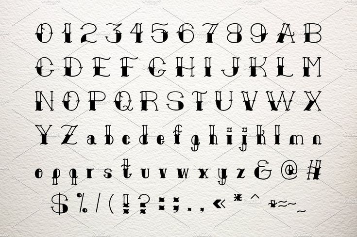
Old alphabets letters
We used to have six more letters in the English alphabet
Along quaint New England streets, you’ll probably spot a sign or two declaring itself “Ye Olde Tavern” or “Ye Old Soda Shoppe.” But before you adopt a British accent and order a pint of ale inside, there’s a bit of history you should know.
Phrases like ye olde are actually just some of the late 19th century’s first marketing ploys, meant to evoke a sentimental connection to older times. And ye has its own complicated story—based in the history of the alphabet.
Advertisement
English has always been a living language, changing and evolving with use. But before our modern alphabet was established, the language used many more characters we’ve since removed from our 26-letter lineup. The six that most recently got axed are:
Eth (ð)The y in ye actually comes from the letter eth, which slowly merged with y over time. In its purest form, eth was pronounced like the th sound in words like this, that, or the. Linguistically, ye is meant to sound the same as the but the incorrect spelling and rampant mispronunciation live on.
Thorn is in many ways the counterpart to eth. Thorn is also pronounced with a th sound, but it has a voiceless pronunciation—your vocal cords don’t vibrate when pronouncing the sound—like in thing or thought.
Today, the same th letter combo is used for both þ and ð sounds. There is a pronunciation difference—thorn is a voiceless pronunciation and eth is voiced—but that’s just something you pick up as you learn to speak. Of course, you’ll never hear about this in school, because that’s English for you.
Advertisement
Wynn (ƿ)Wynn was incorporated into our alphabet to represent today’s w sound.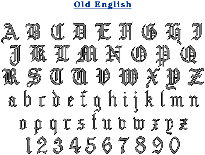 Previously, scribes used two u characters next to each other, but preferred one character instead and chose wynn from the runic alphabet. The double
u representation became quite popular and eventually edged wynn out. Ouch.
Yogh was historically used to denote throaty sounds like those in Bach or the Scottish loch. As English evolved, yogh was quickly abandoned in favor of the gh combo. Today, the sound is fairly rare. Most often, the gh substitute is completely silent, as in though or daughter.
Ash (æ)Ash is still a functional letter in languages like Icelandic and Danish. In its original Latin, it denoted a certain type of long vowel sound, like the i in fine. In Old English, it represented a short vowel sound—somewhere between a and e, like in cat. In modern English, æ is occasionally used stylistically, like in archæology or medæval, but denotes the same sound as the letter e.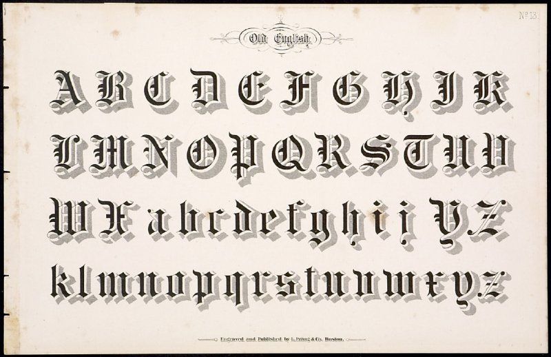
Ethel also once represented a specific pronunciation somewhere between the two vowels o and e, though it was originally pronounced like the oi in coil. Like many clarifying distinctions, this letter also disappeared in favor of a simpler vowel lineup (a, e, i, o, u) with many different pronunciations.
Advertisement
This post originally appeared at OMG Facts.
10 Letters That Didn't Make the Alphabet
You know the alphabet—it’s one of the first things you’re taught in school. But did you know that they’re not teaching you all of the alphabet? There are quite a few letters (defined somewhat loosely) that English largely tossed aside as our language grew, and you probably never even knew they existed (though in some cases, their fossils can still be seen).
1. Thorn
Sans serif (left) and serif (right) upper- and lowercase versions of the letter Thorn.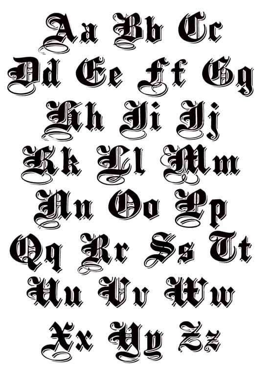 / Eirik1231, Wikimedia Commons // Public Domain
Have you ever seen a place that calls itself “ye olde" whatever? As it happens, that’s not a Y, or, at least, it wasn’t supposed to be. Originally, it was an entirely different letter called thorn, which derived from the Old English runic alphabet, Futhorc. We replaced thorn with TH over time—it fell out of use at least in part because Gothic-style scripting made the letters Y and thorn look practically identical. And since Continental printing presses didn’t have thorn anyway, it just became common to replace it with a Y, a practice that was dropped as well—except on olde signs.
2. Wynn
The uppercase and lowercase versions of the letter Wynn. / Szomjasrágó, Wikimedia Commons // CC0 1.0
Another holdover from the Futhorc runic alphabet, wynn was adapted to the Latin alphabet because there wasn't a letter that quite fit the "w" sound that was common in English. You could (and they did) stick two Us together, but that wasn’t exactly right. Over time, though, the idea of sticking two
Us together actually became quite popular, enough so that they literally became stuck together and became the letter W.
3. Yogh
The upper and lowercase versions of the letter Yogh. / Wikimedia Commons // CC BY-SA 4.0
Yogh represented quite a few sounds in Middle English. According to English scholar Dennis Freeborn’s From Old English to Standard English, in just the Middle English poem Sir Gawain and the Green Knight, it could stand for the “y” sound in yet, the “ch” sound in German Bach or Scottish loch, and many more.
But as the years went on, scholars started replacing all the instances of yogh with Y, G, or GH in their texts. Then, these new GH letters, through various linguistic processes, split into some of the wide range of sounds associated with "gh" today (though not all—the GH you see in ghost is thought to be from Dutch printers, for instance). It wasn’t a smooth process—according to linguistics professor Kate Burridge, “in the 1600s the word daughter was pronounced three ways: ‘dauter’, ‘dauchter’ and ‘daufter.’”
The yogh held on in Scotland, where its shape began to resemble a cursive Z—so when printing presses arrived, Scottish printers just replaced the missing yoghs with readily available Zs. Over the centuries, this meant that people began mispronouncing names—even today the first name of the UK politician Menzies Campbell is pronounced “MING-iss” rather than “Men-zees," though some Menzies do pronounce it with a Z.
4. Ash
The sans serif and serif versions of the letter Ash in both upper and lowercase. / Kagee, Wikimedia Commons // Public Domain
You’re probably familiar with this letter from old-fashioned text, especially the kind found in churches. It’s even still used stylistically in words today, like æther and æon. What you may not know, however, is that æ was an English letter back in the days of Old English; it was called æsc or ash after the ash Futhorc rune, for which it was used as a substitute when transcribing into Latin letters. The letter disappeared around the 13th century; then, according to author Stephen Webb, it found a use in the 16th century in the Latin form of certain Greek words and was also used to pluralize Latinate words that ended in A, meaning it disappeared and reappeared in the alphabet (though nowadays it’s back on the disappearing track).
5. Eth
The upper and lowercase versions of the letter eth. / 1234qwer1234qwer4, Wikimedia Commons // CC BY-SA 4.0
Eth is kind of like the little brother to thorn. Originating from Irish, today it represents a slightly different pronunciation of the “th” sound than is usually associated with thorn, with eth being the “th” sound in the words this or there and thorn being the “th” sound in the word thorn.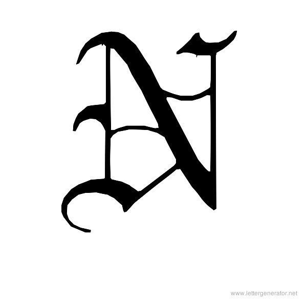
But all evidence suggests that this pronunciation difference didn’t exist in Old English—they were often used interchangeably, even within the same manuscript. According to British linguist David Crystal, a general lack of Old English manuscripts makes it difficult to determine why a thorn or an eth might be used in a particular manuscript, but it could be because there was a difference in the scribe’s accent, the variations were fun, the scribe thought one looked better or was easier to write, or maybe they just didn’t notice. Eventually both thorn and eth were replaced by TH, though thorn managed to stick around a little longer.
6. Ampersand
Today we just use it for stylistic purposes, but the ampersand has had a long and storied history in English, and was actually frequently included as a 27th letter of the alphabet as recently as the 19th century.
In fact, it’s because of its placement in the alphabet that it gets its name. Originally, the character was simply called and or sometimes et (from the Latin word for and, which the ampersand is usually stylistically meant to resemble). However, when teaching children the alphabet, the & was often placed at the end, after Z, and recited as “and per se and,” meaning “and in and of itself” or “and standing on its own” (& wasn’t entirely unique for this—people also used to say "A per se A," "I per se I," and "O per se O," especially when spelling out words to signify that those letters were functioning as words in their own right).
So you’d have “w, x, y, z, and, per se, and.” Over time, the last bit morphed into ampersand, and it stuck even after we quit teaching it as part of the alphabet.
7. Insular G
Júlio Reis, Wikimedia Commons // Public Domain
This letter (referred to as insular G or Irish G) is sort of the grandfather of the Middle English version of yogh. Originally an Irish letter, it was used for sounds like "zhyah," "jhah," and "gah." But with the arrival of the more familiar shape of the Carolingian G, that took over the "g" sound.
As Old English transformed into Middle English, insular g turned into yogh and, as mentioned earlier, was slowly replaced in large part with the now-standard GH by scribes, at which point insular g/yogh were no longer needed and the Carolingian G stood alone (though a descendant can still be seen in modern Ireland).
8. That
Much like the way we have a symbol for and, we also once had a similar situation with that (or, in Old English, þæt), which was a letter thorn with a stroke at the top. It was originally just a shorthand, an amalgamation of thorn and T (so more like “tht”), but it eventually caught on and got somewhat popular in its own right—according to Unicode, the letter could even be used as a stand-in for Old English words that contained þæt, so oþþæt ("until") could be spelled O, thorn, thorn-with-stroke-in-ascender [PDF]. And Yt (with the Y being a relic thorn, à la Ye) survived as shorthand for that until surprisingly late, showing up well into the 18th century.
9. Tironian “Et”
Jirret, Wikimedia Commons // Public Domain
It’s said that a long time ago, Marcus Tullius Tiro (who was basically Roman statesman Cicero’s P.A.) invented a shorthand system called Tironian notes. It was a fairly simple system that was easily expanded, so it remained in use by scribes for centuries after Tiro’s death [PDF].
One of the most useful symbols was the et symbol—a simple way of tossing in an “and.” It was sometimes drawn in a way that’s now a popular stylistic way of drawing the number 7. And English scribes did something very clever with it—if they wrote b⁊, that would stand for "band" or "bond" or whatever spelling that particular scribe used (this being an era before spelling bees). The Tironian et still shows up on things like signs in Ireland, but it’s largely been replaced by the ampersand.
10. Long S
Wikimedia Commons // CC BY SA-3.0
You may have seen this in old books or other documents. Sometimes the letter S will be replaced by a character that looks a bit like an F. This is what’s known as a long S, which was an early form of a lowercase S. And yet the modern lowercase S (then referred to as the short S) was still used according to a complicated set of rules (but most usually seen at the end of a word), which led to many words (especially plurals) using both. For example, ſuperſtitious is how the word superstitious would have been printed. It was purely a stylistic lettering, and didn’t change pronunciation at all. It was also kind of silly and weird, since no other letters behaved that way—so around the beginning of the 19th century, the practice was largely abandoned and the modern lowercase S became king. But it does survive somewhere possibly unexpected: calculus homework. The integral symbol is thought to derive from a long S representing Latin summa.
Additional research by Austin Thompson. A version of this story ran in 2012; it has been updated in 2021.
Yat, Omega and Izhitsa. What letters left the Russian alphabet? | education | SOCIETY
The Russian alphabet has repeatedly changed over the centuries: some letters have sunk in time, gone out of use, others have been deleted by the decision of the Academy of Sciences and decrees of the emperors. Even at the beginning of the 20th century, there were more letters in the Russian alphabet than now. Before the reform of 1917–1918, in addition to the 33 current letters, the alphabet included i (“and decimal”), ѣ (yat), ѳ (fita) and ѵ (izhitsa) and others. About which letter was considered a sign of difference between literate and illiterate, and why "fita" was called indecent, read the material SPB. AIF.RU. nine0003
Yat - Ѣ
This letter was a real nightmare for schoolchildren for many years, as it was necessary to memorize the difficult rules for its use and a long list of words in which it was written. For this reason, at one time, the 19th-century gymnasium students used the phrase “to learn to yat”, which meant “to learn something difficult well”.
For the first time, the Russian poet and philologist of the 18th century Vasily Trediakovsky proposed to abolish this letter. Photo: Commons.wikimedia.orgCompared to other letters crossed out of use, the yat stayed in the Russian alphabet for a long time. By the end of the 19th century, its pronunciation practically did not differ from the pronunciation of the vowel E (in most dialects - approx.). Despite this, yat could be found in books and documents up to 1918, when another spelling reform took place.
For the first time, the Russian poet and philologist of the 18th century, Vasily Trediakovsky, proposed to abolish this letter.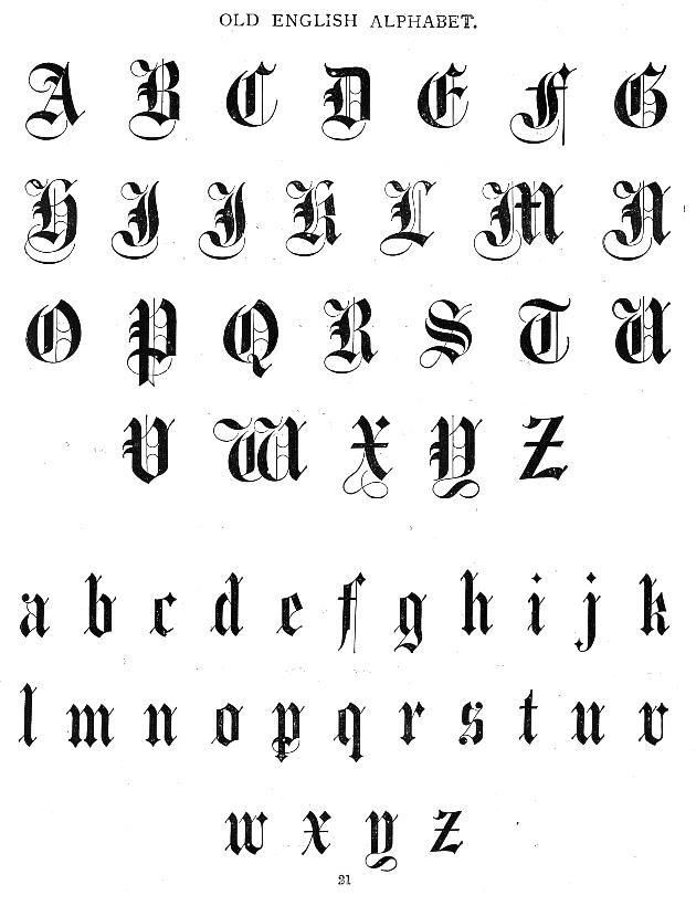 However, Mikhail Lomonosov entered into a controversy with him, who believed that “the letters E and Ѣ in common speech barely have a sensitive difference, which in reading is very clearly shared by the ear and requires <...> in E thickness, in Ѣ subtlety.”
The publicist Nikolay Grech told Emperor Nikolai I, who also considered abolishing it, that this letter is “a mark of difference between the literate and the illiterate.” nine0003
At one time, Nicholas II stood up to defend the yat. By his highest command, he mothballed the spelling reform project of 1911, developed by the Imperial Academy of Sciences.
But the Provisional Government did not intend to preserve such a literal "rudiment". In the summer of 1917, a spelling reform was announced, which was later supported by the Soviet government. As a result, in 1918, the press and office work had already been transferred to a new spelling - without Ѣ.
By the way, yat can still be found in the Church Slavonic language. nine0003
Izhitsa - V
At the beginning of the 20th century, steam locomotives V (Izhitsa), the most powerful machines of the 0-4-0 type, ran on Russian railways. They were produced in the periods from 1908 to 1918 and from 1927 to 1931, even when not everyone remembered the letter V.
During the years of the revolution, it was possible to meet Izhitsa in the words “mѵro”, “snod” and “postas”. Photo: Commons.wikimedia.orgThe fate of this little-used letter is quite eventful. She was removed and again returned to the ranks of the alphabet repeatedly. "Granddaughter" of the Greek letter "upsilon" in Russian was used to denote the vowel sound "i". nine0003
The first time it was crossed out as unnecessary by Peter I. In 1708, he introduced a simplified script for the Russian language, depriving it of a number of letters. He boldly replaced Izhitsu with I or B, depending on the pronunciation. True, it was banned for only two years: in 1710 the letter was restored. In 1735, at the same time when the “green” disappeared, it was again canceled for the next 23 years. A series of cancellations and restorations continued until the 19th century. By that time, in the alphabet, it most often stood in brackets as rarely used. nine0003
During the years of the revolution, Izhitsa could be found in the words “mѵro”, “snod” and “vostas”. There are two versions of the final elimination of this letter. According to the first of them, it simply gradually fell out of use in the civil alphabet, along with words and texts on religious topics. According to the second, it was canceled along with the decimal i, yat and fita during the spelling reform of 1917-1918. This version is reflected in the Great Soviet Encyclopedia.
Omega - Ѡ
One of the interesting letters that you will not find now in any alphabet that uses civil Cyrillic.
During the introduction of the civil font, omega was excluded from the alphabet. Photo: Commons.wikimedia.org In terms of sound in the Old Slavonic language, it did not differ from the usual letter O. Quite early, a tradition was developed to write through omega the combination from at the beginning of the word, while putting the letters friend on a friend. It is curious that often the use of one or another of these letters was determined not only by aesthetic considerations, but also by free space in the line. nine0003
As for the Church Slavonic alphabet, there omega has several forms, which can be related to each other and to other letters in different ways. There are about 5 forms of omega inscriptions: regular, "wide", ligature "from", omega with a title, and omega with a great apostrophe. So, according to one of the rules, the “wide” omega is used for exclamation words “Oh!” and “Ole!”, while above it only in this case is the used superscript sign - a great apostrophe. According to another rule, the prepositions about and about and the corresponding prefixes are written through the usual omega. nine0003
During the introduction of the civil font, the omega was excluded, although the corresponding trial letters were made by order of Peter I.
Fita - Ѳ
Thanks to Nikolai Vasilyevich Gogol, fita gained a reputation as the most indecent letter of the alphabet. In the poem “Dead Souls”, the landowner Nozdrev, having raged, calls the main character, the former collegiate adviser Pavel Ivanovich Chichikov, a fetuk (fetyuk). The author explains this by the fact that "the word fetyuk, offensive to a man, comes from Ѳ, a letter considered by some to be indecent." nine0003 Fita in the ABC of 1904. Photo: Commons.wikimedia.org
The fact is that in those years there was a playful saying “fita yes zhitsa, the rod is approaching the butt”. Her humor consisted in the fact that the letter of the izhitsa, in its outline, looks like a bunch of rods, and the fita - on the buttocks.
Until the middle of the 17th century, Ѳ was read as f and was used as a variant of the letter F - firth. Interestingly, the rivalry between fita and fert has been traced for centuries. So, for example, in the 13th century, in birch bark letters, fita is the only means of transmitting the sound f, but in the 14th-15th century the situation changes radically and the fort comes to the fore in birch bark writing. nine0003
The reform of Peter I did not pass by fita either. That's just in a positive way. First, he canceled the firth, leaving the fith the only way to express the sound "f". But three years later - in 1710 - the differences were again restored, as was the competition of letters.
Over time, "phyta" was used in a limited list of words of Greek origin - in those places where the letter "theta" (θ) was in Greek: Athens, Akathist, Timothy, Thoma, rhyme, etc.
reform 1917-1918 During these years, the fita was finally abolished with its widespread replacement with F.
Zelo - S
The twin of the Latin S - Russian "zelo" - was in use in Cyrillic in pre-Petrine times. It is no coincidence that these letters are similar in appearance: they have close Greek roots. The fact is that Latin originated from the well-known sigma (Σ), and the 8th letter of the Old Slavonic alphabet was born from the Greek ligature (combinations of letters - approx.) stigma (Ϛ, ϛ). If the Greeks often pronounced "st", then the Slavs sounded like "dz". nine0003 The civic script of Peter the Great indicated that the letter Ѕ represented the sound "z". Photo: Public Domain
Throughout its history, "zelo" has had several forms in Cyrillic. It is interesting that the sign in the form of S was used to denote the number 6, and a modified version of the letter Z, looking like a “crossed-out Z” was used in writing words.
The reform affected this letter in the 18th century. The civic font of Peter I indicated the letter Ѕ to represent the sound "z". For this reason, Z was abolished in 1708. But soon a second version of the font was released. In it, just Z returned to its place, thereby displacing S. The “green” was finally canceled in 1735 by the decision of the Academy of Sciences. Nevertheless, in Russian business documentation, the letter was preserved until the middle of the 18th century, disappearing only in the 1760s. nine0003
Subscribe to our Telegram channel - https://t. me/aifspb. You can discuss publications in our VKontakte group - https://vk.com/aif_spb.
LETTERS OF THE OLD RUSSIAN ALPHABET: helghelg2 — LiveJournal
?- History
- Cancel
Text about the origin of one of the Tambov surnames - Shemonaev
Documents on the genealogy of the Solotyachin monastery in Ryazan
Documents on the genealogy of the Tambov region (collection of censuses)
Russian handwritten documentation of the 17th-18th centuries is very difficult to understand due to the fact that this is the time of the most active use of the so-called "cursive writing" - a calligraphic style that significantly accelerated the work of scribes, but at the same time compelled readers to delve into each specific underline. The use of creative letter styles and letter combinations, abbreviations and superscripts - all this made the quality of the manuscript highly dependent on the personality of the writer. nine0003
Considering that the ancient bureaucratic language is not native to any of us, when reading fiscal books of the 17th-18th centuries, even experienced researchers need to spend some time to understand the peculiarities of the underline. To do this, you must first find the words in the text, in the correctness of your understanding of which you are sure, study the features of the style, and then proceed to “continuous reading”. Usually, in order to stop tripping over every word, it takes thoughtful study of two or three pages of a new document. Sometimes revisions were written by two or three different people in turn. In this case, it will take you even more time to master the underscores. But it certainly won't be wasted. nine0003
However, before dealing with the underline, it is necessary to study the letters that the scribe is trying to convey to his readers. Without this, you will not be able to make out even one word. For starters - an express version with the Old Slavonic alphabet and styles, taken from here.
More detailed versions of the styles of the letters of the Old Church Slavonic and Church Slavonic alphabets. The table is taken from here. The first column is a 15th-century Cyrillic statute. The second column is a semi-ustav of the 16th century. The third column is cursive writing of the 17th-18th centuries. The last three columns are printed versions. When you click on the name of a letter, you can go to a bookmark with cursive spelling options taken from the collection presented on this site, as well as in the book "Practical Course in the Study of Old Russian Cursive Writing". nine0003
alphabet
Subscribe
-
PITIM-1740
Text on the origin of one of the Tambov surnames-Shemonaev documents on the genealogy of the Tambov region (Calculinary collection) Text about history .
