What colors help you learn
How Do Colors Influence Learning?
“Colors aren’t important.”
Oh yeah - then how do you explain traffic lights, warning signs, and rainbows? Color is important, and it’s time we pay attention to color in eLearning too.
Learning is a difficult field to understand, and there’s so much research out there discussing these issues that it’s hard to know where to begin. What’s pretty obvious though is that color plays a key role in creating an environment that fosters learning.
So let’s talk about color – What colors help learning? What colors might be annoying or distracting to online learners? And how can we mitigate that risk? That’s what we’ll be delving into here.
Not convinced? What If we told you that color, as part of the electromagnetic spectrum
, is in its purest form energy, a wavelength, which has its own magnetic frequency? What if we told you that colors can affect neurological pathways in the brain? And that they can create a biochemical response? Now, facing that evidence, it’s clear that color has been overlooked for far too long. Dr. Robert Gerard recognizes this and has pioneered research, which suggests that every color has a specific wavelength, and each of these affect our body and brain in a different way.
Using the right color, and the correct selection and placement can seriously affect feelings, attention, and behavior when learning. It’s time that we leveraged that to our advantage. Even research with Alzheimer’s patients has shown that color cues improve memory and that learners recall images in color more easily than images in black and white – amazing, right?
Now listen, we’re not expecting you to be the next Picasso– but a fundamental understanding of which colors work will benefit your eLearning to no end. So that’s what we’re going to do now. We’ll be going through the colors and having a look at what they mean to you and your learners – and the biological response they can elicit. Bear in mind of course, that this isn’t a definitive science. It might be that you’re scared of blue because you’re scared of water – there are unique elements to color choice.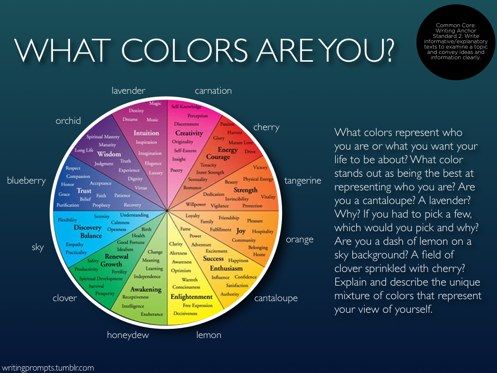 But what we’re going for here is a broad-strokes approach that helps us appeal to the most learners with the right colors for our projects. Okay, boilerplate done, let’s begin.
Read more: The Complete Guide to Color Combinations in eLearning
You probably know this already, just by taking a look at a forest or a field. Low wavelength colors promote restfulness and calm, and they improve efficiency and focus.
So that’s why green is an excellent color for improving concentration. Apart from being one of the easiest colors on the eyes, it reminds us of nature. That’s why TV stars stay in the ‘green room’. It’s a relaxing space.
Green is a good color for keeping long-term concentration and clarity, making it a good choice for an office – as opposed to red, which is seen as stimulating and exciting. Maybe it helps in the short term, but stimulation has to tail off sometimes.
Interestingly enough, there’s some real scientific evidence for this. Some studies have shown that people who work in green offices have higher rates of job satisfaction, and consumers have been shown to spend more time shopping in stores that are painted green [1].
Another study, led by Dr. Kate Lee, examined 150 university students. She gave the group a boring, monotonous task that dragged their attention span to a breaking point, pressing a series of numbers over and over as they read off a computer screen. The students were told not to press keys when the number three appeared on the screen. Then break time came, and in a 40-second window half of the group viewed a green roof, while the others looked out onto a bare concrete roof. Amazingly, the research showed that students who looked at the green view made fewer errors and had overall better concentration. [2]
Dr. Lee hypothesizes that the green roof provided a ‘restorative experience’ which helped boost the mental resources of the students involved in the study. If true, that’s a major consideration. If your learners are tired and bored of their compliance material, add in a restorative green screen, a forest scene, or something else for a bit of a break. Lee believes that just a moment of looking at a green space could provide a moment of revitalization for workers who were struggling to concentrate.
Think about the orange sun setting over the horizon. Nice, right? It’s true, orange can be a welcoming and mood-lifting color for learners, which in turn promotes comfort and improves neural functioning.
Some theorists argue that an environment rich in the color orange increases the oxygen supply to the brain, stimulating mental activity while simultaneously loosening peoples’ inhibitions. An increased oxygen supply also leads to feeling invigorated and getting ready to ‘get things done.' Some have even suggested that test centers be painted orange to stimulate exam-takers.
But this comes at a cost – avoid bolder orange colors if your learners are young and naturally energetic. This isn’t a good color for those prone to overstimulation as well, for instance if your group of learners have attention deficit hyperactive disorder or another health concern which leads to easy overstimulation.
That’s not it on the science for orange, though – many studies have found that when colors are used to emphasize a feature or piece of content on the screen, learners’ attention levels increase. Of course, the best colors for this are warm colors, like orange. So we can say that when you’re looking to highlight certain facts or important information, orange can be a better choice than the traditional red. But, because of its energy and brightness, orange can be an overwhelming choice. Orange is, in other words, best in small doses.
The secrets of orange were known in ancient China too – in Feng Shui, orange is seen as a “yang” color which stimulates focus and promotes organization [3]. Of course, we need to remember that brightness and saturation also come into it, and too bright a color will probably give you a headache! Looking to the experts, color psychologist Angela Wright states that bright orange hues stimulate while low saturation is more soothing. So for boosting energy, go bold, and for relaxing, go mellow. Makes sense, huh?
So to close out orange as a color, in eLearning courses it can be used to highlight key facts and figures, communicate energy, life, and activity. Orange is a vibrant color that demands attention, giving it an edge as a choice for highlighting. But again, use with caution!
Read more: Color Psychology: Use Warm Hues to Energize Your eLearning
Some research suggests that people with highly intellectual work, which requires a high cognitive load, for instance, programmers or academics, are more productive in a blue environment. That said, though; we can’t keep life too monochromatic – it should be balanced with warmer colors. These can be found by using the opposite side of the color wheel.
Blue is best used for learning situations which are challenging. Blue paper, blue ink, or blue highlighting can be used to help improve reading comprehension too. Blue in general it seems is a relaxing and calming color, but lighter shades will seem more ‘friendly’ while darker ones seem a little more somber.
Back to the experts, many color psychologists recommend using blue colors, but adding a bit of extra kick with orange, especially for highlighting information (like we mentioned earlier!).
So in summary, blue is great for promoting high levels of thought, but too much can create a sense of detachment and coldness.
Read more: Color Psychology: Use Cool Colors to Set Just the Right Mood for Learning
Hopefully, by now you’re having a dramatic rethink of the color of your courses, your house, and maybe even your car. That’s great – that’s what we want. Take note of the lessons above and let us know how you’ve implemented them in your eLearning courses. Remember, color is fundamental to the human experience. It’s a huge part of our lives and our perceptions, and we should leverage that in our eLearning courses.
REFERENCES:
1.Effect of Different Colors on Human Mind and Body http://humannhealth.com/effect-of-different-colors-on-human-mind-and-body/243/8/
2. Seeing green boosts your concentration, research shows. May 25, 2015. http://www.smh.com.au/technology/sci-tech/seeing-green-boosts-your-concentration-research-shows-20150525-gh8udh.html
3. Best Color For Concentration And Productivity Is Orange http://www.huffingtonpost.com/2013/09/18/best-color-concentration_n_3949427.html
4. Brain-Based Learning by Eric Jensen, 2000 (p.54-70)
Using Color to Enhance Learning
Categories
By Age
You’ve probably noticed that color influences your mood, but have you stopped and considered how you can use color to enhance learning and influence mood in the classroom or other educational environments? The colors you choose to use in your classroom or center can actually have a major impact on children’s mood and how children learn and absorb information. For example, using yellow in your classroom will encourage children to be creative and will also help you maintain their attention. In her book Start Smart: Building Brain Power in the Early Years, Revised Edition, Pam Schiller, PhD, includes the following chart and ideas for using color to enhance learning and influence mood:
Red | Creates alertness and excitement. |
Blue | Creates a sense of well-being. |
Yellow | Creates a positive feeling. |
Orange | Increases alertness. |
Green | Creates calmness. |
Purple | Creates calmness. |
Brown | Promotes a sense of security and relaxation. |
Off-White | Creates positive feelings. |
Ideas for Infants and Toddlers
- Infants only see black and white when they are born, so providing bright colors in their environment will help their brains learn to recognize color.
- Wrapping red fabric around bottles or placing red placemats under children’s plates will help even the pickiest of eaters get the nutrition they need.
- Using crib linens in cool colors (blue, green, purple) can calm children and help them rest better.
Ideas for Preschool Children
- Wearing a yellow or off-white apron or smock when you present information to children can help maintain their attention.
- In areas where children need to be attentive, try placing a yellow placemat, a yellow vase of flowers, a picture of yellow flowers, a yellow folder, or a yellow pencil case to help them pay attention.
- Using calming colors (different shades of blue, beige, and green) in quiet areas can calm children and help them feel relaxed.
Ideas for School-Age Children
- You can teach children about how color affects their moods, appetites, behavior, and learning by asking questions about how they feel around certain colors and whether they agree with research findings about the impact of color.
- Include a discussion about color-related phrases (e.g., feeling blue, seeing red, true blue, having a green thumb) in your lesson plans. Ask children if the phrases and their meanings match their experiences with color.
- Make an effort to display art from different artists in your classroom. The artwork you choose can lead to discussions about why the artists chose certain colors and how they used colors to create emotional reactions to their work.
Ideas for Small or Large Groups
- Hang crepe paper streamers to influence the moods in certain areas.
 For example, dark-colored streamers in a reading area would help children relax and focus on what they are reading.
 - Use reds and yellows in areas where you would like to encourage creativity (e.g., art learning center, dramatic play learning center, writing area/learning center).
- Consider the effects of color when planning family engagement events or other classroom activities. Bright colors may overstimulate children if they are already excited.
Be sure to read Start Smart: Building Brain Power in the Early Years, Revised Edition for more information on how color can influence learning and mood and for a variety of other fun ways you can help children learn and grow.
Additional Resources
Instructional Strategies
Instructional Strategies
Get new articles in your email.
Sign Up Now
how different shades affect a person
The psychology of color is no longer a myth, but a scientific fact actually practiced. Knowledge about human perception of colors is used in their work by marketers, designers, advertisers, teachers and many other specialists. If you pay attention, you can trace the pattern of using different shades in advertising signs, price tags in a supermarket, website design, product packaging and much more.
Everyone knows that red accentuates attention and green helps to relax. In this article, we will cover more. Read how to make learning more effective with different colors.
Source: professionali.ruInfluence of colors
- red - excites the psyche, increases brain activity, increases concentration. However, an excess of this color can provoke aggression, since at a subconscious level, red is often associated with something disturbing;
- orange - improves mood, increases creative thinking, promotes active work. This color fills with a sense of success, solidarity and goodwill. Helps to cope with melancholy and depression.
 Orange is a safe color, there are no “contraindications” for its use;
 - yellow - just like the two previous colors, improves concentration. It is used by both office workers and creative people. Yellow gives a feeling of happiness and well-being, but in large doses it can provoke a headache;
- purple - activates intuition, has a relaxing effect, reduces physical and mental activity. In excess, it can cause fatigue and boredom. In small doses, it can reduce headaches and tension;
- blue - slows down activity, encourages unhurried analytical reflection. It is the color of discipline and tranquility. In excess, it can provoke depression, especially in melancholic people. It helps people who are too active to slow down and “come to their senses”;
- blue - has a relaxing effect, soothes and slightly "slows down" performance. Useful for people prone to stress;
- green is a neutral hue, somewhere between warm yellow and cool blue.
 This is the color of nature, it gives peace and harmony. It is used to treat depression: it improves eyesight and appetite, and helps restore well-being. In small doses, it promotes enthusiastic work. But there should be little green in the learning space: it can cause apathy and loss of interest in tasks;
 - white — the color of a sober mind and prudence. It clears the mind and calms the emotions. Do not use in excess: white can reduce performance and interest in activities. It is better to take it in small quantities or alternate with other colors;
- black - will not help with studies. In excess, this tone causes depression, lowers mood and physical well-being. In small quantities, it has no effect, it is neutral.
How to use colors
Room
Many schoolchildren and students prefer to study in a room with light or pale walls. It helps to relax and forget about deadlines. But this approach will not help to complete tasks on time, quickly learn the material and fix it in memory for a long time.
Curtin University did a study. According to him, a room with bright elements causes little discomfort for the student. And this, in turn, contributes to the concentration of attention and active brain activity.
Fill the room with large items in bright colors: yellow, orange, red. Paint the walls, hang colored curtains, buy bright bedding or a rug. Look for a houseplant with interesting flowering. For example, Anthurium has beautiful red leaves.
Source: urbanlook.ru, rastenievod.comFeel free to experiment with orange, use yellow a little less, and red should be at least.
Notes
One-color notes are not only visually boring, but also ineffective. Use highlights to highlight important information. For quick orientation in the abstract, you can follow the invented scheme.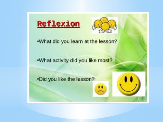 At the same time, choose colors according to the degree of their influence on brain activity. For example:
- red - highlight definitions;
- orange - clarification of list names;
- yellow - important facts in the paragraph;
- purple - interesting, but not very important information, etc.
Stickers
Have you ever wondered why manufacturers make stickers of different colors? Aesthetics plays a secondary role here.
These small sticky notes are used to quickly memorize necessary information. They can be used in different ways:
- In order of importance (the most important - on red, a little less significant - on orange, yellow, blue, light green, etc.).
- According to the level of complexity (the same as in the previous paragraph, only according to the degree of decreasing difficulty in memorizing information).
- Subject (terms for biology - in green, in physics - in lilac, in English - in yellow, etc.
 ).
).
There are also various options for using stickers:
- As bookmarks in a textbook/summary to quickly find the desired chapter.
- As "reminders" that can be stuck anywhere: monitor frame, mirror, refrigerator, room door, etc. It is important that these places often come into view. This technique is very effective and is often used in the study of foreign languages.
- As part of the planner, where the cases are listed in order of their importance. The planner template can be found here.
Reminder bracelet
If you tend to be distracted from important tasks, you can use an interesting life hack. A red bracelet will serve as a reminder that now you need to do business, and not listen to music on headphones. Also, red color will help to return the brain to an active state.
This technique can also be used instead of stickers. This will be effective if you have already learned the information and just want to fix it in memory. For example, a red bracelet is a theorem in physics, purple - a catchy English word that you often forget.
To relax
You need to rest, because overload reduces efficiency. To make your study breaks effective, use the psychology of color.
Green and blue will relieve stress, help you relax, free your head from unnecessary information and "reboot". Take a walk in a square or park, sit near a quiet pond. Fresh air and soothing colors will quickly put your thoughts in order.
If you feel that you are starting to lose heart over books, yellow and orange will help. These tones are able to improve mood and give a feeling of happiness. If it's warm autumn outside, step into the park and rustle your feet in the dry bright foliage. Or brew amber-yellow tea, enjoy its color and aroma.
Source: clubcha.ru Overworked, head buzzing? Dim the lights, light a lavender-scented candle, and lie back on your purple-lined bed. This color will relieve headaches and tension.
Man is the most interesting creature on the planet. Our psyche is so multifaceted that scientists have not yet studied all its secrets. But one thing is known: overworking is just as ineffective as procrastinating. If you feel that completing tasks is detrimental to your motivation to study, contact Phoenix.Help. Our experts will help to cope with any task.
The psychology of color: provoking emotions in emails
Nastya Roshchinskaya, SendPulse content marketer, wrote an article specifically for the Netology blog on how to evoke different emotions in email subscribers using color.
Colors are believed to influence human emotions and behaviour. What does the right color do in email marketing? It helps to lead the consumer to the target action and increase brand awareness. In the article I will tell you what associations different colors evoke and how well-known companies use it in their mailing lists.
Training Program: "Email Marketing: Increasing Sales and Expanding Your Customer Base"
What Research Says
Perception of color depends on personal preferences, upbringing and cultural characteristics of a person, but when it comes to shopping and interaction with a brand, there are also universal moments:
- for 80% of users, color affects brand awareness;
- 90% of customers decide to buy based only on the color of the product.
Color helps a brand stand out and be remembered from competitors. It awakens memories and affects the emotional state of a person. And each in its own way. Let's figure out what to do with email marketers.
Red - highlighting
Emotionally strong and energetic color. Shades of red evoke opposite feelings - love and hate, joy and anger, friendliness and aggression. The reaction depends on the amount in which it is used.
If you want to attract attention, red accents will do. See how unobtrusively Antropologie leads the subscriber to the target action with the help of muted red text for the CTA buttons:
Yellow - revitalize and lure
The sun and happiness are the first associations that come to mind. Saturated yellow expresses joy, optimism and spiritual lightness, while darker shades calm and invigorate at the same time.
Yellow encourages impulsive shoppers, so use it in your flash sale or out of stock emails. Add yellow if you want to cheer up your followers.
The Alice and Olivia mailing list is full of bright yellow, but it does not cause anxiety or fear. On the contrary, the connection of the online store action with the legendary The Beatles and their hit Yellow Submarine comes to the surface:
Orange - directs to the target action
Combines the energy of red and the joy of yellow, thanks to which it stimulates a feeling of comfort and even stimulates appetite . Orange is also the color of motivation and a positive outlook on life.
This color encourages action like red, but makes it softer. Pich Shop puts orange accents on a light background to make it easier for the subscriber to navigate the mailing list and go to the target action.
Blue - trust
The color of reliability. Tones and shades of blue are associated with security and peace, inspire confidence and even increase productivity.
Use blue in your mailing to increase the credibility of the company in the eyes of the subscriber, and blue to enhance the feeling of cleanliness and peace. But dilute the color scheme of the letter with other shades so as not to inadvertently drive a person into depression.
The La Roche Posay dermatological brand cares about the health of girls' skin, so the company's logo and mailings are made in rich blue colors, symbolizing purity.
Green - we encourage you to take care of nature
This color symbolizes nature, and nature is harmony, vitality and a new beginning.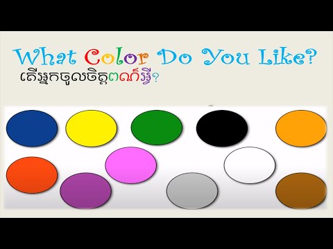 Dark shades are associated with wealth and stability, while light ones are associated with kindness and compassion.
Focus on green if your company's corporate policy is about sustainability. Tentree is a sustainable clothing brand. When the company reminds subscribers of the importance of protecting the environment, the letters are filled with rich colors of fresh greenery.
Violet - add mystery, but not too much
Associated with luxury and mystery. Violet color motivates a person to solve pending tasks and problems, and most importantly, causes a desire to create.
Online clothing stores use lighter shades of purple to bring out the romance, while beauty brands show off mystique with darker hues. Try to use this color in moderation, without distracting from the main thing, as NYX does.
Black - complementing other colors
This color stands for sophistication, control and independence. Since black is the absence of any color, it is associated with secrecy, individuality and restraint.
Among the negative meanings of black are evil, sadness, depression and even death. So in mailing lists, dilute it with other colors. Send intensely black emails only to specific audiences or on special occasions. The Pull&Bear newsletter is dedicated to Black Friday and the chosen color matches the occasion.
White - balance the elements of writing
Traditionally, it is associated with purity and innocence. White is a balanced combination of all the colors of the palette, so it can both charge you with vivacity and optimism, as well as calm and drive away fears. But too much white can make people feel lonely and empty.
In mailing lists, this color is most often used as a background color, as it highlights the rest of the letter and is combined with all colors. Take a look at Cuyana’s newsletter — the white background adds lightness, making the design look neat and restrained.