What makes primary colors
Primary Colors - What Are the Primary Colors in Color Theory?
Most of us learned at school what the basic primary colors are, the main colors being red, yellow, and blue. However, over the years, other color models have been discovered and the issue has become a little more complex. So, what are the primary colors and exactly how many primary colors are there?
Table of Contents
- 1 What Are Primary Colors?
- 1.1 Additive Colors
- 1.2 Subtractive Colors
- 1.2.1 Basic Facts for the RYB Color Model
- 1.3 How Many Primary Colors Are There?
- 2 Color Psychology and Primary Colors
- 2.1 The Color Blue
- 2.2 The Color Green
- 2.3 The Color Yellow
- 2.4 The Color Red
- 3 How Can You Mix Primary Colors to Create New Colors?
- 3.1 Are Primary Colors Pure?
- 4 Frequently Asked Questions
- 4.1 How Many Primary Colors Are There?
- 4.2 What Are Additive Colors?
- 4.
3 What Are Subtractive Colors?
- 4.4 Can You Mix All the Primary Colors?
What Are Primary Colors?
A primary color definition can be a bit tricky as it is not as simple as what you learned back in school. A basic explanation is that primary colors can be pigments or light, that when combined, create a myriad of other colors. The traditional color theory we all learned when painting, tells us that there are three main colors, red, yellow, and blue. However, when it comes to how many primary colors there are, it is a little more complex than this.
This is because the traditional color theory only involves the use of pigments in paint and does not take into consideration the way light blends color. So, there are other color models you should consider. These involve the RGB color model, which has red, green, and blue as your primary colors, and is used with things like television screens and computer images. The other is the CMYK model which includes cyan, magenta, yellow, as well as black, and is mainly utilized for printing.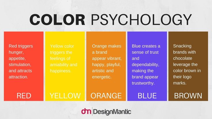
As you can see a primary color definition is more than meets the eye. Speaking of, the eye is an amazing organ, and how it perceives color is due to where the color comes from. Some colors are sent directly to the eyes, while others reach the eyes through a reflection. When it comes to light and the RGB model, and how we see color, it involves color receptors in the retina, which are known as cone cells, and these are responsible for color vision and sensitivity.
We have three types of cones, mainly green, red, and blue. This means we have trichromatic color vision. So, therein lies the major difference between the primary colors. Everything is about how colors enter the eye. There are two principal types of color mixing models called additive and subtractive colors.
Additive Colors
Additive colors were originally discovered by Sir Isaac Newton when he was experimenting using a prism and mirrors. He used the prism to refract white light, which split into different colors and when recombined, they formed white light.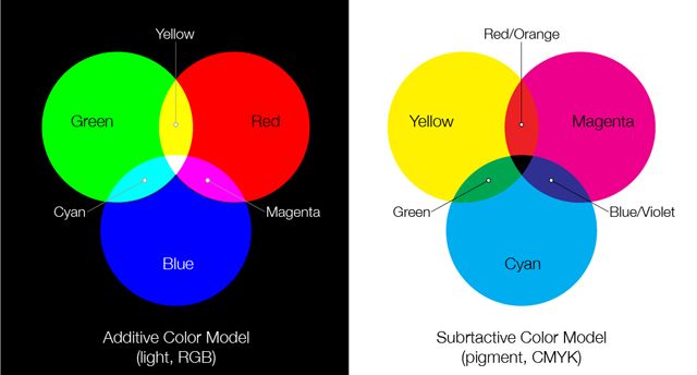 This was then used to develop the first visual representation of colors known as the color wheel. The experiments led to the theory that red, green, and blue are the primary colors that all other colors come from.
So, these colors are said to be the primary colors for the additive color model and are what happens when you look at a computer screen or television.
For example, if you combine green and blue light, you should come up with a cyan color. However, it might be more complicated than this, and some say that the yellow-green section of the spectrum responds better than the red when it comes to how the receptors in the eye respond. So, the range of colors can depend on the three additive primary colors, which could vary. However, we will remain with the traditional RGB primary colors, just to keep it simple.
Subtractive Colors
This color model is achieved when you are blending inks or paint pigments.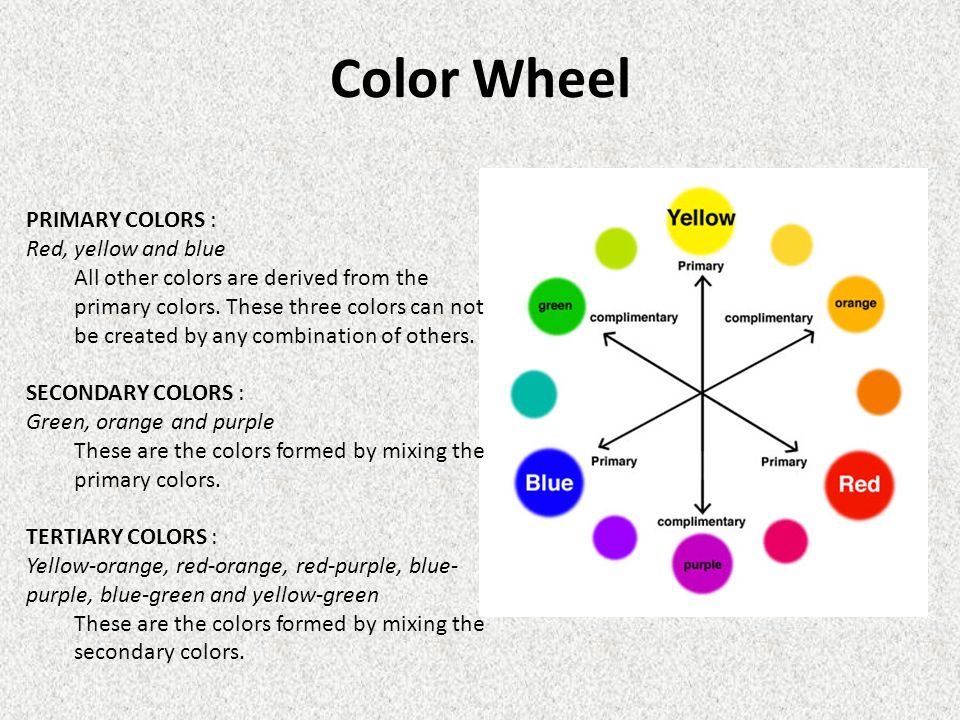 These colors can be seen because they are reflected by the light that lands on them. For example, if you add yellow ink to a white piece of paper, the ink will absorb all the blue color wavelengths and leave the others, which you then observe as yellow. So, you begin with white and then subtract light at various wavelengths as the primary colors are added. The color gets darker as more colors are added, as light is reduced. This is different when compared to additive colors, which become brighter.
| Shade | Hex Code | CMYK Color Code (%) | RGB Color Code | Color |
| Red | #ff0000 | 0, 100, 100, 0 | 255, 0, 0 | |
| Yellow | #ffff00 | 0, 0, 100, 0 | 255, 255, 0 | |
| Blue | #0000ff | 100, 100, 0, 0 | 0, 0, 255 |
The main colors for paint pigments are red, yellow, and blue, and cannot be created by mixing other pigments.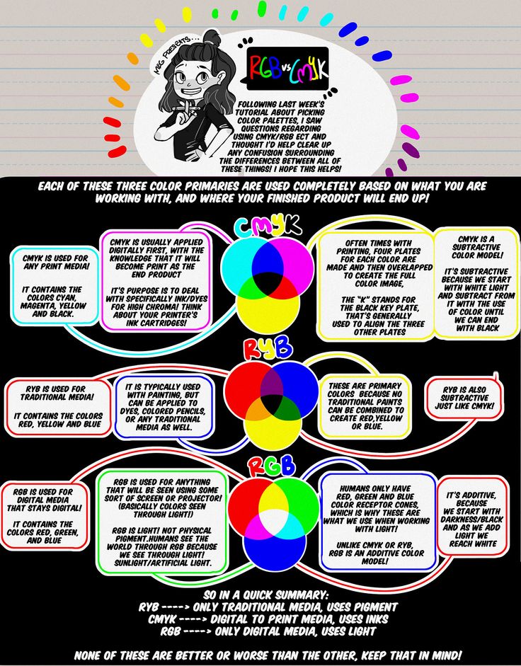 You also have subtractive primary colors for ink, which is used extensively in the printing industry. In this case, the primary colors used are cyan, magenta, yellow, and also the addition of black. You will notice that cyan and magenta are not the same as blue and red, some people use these synonymously.
| Shade | Hex Code | CMYK Color Code (%) | RGB Color Code | Color |
| Cyan | #00ffff | 100, 0, 0, 0 | 0, 255, 255 | |
| Magenta | #ff00ff | 0, 100, 0, 0 | 255, 0, 255 | |
| Yellow | #ffff00 | 0, 0, 100, 0 | 255, 255, 0 | |
| Black | #000000 | 0, 0, 0, 100 | 0, 0, 0 |
Basic Facts for the RYB Color Model
There are a few essentials you can keep in mind when using this color model.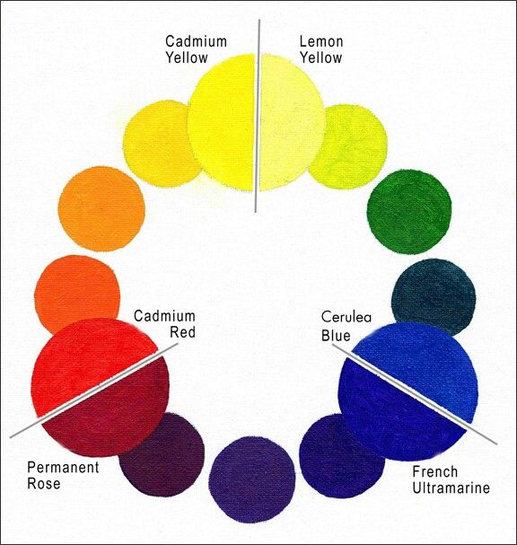 For example, this color model and its main colors are used for the mixing of paint pigments and include red, yellow, and blue as the primary colors. It cannot be used for designing websites, which does not have the same primary colors.
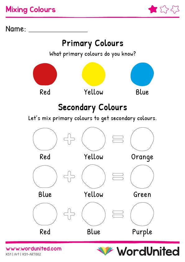
- You can blend the primary color to make more colors, for example, secondary colors like purple, green, and orange.
- However, adding all three primary colors in similar amounts will create a muddy or dark brown color.
- All the primary color paints are not the same. Different manufacturers add different ingredients, so there are various reds, yellows, and blue colors.
How Many Primary Colors Are There?
Now that we have gone through a bit of what primary colors are, you can see that it is more than simply the three colors red, blue, and yellow. The primary colors change from each color model. So, is red a primary color? Yes, it is, in the RGB and RYB color models.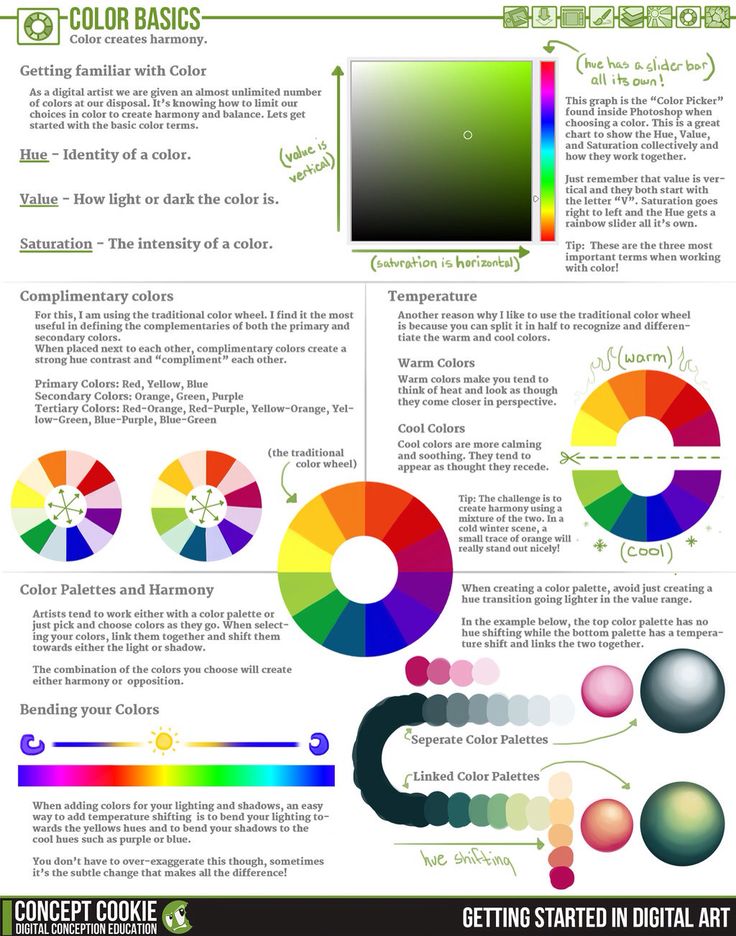 However, when it comes to the CMYK color model, it is a secondary color made by blending magenta and yellow.
Blue is similar to red, as it is a primary color in both the RYB and RGB color models and a secondary color in the CMYK color model.
Cyan and magenta are blended to create a blue color. Yellow, on the other hand, is a primary color in the CMYK as well as the RYB color models, and secondary color in the RGB color model, where red and green are combined. Remember, that if you combine all the primary colors in the RGB color model, you will form white light. Green is a primary color in the RGB color model and secondary color in the CMYK and RYB color models. This is achieved by mixing yellow and cyan, and blue and yellow respectively.
Color Psychology and Primary Colors
When looking at the primary colors in psychology, there are four main colors blue, green, yellow, and red. All these colors represent the whole person from the body to the mind and emotions.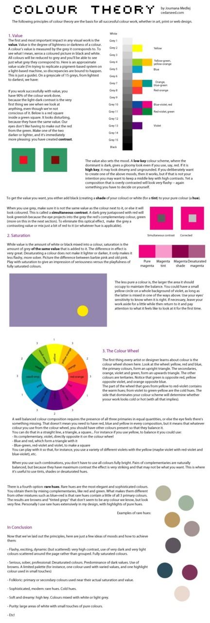 Let us now look closer at these primary colors.
The Color Blue
When considering color psychology, blue is seen as something related to human intellect. Various shades of blue are all soothing, softer blues can calm the mind and so help improve concentration, while stronger shades of blue help to stimulate the mind. Blue is a color favored by many, but it is a favorite amongst men. The color is seen as trustworthy and confident.
However, blue can also have negative associations, for example, it can seem cold, distant, isolated, depressing, and predictable.
The Color Green
Green is another favorite color by many and is closely related to all things natural as well as associated with health, growth, prosperity, abundance, and balance. Green helps to connect all of the other primary colors and facilitates a certain balance or harmony. Green can be striking, but it does not overly intrude, which makes it quite a popular color.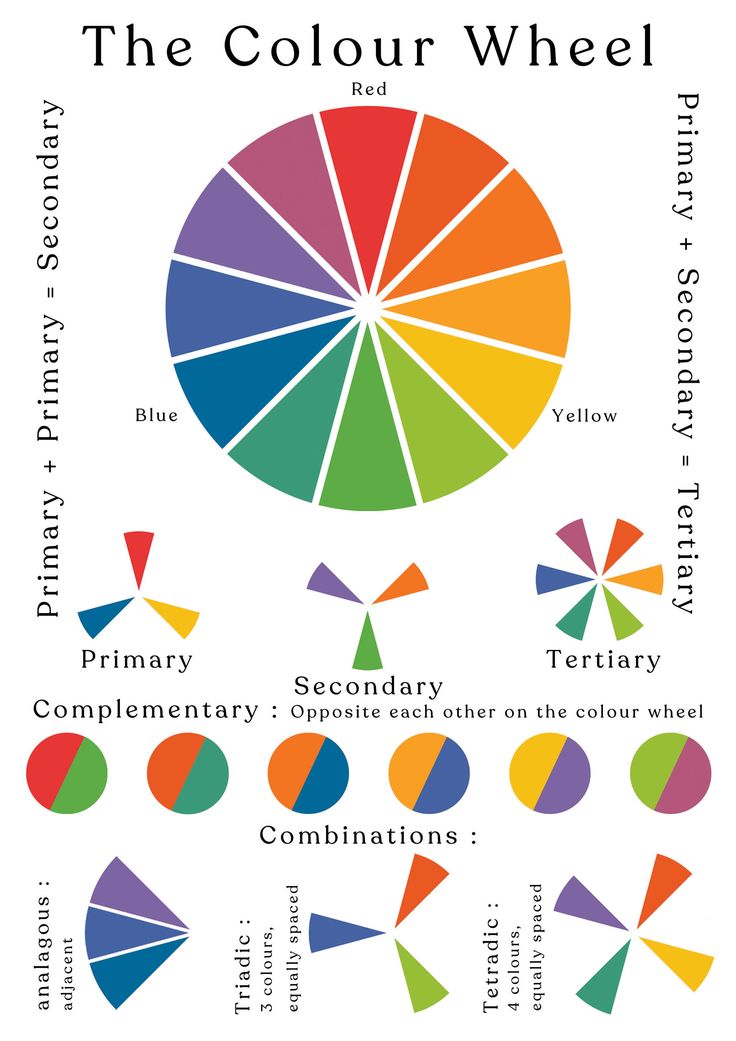 Green can also denote feelings of envy and can be related to stagnation, and boredom.
The Color Yellow
Bright, happy, and optimistic yellow, is a color that is associated with emotions. Yellow also inspires, energizes, can stimulate creativity, amuses, and provides warmth. However, it should be used carefully as it can also have adverse effects. For example, it can cause sadness and apprehension.
Yellow can also be seen as cowardly, egotistical, and deceiving.
The Color Red
Red has a long wavelength and is, therefore, considered a strong color that attracts attention, which is why it is used as a color for caution. For example, red traffic lights or other warning signs. The color is vibrant and easily seen and conveys a sense of urgency. Red is also associated with physical skills. Red is seen as warm, enthusiastic, and full of energy, strength, confidence, and passion. Negatively, it is associated with danger, anger, and aggression.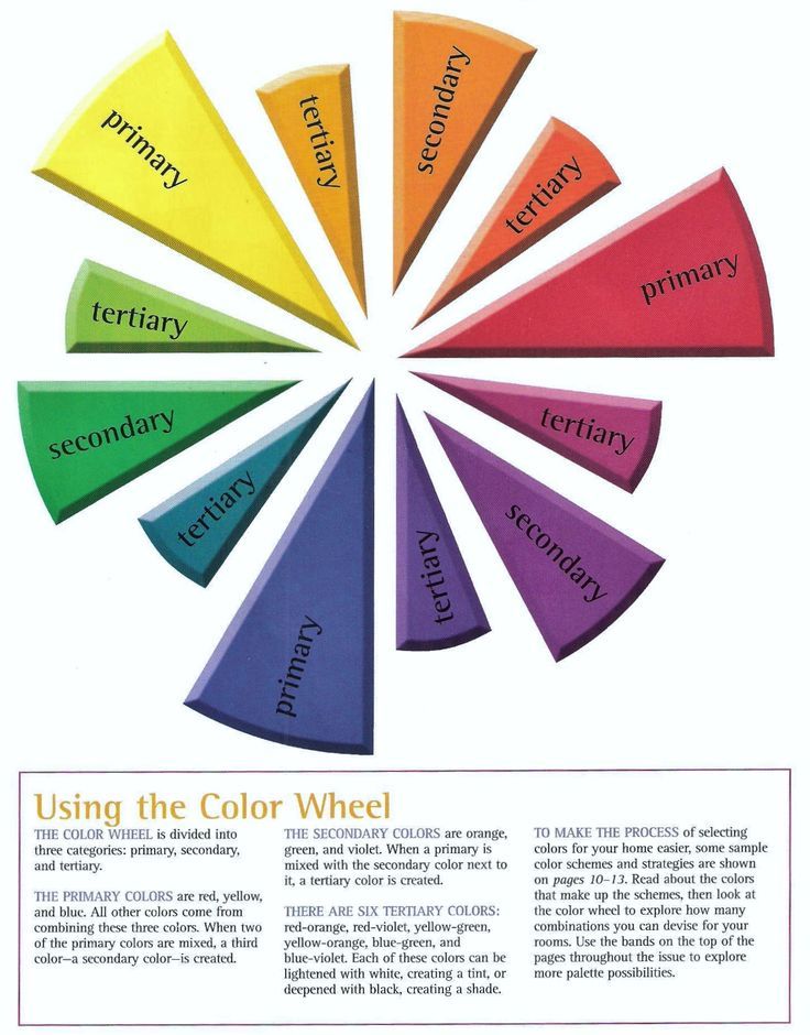
How Can You Mix Primary Colors to Create New Colors?
When you blend two primary paint colors, this creates secondary colors. Since you can get different paints and hues, and you might use different amounts, you can create different shades. For example, alizarin crimson or cadmium red medium will produce slightly different secondary colors.
When learning color theory, you will discover the color wheel, primary colors, secondary colors, intermediate, and tertiary colors. You also get warm and cool colors. Blues and greens are considered cool colors, while the reds, yellows, and orange colors are warm.
So, in the case of alizarin crimson, even though it is a red color, it is considered a cool red, which means it has more of a blue bias or undertone.
The cadmium red medium is a warm red, as it has more of a yellow bias. So, when mixing primary colors, this has to also be taken into consideration.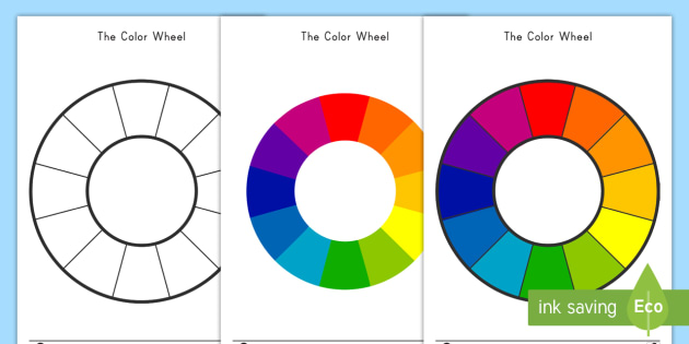 When blending two warm colors, for example, cadmium red medium with cadmium yellow medium, it will produce a purer orange than if you mixed a warm red and cool yellow. Also, if you use, for example, the alizarin red, which is a cool red, and then blend it with the cadmium yellow medium, which is a warm yellow, you are including blue into the mixture. This means you have all three primary colors mixing, which can produce a muddy and less vibrant color than what you are expecting.
Are Primary Colors Pure?
Most of us have been taught that you get pure colors, which cannot be created by mixing any other colors, which is part of the primary colors definition. However, this is not all true because you can make red by blending two colors, specifically, magenta, and yellow. Blue can also be created by blending cyan and magenta. So, you have more of a wider range of color capabilities with the CMYK color model.
Theoretically, there are the traditional primary colors that we rely on to understand colors, and they do form an important basis for color theory, but as you can see, it is not something that is absolute and there are variations.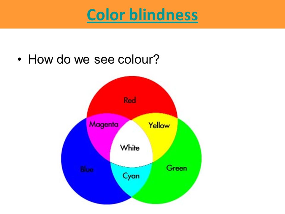
This happens even more when working with paints because there are no “pure” paint colors. As we have mentioned when mixing colors, if you take two primary colors, you will not necessarily get the color you expect. This is because most paint colors contain more than one pigment, and each manufacturer has a different formula for their paints. For example, many of the yellow paints, have either a red or green undertone. Red colors have a yellow undertone or a blue bias, and many blue paints have a red or yellow undertone.
All of this will affect the color you want to mix, so if you want to make a green, it should be simple to mix blue and yellow. However, the yellow you use might have a reddish undertone. This will mean you are mixing red, yellow, and blue which will give you a muddy brownish-green color. The point is to always take into consideration the paint undertones before you mix colors, otherwise, you will simply be creating a muddy disaster.
Working with colors, whether it is with painting or creating a website, the process can be more complicated and challenging than you first realize.
This is why gaining a firm foundation in color theory and how colors work together is so important.
Frequently Asked Questions
How Many Primary Colors Are There?
This can be a trick question because most of us learned our primary colors and these add up to three, red, yellow, and blue. However, if you consider other color models, this widens the number a bit. For example, you also have the RGB and CMYK color models with different primary colors.
What Are Additive Colors?
The word additive explains it quite nicely, which means colors are added to make new colors. This is mostly used for light sources like web pages and television screens. The red, green, and blue light is blended in different ways to create the various hues. This deals with how the light is seen directly and is not reflected.
What Are Subtractive Colors?
Subtractive colors are used in the case of objects or real surfaces like a canvas or a piece of paper.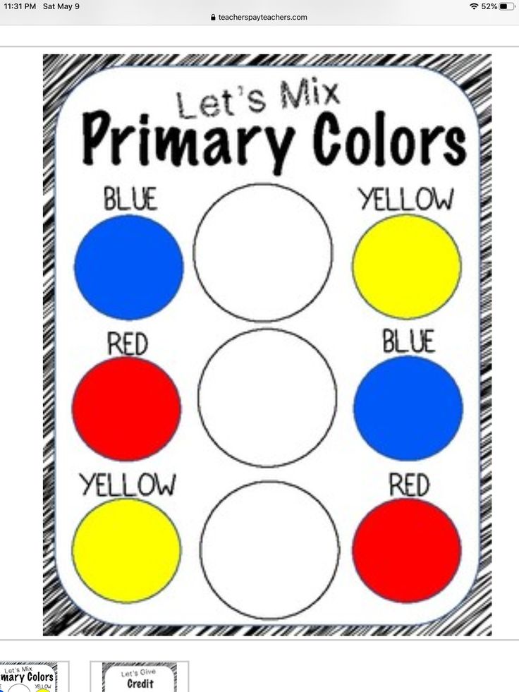 So, this means it is used for painting and things like printing. Subtractive simply means that certain color wavelengths are emitted, and you are left with the color you can visibly observe and deals with the reflection of light.
Can You Mix All the Primary Colors?
When painting, mixing all the primary colors will give you something close to a muddy brown color. This is why you should take note that many of the red, yellow, and blue paints in a tube might have an undertone or color bias. This will ultimately affect the color outcome.
Primary color | Definition, Models, Mixing, Examples, & Facts
primary colours of light
See all media
- Key People:
- Piet Mondrian
- Related Topics:
- yellow blue red magenta cyan
See all related content →
primary colour, any of a set of colours that can be used to mix a wide range of hues.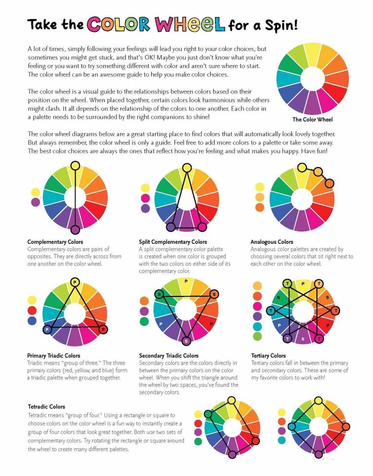 There are three commonly used primary colour models: RGB (red, green, and blue), CMY (cyan, magenta, and yellow), and RYB (red, yellow, and blue). The colour variations between the models are due to the differences between additive and subtractive colour mixing.
Additive colour mixing
Additive colour mixing occurs when two or more colours, created through light waves, are combined before they reach the eye. This can be visualized by shining coloured lights onto a white wall. If red and green beams of light are combined in equal amounts, they create the colour yellow (in this case, yellow is a secondary colour—the result of a mixture of two primary colours—but in the subtractive CMY and RYB colour models, yellow serves as a primary colour). If a more saturated red beam is mixed with the same green beam, then the resulting light would be the colour orange.
The scientific basis of additive colour mixing comes from English physicist and mathematician Isaac Newton’s 1665 and 1666 experiments with light—specifically, the test in which he separated white light with a glass prism.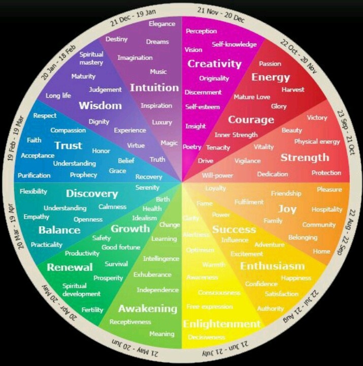 Newton determined in his book Opticks (1704) that white light is a combination of all colours, which he listed as red, orange, yellow, green, blue, indigo, and violet. In the early 19th century, the mixing of coloured light was explored by English physicist Thomas Young, who theorized that the human eye perceives colour through three photoreceptors that are only sensitive to specific wavelengths on the visible spectrum. About 50 years later, German physicist Hermann von Helmholtz built upon Young’s theory and suggested that each of the three receptors could only receive short, medium, or long wavelengths.
The RGB colour model (red, green, and blue) was initially demonstrated in 1861 by Scottish mathematician and physicist James Clerk Maxwell in his projection of what is often called the first colour photograph. Using knowledge built from previous experiments with multicoloured spinning tops, Maxwell had British photographer Thomas Sutton take three black-and-white photographs of the same object—once each with red, green, and blue filters placed over the lens—which were printed on glass and projected together.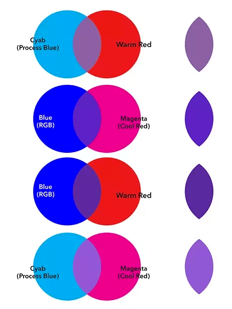
The RGB colour model also aligns with Helmholtz’s wavelength theory, with red, green, and blue as long, medium, and short wavelengths, respectively. When mixed with different combinations and ratios, these primary colours form a wide range of hues, and, when equal amounts of red, green, and blue light are combined, they form white light. The RGB colour model is used in digital devices, such as televisions and computers.
Subtractive colour mixing
When using subtractive colour mixing, the colourants absorb and selectively transmit or reflect light. This can be seen when a coloured filter is placed over a beam of light. If a yellow filter is used, all other colours are absorbed, leaving only yellow light shining through. It is also seen in paints and other pigments. Yellow paint absorbs blue and violet light while reflecting yellow light, as well as green and red light which combine to create more yellow light.
Get a Britannica Premium subscription and gain access to exclusive content.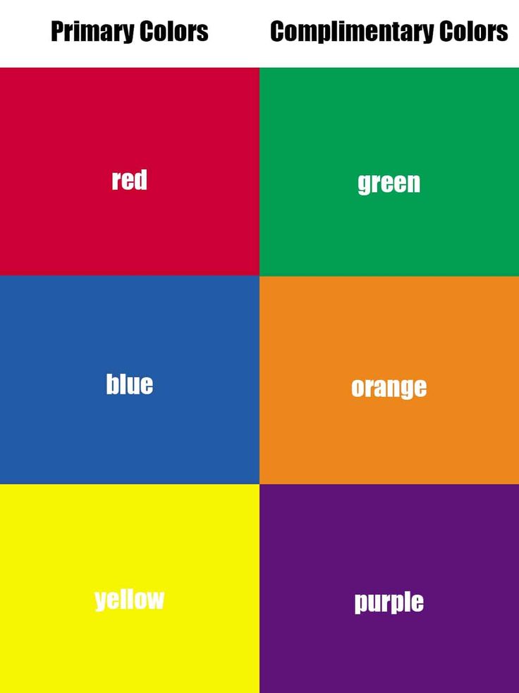 Subscribe Now
When a different colour, such as blue—which absorbs yellow, orange, and red light—is mixed with yellow, the result is the coloured light that was not absorbed by either pigment. In the case of blue and yellow, the result would be green. As more pigments are combined, more light is absorbed, and the colour mixture progressively becomes darker.
The CMY colour model (cyan, magenta, and yellow) aligns with the additive primary colours of red, green, and blue. Cyan absorbs red light, magenta absorbs green light, and yellow absorbs blue light. This colour set, with the addition of black, is often used when printing images.
Although red, yellow, and blue (the RYB colour model) are widely taught as main primary colours, the CMY colour model produces a larger range of colour mixtures. The RYB colour model is the oldest and perhaps most accessible of the three colour models, having likely been known since ancient times by artists working in paint and easily taught and visualized with art supplies in a classroom.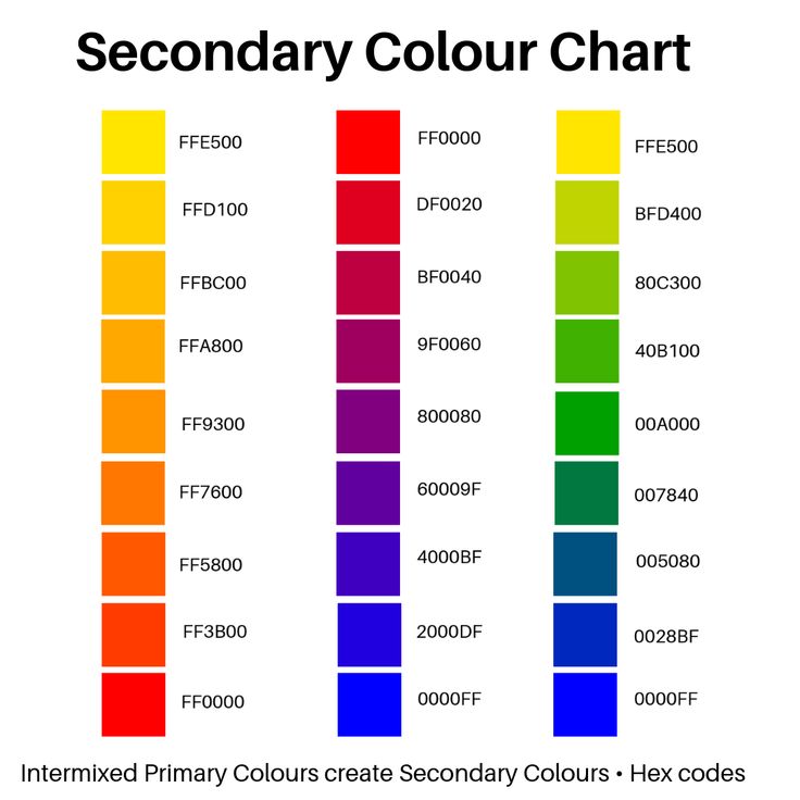 The RYB and CMY colour models have often been conflated due to the misconception that cyan is equivalent to blue and that magenta is equivalent to red.
Another common misconception is that primary colours are “pure” and cannot be made by mixing other pigments. In reality, colours from the CMY model can be created from colours from the RYB model and vice versa. The RYB primary colour red can be made by combining magenta and yellow pigments, and the CMY primary colour magenta can be made by combining red and blue.
Connie Deng
Color value
Whether we realize it or not, colors have a certain impact on our entire lives.
Usually we intuitively look for the color we need. If we feel tired in the morning, we involuntarily choose clothes in warm and vibrant colors - orange, yellow or red. Subtly sensitive people choose colors most accurately. These are usually women, as men are more socially bound and often suppress the urge to wear clothes of the desired color.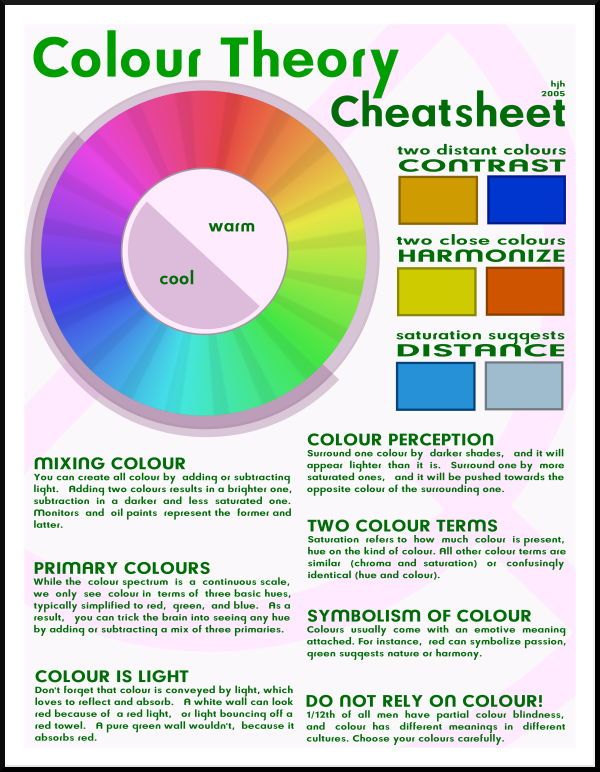
Marketers are well aware of how colors affect customers. For example, in those cafes where they want customers to linger less for food so that more visitors pass, there are always a lot of bright colors such as yellow and red. At the same time, soft color tones and subdued lights can be found in restaurants where they are interested in keeping customers longer.
The primary colors are red, blue and yellow, and the secondary colors are green, orange and purple.
Red - the color of life, sun, fire. It evokes opposite feelings - love and hate, joy and anger. He is the most conspicuous. It is believed to stimulate circulation. Red - the color of the heart, lungs and muscles; it makes a person talkative, excites and intensifies emotions - all revolutionary flags are certainly red. It makes the lazy more active.
Blue color brings a sense of peace and infinity, relaxes a person. This cold light affects the endocrine system, our reactions to stress, relaxation (relaxation), as well as the body's defense system against infections and allergies.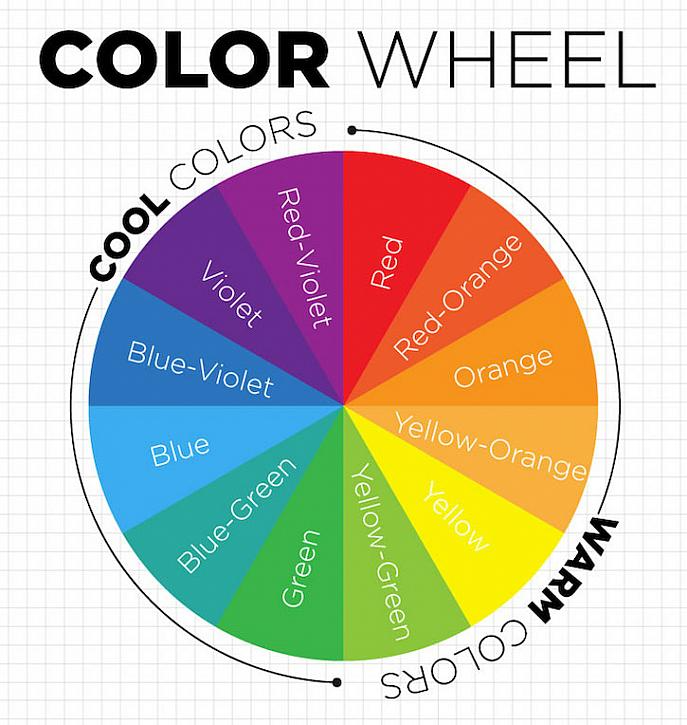
Yellow symbolizes the midday sun and has a stimulating effect. To a greater extent, it is perceived by the left hemisphere of the brain, its "intellectual" half, and can have a positive impact on learning and acquiring professional skills. Yellow improves the mood of people who are always dissatisfied with something.
Green is the most common color in our European nature. It has a calming effect, and therefore a walk among the greenery is often extremely healing.
Orange represents joy and happiness. It has a beneficial effect on a person who suffers from depression or is prone to excessive pessimism. People who wake up in the morning already tired, dissatisfied and won’t utter a word until they drink a cup of coffee, their mood completely changes if they look at the world through orange glass for at least a few minutes after waking up.
Violet color is always associated with spirituality. It acts on the subconscious and helps a person to know himself, enhancing the effect of meditation. If you put on purple glasses and go to a crowded place, you can be sure that no one will even come close to you. And if you want to moderate your appetite, put on purple glasses when you sit down at the table. Dishes in purple look very unappetizing.
Turquoise color is something that connects the outer and inner sides of our lives. The therapeutic (healing) effect when using this color is often manifested in the fact that there is a feeling of relaxation, liberation and well-being.
The simplest experience will help you understand how different colors affect you. It is necessary to hang multi-colored transparent strips on the window and look through each for several minutes. Soon you will understand which color is especially pleasant for you, and which one is unpleasant at this moment.
There are several types of color effects on a person, but we will consider the physical and psychological.
Physical influence refers to the effect of color on the functional systems of the human body.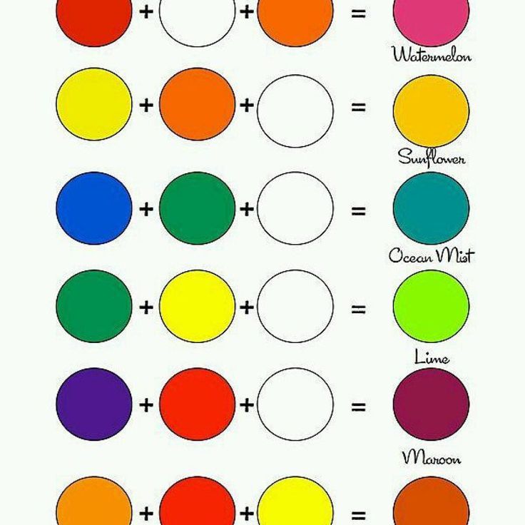 Red and blue colors have the brightest ability to do this, especially at maximum saturation.
Red color excites the nervous system, activates all body functions, increases muscle tension for a short time, causes rapid breathing and pulse.
Yellow color - physiologically the most optimal, least tiring, stimulates vision and nervous system;
Green color - the most familiar color for the organ of vision, increases motor-muscular activity for a long time, reduces blood pressure and dilates capillaries, soothes and relieves muscle and headaches;
Blue color - soothes, reduces muscle tension and blood pressure, calms the pulse and slows down the rhythm of breathing;
Blue color - has a calming effect, which turns into a depressing one. It inhibits the functions of all physiological systems of the body.
Violet color - combines the effect of red and blue, makes a depressing impression.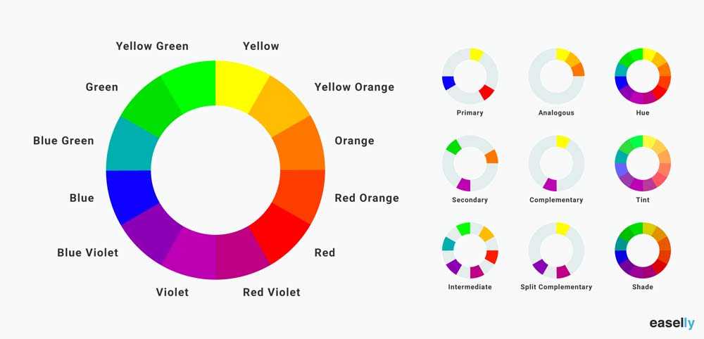
Red, yellow, orange are extraversion colors, ie. give rise to an outward impulse.
Blue, violet, green - introverted, their impulses turned inward.
orange and red along with the visual excite the auditory center of the brain, this causes an apparent increase in the volume of noises (for example, a police flasher with a siren). No wonder these active colors are often called flashy.
Green and Blue , soothing colors, weaken the excitation of the auditory center, i.e. as if to reduce the volume of noise.
Tan seems dry, greenish blue damp, pink sugary...
This effect of color cannot be explained by associations (autumn yellow-brown leaves, etc.). It is caused by synesthesia, i.e. stimulation of one sense organ while stimulating another. For example, there are such main characteristics of the apparent effect of colors:
White - light
Yellow - light warm dry
Orange - warm dry flashy, loud
Red - heavy warm dry flashy, loud
Violet - heavy
Blue - heavy cold, moist, calm
Green - cool wet calm
- light wet, calm
Brown - heavy, moist, moist Black black - heavy dry black
"Synesthetic feeling" is inherent in all people, but it is most familiar to creative people with a fine mental organization.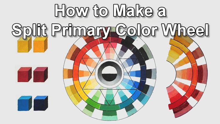 This is how Japanese poets felt the world:
Twilight over the sea.
Only the cries of wild ducks in the distance
Vaguely turn white.
(Matsuo Basho)
It's raining in May.
And the wind in the plum leaves
is freshly green.
(Saimaro)
But it is obvious that colors have a much stronger effect on our physiology and psyche through the mechanism of associations.
Color associations occupy an extremely important place in human life. It has been like this since time immemorial, and perhaps for an ancient person the language of flowers was much more eloquent than for us today. Warriors, with their combat attire, sought to cause excitement and fear; priests, decorating the victims with flowers and gilding - reverence, delight, ecstasy; kings dressed in gold and precious stones - trembling and trembling, a sense of their own insignificance among subjects; and colorful mats and bright decoration of dwellings helped people switch from work to rest and family joys.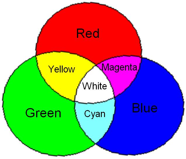
PSYCHOLOGICAL IMPACT OF COLOR
Here we will talk about feelings, experiences that we can experience under the influence of a particular color.
Absolutely green is the most calm color. It does not move anywhere and has neither an overtone of joy nor sadness. It is this complete lack of movement that has a beneficial effect on a tired psyche, but it can also become boring over time. When yellow is introduced into the green color, it revives, becomes more active. When blue is added, on the contrary, it starts to sound more muffled, becomes more serious, thoughtful.
Yellow color worries a person, “pricks”, excites, activates his state.
Blue tends to deepen. The deeper, darker the blue color becomes, the stronger it calls to the infinite, awakens a hunger for purity and the supersensible. A very dark blue gives an element of peace. Brought to the limits of black - acquires an overtone of sadness. Becoming, on the contrary, bright, it becomes distant and indifferent, like a blue sky.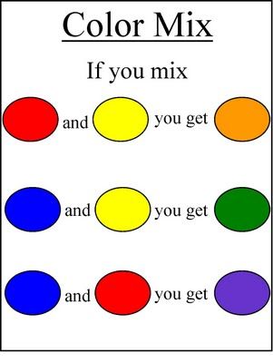 And the lighter is even stronger, the blue becomes more and more silent until it reaches complete silent rest, becoming white.
White color is a symbol of the world, in which all colors, all material properties disappear. Therefore, it acts on our psyche as silence. But this silence is not dead, but, on the contrary, full of possibilities.
Black the same color is really silence without a future.
The balance of white and black gives birth to gray. Naturally, the gray color can not give any movement or sound. Gray is soundless and motionless, but this immobility is of a different nature than that of green, born of two active colors - yellow and blue. Therefore gray color is inconsolable stillness.
Red we perceive as an invariably warm color, as lively, restless, but not having, however, the frivolity of yellow and, unlike the latter, as if glowing within itself.
Violet color is like chilled red, so it sounds a bit painful, like something extinguished and sad.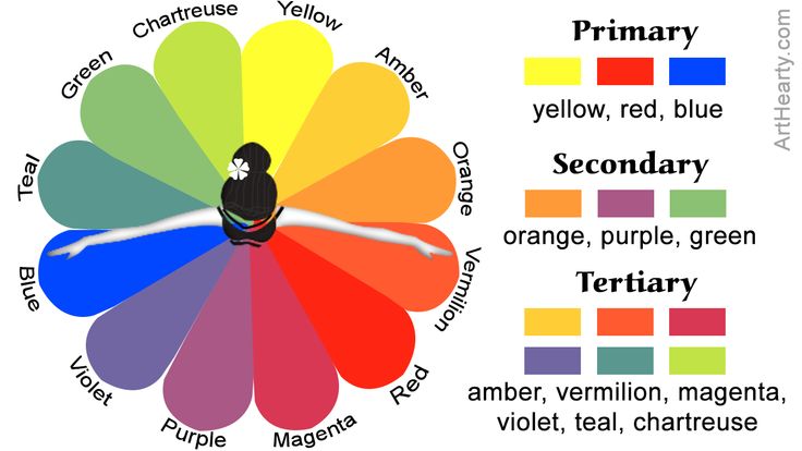
The choice of color preferences (favorite color) depends on many factors: temperament, character of a person, family traditions, etc. Foreign scientists, as a result of numerous studies, have come to the conclusion that preference for colors is biologically innate.
Children under the age of 1 year, regardless of race and place of residence, show the same preferences: they prefer red, orange and yellow to green, blue and purple.
Among adults, the colors are distributed according to their popularity as follows (as preference decreases):0014 - brown - black .
And in conclusion, it remains to tell one more interesting detail regarding color preference. Specialists subdivide colors into groups A and B:
The colors of group A - simple, clean, bright, contrasting in combination -
- act as strong active stimuli and meet the needs of people with a healthy, restless nervous system.
These are mainly children, adolescents, youth, rural residents and manual laborers, people with an ebullient temperament and an open, direct nature.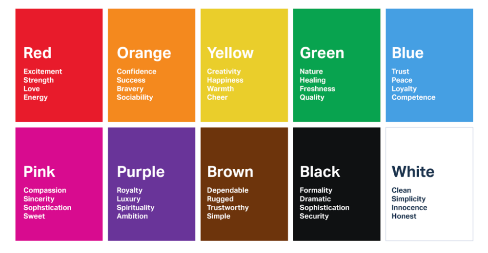 It is no coincidence that we often meet these colors in the interior of children's institutions, on advertising posters, in the youth environment, and in arts and crafts.
The colors of group B - complex, low-saturated colors - whitened, broken, blackened - - soothe rather than excite; evoke complex, ambiguous emotions.
Such colors need more prolonged contemplation for perception, satisfy the need for subtle and refined sensations. For all these reasons, the colors of group B are preferred by people of middle and old age, intelligent labor, with a tired and / or finely organized nervous system. These colors are more common in European classical costume, in the interior of the dwellings of the urban intelligentsia, in painting 18-19centuries, in modern design graphics and architecture.
MDOU "Kindergarten No. 85" of the city of Yaroslavl
Color world
Dear parents!
Developing the creative abilities of your children, we introduce preschoolers to the color .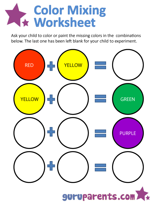 Color is mastered by children early and occupies a special place in a number of expressive means.
The development of color as a means of expression has its own dynamics: from monochromaticity through multicolor to strict color relationships and the assimilation of the laws of color combinations.
Sensor color standards are chromatic colors - red, green, blue, violet (rainbow spectrum) and achromatic colors - white, gray, black, as well as shades of all colors by lightness and saturation.
From an early age, a child knows three basic colors (red, blue, yellow) - this is
primary (or primary) colors, from which all other colors are obtained by mixing. These three colors cannot be obtained by mixing any of the others.
From the second younger group, children begin to mix colors and receive secondary (additional or mixed) colors. These are the colors that can be obtained by mixing a pair of primary colors (yellow and blue make green, red and yellow make orange, blue and red make purple).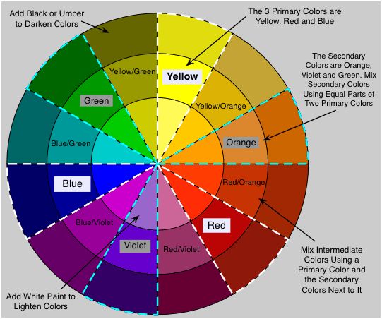
There are tertiary (derivative) colors that are obtained by mixing (combining) primary and secondary (for example, yellow and green give us yellow-green).
Mixing two colors that are not in a row in the spectrum gives an intermediate color between them, and mixing two adjacent colors gives a shade (for example, red-orange).
In nature and works of art, colors are found in complex and varied combinations.
Chromatic colors are divided into two groups - warm (from red to yellow) and cold (from green to purple) tones.
Each chromatic color or hue has a specific lightness, brightness and saturation.
The brightness of colors allows us to distinguish one color from another and give it a name.
Lightness is the degree of proximity of a given color (or shade) to white, and
saturation - the degree of its purity, that is, impurities to a given gray color of the same lightness.
In everyday life, when they denote shades of color, they usually indicate their lightness (dark green, light yellow), meaning brightness. Therefore, it is quite enough if children learn the variability of color tones in terms of lightness and the corresponding names of shades.
Some light shades have special names in everyday life (light red is called pink). It is quite acceptable for children to use the names of these shades (except for the incorrect name of light blue as blue). This refers to the naming of shades by hue (i.e., those occupying an intermediate position between neighboring colors of the spectrum). Almost all of them have “objectified” names in everyday life (lemon, lilac, raspberry, etc.)
Looking at pictures with a child, we rarely see individual colors, because the overall impression that a picture creates does not depend on each color separately, but on combination and interaction with other colors. Some colors are so dependent on each other that they are called complementary.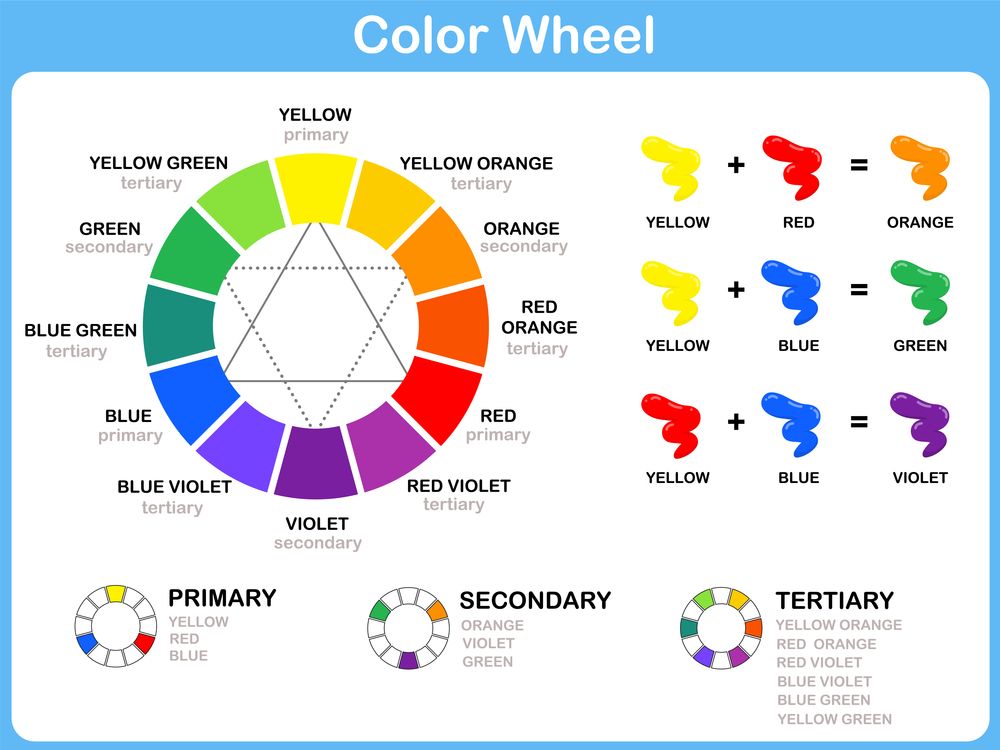
Turning to the color wheel, you can immediately determine which colors are complementary.
It's very simple: the complementary colors on the circle are opposite each other.
Red is the complementary color to green, yellow to purple, and blue to orange.
How Primary and Mixed Colors Become Complementary.
The relationship between primary and mixed colors is illustrated by the double color wheel. Primary colors are in the inner circle, mixed colors are in the outer circle. Complementary colors are opposite each other. The complementary color in relation to one of the main ones is a mixed color, the latter is based on two main ones.
Complementary for a mixed color is the main color that is not included in its composition. Thus, the mixed orange color, being a mixture of red and yellow, acts as a complementary color for the third primary color, which is not involved in its creation - blue.